Looking Outwards – Data Visualization

by mghods @ 12:44 am 18 January 2010

While looking for examples of data visualizations, I found this web-page, categorized some approaches for data visualization. I enjoyed its collection personally. Hope visiting, and reading it could be helpful for you doing Project 1.

Looking Outwards – Battle of the Bigs

by jsinclai @ 11:56 pm 17 January 2010

http://www.bme.eu.com/news/avatar-vs-modern-warfare-2/

I think this is a really nice comparison visualization. It’s simple; there is nothing groundbreaking in any way. I think this comparative technique did its job, and certainly let’s you see a bit more than numbers themselves would (in the same manner that this comparison of the world’s tallest buildings .

I particularly like the emphasis on prominent information, but also the subtle inclusion of peripheral, albeit relevant information.

Looking Outwards – Visualizing information flow in science

by ryun @ 11:51 pm

Visit the website

Eigenfactor.org is a non-commercial academic research project sponsored by the Bergstrom lab in the Department of Biology at the University of Washington. Eigenfactor uses the structure of the entire network to evaluate the importance of each journal. A set of 4 interactive visualizations based on the Eigenfactor Metrics and hierarchical clustering were produced in order to explore emerging patterns in citation networks.

With the same data, Eienfactor visualizes it in 4 different ways successfully. It does not seem that this visualization can be customized but if can, this would be very useful to visualize the complicated relationship among data.

Looking Outwards – Visualization

by Max Hawkins @ 11:12 pm

Fundrace 2008

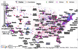
With the election long-over this visualization is a little dated, but I still enjoy interacting with it. It’s a Google map that plots campaign contributions to presidential candidates based on location. The site is an endless source of enjoyment because there are an unlimited number of ways to ask “What if?” and test your theory. Is my neighborhood really as Republican as I think? Am I the only Democrat? Did my boss vote for McCain or Obama? Is it true that all actors are liberal?

The other interesting aspect of the visualization is its addition of 2004 map data. Unfortunately this feature is tucked away in hard-to-reach a corner. If this were more accessible it would be possible to see trends in political opinion in an area over time. Most likely people were interested in current data during the election so older information was left out.

Phyllotactic Trees

I had never seen this visualization method before. It uses patterns found in nature like those created by sunflower seeds and cactus needles. I think it’s really beautiful.

It’s also (apparently) an efficient way to visualize large hierarchical datasets.

Looking Outward: Diseasome

by Nara @ 7:25 pm
Diseasome

Diseasome

Diseasome is an interactive map that visualizes the links between hundreds of different diseases and genes. It does a good job of illustrating how many of the diseases humans are diagnosed with are anything but random, and how having one disease can indicate that you are susceptible to many others. I am personally interested in this because several members of my family have recently been diagnosed with cancer, but all of them have had different types of cancer: lung, breast, and pancreatic. Seeing this visualization helped me to understand that these diseases are all genetically linked, and has therefore helped me to bridge a lack of understanding about the role of genes in cancer. While this map doesn’t really illuminate much about the research being done into specific diseases, it does illustrate that we are forming an ever-clearer picture of the human genome and represents hope for those of us who know we are at risk for serious illnesses.

Looking Outwards: Two Sites

by Michael Hill @ 7:03 pm

Information is Beautiful

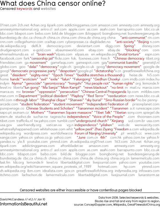
So here is a new blog, written by freelance writer and author David McCandless, that contains some of his work as well as pulls information visualization from various places across the net.  Something I find especially nice is that when he is posting his own work, he does his best to post a link to his source of information.

infographic

Good.is

This site is filled with a great variety of short articles and blog posts regarding many of today’s important issues. They even have a special section for infographics aimed at making large amounts of data easier to understand.

Looking Outward – Visualizing Possibilities

by sbisker @ 6:52 pm

This class has got me thinking about both how people visualize things and how they visualize what’s *possible* to do (make, visualize, destroy…) with the tools at their disposal.

Right now, training in the construction of visualizations seems to be through immersion – reading blogs like Infosthetics, Visual Complexity, Boing Boing and the like. Much time is spent dissecting projects individually to try to sort out how they were made a certain way and why. Indeed, that was the structure of most of our class Wednesday – deconstruction and discussion of project after project. But in order to really understand how tools can be used to visualize something, you have to also visualize the process by which those things are created. Sites like Instructables do a very good job of having their members not just show off interesting creations, but also their process of creation through step-by-step instructions. But something is still missing…after looking at my Looking Outward find for this week, I believe we are missing sites that let potential visualizers see relationships between methods of visualization and the visualizations that people have made with them.

This week, I wanted to chat about a site called Thingaverse. Thingaverse is interesting to me because the site itself is a new way for people to visualize the relationship between tools and things that people have created with those tools. In that sense, it’s a bit of a “meta” visualization.

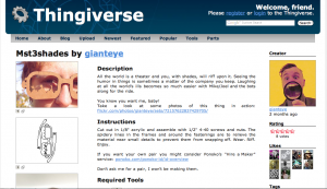
Take, for instance, these funky looking laser-cut MST3K glasses. In addition to showing the finished product, the site also encourages showing off the 2D .dfx file as an image, and tells people to list the tools used in its construction (“laser cutter”, “3d printer”, etc.) This lets people build a much clearer understanding of why it was possible to make this with the tools chosen.

In addition to showing construction processes for individual projects (which is already possible on Instructables), Thingaverse takes things idea a step farther, and lets people really explore a specific tool’s potential. This is done by letting people tag a project with the tools they’ve used – these glasses are tagged with “laser cutter.” Then, a Laser Cutter page allows people to say “Neat, so this was made with a laser cutter – what else can I make with a laser cutter?” By letting people explore a gallery of built objects by tool, the site effectively crowd-sources a visualization of what *can* be made with any tool people might be considering picking up.

————————–

Why is there no site like this for software visualizations – or most types of software projects in general, for that matter? It’s nice that Processing hand-assembles a library of interesting projects made with that tool, and other individual tools do this as well – but this is more for self-promotion than critical deconstruction of visualization tools and techniques. What I would love is for a site like Infosthetics to really pay attention to the tools used in making particular visualizations, and letting the resulting comparisons between tools give people some feel for what tools they might need to learn to create visualizations of their own.

Looking Outwards- Capitol Words

by caudenri @ 6:37 pm

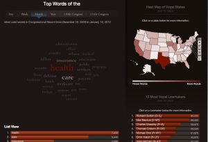
Screen shot of "Capitol Words" web site

capitolwords.org

Capitol Words is a robust information design project on the web that visualizes daily word counts in Congress in a number of different ways. What I like about this is that in a few minutes of browsing you can get a very good idea of the most discussed topics in Congress of the day or the past week or month, and get and idea of who is talking about it. The web site has an option to see individual lawmakers’ word counts as well as overall who the loudest or quietest lawmakers are. I think this is especially useful and relevant to the public because it updates every day, making it a tool to help keep up with activity in Congress as well as an entertaining diversion.

Looking Outwards Visualization

by paulshen @ 5:45 pm

http://www.virtualgravity.de/

This visualization depicts the “weight” of data, in the form of comparisons similar to ones shown in class. Again, Google is used to determine how important a word is. What’s interesting about this piece is its execution. Instead of providing a screen display (bar graph or the like), the piece uses the analogy of a scale to show how two words compare. Unlike the other visualizations presented in class, this piece incorporates tangible interaction and physical display for representing information.

banner2

The physical execution is nice, albeit a bit gratuitous. I wasn’t too fond of the input, but I like the interaction of dropping something onto the scale representing the word.

Looking outwards – Info visualization

by xiaoyuan @ 1:48 pm

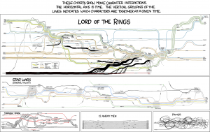
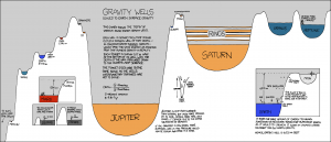
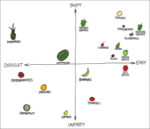
This is the information visualization looking outwards. The artist is Randall Munroe, creator of the webcomic xkcd.

Munroe is a geek’s artist, and his work often deals with topics in science, mathematics, and nerd culture. While not exclusively an information visualization artist, he often creates graphs and charts that are unconventional, clever, complex, and revealing.

Not all the graphs are rigorously precise. For example, “Fuck Grapefruit” does not have measurement units and is apparently a reflection of his subjective opinion.

However Munroe succeeds immensely in presenting information in humorous ways that most people would never think of.

Looking-Outwards:The Whale Hunt

by kuanjuw @ 11:47 am

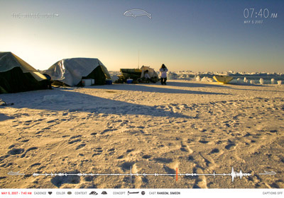
It is from Jonathan Harris two years ago.

A new way of interactive storytelling by using a bunch of  photos which are presented in a framework that tells the moment-to-moment story of the whale hunt. The full sequence of images is represented as a medical heartbeat graph along the bottom edge of the screen, its magnitude at each point indicating the photographic frequency (and thus the level of excitement) at that moment in time. A series of filters can be used to restrict this heartbeat timeline, isolating the many sub stories occurring within the larger narrative.

check it out:

http://thewhalehunt.org/whalehunt.html

Looking Outwards – Interactive Facades

by mghods @ 2:03 am

Surfing  “Interactive Architecture” website, I decided to explore real world  implementations of “Interactive Facades”. “City of Sound” and “Web Designer Depot” have listed considerable numbers of buildings with “Interactive Facades”. Comments, also, contains links to other examples of “Interactive Architecture”. From interaction point of view, “Interactive Facades” can be divided into two categories:

1- Those which interacts with environmental factors, as an example Ned Kahn works, or Flare Facade.

2- Those which interacts with individuals, such as Aperture (has not been built yet) or Climate on Wall.

Alternatively, all of these facades can be controlled independently by a passive code.

From architectural point of view, “Interactive Facades” can be divided into four categories:

1- “Projection Facade”, in which facade has just used as a surface for projection. Input, processor, and memory of interaction system may be built-in facade or not; however, source of interaction system output is not involved with architecture. 555 KUBIK is a successful example. I believe this method is best for built buildings, and can be used as a renovation solution, for making facades interactive.
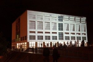
2- “Lighted Facade”, in which facade has built-in LEDs, or other light sources, and they act as an interaction system output by changing color or light luminance. Moment Factory is a funny example of them. Building Music is another example of this category. This approach is both suitable as a renovation solution, same as new architectures, especially those with multiple membranes.

3- “Mechanistic Facade”, in which facade has built-in mechanical mechanisms, and they act as an interaction system output by different movement of  mechanisms; however, architectural form of facade, as well as architecture itself does not change. Most of Ned Kahn works, specifically those related to wind fell under this category. This system is mostly suitable for new architectures, yet, could be considered as a renovation solution in some cases. (Parking Structure 9)

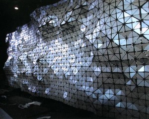
4- “Protean Facade”, in which facade has built-in mechanisms that can change the shape of facade, and architecture, in response to inputs of interaction system. Hyposurface is an example of a surface with these characteristics, however, it has not implemented in an architecture as facade. It is obvious this category is not a renovation solution, and should considered as a part of new architectural designs.
Looking Outwards – Formula for Computer Art

by Karl DD @ 5:44 pm 14 January 2010

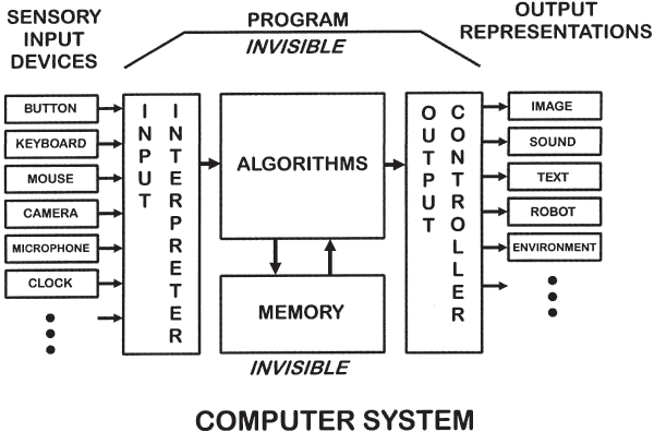
I thought some people might be interested in knowing a bit of background on Jim Campbell’s Formula for Computer Art. Campbell published the diagram in an article for the journal Leonardo in 2000. It is well worth a read:

Delusions of Dialogue: Control and Choice in Interactive Art


The process that Campbell outlines can be thought of as transcoding data from one form to another. I don’t think this abstraction is escapable, and I don’t think adding interactivity, in the form of a feedback loop, necessarily makes the system more meaningful.

What we can do is make interactions richer by moving away from one off ‘reactions’ towards richer responses. Campbell notes:

The first time I walked through an automatic door at the supermarket I thought the door was smart and was responding to me. Now I step on the mat to open the door on purpose. The point is that often the first time an interface is experienced it is perceived as being responsive, but if the interface is experienced again it becomes controllable. The second time it is not a question but a command.

This is particularly relevant for us now. Audiences are not new to interaction, meaning gimmicks are out, and we have to deal with the expectation of interactivity – “Why doesn’t the [image/sound/robot…] do anything when I [move my arms/speak out loud/touch the screen…] ?”

For non-interactive art the question is: Do we see Campbell’s formula in the work? Is out attention drawn by the questions the work raises, or the insight it gives us, or the aesthetic beauty? Or does the work lack substance and all we see are sensors connected to actuators?

Looking Outwards

by rcameron @ 1:19 pm

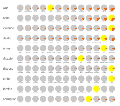
In light of the recent earthquake, Jer Thorp put this visualization together to highlight Haiti’s misfortunes over the past 29 years or so. He searched for the words on the left in NY Times articles associated with Haiti and its neighboring countries and charted them.

Jer’s blog can be found here: http://blog.blprnt.com/

Looking Outwards

by xiaoyuan @ 1:30 pm 13 January 2010

This is a piece created by Nathaniel Mellor. It consists of three robot heads singing “freedom freedom freedom…” in a weird voice. It is slightly creepy and seems to exploit the the uncanny valley by looking realistic but behaving purposely robotic. The eyes roll around asymmetrically, unblinking. They don’t show emotion. The face of each head is basically a painted rubber mask and the machines behind it part and close the lips to simulate speaking. There are aspects that can be improved. Firstly, when a head speaks, it doesn’t move any facial muscles and so it doesn’t appear as though it is talking. Secondly, the head looks slightly blobby and unstructured in movement because the masks don’t have skulls to hold the shape. While there are other realistic-looking animatronic talking heads, what makes this work unique and likable is that it is purposely weird and disturbing.

caryn- looking outwards 0

by caudenri @ 8:38 am

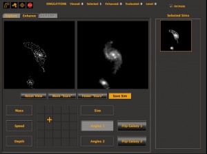
http://mergers.galaxyzoo.org/
Screen capture from the Java applet
While its not technically media art or design, I wanted to talk a little about Galaxy Zoo Mergers, a crowdsourcing effort by a website attempting to classify galaxy collisions. Take a look at the “Science” link on the site for an in-depth explanation of why they are doing this project and what its benefits are to science- but in short, to better understand galaxy collisions, scientists need accurate simulations of galaxy collisions and the human eye is better at helping create these than a pure computer simulation. They’ve created a Java applet which works like a game to have the user tweak simulations of galaxies to look like actual pictures of galaxy collisions. I thought this was an interesting solution to crowdsourcing- by making the participation fun and engaging, people are both entertained and feel that they are contributing something unique and important to the world of science.

jmeng – Looking Outwards – wooden mirrors

by jmeng @ 8:00 am

I didnt know where to begin “looking-outward”, so I did the first thing that came to mind – I googled “Interactive Art” and looked at the first video I found. Luckily, the video was a lot better that my google-ing skills.

** WordPress is being super difficult so I’m just gonna link to videos…

The video I found was about wooden mirrors. Basically, there is a camera that takes in an image, converts it to grayscale and pixelates it to the number of wooden pieces on the piece. Based on what color it wishes to represent, the different wooden chip “pixels” will rotate down or up (towards a ceiling spotlight) to make lighter and darker shades.

This video was kind of annoying because some of the wooden pieces were broken and didnt rotate, making the overall effect pretty bad, but explained the idea well. I found a related video that features a rotating peg wooden mirror that looks better but doesn’t explain anything.

What I found interesting is that the effect is actually very mirror-like when viewing it from far away, watching someone near it interacting with it. The closer you get to the mirror, the more detailed it can mirror your image, but the more abstract-looking it appears to you (like looking at pointillism really close). I also like that the mechanics are conceptually pretty simple, but that it basically simulates a video screen with just rotating pieces and making pieces darker by changing their angle in relation to a overhead spotlight.

Looking Outwards #1

by areuter @ 7:01 am

Electric Sheep

Electric Sheep by Scott Draves is an interesting interactive piece which reminds me of Karl Sims’ Evolved Virtual Creatures.    The “Electric Sheep” are high resolution fractal animations that are collectively rendered on all “sleeping” computers which have the program installed, and they are then displayed as screen savers.  The interesting part is that users can actually vote on the animations with the arrow keys, which evolves the fractal into something that is perceived as beautiful by the collective user base.  Furthermore, the “genome” of these beautiful “sheep” are then merged withe those of other popular “sheep” of the past to hopefully evolve the animation into a fractal even better then it’s predecessors.

Video

I downloaded the program to try it out, but unfortunately I didn’t have much luck with it.  A message informs you that the first :sheep” will probably take a few seconds to appear, but may take as long as a few hours.  I left it running on my computer overnight and awoke to firewall errors instead of pretty pictures, and half and hour after resolving them I still don’t see anything–since the program is render intensive, I’m wondering if my old computer just doesn’t have enough power to run it. It’s too bad since I was really hoping to mess around with it and observe how the evolution process occurs, particularly if my inputs had any visible effect on the “sheep”.  I’ll check back on it tonight to see if any “sheep” have appeared yet…

Looking Outwards: AR in everyday life

by Michael Hill @ 5:02 am

As a sort of follow up to Karl’s post about augmented reality in the public eye, I thought I would talk about a couple of places one might find AR lately

The first relates to Avatar.  All of the toys for this movie come with a stand that seconds as what is called an “I-Tag”.  These, in combination with free software from the movie’s website, allow kids to “hold” models from the movie in their hand.  With certain combinations of I-Tags, the virtual creatures will even interact!

Watch this nifty video that WordPress refuses to embed! Then continue reading.

As seen in the video above, Lego is doing something similar.  Simply hold the box up to the screen, and it will show you a digital representation of what it will look like after having been built.  I was lucky enough to experience this kind of display on a recent trip to Disney Land in California, and have to admit, it’s a nifty little feature to have at your fingertips.

Read More Here

Looking Outwards – Wearable Computing

by Max Hawkins @ 2:06 am

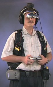
Often I see articles in Make Magazine and other maker-themed publications featuring wearable computing projects. Wearable computing is the idea that computing devices can be embedded in our clothing to augment our experience with electronically-accessible information. Using these devices we can become more aware of our surroundings and sense things beyond our natural senses. The field is increasingly popular in forward-thinking research environments like IDEO and The MIT Media Lab. Often I’m impressed by the technology used in the projects, but end up doubting I’ll be putting LEDs into my clothing anytime soon.

Typing wearable computing into Google Images gives you an idea of the problem. Wearable computing at its best is quirky—a wearable coin-slot detector, Leah Buechley’s turn signal biking jacket—and at its worst (the stuff Google finds) it’s clunky, distracting, and unattractive. Most projects take the form of clunky wristbands, goofy goggles, and stiff vests covered in wires. Some broadcast unnecessary information in a noisy way that doesn’t do favors for anyone. Most people don’t care to see a readout of your heartbeat on your earrings or watch TV on your t-shirt. There’s a reason why the sound equalizer shirt is sold exclusively at ThinkGeek.com.

In the real world, our clothing communicates in much subtler ways that the flashing of an LED: buttoned or unbuttoned, baggy or tight, neck lines, sweat stains, and wrinkles. If wearable computing is to succeed with a mainstream audience I believe it will have to learn to speak their language. Instead of forcing information through new, uncomfortable, and often unfashionable modes of fabric-based communication, wearable computing should be executed using the metaphors we’ve already created through thousands of years of expression through fashion.

Adidas’s Adidas 1 sensor shoe does a good job of embedding technology in an easy-to-grasp form. I believe projects like these will make wearable computing easier for people to accept.

Of course, I shouldn’t entirely discount the clunky visors and flashy t-shirts. Often the avant-garde ends up assimilating into the mainstream over time. It’s entirely possible that someday we could be wearing augmented reality goggles to work every day. In addition, projects like these were important in spawning the LilyPad Arduino, wider distribution of conductive thread, and other building blocks for future computing textile innovation. However, I think there’s room for a more refined implementation of technology in clothing that is less Star Trek and more Devil Wears Prada. Because, really, I would love to have a TV on my shirt if only I could wear it without being laughed at.

« Previous PageNext Page »
This work is licensed under a Creative Commons Attribution-Noncommercial-Share Alike 3.0 Unported License.
(c) 2016 Special Topics in Interactive Art & Computational Design | powered by WordPress with Barecity