Looking Outwards: Freestyle

by guribe @ 8:48 am 12 May 2010

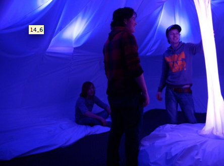
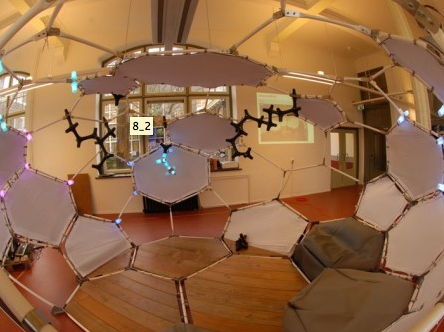
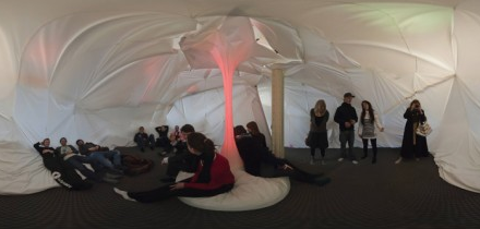
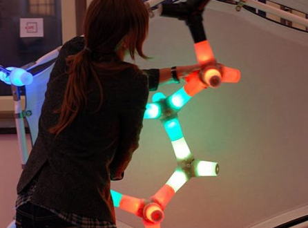
These projects caught my attention because they create an exciting environment that encourages people to play & interact with it. They were created by students studying a course on interactive environments.

There are few courses as extraordinarily ambitious as the Interactive Environments Minor a semester-long project at TU Delft organized by the Faculty of Architecture – hyperBODY and Industrial Design and Engineering – ID-StudioLab.

“Throughout the course, three interdisciplinary groups of students supported by TU Delft researchers and guest teachers have designed and built three interactive lounge pavilions. The pavilions attract people to enter, facilitate relaxation and provide a refuge from daily chores.”

“Each of these structures is a dynamic system, which communicates with its visitors across different modalities. The installations not only actively adapt to their users’ actions, but autonomously develop a will and behaviour of their own. In this way interactive architectural environments come to life, engaging their occupants in an unprecedented experience of a continuous dialogue with the occupied space.”

While he’s been too modest to put his name up front on these projects, the real passion and brains behind this project has been Tomasz Jaskiewicz bringing together undergraduate students from a range of degree courses to create a unique design space occupied by programmers, engineers, architects and designers. I look forward to seeing how this evolves in future.

You can find out more at http://www.interactive-environments.nl/

Jon Miller – Looking Outwards 8 – Facadeprinter

by Jon Miller @ 4:01 am 10 May 2010

link: http://www.pixelsumo.com/post/facadeprinter

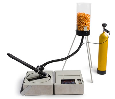
This is another innovative combination that involves two preexisting pieces of technology: printing software and a paintball gun. They use it to print images onto a canvas, which could be anything, including the sides of buildings and structures. It looks like they are also attempting to package it as a quick way of communicating visually, for example during disaster relief where there is a need for large, easy to read signs to be put up quickly.

Jon Miller – Looking Outwards 7 – Color Survey, Xkcd guy

by Jon Miller @ 2:41 am

Link

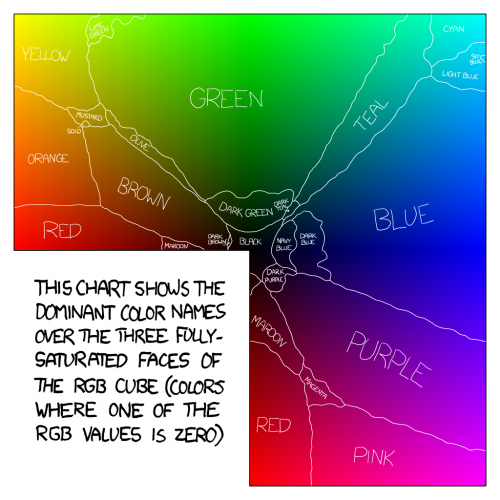
The data set given was to ask people to name colors. The xkcd guy then analyzes and the results in an interesting and humorous way.
A lot of thought and analysis, however tongue in cheek, has gone into this, much more than pictured above. I recommend checking out the link. He analyzes the most “masculine” and “feminine” colors (“penis” and “dusty teal” respectively), as well as looking at some of the more interesting things said by the participants.

Jon Miller – Looking Outwards 6 – Duct Tape Platformer

by Jon Miller @ 8:27 pm 9 May 2010

Link: http://www.artificial.dk/articles/edgebomber.htm

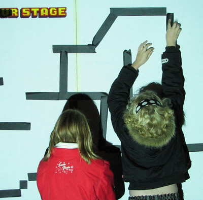
This piece allows people to place duct tape on the wall, which is then scanned and turned into a playable platform game that is projected onto the screen. It’s one of those ideas that, once thought of, is relatively easy to implement, if only one had the idea first. This piece is relatively old (2006), but in case anyone was not yet aware of it, here it is.
I think it is meaningful because it is a creative combination of the physical world and the game world. I could also see something like this turning into a creative tool for level design.

Digital Owner

by Mishugana @ 11:14 pm 14 April 2010

Dog shock collar

by Mishugana @ 10:15 pm

CODE::

import processing.serial.*;

Serial myPort;
int val;

void setup() {
size(200, 200);
}

void draw() {
if(!mousePressed) {
if (myPort!=null)
myPort.stop();
myPort=null;
} else {
if (myPort==null)
myPort=new Serial(this, Serial.list()[0], 9600);

}
}

Sonic Wire Sculptor

by Cheng @ 10:54 pm 11 April 2010

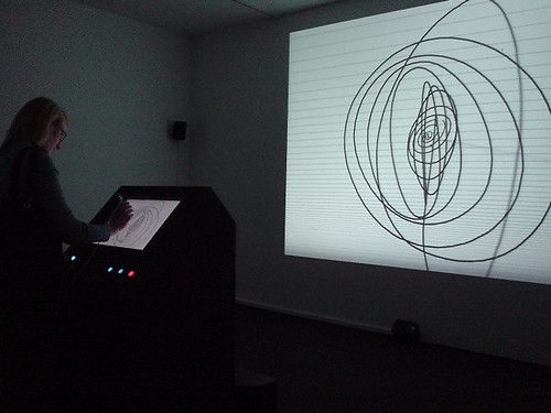
Amit Pitaru’s Sonic Wire Sculptor turn drawing in 3D into sound. Originally developed in Windows (here), it now has a pretty cool iphone app here. Notice how far the project has gone!


In the iphone screen shot above, horizontal lines separate notes in scale. Timbre of notes can be chosen to express sound differently.

Frankly I was worried to read the title of the project on Programming Interactivity (P195); it turns out to implement it in the opposite direction 😛 Still, it demonstrates that mapping pitch and wire shape makes sense! Additionally, in the windows version, stylus pressure is mapped to line width, and loudness of music.

The Knitting Machine

by Cheng @ 9:55 am 1 April 2010

Dave Cole’s Knitting Machine

null

Looking Outwards #6: Final Project

by areuter @ 10:10 am 24 March 2010

In preparation for my final project, a continuation on Minute, I wanted to research what other people have done with time perception in art. It was actually very difficult to find any works directly related to how people experience time internally, as most time-related art works are focused on altering external environments to convince viewers that their perception has changed (for example, time-lapse).

While researching I found an interesting segment from Hugh Foley and Margaret Matlin’s book, Perception and Sensation:

Time perception might well be influenced by physiological state, knowledge, personality, and other factors. For instance, there is some evidence that a person with a high fever shortened her estimates of a 1-sec interval and that a person who lived in a cold cave lengthened his time estimates. The evidence for the contribution of metabolic rate to time perception is weak, but would be consistent with a biological clock. The fact that knowledge and experience also play a role (Theme 4), however, argues that there is a cognitive component in time perception. Alberto Montare (1985; 1988) has found that providing feedback to people about the accuracy of their time estimations increases the accuracy of subsequent judgments. Montare did not find gender differences, suggesting that time perception might be equivalent among men and women.

So it does appear that a person’s background affects their perception of time, although the most important factor may be his or her physiological state–perhaps other factors such as location effect time because they effect the body through stress and other lifestyle habits that vary by region.


Jeremy LAKHLEF – La perception du temps
Uploaded by bofman. – Watch original web videos.

Here’s one slightly related video I found, which simultaneously displays several videos which all span the same about of time, but the content of each panel affects he viewer’s time perception in a different way. It’s successful in communicating it’s point, although some of the videos are more interesting than others (the top left and bottom right) and I don’t feel that this is anything that I’ll really remember a few months from now. However, it does help me understand things I can do better in my own project: higher video quality, stronger consideration of aesthetic during filming. On the other hand, here’s a video I found which has nothing to do with time, but does really interesting spatial arrangements with video clips, which might be interesting to keep in mind while establishing the arrangements in my own project:

Looking Outwards – Augmented Reality

by ryun @ 8:14 pm 21 March 2010

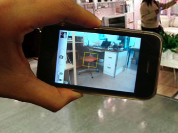
Last semester, I built a “Virtual Wall” as my term project. This project was about tangible shopping experience. People buy furniture, televisions from the store but it is quite hard for them to see how they will look like on their apartment overall before they purchase them. So what they usually do is they buy the product only based on their imagination. The idea started from here. What if there is a way to upload their room picture on the wall and put the virtual item pictures on it and see how it looks like in advance? This is the concept about the project.

In this design, however, you need big space to see and control things and run a projector to make a real-size screen. I was thinking if there is another handy and easier way to keep this interaction and the main concept. Therefore, for this capstone project I would like to use augmented reality technology in iPhone and try to make interesting interaction with a virtual wall concept.

Besides, the virtual wall concept, it will have huge potential. I did not decided what it will be but, I would like to make something fun like these below.

Lego Augmented reality

Hallmark Augmented reality card


Looking Outwards: Gramazio & Kohler Walls

by mghods @ 6:54 pm 20 March 2010

Fabio Gramazio is a professor of architecture in ETH Zurich Architecture Department. He is also a co-founder of Gramazio & Kohler, an architecture firm based in Zurich, Switzerland. He has done many interesting projects in field of digital fabrication. He has been offering a course in creating digital fabricated walls. Here are some of the projects done his classes: (You can find a brief description of each work here.)

1- The Programmed Wall

2- The Perforated wall

3- The Disintergerated Wall

4- The Resolution Wall

5- Acoustics

6- The Sequential Wall 1

7- The Sequential Wall 2

8- The Programmed Column

Looking Outwards: Spam Architecture

by paulshen @ 5:39 pm

http://www.sq.ro/spamarchitecture.php

This is a looking outwards for my capstone project. I stumbled across this project which generates 3D models analyzing the spam in an inbox (the project documentation is very limited). However, I find the models very beautiful and would like to learn how to render such models (as well as how to generate them). One critique I have of the project is that there seems to be little I can conclude from just looking at the models. But perhaps this is a result of the limited documentation.

Looking Outwards: Augmentation (Sightseeing telescope)

by paulshen @ 5:36 pm

http://www.we-make-money-not-art.com/archives/2008/06/im-back-from-my-favourite.php

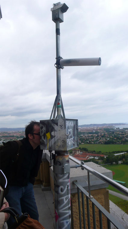
Sightseeing telescope reveals open wifi networks in urban space

Similar to my project of augmenting videos with optical flow, this project augments a telescope with the current state of wireless networks that can be “seen.” In the same sense, this project shows something that is invisible to the naked eye.

The telescope works with a WiFi antenna that can detect WiFi networks far away in a direction. Using this information, the sight of the telescope is projected on to a screen, along with circles indicating WiFi networks.

Obervatorio reflects on this scenario by informing viewers about the current state of wireless networks located in the area where the device is installed. The sightseeing telescope, installed on the Laboral tower, tracks and shows where Gijon’s wifi networks are located in real time. You can visualize them on the screen of the telescope, swing it around and see which areas have a denser wifi coverage, and get additional data such as which ones among these networks are open or private. Because Observatorio is programmed to try and connect to any open network available in the area, it can send the information from the observation tower to the exhibition hall, where it is displayed on a big screen. If there is no open networks detected in the area, Observatorio remains separated from the main exhibition space, located in another building. A modification of these networks is also offered, showing an ideal configuration in which the local residents of large areas in the city could gain or share access to it.

Looking Outward: Capstone Ideas

by Nara @ 9:54 am 17 March 2010

So I have two ideas for what I want to do for my final project, and I’m not sure which one I’d rather do / which one would be a more worthwhile use of my time.

Idea 1

Basically, this is just to redo Project 2, which I thought was a good start but I really just didn’t have time to develop into what I wanted it to be. I also felt like this would be a good project for me because it has a physical component (laser-cutting the drop caps), and I’ve not done any projects that combine art/design and programming and have output anything other than an either interactive or static display on a screen. Another pro would be already having a starting point, even though the program would largely need to be reworked.

Idea 2

This is an idea for a project that I’ve had since last semester, but at the time I was only just beginning to learn about how to do data visualization, and I wasn’t sure how I’d go about implementing it. Now that I have over a semester’s worth of experience under my belt, I feel better-equipped to tackle it. The idea is to algorithmically/heuristically classify typefaces based on the shapes of letterforms and typographic properties. You’d think it’s been done, but it actually hasn’t, not involving programming anyhow. Some examples of static visualizations done by hand are The Periodic Table of Typefaces by Cameron Wilde and and this typeface classification by Martin Plonka. While both of these examples are beautifully done, they are limited to relatively small datasets and don’t necessarily help a user answer a question like, “What kind of subsets exists within types of typefaces?” and “If I want a typeface that’s a lot like Helvetica but not Helvetica, what should I use?” I know that some designers might hate me if I did this project because it reduces knowledge that we’ve acquired through years of learning and experience to a simple set of heuristics and mathematical comparisons, but I don’t think that’s a reason not to do it. The visualization component itself would also not be easy but could (and should) be done quite beautifully.

If anybody has any suggestions or opinions on which they think would make for a better project, let me know!

Looking Outwards – Flight Maps Revisited

by rcameron @ 11:48 pm 16 March 2010

I’ve been really interested in building out my Project #1 (screenshot below) and am determined to do that for this final project, but I also want to do something with projection. So, I’ve decided to mash them together and make a projected version of the final product which triggers as people walk by. I thought a floor projection would work really well, but haven’t really thought through logistics yet.

Some projects that seemed somewhat related are:

Feedtank – Enzimi installation

SNIFF (which we saw in class)

Catchyoo

Nextfest Interactive Video Wall

Water Wall

Looking Outwards – Capstone

by jsinclai @ 5:44 pm

I’ll start with a brief discussion of my current capstone ideas:

1. Something with sticky-notes!
I’m in MHCI…and we love stickies. We love stickies more than eating, sleeping, and sex. We put them everywhere, we do everything with them…
I really liked that piece we saw in class where participants would use sticky notes to grab virtual objects and then place the virtual objects on themselves. It was highly interactive and very fun!
Unfortunately, I can’t find the video.

2. Polishing one of my first 3 projects and taking it to the next level:
–the happy hardcore visualization.
The visualization itself needs polishing, and perhaps a reiteration. It could also use more data, and I should probably write a crawler+scraper for discogs, and some sort of automatic way to tie the data together. If it was automated, I could essentially choose a genre of music and visualize the inbrededness of that genre (maybe even giving it a numerical value?) and then compare the imbrededness of multiple genres!

–Making Faces
Make some better looking faces…is there enough technology for procedurally generating real-life faces? Maybe I can take something from http://www.faceresearch.org/demos/average ?
That’s really only the first part. The next part is naming faces!
But the really interesting part is seeing the names, or then taking the data from the faces and names. What does “John” look like? Take all the faces named John and average them together.

–The “Makes you dance and sing” installation thing.
I could definitely make it into a fun and interactive installation. It certainly needs some polishing, but I’d definitely have to think about what I could do to make it a BIG capstone project. This would probably be the easiest capstone to do since I think it already works so well!

3. Activating the Gates Center (GHC) Helix
The gates center has this really interesting, 630-foot-long spiral walkway at the heart of the Gates Center that goes from the third to the fifth floor, “the helix.” It’s significantly slower to traverse floors using the helix compared to the stairs and elevator, but there is something tacitly enjoyable about strolling up or down. Unfortunately, the Helix is rarely used except for the students who have classes nestled inside of it.
How could I make this space come to life? How could I make this space interesting and fun?
Clearly something that crosses a lot of people’s minds is “rolling” down the helix. It just seems like fun, like a roller coaster! But a new sign forbidding any sort of “rolling” (skateboards, roller blades, etc…) appeared after a friend of mine took a rolling chair from the fifth floor down to the third. Needless to say, he had a blast.
After seeing some of the videos in class on Monday, I really started to think about having objects flow down the helix. What if there were a bunch of bouncy balls flowing downwards? What would happen then if a patron spawns a square block…something that doesn’t roll? Could the bouncy balls get stuck behind the block and slowly start pushing the block downward? What other objects could patrons “spawn?” Could they create environments to appear as they walked down the helix? Could environments create themselves as people walk along? Could the traffic density cause different events?

-Bravia Bouncy balls — flowing down an incline https://www.youtube.com/watch?v=2Bb8P7dfjVw
I’d like to be a part of that, or experience it from the inside. What if this beautiful deluge follows the user?
-http://www.todo.to.it/#projects/ad
-http://www.shpixel.com/blog/?p=3
-in the event that projectors aren’t feasible:
-LED Mesh https://www.youtube.com/watch?v=e_4M9VIhGhk
-Conductive paint to engage surfaces: http://www.newscientist.com/article/dn18066-living-wallpaper-that-devices-can-relate-to.html?full=true&print=true

More thoughts: If projectors will be used in places that patrons will walk in front of them, maybe their shadow can contribute to any bounding boxes.

More to post as I explore!
Looking Outwards – Ant Farm

by Max Hawkins @ 11:07 pm 15 March 2010

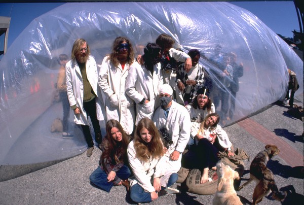
Choosing the topic for my capstone project, I am inspired by the 1970s San Francisco architects and artist collective Ant Farm. Their work, a series of experimental architecture and film pieces produced between 1971 and 1978, is inspired by the space age, nomadism, and radical counterculture. Their 1974 installation Calillac Ranch has become an icon of American culture.

I am particularly interested in Ant Farm’s early work. In 1970 the group produced a set of temporary inflatable buildings designed as communal living spaces and performance centers. Politically charged, the inflatables challenged American consumerism culture by suggesting a radically different and communal way of living. They could be quickly and inexpensively constructed, moved, and augmented, supporting a nomadic way of life.

Ant Farm was also interested in making architecture accessible to non-experts. In early 1971 they released their “Inflatocookbook”, a primer on inflatable construction with practical tips based on their experiences producing inflatables around the country. The group toured art museums and university campuses teaching people how to make inflatables.

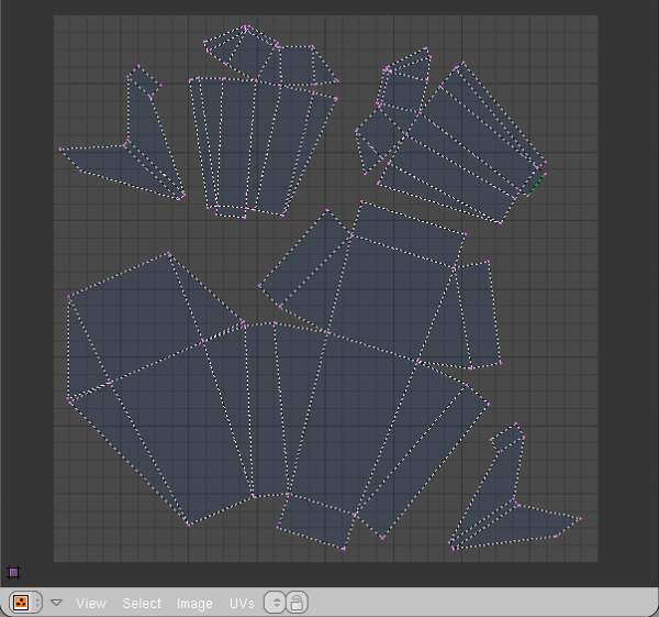
For my capstone, I want to continue Ant Farm’s effort to bring architecture to the masses by creating a 3D inflatable blueprint creation tool. My project will use 3D unwrapping algorithms like those available in Blender to flatten computer-based 3D models and prepare them to be inflated. Later editions could perform calculations to determine the type of fans needed or how to tie down the inflatables.

The potential uses for such a tool are nearly unlimited. By lowering the bar for making architecture, the program allows underrepresented groups to create large architectural statements. Inflatables can serve as temporary shelters, canvases for video projection, tools for political dissidents looking to make a dramatic statement, or just a place to hang out. I want the software to be easy enough that ordinary people can use it to experiment with inflatable structures on the weekends—Ant Farm’s dream of architecture for the masses inflating in your back yard.

Sources
http://we-make-money-not-art.com/archives/2008/03/centro-andaluz-de-arte-contemp.php
https://www.flickr.com/photos/chiplord/sets/72157605232897509/
http://on1.zkm.de/zkm/stories/storyReader$4601
http://www.spatialagency.net/database/ant.farm

Looking Outwards–Capstone

by aburridg @ 8:49 am

I want to do a continuation/deeper exploration of the theme I tried to portray in my first project. So, I will be doing an information visualization project. So, I figured looking up some more Info Vis art projects would be helpful and inspirational.

Here’s the first one: 10×10

I think we’ve seen a lot of projects like this one in class. The project uses a real time feeds from various news sites to take at most 100 images from these sites along with words associated with each picture. I suppose I would be interested in doing something along these lines–maybe have my participants draw what they think a color represents. Another reason I like this project is that it seems like an easy way to get the news all at once (and I know I need help with that since I rarely read the news). However, on that point, I think I would’ve liked this project more if the artist had instead used headlines or captions associated with pictures instead of just a word.

Here’s another: 10 Revealing Infographics about the Web

This webpage is very interesting (and funny!): it contains pictures that visualize information about the internet. It’s not interactive, but some of the graphs and map pictures were designed very nicely. I got some good ideas on how to design a good interface from these pictures. I know for my final project I want to display the data in more than one way.

I think we may have seen this in class, but I don’t remember. digg labs/arc

I found this project interesting because of the colors–since I’m going to be working with colors for my capstone project. This project uses colors to distinguish between different digg users though.

Looking outwards

by xiaoyuan @ 8:03 am

http://www.kongregate.com/games/DannySeven/drunken-masters

A fun game where you can be a bartender. Very well-crafted, detailed, and fun. Unique gameplay elements and excellent flair all around. I’ve learned about cocktail mixing from this game. It makes me want to have a drink.

Touchbook

by Michael Hill @ 7:19 am

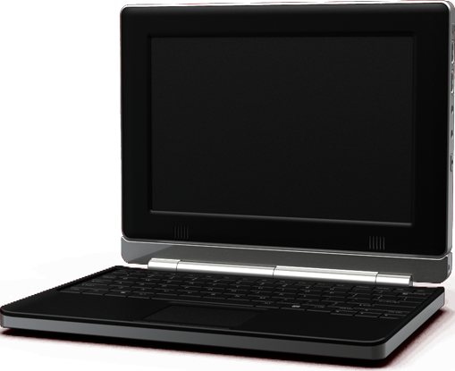
The underlying idea for my project is to convert a netbook into a small Wacom tablet similar to a Cintiq.  After this, I would like to create different kinds of applications for it.  The end product would be geared towards artists as a digital “sketchbook”.  In the case that I cannot build the hardware itself, I may opt for a more fleshed out version of the software.

While doing my research I stumbled across two different items.  The first of which is called a “Touch Book“.  This is basically a tablet pc running on an Arm processor on a custom operating system.  Hardware like this would be more ideal, but I do not really have the time to start from the ground and work up.

The second article I found was published this morning on Hack-a-Day‘s website.  While technically the reverse process of what I’m trying to do, the underlying principle of combining a screen and a scrap wacom tablet is basically the same:

Next Page »
This work is licensed under a Creative Commons Attribution-Noncommercial-Share Alike 3.0 Unported License.
(c) 2016 Special Topics in Interactive Art & Computational Design | powered by WordPress with Barecity