Final Project Progress: Flight Maps
Name: Any ideas? Something that’d make for a catchy url.
It will be presented on my laptop. Currently being moved to HTML5.
Name: Any ideas? Something that’d make for a catchy url.
It will be presented on my laptop. Currently being moved to HTML5.
Sentence
Recursive Photo Booth uses augmented reality to enable a simple and fun new form of collaborative photography.
Summary of interaction:
Participants can virtually pose with a photo that is taken by the participant before them (who in turn, is posing with the one before *them*, and so on…)
Hardware needs:
Video camera / external webcam, OR a high surface (stool? chair on table?) on which to rest laptop computer webcam
Secondary monitor (can bring my own in a pinch)
Favorites:
Project 1: Pin Numbers, The World According to Google Suggest, Jersey Numbers
Project 2: Ivy Curtain, Queen
Project 3: FaceFlip, Chocolate Chocolate Add Some Milk
Hardware: Projector, camera.
Favorite:
1. Fantastic Elastic Type [David Yen]
2. FaceFlip [Max Hawkins]
3. Tesserae: Making Art Out of Google Images [Max Hawkins]
Progress Report:
PCA is working (using the library at http://johnhugg.com/tuftsgeometry/)
Doing lots of reading on shape detection
Will make interface a little more interactive as well
I plan to get a higher-res image when I get home.
Title: 2 Girls 1 Cup Reactions
Description: Analyzing the powers of one shock video.
Equipment:
probably just DVD player on a screen, maybe projector? I could provide my laptop.
These are some final static 2D images representing different songs. I eventually want to create 3D objects out of the songs, similar to these 2D blueprints.
These images were created out of information parsed from MIDIs.
-The shapes in the center represent the time signature (a square, for example, has four beats in a measure)
-Each side of the center shape represents one beat, so the circles around the center represent full measures.
-Each dot/circle represents a note
-The center dot represents the key it is in (if the song is in C major, the center represents middle C, for example)
-The placement of the other circles represents the distance of the interval from the center note as well as that note’s rhythmic placement within the measure (If the note is played on beat one, it is displayed exactly below the center note, for example)
-The color of the dots represents the instrument that note is played in
***For the final presentation***I will be displaying a series of images on a large poster while showing a recording on my laptop.
Name: Flegs
An interactive installation in the Gates’ Helix that shows what is really happening on the other side of the wall.
The project:
Ideally, this would be an installation in the Gates Helix near the helix entrance to the fourth floor. A camera will detect people on the outside of the helix, and project fake feet in their place.
How this will presented:
I want to be a part of the main exhibit, and having the installation in Gates isn’t being part of the exhibit. What I can do is use a table flipped on its side as a faux wall. I’ll need a table, and a stand/desk for my laptop, my camera, and my projector. Looks like I’ll just be showing a video and a poster. If a TV+DVD player can be provided, that’d be great. Otherwise, my laptop and one of my lab’s 22″ monitors could probably do the trick.I’ll also need a poster stand.
I have class on Wed from noon to 4:30 straight…but I’ll definitely make an effort to be there at least an hour and a half early. Patrick mentioned we can set up in the morning, so I’ll probably do that.
Cheers!
Need:
TV + DVD Player
Poster Stand
Update 4/26/2010:
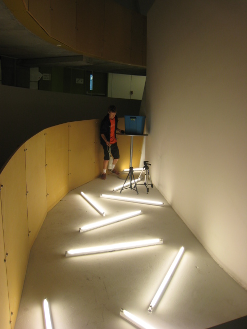
I installed Flegs today for two hours! It was a lot of fun and I had some great support.
Here’s a pic from setting up:
Amit Pitaru’s Sonic Wire Sculptor turn drawing in 3D into sound. Originally developed in Windows (here), it now has a pretty cool iphone app here. Notice how far the project has gone!
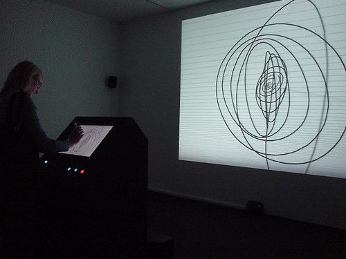
In the iphone screen shot above, horizontal lines separate notes in scale. Timbre of notes can be chosen to express sound differently.
Frankly I was worried to read the title of the project on Programming Interactivity (P195); it turns out to implement it in the opposite direction 😛 Still, it demonstrates that mapping pitch and wire shape makes sense! Additionally, in the windows version, stylus pressure is mapped to line width, and loudness of music.
My original idea for this project was to make a desktop version of my web app, visually, so that I could start to play with visualization and interaction with heavily visual data outside of a web browser (because we all know how restricting those things are).
I did a lot of sketching trying to figure out UI paradigms and ways that I could interface with hundreds, or thousands of images at once. It wasn’t going well, and I decided that I’m more interested in each image individually than the fact that this is a conglomeration of images. However, I didn’t want to make it difficult for the user to find specific images that exist in the global site or their personal repositories. To kind of remedy this problem, I came up with a treemap UI that is additive, so you can search for one tag, say “typography”, and see what comes up, but then you can add in another tag, say “posters”, to further limit your result set. This makes it easy to do things like limit by user, popularity, or color as well. When you have a result set, you can browse it visually to find exactly what you’re looking for.
After a little bit of thinking, I came to the realization that this was a waste of time, since it would just be studies for the eventual mobile app. So why not just make the mobile app from the get-go?
So that’s what I did.
I had messed with openFrameworks a little bit the week before this project really got going because I knew I was new to it and that if I didn’t have a head start there would be no way I could get this done. This proved extremely useful. I also made a rudimentary API and tested the connection between visually and Processing ahead of time too, so a lot of the classes and things that I had to make weren’t hard to port to oF. For the checkpoint, I grabbed color data from visually and made a proof-of-concept to let myself know I could get this thing to work. The above image was what I had for the presentation, but it isn’t an accurate representation of the actual colors by any means.
The image on the left is a much more accurate representation of the color space of each image. However, as you can see, things aren’t lining up properly and there’s a lot of negative space within each bar, so this is something I’ll have to work to perfect over the weekend.
The heart and soul of visually is images, so I tried outputting those too. There was a weird bug trying to output both colors and images at the same time which I have to take care of. As you can see from the image in the middle, there seems to be some colorspace mixup when it comes to solely displaying out images, likely having to do with the hack-up class I’m using, so that’ll have to be fixed first. The class I was using seems to have been inverting the colors on the image it output. In the rightmost image, you can see its now displaying properly.
This weekend I think my goal is to make an interactive tree map. The transitions from screen to screen and the searching won’t be necessary until all the key components work individually, but since the map is kind of the main UI paradigm, getting that done will be key. Also, right now my API is really rudimentary, and while I have a RESTful API in the works, there’s no way it’ll be done in time to use for this project, so I’m wondering if there’s some more efficient way of storing data (SQLite?), because I can see reading and searching XML files and arrays becoming a problem in the near future for memory management (and my sanity).
So, first of all, I apologize for not being there on Monday to present this. To refresh your memory, I’m doing a project where I’m trying to take time-lapse photos of natural color processes (such as a banana turning brown), get the average color of each frame, and display the colors as a gradient.
I’m trying to work on little modules in Processing that would be inserted into a website where people could explore the colors and hopefully download color swatches.
Not sure if the embed option for applets is going to work but in any case here is the link to what I have so far:caryn-finalprojsketch
Haven’t quite figured out yet how to have the image display even when you’re not hovering over the bar…but that’s going to happen at some point. Hover over the gradient bar to see the image the color came from and the hex color.
I did a lot of experimentation with sampling different points in the pictures…and even with my better lighting and picture-taking circumstances, the colors still look muddy. I’m still trying some things, not sure what I’m doing wrong but I think part of it is that the colors are just going to look more intense when they’re in the context of a photo rather when the actual color is singled out artificially.
Here’s a mock-up of what I’m starting to think this could look like on the web (ideally)
For our project we are exploring the theme of interactive fabrication. For more information take a look at the full project proposal.
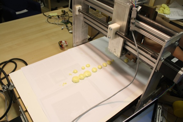
This week we begun some initial tests with using expanding foam to create physical forms. Below you can see the basic setup: a custom dispenser attached to a 3-axis CNC router and controlled in near-realtime from a computer.
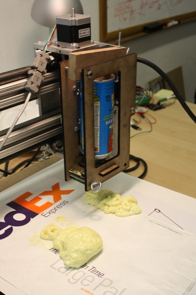
Setup
To control the CNC router we use the open source EMC2 machine controller application running ‘realtime’ Ubuntu on an old PC. By setting EMC2 into Manual Data Input (MDI) mode we can send it commands using Python. This allows EMC2 to control the machine with the correct direction and step signals over the parallel port, and enables us to basically feed it simple ‘goto x y’ commands using G-Code from Python.
Because we want to explore a range of different interfaces we decided to use the Ubuntu PC as a server and send G-Code commands from another faster computer via OSC. This way the server PC can concentrate on driving the CNC, and we are free to do more intense processing on the remote computer. At this stage we are using a sketch interface built in openFrameworks to send the G-Code commands.
Fidelity
Due to the nature of the expanding foam material, it is quite difficult to get high fidelity representations. Below you can see our initial attempt at drawing a simple curve without any nozzle attached to the can. It simply pumps out foam and the machine can not move fast enough so it piles up into a blob.
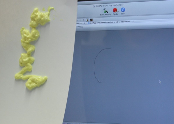
In the video below you get a picture of how much foam comes out without any nozzle, this then expands quite a lot before it hardens. You can also see how the CNC lags behind the drawing quite a lot, commands are essentially placed in a queue and the CNC processes them at it’s own speed. With a little more programming it should be possible to optimize/simplify the lines created by the mouse to speed up the physical motion. Due to the coarse nature of the material, this kind of optimization will probably not be noticeable.
We are more concerned with the interaction, so fidelity is not the main concern. However we found that various small changes can dramatically help the output look more like the input. For example, attaching a nozzle and moving the nozzle closer to the surface results in the following output.
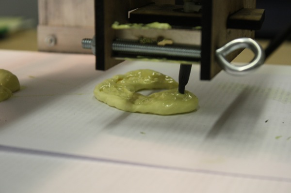
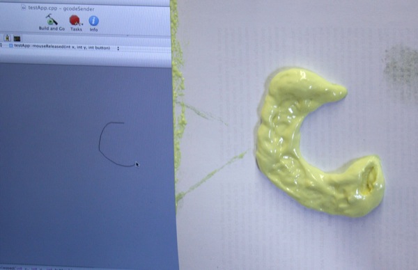
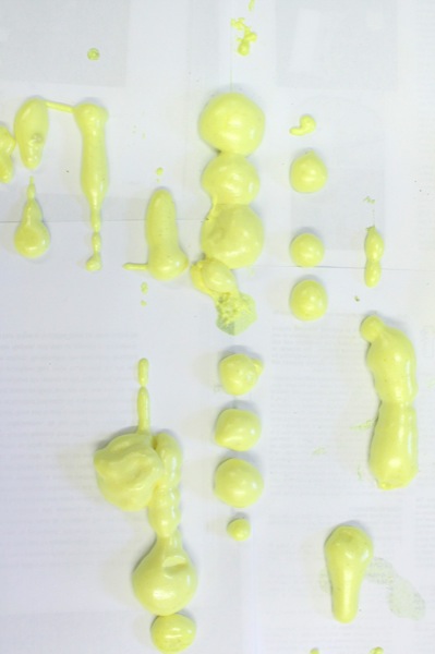
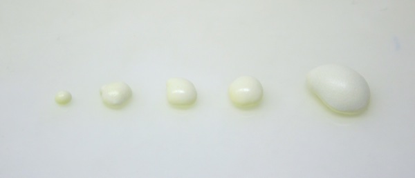
Limiting the amount of material dispensed by opening and closing the nozzle can also help create smoother lines. Below we outputted a series of small dots with reasonably accurate form.
Material
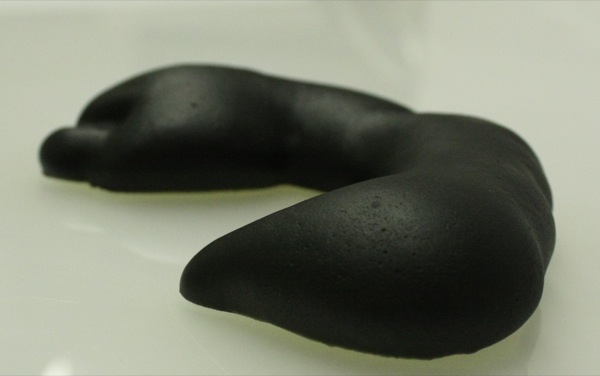
The expanding foam dries into a very lightweight and super smooth material. By adding a quick layer of spray paint it transforms the material into something quite richer in appearance (given it’s humble origins). Below are several treatments we have experimented with. My personal favorite is the metallic gold!

This is what the C shape in the image near the top expanded into. Then painted with flat black.
Summary
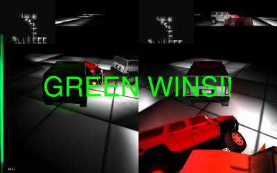
This is a game about protecting your “Little”, a small car that follows you around, while running into your opponent’s “Little”. At your disposable is the ability to change the terrain at will. You can form hills and valleys in real time at your discretion, to aid you and thwart your opponent.
To download the game, contact me or Golan Levin. The filesize is too large for this server.
Some screenshots:
The players face off.
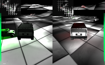
The battle ensues!
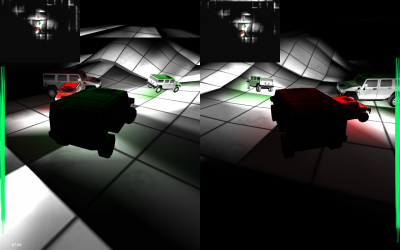
Green wins!
Concept
My idea went through several iterations, however I was satisfied with what I ended up with. I wanted to do something involving dynamic terrain generation. Initially, my idea was to write algorithms that simulated Earthlike terrain formation, creating a similar effect to watching a few seconds of stop motion photography of a mountain forming over a period of thousands of years. However, I was also interested in making this a game somehow, so I decided to add an element of driving through these mountains, as they formed.
I decided the gameplay element would be to make as much progress as possible, as terrain gradually became harder and harder to progress through. This idea was scrapped, because I felt it would be frustrating to have to struggle through ever growing, terrain, with losing by getting stuck as the only option. I also saw my original idea (forming terrain) getting lost as I attempted to answer the question of how to create a lifelike environment in only a few weeks.
After many more ideas passed through my mind, I settled on creating a game where the player controlled the formation of hills and valleys, an idea I had from the beginning. The game would involve two players driving around, each in charge of protecting a “baby car” while simultaneously crashing into the enemy’s baby car. This idea is only one of several that I could have implemented; listed here are some of the others and why I chose not to implement them:
A game where two players cooperate to ward off zombie-like little things that attack your castle in waves. Defense would consist of forming hills and valleys to lure them away from your castle to a hole, where they would fall to their doom. This idea was scrapped because I felt the game would be too difficult to implement quickly and well.
A game where one player attempts to escape the other player. The hunter can make hills and valleys – to hinder and trap the quarry. I scrapped this idea because I wanted both players to be able to create hills – I felt being the quarry would become boring.
A game where one player protects a treasure while the other player attempts to capture it. The game that I eventually created is, in essence, similar to this game, except that each player has something to protect, and ‘capturing’ is changed to ‘crashing into’. I wanted to make sure to add an element of collision and mild violence when I observed Xiaoyuan’s glee at running into my car during one of the checkpoint presentations.
Implementation
At the suggestion of one of my classmates, I started to use Unity, a game engine designed for making 3 dimensional games, especially first person shooters. Using Unity as a development environment has been a very smooth experience, and I would recommend it to anyone looking to rapidly prototype computer games that require advanced physics, good graphics, or simply work with a 3D environment.
From Unity, I took from the public domain a demo of a vehicle and began to familiarize myself with heightmaps and meshes, because I would be constructing all of the terrain procedurally from code. I also looked into terrain deformation, and I found a demo of mesh deformation, which proved to be somewhat similar to what I needed.
I decided the terrain would be an infinite expanse of grid that formed as you approached it – this would serve to give the world more of an otherworldly feel as well as reduce rendering costs. Also, if necessary, I could delete parts of the grid.
Then, I learned how meshes behave, and I began to create my own rectangular prism meshes from code, as these would be the basis for my terrain deformation. Once I had satisfactorily created these prisms, I looked into deforming them to make hills and valleys. The mesh deformation algorithm was essentially a function that that added to the height of the mesh at the point of interest, and changed the height of the surrounding points by varying lesser degrees, so that it looked as if someone had stuck a ball under a rug.
I would then redraw the mesh and recalculate the collision detection. I am glad that I chose to use a grid from the onset, because I was able to apply a couple optimizations that allowed the game to run at an acceptable rate on my computer. Some include: only calculating the collision detection near the vehicles, updating the collision detecting at a slower rate than the rendering of the meshes, and only calculating the deformation on a select part of the grid, rather than the entire playing surface.
Future
I think the game could do with more polish. I also think there are many new possibilities for using terrain deformation as a gameplay mechanic – only one of which I have explored. Furthermore, even within the concept of terrain generation itself I have barely scratched the surface. I could create tunneling algorithms, or the ability to create crevasses.
The Interactive Fabrication project will explore and develop new interfaces for digital fabrication from an art & design perspective. Our aim is to create prototype devices that use realtime sensor input to directly influence and affect fabricated output. The above figure illustrated how the current creative process for digital fabrication closely follows the desktop publishing metaphor: A computer is used to create a design, a file representing the design is saved, that design is then fed to an output device, and finally the output device manifests the design into physical form. This process is a far removed from traditional craft where the artist or designer interacts directly with the material using tools such as brushes or chisels to paint or sculpt.
Although there are numerous advantages to the current digital approach, we believe by more closely linking input to output artists and designers can better understand the nature of the material they are working with. Furthermore interactive fabrication opens up new creative possibilities for fabrication through interactive performance and improvisation.
Shaper is a new prototype that will explore near real-time fabrication using an additive 3D printing process. We will construct a 3-axis fabrication device that can be controlled directly via computer. This will allow us to experiment with a range of sensor based interfaces for near real-time digital fabrication. The first iteration of this prototype will focus on a sketch interface where gestures are used to control the fabrication device. Different software modes allow the device to automate the creation of 3D form, a single sketch gesture can be repeated to slowly build up 3D form by shifting a print head slowly along the Z axis. Subsequent interface iterations will explore other forms of input such as real-time tracing of physical objects using a camera and the use of sound to control the amount of material dispensed from the print head.
‘Speaker’ is an existing prototype that interactively sculpts wire forms based on the sounds of people talking. A micro-controller is used to analyze speech and control several small motors that push and bend wire. The sound level determines the shape the wire is physically bent into. The next stage will focus on rebuilding the system to allow more accurate shape forms to be created in. This will create a more interactive experience as people can more directly see how their voices affect the fabricated output.
‘Trace Modeler’ is an existing prototype that uses realtime video to create three-dimensional geometry. The silhouette of a foreground object is subtracted from the background and used as a two-dimensional slice. At user-defined intervals new slices are captured and displaced along the depth axis. The next stage will involve developing a system for outputting the forms directly to a fabrication device in an interactive manner, e.g. by sending the silhouettes incrementally to a laser cutter or milling machine.
Cheng Xu & Karl D.D. Willis
visually is a media bookmarking website. Gather images and video to create your own visual trends over time, and discover the unique visual culture of people and places around the world.
Proposal (PDF)
visually mobile progress (04/08/2010)
Idea / Summary
Continue the Minute idea I worked on in the first project
Create gallery installation (for senior show / STIA exhibition)
Present audiovisual display of people perceiving a minute
->Minute videos pulled from a database
->Minutes will be randomly arranged to that viewers can make their own inferences about what might be affecting people’s perception of a minute
Allow people to add their own minutes to the project database on the spot
What I have so far
App that plays back (preselected) minutes
Videos are randomly arranged based on people’s background information
Six app-ready minutes, another 20 or so are still on tape
What I still Have to Do
Digitize and prepare remaining minutes
Clean up / polish app
->Do another pass on video arrangement
->Fix memory issues
Create second app to record new minutes on the spot and submit to database
Build booth for recording and other presentation components
And If I have time…
Add to database
->Record more minutes
->Collect optional background information
Add extra feature to arrange videos based on background info
In preparation for my final project, a continuation on Minute, I wanted to research what other people have done with time perception in art. It was actually very difficult to find any works directly related to how people experience time internally, as most time-related art works are focused on altering external environments to convince viewers that their perception has changed (for example, time-lapse).
While researching I found an interesting segment from Hugh Foley and Margaret Matlin’s book, Perception and Sensation:
Time perception might well be influenced by physiological state, knowledge, personality, and other factors. For instance, there is some evidence that a person with a high fever shortened her estimates of a 1-sec interval and that a person who lived in a cold cave lengthened his time estimates. The evidence for the contribution of metabolic rate to time perception is weak, but would be consistent with a biological clock. The fact that knowledge and experience also play a role (Theme 4), however, argues that there is a cognitive component in time perception. Alberto Montare (1985; 1988) has found that providing feedback to people about the accuracy of their time estimations increases the accuracy of subsequent judgments. Montare did not find gender differences, suggesting that time perception might be equivalent among men and women.
So it does appear that a person’s background affects their perception of time, although the most important factor may be his or her physiological state–perhaps other factors such as location effect time because they effect the body through stress and other lifestyle habits that vary by region.
Jeremy LAKHLEF – La perception du temps
Uploaded by bofman. – Watch original web videos.
Here’s one slightly related video I found, which simultaneously displays several videos which all span the same about of time, but the content of each panel affects he viewer’s time perception in a different way. It’s successful in communicating it’s point, although some of the videos are more interesting than others (the top left and bottom right) and I don’t feel that this is anything that I’ll really remember a few months from now. However, it does help me understand things I can do better in my own project: higher video quality, stronger consideration of aesthetic during filming. On the other hand, here’s a video I found which has nothing to do with time, but does really interesting spatial arrangements with video clips, which might be interesting to keep in mind while establishing the arrangements in my own project:
I want to program a game where you get to kill a lot of enemies with guns… (More info to come)
When I was a small child, I remember when I experienced Kaleidoscope at first. It was small cylinder but the visuals that it created were so beautiful and I was very amazed, play with it all day long. Kaleidoscope is such a mysterious toy that generates endlessly different patterns using multiple mirrors and small colored particles.
For the capstone project I would like to build a “Kaleidoscope Mirror”. We are able to see ourselves only in the way it is through the regular mirror but Kaleidoscope Mirror can show the viewers in various ways with different patterns. Because the different patterns can be seen when Kaleidoscope is rotated, I am thinking of what interaction between the viewers and the screen can interesting. This part is not decided. One option is the viewer could rotate the mirror’s frame. The other option is the mirror detects the viewers l gesture or voice such as ‘Mirror, Mirror… ” and respond to that. Here is another example of Kaleidoscope using self-portrait image