The Concept
I actually came up with the idea for this project a while ago. Last semester, I wanted to do an information visualization piece for my senior studio class and after searching for ideas for things that hadn’t been tackled in the realm of computational information design yet, I thought up this project. The only visualizations of typeface classification and the relationships between fonts had been static posters, so I thought this was a real opportunity to do something that hadn’t been done before. At the time, however, I felt too inexperienced in information visualization to tackle this project.
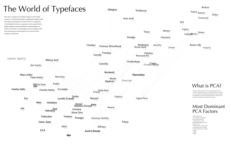
The concept has a fairly broad scope and can be expanded to include any number of ideas and applications, but for the sake of making it workable for this class, I decided to focus my efforts mainly on the analysis of the letter shapes and the mapping in 2D space, where proximity represents a measure of similarity between two typefaces. Obviously there are a number of other visualizations that could be tried, and the applet could serve a number of different uses, and someday I’d like to try a lot of those things, but in terms of this project, there just wasn’t time. The project would have two deliverables: a large poster representing the map, as well as an interactive applet implemented in Processing and Java.
The Significance
Many people have asked me, “Why do this project? Why are you interested in this?” The answer is that I think a lot of us graphic designers carry a vague notion of this typeface map in our heads, but if you asked us exactly to describe it (or even draw it) I think we’d have a hard time just because I think our understanding of the relationships between typefaces is based as much as, if not moreso, on this intuitive sense, rather than facts and math. So, I’m interested in comparing the maps in our heads with a mapping based on mathematical analysis.
In addition, part of the inspiration for this project came when a non-designer friend asked me, “I’ve been using Helvetica all the time because I love it, but I feel like I should be branching out. What typefaces are similar to Helvetica that I can try?” I rattled off a list before even thinking about it, and then I started wondering how I knew that and why he didn’t. Part of my intent behind this project was to create a tool for non-designers that will allow them to understand more about the world of typefaces, and make informed decisions about which fonts to used (not based on purpose, since that’s an entirely different animal, but based on relationships to well-known fonts).
The Execution
The project had two main components: Analysis of the letter shapes using various metrics and shape analysis methods, and mapping the nodes in 2D space using PCA. The letter shape analysis was done using the Geomerative library for Processing, which unfortunately had a number of problems; for example, the fact that the positions of the points on the outline of the letter shape start at a different and completely random position for each font. As a result, some of my computations were slightly hack’ish, and when I continue this project, I’d like to make them more sophisticated and smart, but with how little time we had, I didn’t really have the time to dwell on these things if I had a hack that was working.
As for the mapping using PCA, I used the TuftsGeometry library for Java, which is very lightweight and easy to use. Unfortunately, it doesn’t quite have that many useful extensions; for example, it can’t give me a readout of exactly which factors are included in the PCA projection and how dominant they are. However, the ease of use of this library compared to many other PCA libraries for Java to me was much more important than its extensions.
Once I figured out how to do the PCA projection using this library, I just needed to add the new variables to the matrix input every time I added one, so that was fairly simple and easy. One of the trickier bits was weighting the variables. Since the variables are in different units (some are actual measures while others are ratios) the real variance between them isn’t always indicative of how important a variable is, and so you need to weight them accordingly. Finding the correct weightings took up a lot of time in this project.
A classmate suggested that I also use this to calculate the best serif/sans-serif pairings for each typeface, so I did. That was fairly easy to do; it just used some of the same variables but with a different weighting to look for the typeface in the opposite “class” (serif or sans serif) with the highest degree of similarity.
The Process
The final product essentially does the following:
- Reads in a TrueType font file
- Converts it to a polygon using the Geomerative library
- Runs shape analysis on a specified set of letters and their properties
- Puts these analysis variables for each typeface into one large matrix
- Sends this matrix into the TuftsGeometry library to do a PCA projection
- Maps the typefaces in 2D space using the PCA projection
- Calculates the best serif/sans-serif pairing for each font using a small subset of the typeface variables
- Displays the mapping on-screen, with some extra interface stuff
Also, for the sake of comparing the mapping to our learned knowledge related to typefaces, the program reads in a CSV file with some information for each typeface such as the year it was made and the pedantic classification it’s been given by ATypI. The digital applet allows the user to overlay this information on the mapping to see if any interesting and/or unexpected results are shown.
The Difficulties
The project actually progressed fairly well until I ran into a major technical difficulty the day before the final show. I had just rendered the PDF poster and was going to print it when I realized a few things I needed to add and opened Eclipse back up. For some reason, however, it had deleted all the contents of my /bin/data folder, which contained all of the TrueType font files I had been working with. I was able to recover some of them, but most of them had been downloaded from FontYukle.com and were low-quality. Before rendering the PDF, I’d managed to replace most of those with fonts from my own OpenType font library that I’d converted to TTF files, but all of those were gone and unrecoverable. Sometime over the summer, I’d like to do all of those conversions again so I can restore the applet to what it looked like when it was working well. Thankfully at least I had the poster as proof of my program’s success.
The Final Deliverables
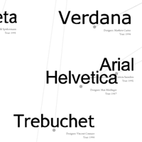
The poster can be seen below:

The applet currently isn’t online since it needs a lot of fixing up. Hopefully I can work on that over the summer because I do want to continue this project since I think it has a lot of potential.
The Next Steps
Once I have some time to relax and detox from this busy school year, here’s some things I want to work on next:
- Restoring all of the font files
- Making the shape analysis metrics a little more sophisticated and less hack’ish
- Focusing more on the applet as opposed to the poster and adding more functionality to the interface (eg. zoom)
- Play around with a few other visualization methods to see what happens
- Write a paper??
