Final Project: Progress
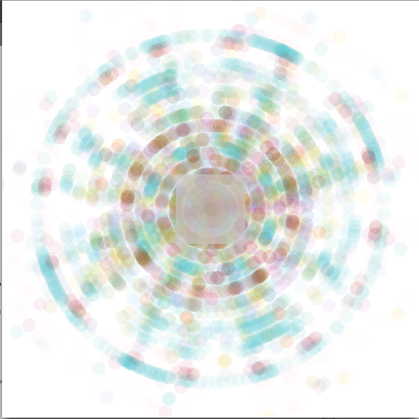
These are some final static 2D images representing different songs. I eventually want to create 3D objects out of the songs, similar to these 2D blueprints.
These images were created out of information parsed from MIDIs.
-The shapes in the center represent the time signature (a square, for example, has four beats in a measure)
-Each side of the center shape represents one beat, so the circles around the center represent full measures.
-Each dot/circle represents a note
-The center dot represents the key it is in (if the song is in C major, the center represents middle C, for example)
-The placement of the other circles represents the distance of the interval from the center note as well as that note’s rhythmic placement within the measure (If the note is played on beat one, it is displayed exactly below the center note, for example)
-The color of the dots represents the instrument that note is played in
***For the final presentation***I will be displaying a series of images on a large poster while showing a recording on my laptop.


Gabi – nice work. here are comments from the crit on 4/19:
✓ Gabi: Visualizing Music
——————————————————————
This looks like x-ray crystallography.
Recommend eliminating the square/triangle thing in the center. It’s not very helpful, and it covers over real data. If you really need to show this (and I don’t think you do), then put it on a surrounding ring.
Consider some experiments showing 4 bars or 16 bars of data around a circle (not just one bar). You might begin to see chord progressions!
Nice work! You’re actually showing some interesting information. Get some more files and keep going. I recommend exhibiting a series of prints, alongside a laptop running some loops of MIDI files being analyzed. — GL
Can you help us make sense of this data at all? The crystallography metaphor is a good one – you’re basically looking at the “structure” of music. Can I look at a bunch of rock music pictures, and a bunch of jazz music patterns, and so forth in order to get a feel for the underlying “structure”? I feel like I’m more likely to do that before I look at the visualization of any single song. -SB
Hmm…some midi files are better written than others. Maybe you need a better source of midi files for these visualizations? You might be well served by listening to lots of midi-files and hand-picking the ones that “sound” closest to the real songs. -SB
Scrape a midi website and batch-process a couple thousand sound files then look for the patterns between them.You dont even need to live scrape a site, you can download a ton of midi file im sure…
There needs to be an easy way to play the song. It could help us understand where the visualization comes from.
Pretty! I can’t tell exactly what you’re measuring in the music from looking at them, but I almost don’t mind. They’re nice abstract representations of the music.
If you provide a little background information along with them about the instruments (what instrument is what color) it might help people better understand what they’re looking at.
What do the shapes in the middle represent? Ok, they make sense, but I don’t think they’re adding much to the visualization since you have to explain them.
I’d wear those on a t-shirt. Print some shirts and sell them at the exhibit!
– Sell them made to order—your favorite song on a tee shirt.
I like that idea a lot. I’d buy one.