visually mobile (progress)
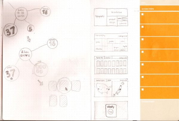
My original idea for this project was to make a desktop version of my web app, visually, so that I could start to play with visualization and interaction with heavily visual data outside of a web browser (because we all know how restricting those things are).
I did a lot of sketching trying to figure out UI paradigms and ways that I could interface with hundreds, or thousands of images at once. It wasn’t going well, and I decided that I’m more interested in each image individually than the fact that this is a conglomeration of images. However, I didn’t want to make it difficult for the user to find specific images that exist in the global site or their personal repositories. To kind of remedy this problem, I came up with a treemap UI that is additive, so you can search for one tag, say “typography”, and see what comes up, but then you can add in another tag, say “posters”, to further limit your result set. This makes it easy to do things like limit by user, popularity, or color as well. When you have a result set, you can browse it visually to find exactly what you’re looking for.
After a little bit of thinking, I came to the realization that this was a waste of time, since it would just be studies for the eventual mobile app. So why not just make the mobile app from the get-go?
So that’s what I did.
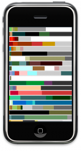
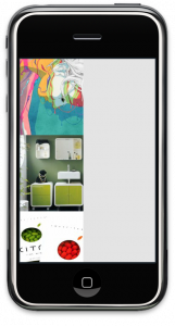
I had messed with openFrameworks a little bit the week before this project really got going because I knew I was new to it and that if I didn’t have a head start there would be no way I could get this done. This proved extremely useful. I also made a rudimentary API and tested the connection between visually and Processing ahead of time too, so a lot of the classes and things that I had to make weren’t hard to port to oF. For the checkpoint, I grabbed color data from visually and made a proof-of-concept to let myself know I could get this thing to work. The above image was what I had for the presentation, but it isn’t an accurate representation of the actual colors by any means.
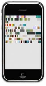
The image on the left is a much more accurate representation of the color space of each image. However, as you can see, things aren’t lining up properly and there’s a lot of negative space within each bar, so this is something I’ll have to work to perfect over the weekend.
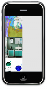
The heart and soul of visually is images, so I tried outputting those too. There was a weird bug trying to output both colors and images at the same time which I have to take care of. As you can see from the image in the middle, there seems to be some colorspace mixup when it comes to solely displaying out images, likely having to do with the hack-up class I’m using, so that’ll have to be fixed first. The class I was using seems to have been inverting the colors on the image it output. In the rightmost image, you can see its now displaying properly.
This weekend I think my goal is to make an interactive tree map. The transitions from screen to screen and the searching won’t be necessary until all the key components work individually, but since the map is kind of the main UI paradigm, getting that done will be key. Also, right now my API is really rudimentary, and while I have a RESTful API in the works, there’s no way it’ll be done in time to use for this project, so I’m wondering if there’s some more efficient way of storing data (SQLite?), because I can see reading and searching XML files and arrays becoming a problem in the near future for memory management (and my sanity).
