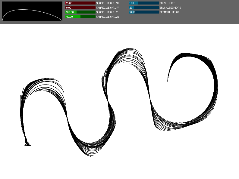
Project 2: Dynamic Brush Simulation

More information to come, for now, check it out here!
*Feb 21, 2010: Updated to work properly without tablet

More information to come, for now, check it out here!
*Feb 21, 2010: Updated to work properly without tablet
Hi Michael — here are the class comments from the PiratePad.
———————————————-
Nice work — lots of good sotware development. But your background research for this project could have been stronger — go find some related papers! Look into Steve Strassman’s “Hairy Brushes” siggraph paper, 1986 — Steve Strassman, Hairy Brushes, ACM SIGGRAPH, Vol 20, No 4 (1986) and all of the papers which have cited this. There’s a huge amount of simulated sumi-e brush research from asia.
Give some consideration to ink weight — layering multiple depositions of ink — to produce grayscale variation within the marks. i.e. the more times a pixel is touched by the brush, the darker it is, etc. Directional blurring of the ink already deposited, by the brush on top of it, could also be interesting.
Very cool! A useful tool to make organic looking lifeforms. However, the knobs are a little difficult to work out, but I’m sure if someone played around with it a bit/you made some instructions, it would be fine. Is there a way to export the images you create (besides prtsrc-ctrl-v, hehe)? Oh, I like how you can change the difference outlines (spine, skeleton, etc.) I wonder if you could add blending or gradiant features? Maybe have an option that can make the brush softer or something. Or, maybe also add some little features to the brush that will add fur along the edges or bumps? And colors, of course. But, very, very impressive and cool for the time you had. 🙂
-Amanda
I like the shapes that are produced. It’s cool that you show the “behind-the-brush” stufff (spine, etc.). The forms have a pleasant organic feel.
i really like how the shape changes slightly after you draw them sort of like the ink is bleeding
I like the outline version more than the shape one.
Neato. For your own sanity (and so others understand your work), add a text label with your keyboard shortcuts to the top or bottom of the app. -SB
I’m impressed with the outcome. The shapes look like actual brush strokes. Can you choose different colors or transparency levels?