Project 2: Decorated Initials

I got my inspiration for this project from Daily Drop Cap. The designer Jessica Hirsche posts one letter of the alphabet each day, highly decorated drop caps like a modernized version of the gilded initial caps in very old books. Many of the decorations come in the shapes of vines, leaves, and swirls, so when I read that the purpose of this assignment was to simulate nature, I wondered if it would be possible to simulate a vine effect algorithmically, and mimic the way Jessica Hirsche does some of her drop caps by hand. There would be more limitations, of course. For example, from the very start I decided I would not deal with color — that added dimension would overcomplicate the project far too much. The basic idea was fairly straightforward: given a letter, grow vines or swirls out of its edges.
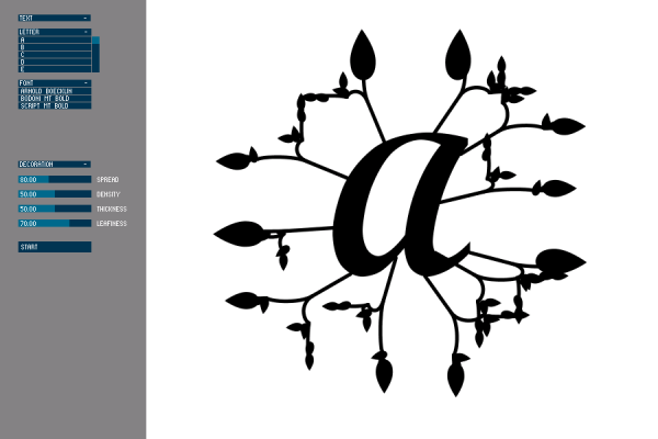
The reality turned out to be much more complicated, and I’m ashamed to say that this project was rather a failure. It took me a VERY long time just to find a way to get the points on the outside of a letter — and even now it isn’t perfect, since it will also give you points from the counterform of the letter (such as the hole inside of an ‘O’). I’ve gotten around this for most letters by cheating and only grabbing the first 2/3 of the points (since the outer edge generally comes before any inner edges) and then choosing a set of starting points from there. However, this is optimized for letters like the ‘A’ below and doesn’t necessarily yield good results for, say, the letter ‘N’.
I had planned to go for a much more swirling, viney look, but I had trouble procedurally generating the vines and producing nice curves. I ended up adapting a version of the Processing tree with Bezier curves instead of straight lines. It wasn’t exactly the look I had been trying to achieve, but it produced the best results with the least overlap and interference between vines.
As shown above, the user is given several input options; namely, you can choose the letter, a font, and then play with a few sliders that will affect the output of the vines/swirls, such as the density, the thickness of the lines, and the size of the leaves at the end of the vines. I had ideas for other user input options (such as symmetry vs. randomness of the output) but did not have time to implement them.
Initially, my plan was to generate the output in such a way so that the resulting decorated letterform could then be lasercut and turned into a stamp. Obviously, I gave up on this idea, as there just wasn’t enough time to pursue it.
All in all, this has been a very frustrating and exhausting project, and I wish I’d known what I was getting myself into when I first conceived it. I’m glad I tried, but I do think it was too ambitious for a project of this length. As Patrick suggested, though, I may continue this for my final project and flesh it out a lot more.

Hi Nara, here are the class’s comments from the crit.
—————————————–
I love daily drop cap and i love the premise of your project! I definitely think you should pursue it for your final
I agree – Patrick
This is a great starting point & an interesting idea for this project. It stood out on the blog to me just b/c of your overall goal.. i just wish it had been executed better (you just need more time) -GFU I agree. The shapes are starting to get there, but obviously this is a very complex problem
It is possible to computationally synthesize these complex forms using recursive algorithms
Once you get it just right you can generate beautiful forms very easily and put the drop cap people out of business
You can get at the outline of a given type form using straight Java (inside Processing):
—
Font font = new Font(“sansserif”, Font.PLAIN, 9);
FontRenderContext fontRenderContext = new FontRenderContext(null, false, false);
GlyphVector gv = font.createGlyphVector(fontRenderContext, “hello world”);
Shape shp = gv.getOutline();
—
You can then get at the points themselves with shp.getPathIterator()
http://java.sun.com/j2se/1.4.2/docs/api/java/awt/Shape.html
More java code… to find the winding rule points) {
/** Get the winding direction of a set of points
*
* @param points An array list of points on the perimeter
* @return True if the points are in a clockwise direction, else false
*/
private boolean getWinding(ArrayList
float total = 0;
for (int i = 0; i < points.size(); i++) { Point2D.Float thisPoint = points.get(i); Point2D.Float prevPoint, nextPoint; int sizeMinusOne = points.size() - 1; if (i == 0) { prevPoint = points.get(sizeMinusOne); } else { prevPoint = points.get(i - 1); } if (i == sizeMinusOne) { nextPoint = points.get(0); } else { nextPoint = points.get(i + 1); } total += thisPoint.x * (nextPoint.y - prevPoint.y); } total /= 2; return (total > 0) ? true : false;
} –awesome!
pretty.
I’m working on a similar proj where vine and leaves grow on a curtain, feeding themselves light on the way… which might be a way to get them to distribute evenly…
OpenFrameworks connects to an OpenType library that provides type outline points.
Geomerative, good research.
Bit off more than you can chew — good work 🙂
Seems to need more local intelligence about the letterform, if not an actual growth algorithm.
GL
Nice applet you’ve built for yourself to test what’s working and what’s not. -SB
Maybe it would help to print out some letters and hand draw how you would like the plants to be generated. Then study you drawings to figure out why you put the plants where you did. (For example, growing out of the serifs)