Project 1: Minute II
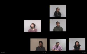
Minute (II) is an interactive application which allows the viewer to examine how people’s backgrounds affect their perception of time–in this case, a minute. Previously, in Minute (I), I asked several people to perceive a minute while I recorded them, and afterward, fill out a survey on their background (do they drink coffee, how much did they sleep last night, etc). From this I created a video in which the participants’ minutes are arranged in a grid; their exact placement roughly determined by one aspect of their background. There appeared to be some correlation, but it was difficult to tell due to the limitations of using a discrete grid structure on a continuous set of data. For this iteration, I decided to break away from the grid and place the minutes along the x-axis based on the currently selected background criteria (the y-axis is random). Most importantly, I implemented my goal of making the information interactive (using openFrameworks), so that the viewer can investigate the specific background information that they believe might influence a person’s perception of time. This also makes it possible to include a huge database of minutes, and then randomly select a subset of them to play each time the application is run. One other modification was moving the actual elapsed time from the center of the screen to the bottom so that more emphasis is placed on the participant’s relative perception of time (potentially a result of their background) than how “accurate” they are.
Please contact me if you would like a copy of the application, the ZIP is pretty large (74 MB)…

Hi Alyssa, here are the PiratePad comments from the crit.
Funny! That girl talking about Fuel and Fuddle was hilarious. I really like the idea! I kind of wish there was a timestamp on the photos or something to actually show us what the participants’s perceived time was (but I understand what you mean about the relative time). Really great work getting the data–it’s clear you put a lot of effort into it. I like the filters at the bottom! -Amanda
I’m the only person on the screeeen
The investigation of “how long (do you perceive) is a minute” is a great starting point. You have some presentation issues — make sure your screen layout fits in 1024×768, which is a standard projection size; and also, you should describe the concept first, so that your audience understand what we’re seeing. The graphic idea of people’s videos dropping out after a minute is a nice design concept. Might be nice to see the timing-numbers LARGE. More people in your survey. I don’t understand why the grid is irregular.
With the quantity of data you have, I don’t know if the additional survey data is that meaningful for dividing the people. maybe you could show the characteristics vs time using other graph techniques so you didn’t watch the same videos to examine different characteristics.
The visual arrangement of the faces feels like it needs a little more deliberateness or communication of *why* they are where they are. I see you’re addressing this now in class; maybe it will look better with a large number of people (versus just 4, where it looks oddly sparse). It’d be nice if people dropped out a little more “loudly” (fade out? a freezing before disappearing?) -SB
– I agree with a freezing, to accentuate their exit. Or perhaps only their frame/outline remains for a moment, as if TV/monitor were shut off.
Is it actually interactive? Can the user choose the arrangement filters in real-time? If not it’d be nice if it were, especially since you have such a simple arrangement.
The idea of what is the precieve of a minute is interesting.
I think it’s a little unfair that you’ve basically already done this project before and don’t seem to have added anything new.
Seconded. It’s absolutely unfair.
I think it’s a great project that asks a great question. It doesn’t matter if you’ve used this material for a previous class; the content is still interesting and it’s your prerogative if you want to reuse it.
Yes it’s a continuation of a project from a while ago, one which I’ve been intening to expand upon for a while. The previous project was a video–this is an interactive continuation of that idea which I built from scratch within the past week (of course, I’m reusing my data from earlier). Unfortunatley I had to take a step back in order to build the foundation for this next step (and it did take some time to build the application), so yes, visibly it does look similar although it’s completely changed beneath the hood. However, I’m really interested in following this project through to completion, whether I do it for a class or not, and I saw this assignment as a perfect opportunity to begin expanding upon my previous effort.
I just heard a great NPR piece on the perception of a minute:
http://pd.npr.org/anon.npr-mp3/npr/atc/2010/02/20100201_atc_07.mp3
Really interesting find–thank you! 🙂