Tesserae: Making Art Out of Google Images
Tesserae
After the critique last week I decided to change my topic from mapping the colors of the tree of life to comparing the meaning of words in context. This idea came from the realization that images of closely-related species take on different colors based on whether that species lives in captivity or in the wild. One chimpanzee had a green hue in the visualization whereas its close siblings were all yellow. It turned out that the difference was due to green leaves in the first chimp’s environment and the yellow zoo-bedding in its siblings’ environments.
My final visualization (named Tesserae, the latin word for tiles) was created in order to display these differences visually and allow people to test hypotheses about the contextual meanings of words like the names of the two chimps. It uses an HTML interface that allows users to type in related words and see their visualizations side-by-side.
One frustration I had with the previous project was that the color average used to color the nodes lost the rich textures of the underlying images, leading to an uninteresting visualization. To remedy that problem I took 15×15 pixel chunks out of the source images, preserving the textures while obscuring the overall image. This allows the visualization to become an composite that abstracts away the meaning of the individual pieces, making the user to focus on the relationships between images rather than the images themselves.
Since all of the images are downloaded and client-side, no two visualizations are the same. The tiles are arranged randomly on load and the images themselves change as Google’s search index updates.
Analysis
In practice Tesserae is more useful for aesthetics than for practical comparisons between words. I’ve been using it more often as a story-telling tool than a data analysis one. This visualization is a good example. It uses the search terms “stars,” “earth,” and “sun” to paint a picture of our solar system.
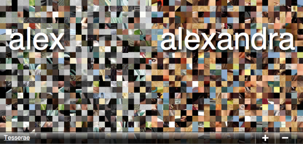
Some meaningful comparisons do exist, however. They just seem harder to find. One that I found a little interesting was the difference between the names “Alex” and “Alexandra,” shown below. Tesserae does all image searches with SafeSearch off, so the image for Alexandra is full of pink-tinted pornography. Alex has no porn and is a washed out gray. If I put on my “culture” hat for a second, this might say something about how the internet views women and men differently.
There are a few more examples worth looking at on the project’s website.
Room for Improvement
Aside from the performance issues listed on the project website, I can think of a few places where the visualization could improve:
Since it only grabs the top eight images from Google Images it’s easy to pick different images out of the composite. A larger number of search results might be beneficial but is cumbersome to implement using Google’s search API.
A save button could be added to make it easier to share generated visualizations with friends.
The original photos that created the mosaic could be displayed on mouseover. This would make it easier to find out why a mosaic turned an unexpected color.


Hi Max – here are the PiratePad notes from the crit.
Nice use of the Pecha Kucha format. Wow, a whole tool to make tiles from Google image searches. I guess you had to get a Google API key. NICE NICE NICE contribution, I can imagine other people really wanting to use this tool. -GL
What about SORTING WITHIN these results? e.g. China, you have hundreds of images. Could there be color-based sub-clusters that map to some kind of sub-content-groupings? -GL
I like your ability to count down when you run out of things to say…
Very ambitious! Got your own website, nice! Cute monkey pictures…Very nice demonstration in general! I like the tiles–GORGEOUS!! I’m jealous–you’re project seemed to have turned out very well. I’m glad you showed specific examples: if I had just played around with it on my own I would’ve have been able to necessarily find anything interesting from your data. Very, very nice work! 🙂 But…what exactly is Pecha Kucha format? I just googled it, so I’m good now, but that may have been something you would’ve wanted to go over in your project. *major props* -Amanda
I wonder how you can talk about this other project and how it influenced your work to a non-Golan Levin Studio audience (we were all here last week, but random Pecha Kucha member wouldn’t have been.)
Making a website was a good idea in this case, it seems to help “prep” me for what to expect. As for the visualization, it seems to beg “MAN THIS IS COOL…how can I personalize or contribute to this?” This has the potential to really take off if you can think of one or two ways to really “package” your work. It feels like the website is the necessary but maybe not sufficient first step. (Random thoughts….Suggest that people start by, say, typing their name or a random fact about them? Give people a gallery space or a “most popular” section? Make it into a physical, self-published book?) -SB
i like how you described your images as storytelling and how “quilt-like” it looks with patchwork-esque-nes….
Great examples. This slide looks amazing even on a projector.
I wonder if it would look even better if you filtered out images that have a lot of white. I’m a little distracted by the random patches of white.
I love the mosaic effect- it allows you to compare more aspects of the images than just the average color. Are any of the images repeated?