Project 1: Pursuit of Happiness


(My project also has issues viewing in a browser due to loading textfiles. Here’s my project.)
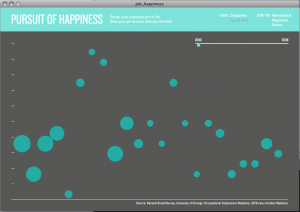
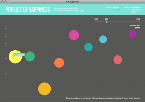
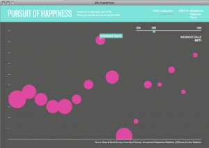
My project looked at visualizing people’s happiness, as it relates to their occupation and their salary. I used two different sources of data: University of Chicago’s General Social Survey, a large, comprehensive opinion survey conducted pretty regularly since 1972, and the US Bureau of Labor Statistics’s Occupational Employment and Wage data. Among routine questions including occupation, age, gender, etc., the GSS has a question about how happy people are in their life. Cross referencing this with the salary statistics from BLS, I hoped to gain insight into whether people were really happier if they earned more money.
I think I underestimated the complexity of the data and the interface necessary to effectively explore it, so I didn’t manage to fully implement some features I had intended. Overall, I’m pretty satisfied with the outcome as far as representing my idea, given the time, even though it is incomplete and there are some technical and design issues.
My greatest trouble with this project was working with the data. The GSS and BLS data had to be comparable across occupations and span many years (I originally planned 1972-2008) however BLS only provides 1998-2008 and GSS simultaneously provides data only every other year starting in the 90’s. The main issue by far was the occupational codes. Standards changed every few years and I had to write 7 different parsers in Processing to convert the data to something usable, and even then I found that there was errors in the data translation (you may notice that postmasters earn an unusual amount of money in my viz).
Some features that I plan to implement are sorting the data, scraping BLS.gov for occupational descriptions to give a little insight into each job, and a more organic softbody interaction with the bubbles. I had originally placed a lot of emphasis on getting the softbody interaction to really capitalize on the buoyancy as happiness idea, as well as have the various occupations/industries pushing past each other.
Hi David – Here are the PiratePad comments from the critique.
Please don’t be afraid to USE LABELS on your charts
Nice smooth transitions. Maybe use less white-text-on-light-colors!
I like the way the transitions between datapoints work. Very smooth.
Ooh. This graph is pretty. Nice color scheme. -MH
I agree except the head color and font color are so close.
– I think that’s because of the projector -MH
– yeah that is possible
White on cyan isn’t very visible. Sorry, this projector is ASS. It looks much better on his laptop
How about the white on yellow?
I was a little bit confused initially because it looks like there is an x-axis but there really isn’t (it’s just categories). Wonder if there’s a way to make that more clear. I wonder if it’s even necessary to have them displayed in a line like this. If you just randomly placed the bubbles around the screen I almost feel like you could still get the point because the size of the bubbles is really all that matters, right?
I like the mouseover interactive-ness. Very, very cool–I espeically like how if you click on a particlar part of the data set another data set comes up with more information. Maybe includes some numbers or labels on the axes? May look a little cleaner. I’m not exactly sure what information is going along each axis. Also, maybe this isn’t true when you click on the cirlces, but I’m wondering if you need the y-axis, since the cirlces seem to be aligned on the horizontal axis. I’m not quite sure though…since I’m still not exactly sure how you’re expressing your data though. Nice job though… -Amanda