Project 1 – Pin Numbers
IDEA:
To examine people pin numbers for what patterns people tend to lean towards when using a 10-digit keypad arranged in a 3 x 3 grid (with outlying zero). I wanted to examine trends in the numbers and patterns “drawn” when typing in pin numbers. Also to see if these trends changed by sex — more or less patterned. And finally, to see if pin numbers are really as divers as we assume they should be and see what would be considered the “safest” pin.
DATA:
I created a survey through Google Documents Forms and posted it on a facebook event, as a question on Yahoo! Answers, in an email to my sorority d-list, and apart of a blog post on this course’s blog. I imagine that most of the people who filled out the survey were facebook invitees. 600 people were invited to the event, 164 people filled out the survey, and 71 were willing to give up their pin numbers. All information gathered can be viewed here.
PROCESS / ANALYSIS:
I tried to look for patterns by grouping the numbers in different ways:

Benford’s Law – “The first digit is 1 almost one third of the time, and larger digits occur as the leading digit with lower and lower frequency, to the point where 9 as a first digit occurs less than one time in twenty” (Wikipedia).
The image above is an analysis of the numbers by splitting them up in to pairs of digits (blue = first two digits, red = middle two digits, green = last two digits) so that all numbers are between 0 and 99. The height of each bar is the number of times that number appeared in a single pin number. Benford’s Law was quite accurate for the data, but I wanted to look at more patterns in the hand movement used when typing in the numbers.

I then tried to look at patterns by when each number was used in the pin number. The image above graphs the numbers 0 – 9 against their densities based on which number they were in the pin number (blue = first number, red = second number, green = third number, purple = fourth number).


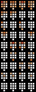
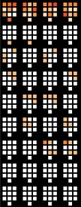
I finally used processing (for a loooong time) to create the series of images featured above. The leftmost image is an analysis of all the data collected, the middle image is for female information only and the right most image is for male information only. From four different keypad representations from left to right show the digit used as that number in the pin number (left most pad is first digit of pin, right most pad is fourth digit of pin, etc…). The top-most row is densities of a number for all data in that set. The darker the color, the denser the population. The following rows show data by numbers repeated during pin numbers by showing which numbers were repeated by density and when in the pin number. I found that 50 out of 71 people (70%) had repeating digits in their pin numbers, including: 19 out of 28 guys (68%) and 31 out of 43 females (72%), two of which had a digit repeating 3 times.

I am currently working on, and have not finished an interactive model that graphs densities of digits based on digits that the user inputs. I will probably show a non-complete version in class if possible.
REFLECTION:
I think my project went fairly successful. I was very shocked to see that so many people were so willing to give up such private and valuable information, and online nonetheless. I am pleased with the data I found and can only imagine that there are so many more number patterns hidden that I did not find. I really like the three images produced above but would’ve really enjoyed being able to interact with something. I have only used processing a few times before and tried to challenge myself to analyze all of the data using processing, and not by using excel or just looking at the numbers. In retrospect, I probably should have just found what I wanted to visualize and then hit up processing, instead of using processing to find patterns and see if it is an interesting visualization, but I did learn a lot about the language and environment that I hope to make use of in other projects.
Hi Jessica – Here are the PiratePad comments from the critique.
Terrific starting-point for an investigation — brave, actually. I wouldn’t have expected that anyone would actually respond to your survey. Wow, collecting 71 pin numbers. Hard to believe, and very interesting. LOVE the HEAT MAP. Dope study.Please LABEL your diagram, since each of the rows means different things, which was only explained by your talk. You might want to talk to a stats expert to see if you can come up with some verifiably significant differences between men & women etc.
This project suggests lots of other visualizations, eg. a 100×100 grid showing first 2 numbers against second pair.
Really cool! I love the heat map idea, too! It’s looks very cool. I kind of wish that the squares had labels (either below or mouseover) to make it easier to see the trends you talk about in your paragraph. Demographic filters would be cool too. Nice work! -Amanda
If you’re ok working for The Man, I feel like there are some people over at CERT/SEI who’d be more than happy to give work like this exposure (or augment your data) in some way…Very nice work. Blurs the line between research and art nicely. -SB
Do have to wonder what would happen if this study ‘got out’ and if hackers could use it to figure out some of the most likely pin numbers.
I’m interested in seeing almost a hybrid between this and the colors across cultures project. Does culture have an impact on the numbers you choose? I know some cultures place a lot of value on numerology eg. Chinese
I wonder how many people would answer this if they got paid for it on mechanical turk. Would they tell the truth or try to game the system? Even if they do lie it could be interesting. See Benford’s law and http://www.wnyc.org/shows/radiolab/episodes/2009/09/11. -MH
– but pin numbers might not apply to Benford’s law – after all, the only rule is that people have to make them up (both when choosing their PIN and when faking it).-Jon
– Listen to the radiolab episode anyway. Radiolab is great. 🙂
The number pad visualizations are a little hard to read.
The number pad visualizations are very difficult to read. Without any indicating text, you have a jumble of information. You can’t expect people to even know what it’s about if you don’t even put the title in the visual. You need to think more about how to show as much information as possible with the minimal amount of visual.
Some labelling would be helpful. Also a lighter background- the black background is washing out the subtle variations in the heat map colors.
Did you take account for banks that do not allow you to choose your PIN number. How much do you think this would affect your stats if not?
Are there any number pads the reverse direction?