Project 1 – Inbred Music
So, I have an awful taste in music. I am absolutely in love with this obscure type of techno called Happy Hardcore. Essentially, it’s underground British rave music. I don’t know how it happened, but it did, so I have to live it with.
Anyways! Ishkur’s guide to electronic music says that “ALL the world’s Happy Hardcore is made by only 12 guys, who have more pseudonyms than a shark has teeth, and who churn it out at such a feverish pace you’d almost think that there’s probably a program that makes it for them. Just randomize the key values, get Sugar from YTV to sing the lyrics, and away you go.”
I wanted to know if this is true.
Is my favorite genre of music controlled by 12 individuals who lack any sense of originality and who must rely on each other to create anything considered music?
I pulled a ton of data from Discogs (like IMDB for music). The data was poorly structured, and not very crawlable, so I had to do a bit of manual tinkering around to download a single artist. Once I had an artist’s real name, I could then pull their data (all their aliases and all the groups they were in) using the Discogs API, which returns some awfully structured XML…
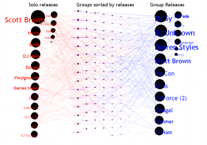
The visualization itself shows three columns of information. The first shows every artist and a circle. The size of the circle represented their number of releases under their solo name and all their solo aliases. The third column had the artist, but this time their circle represented the number of tracks released by groups they were in. The middle column shows all the groups, again, sorted by number of tracks released by that group.
One of the main problems I had was many dimensions to my data, and wanting to show all of them. I had things like number of tracks, number of aliases, tracks per aliases, number of groups, tracks per group, members per group, and I probably could have figured a way to see who remixed who (but that might be a separate project…). In the end, I realized I needed to just focus on one piece: how artists were connected to each other through groups. Everything else at that point was peripheral. Unfortunately, I already had a substantial amount of code and couldn’t find myself starting over. I then was stuck with a visualization that wasn’t very scalable (there are still a lot more artists with a low quantity of releases that were not included).
Regardless, I think this visualization is a great start. I’d love to keep working with this data if I had more time, to further realize this vision.
Future Steps:
-Comparison should be much easier. I had a few mechanisms in place, but as the codebase grew, they broke and didn’t scale.
-I’m really interested in the difference of “inbredness” of different genres, so I’d love to throw a couple of these next to each other.
-The current visualization isn’t scalable at all. I think the best way to scale something like this would be to use something similiar to the “well formed eigenfactors” visualization we saw, though, I’m still unable to conceptualize how I could tie my data into that.
Download Source code and Data Files, as well as the song used 🙂

Hi Jordan – here are the comments from the PiratePad from the crit:
What do the varying sizes of the circles represent?
How are the pieces in the middle arranged?
Interesting that the more successful his visualization is the less interesting it is visually. If he’s right about Happy Hardcore there aren’t many nodes.
As a reminder – Jordan placed his dot so far away from beauty it was outside the triangle.
It looks like there are fine lines connecting the circles… I wish I could see them better…
– maybe it’s a projection issue.. I would imagine the lines are solid on his screen
🙂
Its a little hard to read the names over the dark dots…
I think theres a lot of potential for interactivity and exposure here. Have you seen http://www.thesixtyone.com or justwatchthesky on Tumblr? I think if you had the same kind of exposure aspects it’d become really useful.
Interesting premise for an investigation. I like that it’s driven by your personal interests, and designed to test a real hyporthesis. Also, I’m reminded of a recent visualization about the collaborativity of the beatles: http://www.mikemake.com/#72772/Charting-the-Beatles –GL
Very interesting data (I’ve actually heard of Scott Brown!), but your chart is a little difficult to read. Ah, I just noticed, when you moused over some of the nodes, a description popped up, that’s a bit better–but I still think it could’ve been represented more clearly, maybe something like the way the site posted above did. 🙂 -Amanda
The interactivity (hover-overs) is helpful here, not gratuitous. The fact that it helps you discuss the genre itself means the visualization is working. It’d be cool if you could work the music samples in themselves somehow (does Lala have an API?) -SB
I agree that the interactivity helps, still, a PDF version would be nice. Resolution is an issue. Why only an interactive version? the overflow at the top is especially annoying. Also, how did you collect your data?? You never explained this. –GL
Jon asked: What is your actual set of conclusions, that you were able to make from the visualization?