tesh-LookingOutwards04
Hyper-Reality


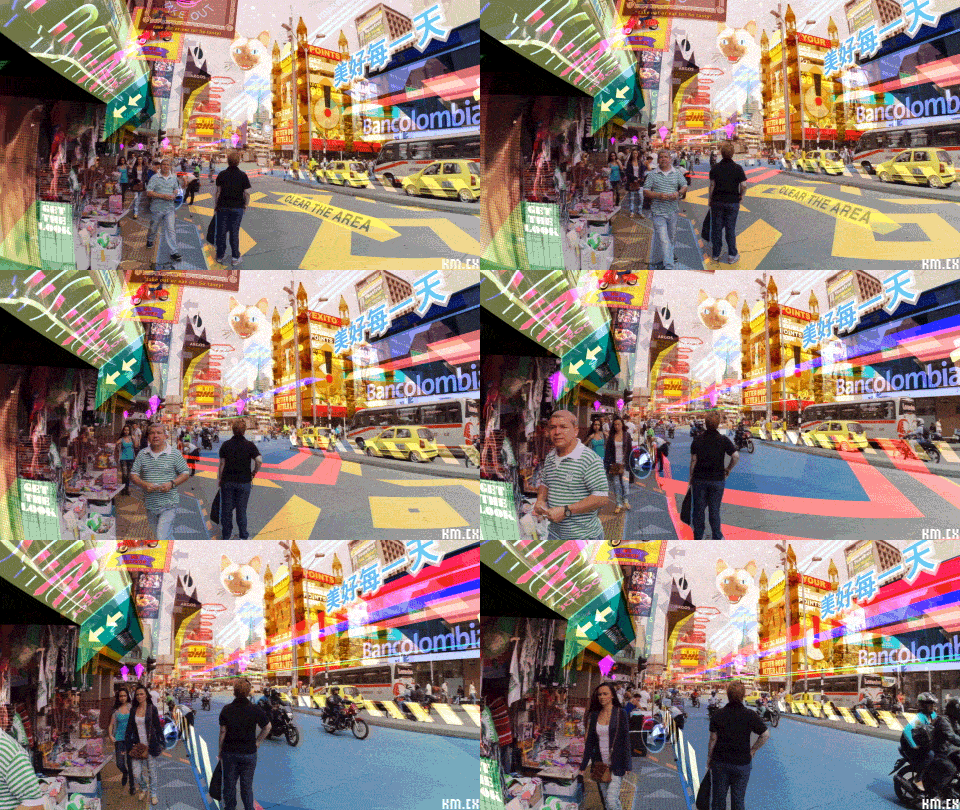
I thought this piece was really interesting because of how Matsuda takes ways advertising is already used today and pushes it into an AR space. He represents this twisted future with such bright colors and text overlays in a way that seems oppressively energetic. The way Matsuda designs the UIs for these complex mock AR/VR systems is incredible, as he takes time to keep them consistent and make sure that they have a similar language of colors and fonts throughout the film. This is especially apparent near the end of the film when the interfaces start to glitch out and fade into one another, but because they are all in such a similar style it actually takes away from some of the shock of the phenomenon (especially since the film is already so consistently busy.)
