Loop Reviews
Our external reviewers for the animated GIF Loops are Saskia Freeke (SF) and Marius Watz (MW).
Saskia Freeke is a lecturer in Physical Computing at Goldsmiths, University of London. She is an artist, creative coder, interaction designer, visual designer and educator. Her art work focusses on structure, geometry and playfulness. A big part of her artistic practice is her ongoing daily art project that she started January 2015, in which she explores and experiments with generative patterns and animations.
Marius Watz is an artist working with visual abstraction through generative software processes. Based in Oslo, his work focuses on the synthesis of form as the product of parametric behaviors. He is known for hard-edged geometrical forms and vivid colors, with outputs ranging from pure software works to public projections and physical objects produced with digital fabrication technology.
aahdee
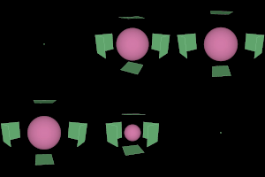
SF: The expanding motion works well, but the transition back lacks smoothness. Aesthetically it can be more surprising.
MW: Technically proficient, but falls short of optimal visual impact. Could use more camera action and visual detailing.
GL: Colors could use refinement; just not as carefully selected a palette as it could be. The motion quality is decent. The “characters” and “story” (a cube and a ball; the cube forms to enclose the ball) are bland and kinda forgettable. If you choose such anonymous forms, one has to work much harder to make them distinctive.
ackso
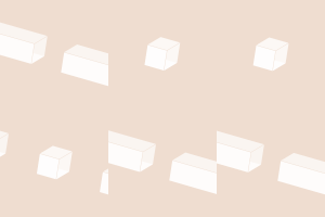
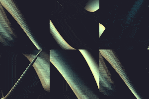
SF: The immersive space you want to show in your gif is present, but lacks a bit more depth and excitement. The gif has a start and an end, not looping. Missing sketches in your documentation.
MW: Clever use of gradient artifacts, but more could have been done with them (colors? pulsing grays?) The ending seems anti-climactically slow, since the viewer already knows what to expect.
GL: This design looks sharp and communicates a pert, clean, timeless concept. Alternating black cycles and white cycles could add even more intrigue to an already captivating design. Unfortunately, the big, big problem here is that there are no cycles at all. (What?) Ackso, check carefully: your looping GIF does not loop. You had one job, as they say; the brief was to make a looping GIF. Either you failed to notice that your GIF did not loop, or you noticed that it wasn’t working, and you were somehow able to live with yourself leaving it that way. Perhaps you think this is no big deal: shrug. I must tell you: in my opinion, this error represents either a gross inattention to detail, or a catastrophic failure of execution. This is a special pity because, as I’ve tried to make clear, the project is otherwise quite elegant.
ango
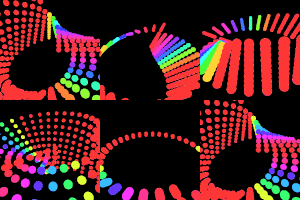
SF: The motion feels relaxing, in contrast to the bright changing colors. Composition in the frame could be better. Great process documentation.
MW: A lot of wins here: Attractive disco flavor, color scheme and geometry cleverly selected for loopability. Props for in-progress documentation showing exploration of the form, also for name-dropping the original geometry OG, Paul Bourke.
GL: I appreciate the research and creative exploration demonstrated by the process documentation. There’s a good illusion and variation of depth here. But the final disco image is somehow predictable, and (IMHO) junked up. It seems to represent a regression to an easy hit (rainbows!). I was sorry to see that you gave up on your original concept of a ball traversing the Mobius strip.
conye
SF: The gif is eye-catching with the use of colors and simple shapes. Simple concept idea that is executed well and good documentation with initial sketches. However, the final gif is too big in size and doesn’t want to load well.
MW: I don’t see any weaving dogs, but the animation is plenty pleasing, nonetheless. The back-and-forth motion feels unexpected, improving rewatchability. (Tip: Use floats for timers and angles throughout.)
GL: Your sketches (depicting dogs’ assholes, Conye!) have much more charm and originality than the final result — to a profound degree. You are good at art, and good at coding, but you will be good at creative coding when you can bridge that gap much more fluently. Next time start with the thing that makes the project unique (e.g. the dogs). Nice c0lors btw.
creatyde
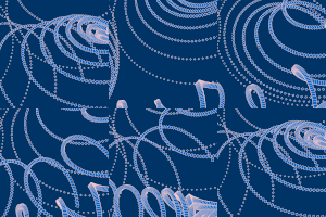
SF: The gif feels very poetic and has a nice analog feel to it. Aesthetics works well with the image used for the contours. Transition could be more dynamic and tell something more next to the image.
MW: Excellent technique, bonus points for bringing in a drawing and reconstructing it to be used as source material. Animation doesn’t quite resolve, however – it feels tentative. Embracing glitch and drawing multiples might have been better. (Technical: Using noise background is bad for animated GIF, as it maxes out file size.)
GL: Ambitious technical exploration. Lovely drawing. Poetic result. The image noise is a choice I probably wouldn’t have made, since it bloats the GIF’s file size and reduces its legibility and contrast. I would have been interested to see you manipulate the shapes of the lines (computationally), and not just their size and position.
dechoes
SF: The contrast of the pastel color next to the animation, that mimics some kind of tension, works well. The “explosion” could be stronger.
MW: Charming animation, imbuing inorganic objects with organic qualities. Excellent use of motion to communicate tension.
GL: Good clean fun, well documented. You learned a lot.
farcar
SF: The gif is very dynamic, colors work well and the motion is very well executed. The shapes are simple but have a great expression.
MW: Classic topic – it’s a fish eat fish eat Pac-man world. Effective use of color and simple line style, the particles emphasizing the “chomp” moment are a great touch.
GL: Snappy execution. I wish there were more surprise. Like: every 15th time, it’s a square fish instead of a circular fish.
fatik
SF: The two gifs have a great similar simple aesthetic. The motion is simple but both have a interesting element in them. Concept could have been stronger if you focused on one idea and experiment further with that one.
MW: Lovely work. Simple but effective, with subtle use of geometry and color. Still feels a little too static, could do with a more dynamic composition. I’d suggest Swiss typography, Saul Bass etc. as further research.
GL: Strong graphic aesthetic. The visual concept is clean but could use more of a “hook”: a contradiction, a puzzle, an illusion, a joke, a loss and regain of synchronization, etc. This needs further development.
jackalope
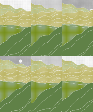
SF: Motion of the lines is very smooth, a bit in contrast with the blocky texture and the noise. The top part of the gif is interesting, but the lower part doesn’t add much to the composition and feels less natural.
MW: Lots of good elements, but doesn’t quite come together. Landscape metaphor feels mixed – the sun is realistic, but why do the hills move? What are the different layers of foreground? Props for hatching effect, this could be used to great impact.
GL: Fine work, glad you got the seamless noise working so well. Fine ambition. Good colors.
joxin
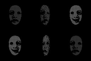
SF: Simple elegant final result. The two different masks out of dots work well and have a nice transition. Concept is well explained in your documentation.
MW: A good idea, well-implemented. The use of a point cloud is excellent, lending itself both to creative expression and ease of animation.
GL: Very well done.
kerjos
SF: Simple and interesting concept you created into a gif. It has a nice composition that looks like a big room/space you are looking at. However, the images are a bit small and you have to look at it for a while to understand what is happening.
MW: Elaborate setup, but the piece ultimately doesn’t make sense. What is the intent? It feels like a forensic animation or documentation of an installation, not a piece in itself. The Muybridge hints at something, but it isn’t delivered.
GL: The concept is confusing. As in, it’s complex and I don’t quite get what’s going on. Next time: more sketching before you commit to code. It’s an interesting ‘failure’: your craft is (really) totally fine, but it has been misapplied, because the problem is how effectively your overall design communicates what you’re intending.
miyehn
SF: Dynamic and organic movement. The color, lights and movement work well together. It is a bit glitchy but gives a nice feel. Good explanation in your document.
MW: Oldskool demo scene style. The moody lighting and subtle color surfaces make the piece, the trick of using multiple spheres to articulate a loopable form works very well. Moments where the fading lights and nearly-disappearing form are near sublime.
GL: Good exploration, with a muscular approach to composition in the frame. You’ve managed to wrench some character out of Lissajous figures, too, which is difficult to do.
ookey
SF: Simple idea and simple final result. The gif works well as a loading animation, the transparency gives a nice touch, but there could be more excitement added.
MW: The inspiration is good, the execution appropriate (nice easing!) But a lot more could have been done in a week, an easy win would have been in-progress research and different forms using the same timing.
GL: Good motion, though I’m not sure why it’s stuck at 4 o’clock. This feels both well-executed and unfinished, like it’s a tiny piece of something much larger and more complex. Needs to be pushed to be 100x more interesting/insane. The blue is quite corporate. The design is polite.
phiaq
SF: Great sketches and well translated to code. There are simple transformation of shapes, but has a great difference in the outcome. The motion is a bit too static and could be more organic.
MW: What does the fox say? Charming piece showing good understanding of character design. The use of transparency for a reveal nails the piece, allowing the viewer to see both the construction of the form and hint at a duality of character.
GL: It’s not about to go viral, but it shows attention to detail and care.
rolerman
SF: Simple idea developed from your inspiration. The motion and composition in the frame works well. Great sketches showing your progress.
MW: An adequate exploration, but it feels like it stopped just when the tools for something more interesting was in place. The path-following trick can be extended to all types of parameters (shape, color, sizes.) That would be a good place to explore next.
GL: It’s a good start that deserves to have been pushed into more interesting territory. Simple things like varying the size of the squares over time (perhaps resolving to the same size ultimately) could have added interest.
sheep
SF: Aesthetically it looks well designed and there is a lot dynamic motion. As you explained: many easing functions. Only there is a concept missing or what you wanted to express, as it is not clear what the gif shows, besides the abstract shapes.
MW: Charming and quirky animation, nicely consistent visual language. The short-and-sweet timing is also more in keeping with most ani-GIFs as seen “in the wild”. One drawback: The skinny lines (shadows?) pointing downwards feel a bit like they might be rendering artifacts.
GL: On first blush, the most sophisticated piece in the class. On second consideration: why should I care about this design? Clearly, you enjoyed working on this. But missing a story, it feels like empty calories. Obviously very tight and masterfully controlled, and yet — it’s candy. Study the work of Vectorpark to see work that is both illustrationally clean yet emotionally gripping.
tesh
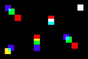
SF: Quick changes happening in the gif, the easing of the movement fits well. The change with the purple shapes and the moving out is too quick. There could be more easing in those purple shapes motion.
MW: This GIF starts well, but feels like it could have been much more. The square is a fun primitive, the “popping” rotations are charming. But it all stops before you get to enjoy it.
GL: Tight, but: maybe a little too fast-paced? I feel like the transitions happen too quickly for me to follow. Where does the mauve background come from?
tyvan
SF: Great concept with the tiled gifs. The motion of the big white circle works well. It is not clear right aways that the white circle is bouncing on the orange circle, as the blue circles distracts you. So aesthetically it could have been stronger.
MW: Simple and elegant. The use of elements passing off canvas to make a tileable animation is very clever, and would make for an appealing web page. Still, as the project notes suggest, a bit more detailing (shading, more change over time?) would have made it even more compelling.
GL: Courageous — to trust that tiled images will all loop at the same time. It’s an ambitious project and well conceived — an image that loops both in space and time. The movement of the white ball is clunky, and could be more nuanced.
zaport
SF: The composition of the shapes are dynamic and interesting, but the easing isn’t smooth. This gives a unsettling feel to it.
MW: The use of trigonometry to create a sinuous form that lies partly outside the canvas is appealing. Unfortunately, the overall feel of smoothness ultimately breaks down by jerkiness of motion once the form appears to “fold” back on itself. Experimenting with a more “predictable” parameter range might resolve this issue.
GL: This piece is forgettable, but you needed to make it — as a part of working towards developing fluency with code. Not every utterance is a moving oration. Shelve it and move on. You need more practice using graphics transforms (translate, rotate, scale).
zbeok
SF: Simple and nice color palette. The motion and use of recursion is simple, easing out is too simple. Gif could be more dynamic and lacks some expression.
MW: This binary tree (slash Cantor Set) is made utterly charming by the clever fractal repetition of circular forms. The use of differing stroke weights to emphasize inside/outside is a a great choice. The only complaint is the “readability” of the forms in its final iterations, and might be resolved by scaling and offsetting in from the frame of the canvas.
GL: Super elegant project, lovely and interesting. The reverse direction is a dirty hack that does not live up to the perfect execution of the forward direction.
avatar
GL: Funny, charming, unusual, idiosyncratic. I wish our external reviewers could have had the chance to see it.
