Category: LookingOutwards07

Zarard-lookingoutwards07

A visual study from the artist on coherence, plausibility, and shape.

I decided to look at Moritz Stefaner because he created one of my favorite data visualizations, Selfie City. While surfing his website I found to OECD index visualization

Countries represented by their wellness components.

THIS IS SUCH A GOOD DATA VIZ. The link to it is here: http://www.oecdbetterlifeindex.org/#/11111111111

It uses a flower. Flowers are pretty and aesthetically pleasing but also simple enough of a shape to still be legible. Additionally each petal represents a different factor in wellness for a country. Not to mention it is interactive and customizable. People are much more engaged when they can see how the data relates to them personally. I think that might be one key insight that will stick with me through my data viz pursuits.

Darca-LookingOutwards07

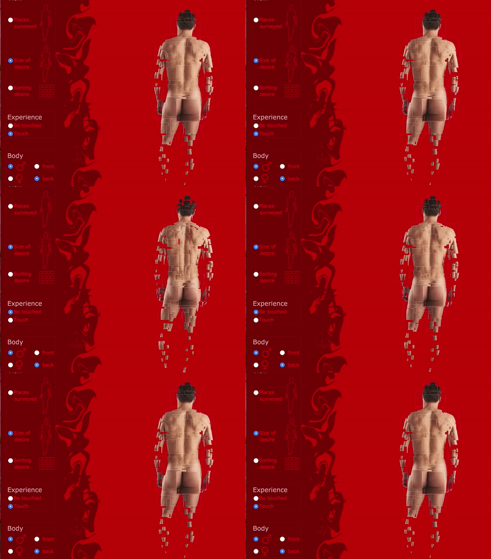
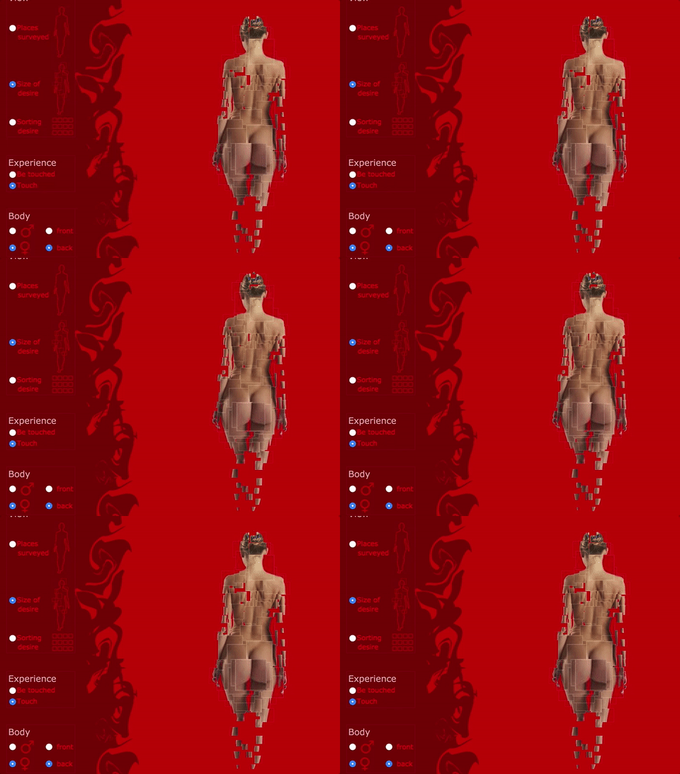
Fleshmap by Fernanda Viégas and Martin Wattenberg

Project homepage: http://www.fleshmap.com/index.html

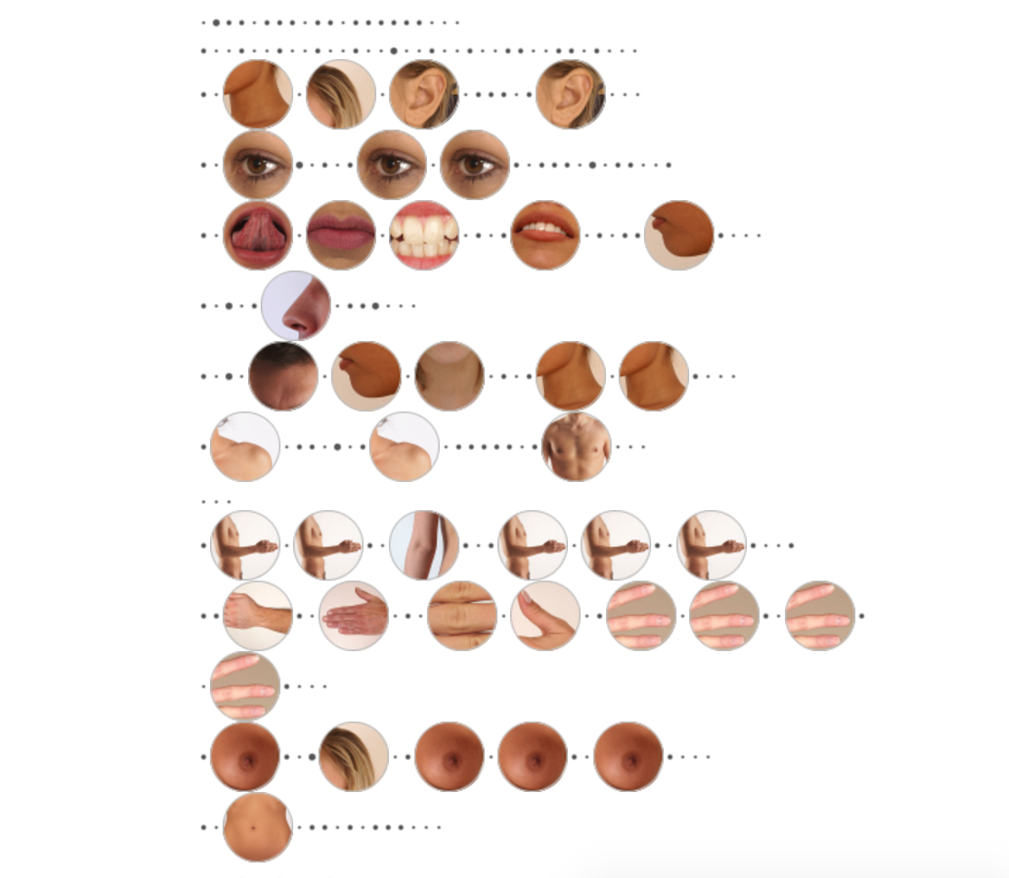
Fleshmap, in the creators’ words, is an inquiry into human desire, its collective shape and individual expressions. In a series of artistic studies, exploring the relationship between the body and its visual and verbal representation. It contains three parts: touch, listen and look.

I appreciate it when a data visualization tells me something new from what I think I know, or what I cannot understand as well by living a life as myself. Playing with the results feels like an open and impromptu discussion with friendly strangers about an intimate topic, full of little surprises, eccentric but intriguing. It tries to explore the secret of human desire, by breaking down the basic senses, examining both the collective patterns and individual uniqueness, abstracting data from real human emotions, to put together images that represent the answer that lies in itself.

It’s fascinating to see the difference between the provider and the receiver in the interaction of touching, for both men and women, that human desire can be different from different ends. It’s not symmetric and opens up the question behind the result of touching areas but what leads to this result that is more complicated than physical interactions, in this case, touch. The origin of it all is that the heart wants what it wants.


anson-lookingoutwards07

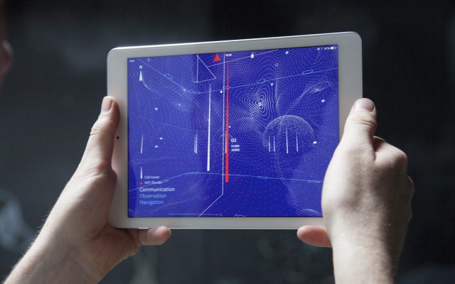
The project I’ve chosen is The Architecture of Radio, by Richard Vijgen. I’m very interested in projects which take the site as an important element in the experience. I’m less interested in visualizations or experiences that take place within a closed loop of user-to-device, and more engaged with hybrid works which connect directly to the physical environment / actual time / specific location of the user.

This project is a site specific iPad app that visualizes what is normally invisible to the naked eye – the network of networks that surround us all the time : i.e. cell towers, wifi routers, satellites for navigation, communication, and observation. The project was created using Three.js and the Iconic Framework (for apps), and utilizes GPS to find cell towers that are within reach from OpenCellID.

I believe that this project taps into an important gap in many people’s knowledge – understanding just how intertwined we are, how surveilled we are, and how we depend on this invisible network of information pathways to inhabit our contemporary always-on, always-connected, and always-observed society. As data privacy and cybersecurity become increasingly problematized, educating the public about the “invisible” structures around them, and how to navigate them safely, will become (has already become) paramount.

This sentiment is alluded to in Business Insider’s review, which the artist uses in their documentation (and therefore believes to be important) : “Both beautiful and slightly disturbing.”

The physical act of holding up an iPad in public space is a bit ridiculous, though, so I think the project could consider alternate, more seamless ways of engaging with the information. And to this end I would suggest Augmented Reality, or Mixed Reality, specifically the Hololens, but to posit that the Hololens is a “seamless” experience, or non-intrusive, is a fallacy.  If Magic Leap releases what they propose to be developing – this experience would fit right in.


Clacker- Looking Outwards 07

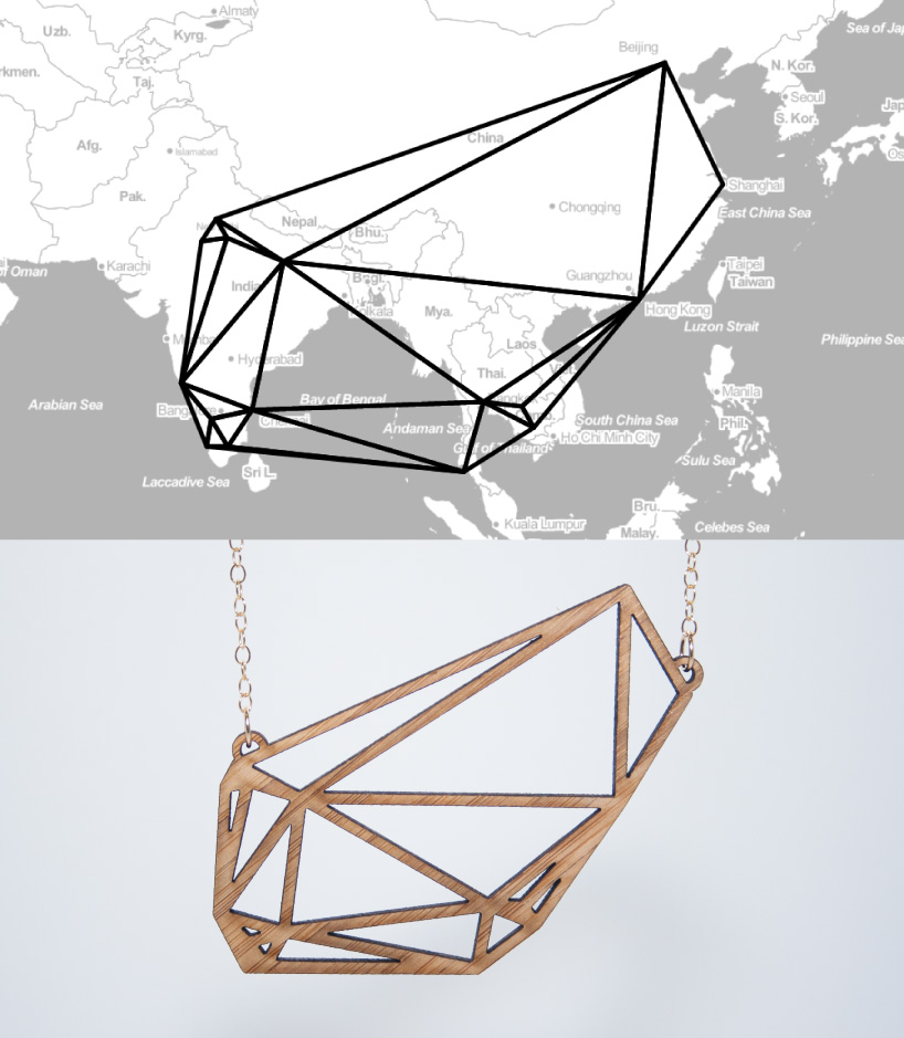
Meshu is a project by Rachel Binx that uses data visualization to make custom jewelry. By connecting Meshu to foursquare, the shape of custom jewelry is determined by ones foursquare check ins. A line is drawn between each point an individual has checked in at, and the resulting polygonal shape filled with lines and connections is a representation of where they have been. It can be printed in acrylic, wood, nylon and sliver. This project interests me because it taps into numerous aesthetic and design tropes that people are curious about in contemporary culture, and pushes them one step further. Custom 3D printed jewelry is a preexisting commercial market, though the ability to print the same shape over and over does not leverage the 3d printer as a unique tool. This project also taps into a contemporary desire to visualize ones self and share that with others. Using tools like foursquare allow people to be both unique and connected. Large-scale data visualizations have also become an entire field of work and a recognizable aesthetic. This project wraps all of these common themes into one art project and the final result is both practical and poetic. 

See the project online here. 

meshu

bamboo_diptych_lores

hizlik-lookingoutward07

138 Years of Popular Science    Jeb Thorp

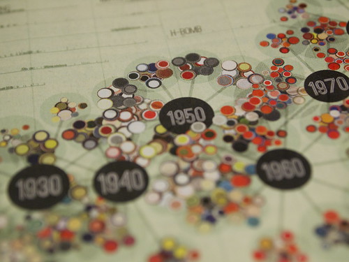
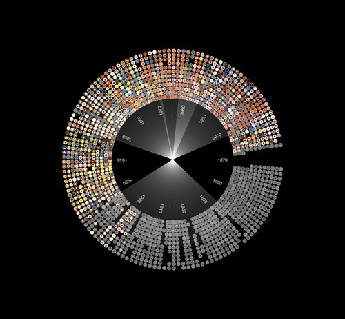
This was a project that caught my eye as I searched through the works of the several data-vis artists and designers listed on the lecture page. I personally have read many pop-sci magazine articles in the past and, along with Wired magazine, value their views, opinions and news regarding the technological and scientific world, past, present and future. Therefore I was interested in what parameters Jeb was considering as the data for his visuals (there are so many things you can compare with 140 years of magazine data). He decided to create a visualization based on terms used throughout the years (“Radio-Television” for example). Although I personally think this is an ok but not best choice, I can’t think of anything cooler. However, I really enjoyed his method of visualizing this massive amount of data. According to his detailed documentation, he wanted a DNA-structure for the decades, with clusters of years surrounding each decade, and within each year is a circle that represents a separate magazine article (and the circle color is dependent on the dominant color on the article cover).

I personally love the final structure, but am unsure about the colors still. Although it is a culmination of all the dominant cover colors over the decades, the overall pop-sci page feels very dull/muted. Perhaps a pure-white background would help pop the cover colors more, or using color in the metadata/term text surrounding the structure? Not sure. I do love his many forms of designing the final structure, including this one “diversion” as he calls it.

You can view more of this project at his blog post. I have been looking more at his other works too and really enjoy his visualizations. I could love to actually pick up and read this page from the Pop-Sci magazine though.

ngdon-LookingOutwards07

All streets limited by Ben Fry

http://3rdfloor.fathom.info/products/all-streets

This visualization simply draws all the streets in the U.S. without any other information such as terrain, boundaries, etc. However we can clearly see where the cities are and how the terrain probably look like from the density and shape of the streets.

I’m particularly interested in this type of visualization because it does not attempt to extract information for the reader but instead let the reader explore it themselves. It has a very simple idea (just drawing all the streets) but has a very complex effect. Different people with different interest can find out different things from the data, and the more you look at it, the more you see.

Also I find the visualization aesthetically pleasing. The way the delicate thin black lines divide the cells when you look up close and the texture of the image when look from afar are really beautiful.


takos-looking outwards 7

I thought that the word tree by Martin Wattenberg & Fernanda Viégas  was really interesting. I’ve always been intrigued by linguistics and the ways that people use language, so I was naturally drawn to it. The particular example image that I included is the data visualization of a set of sentences in which the speaker/writer, a man, reveal in their personal ads that they are married. It’s interesting to see the different ways that different people can go about saying essentially the same thing, and this data (I wish it was easier to read as the text gets smaller, but I couldn’t find anything of a higher resolution) reveals a lot about the people who wrote these adds. For example, you can clearly see that about a third of them were upfront about their marriages, but the others are not. The image is presented as sentences that do reveal that men are married, but only one occurrence of the word “married” is very apparent, which means that the other mentions are hidden deeper within the sentences and kind of hidden. I also thought this chart was interesting in that it ties in extremely well with Markov chains that are construction sentences. If you inputted the same data in a Markov chain and made a sentence from it, you would be able to track the new sentence through this chart, because it shows the likelihood of the groups of words that come after other words.


Drewch – LookingOutwards07

When I think of the power of information visualization, I think about how it can be used as a way to show data in a convincing way to force people to rethink what they thought they knew. I’m not really interested in seeing the latest stock projections, or pro-baseball player stats updates, or Citi-bike riding statistics. These sorts of visualization have their own merits and uses, but I’m interested in seeing information about infrastructures, politics, philosophy, and everything that people take for granted. Choosing an artist/designer to talk about here is a little bit challenging for a couple reasons.

I’m not sure if I should be looking for aesthetically and compositionally impressive charts or for meaningful (that’s subjective ofc) information. Maral Pourkazemi does both well … I think … probably…

download
http://monoment.io/9-questions/

In his piece, 9-Questions, Maral Pourkazemi created 9 statements, all of which really got me thinking. What answer would I pick? What answer did others pick? Does that data even matter? It is very interesting to me how he is able to accomplish what I said earlier about “forcing people to rethink what they thought they knew” without visualizing any data at all.

Food&DrinkRGB-01.jpg I like his other work too, aesthetically, but 9-Questions is the sort of stuff that gets me going.

Jaqaur – LookingOutwards07

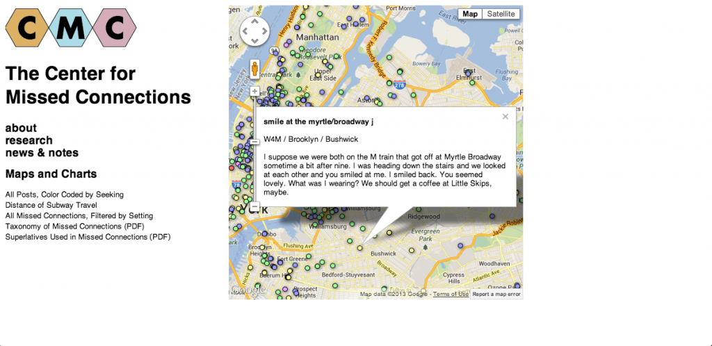
http://lifewinning.com/projects/center-for-missed-connections/

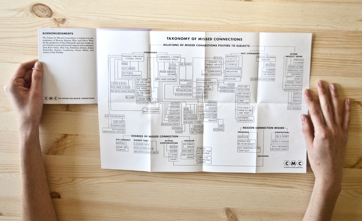
I chose to write about Ingrid Burrington primarily because I love her website, resume, and general sense of humor. That being said, I also really appreciate the cool projects she has done, many of which are not really data visualization, but just humorous or nice-looking things. One project that is a little more data-visualization-y is “The Center for Missed Connections.”

5

It’s an art project disguised as a think tank dedicated to the study of loneliness in cities. It comes in the form of a booklet full of maps, charts, and forms, and while these may be a bit fictionalized, they are still presented as one would present real data, and it almost takes more artistic and critical thinking to fictionalize and plot data than to just plot data you got from somewhere else. Perhaps a little off-the-mark for a data-vis Looking Outwards, but I think it is still a nice project, whose real value comes not from the “data” but from the idea behind studying loneliness in the first place.

9

Keali-LookingOutwards07

entangledwordbank6

entangledwordbank9

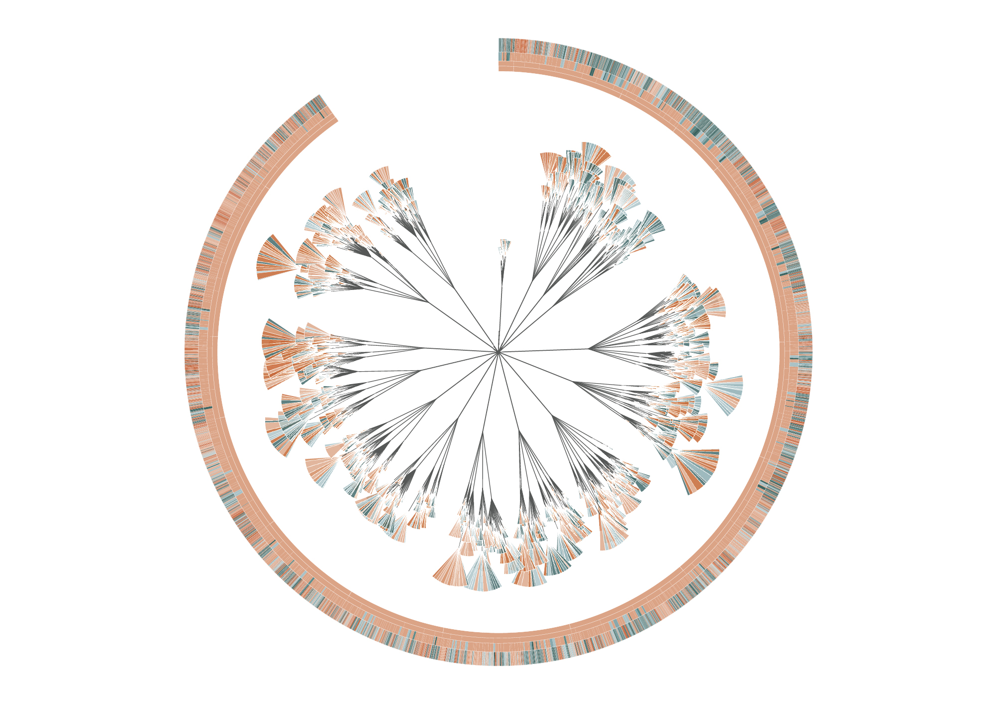
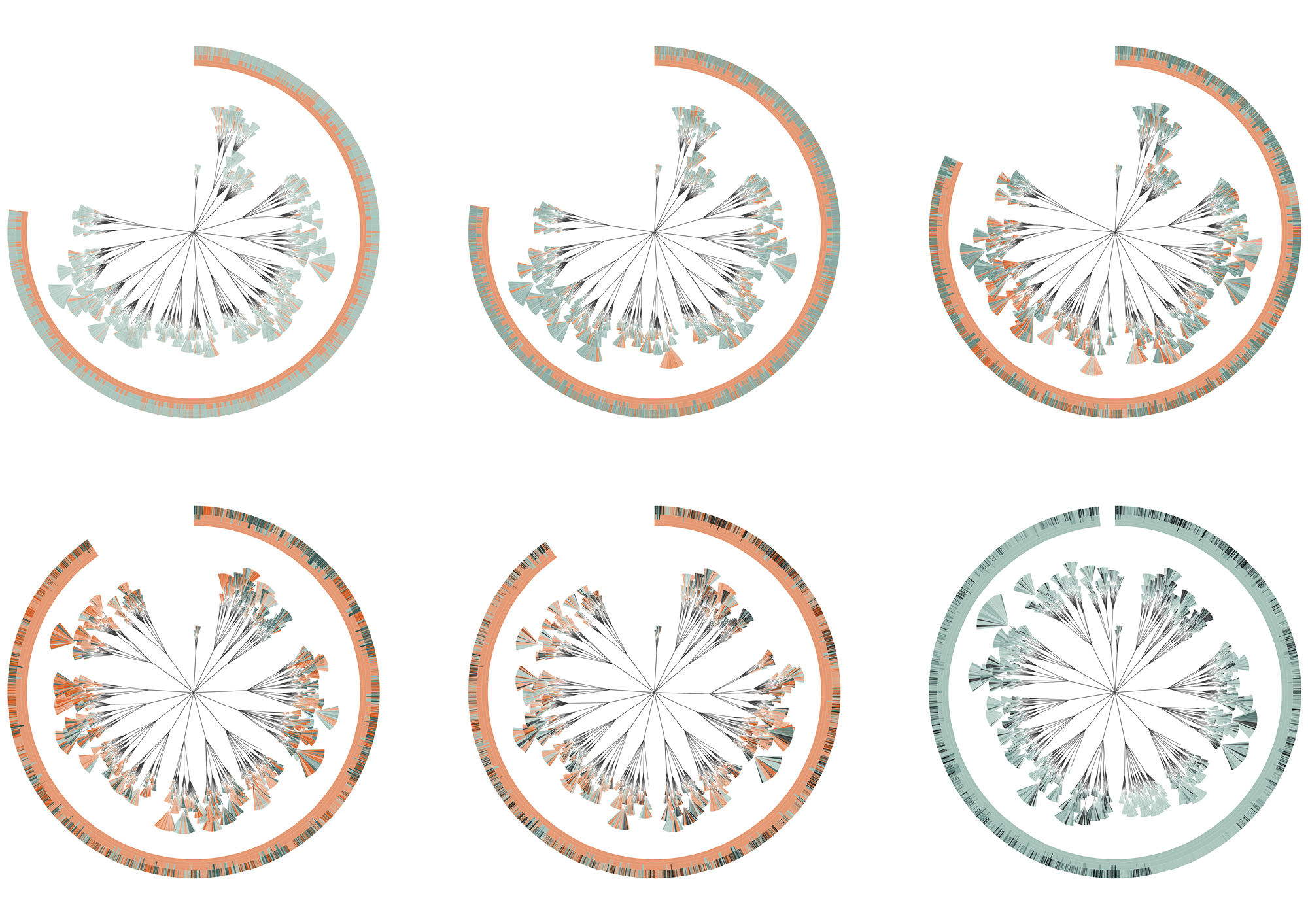
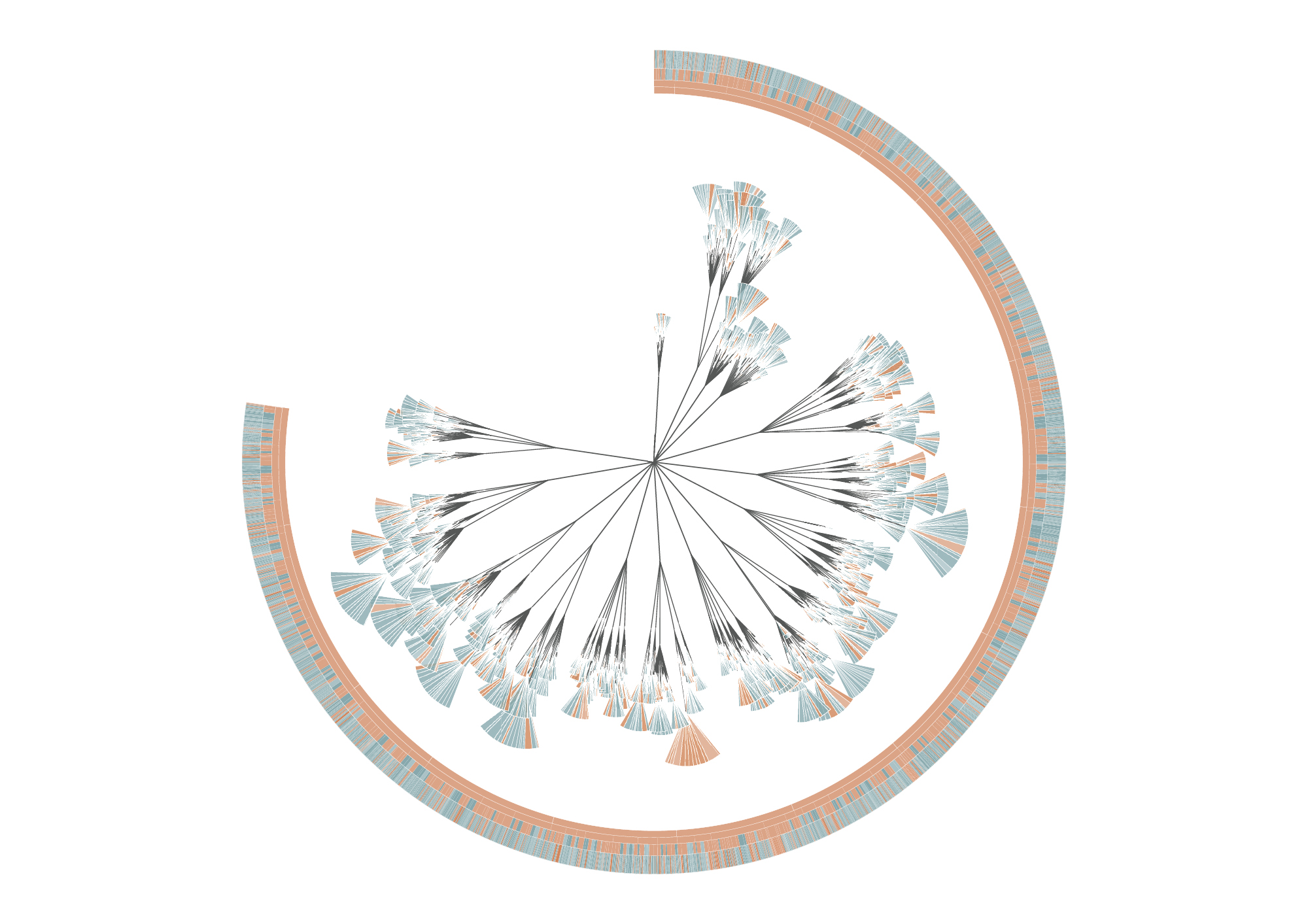
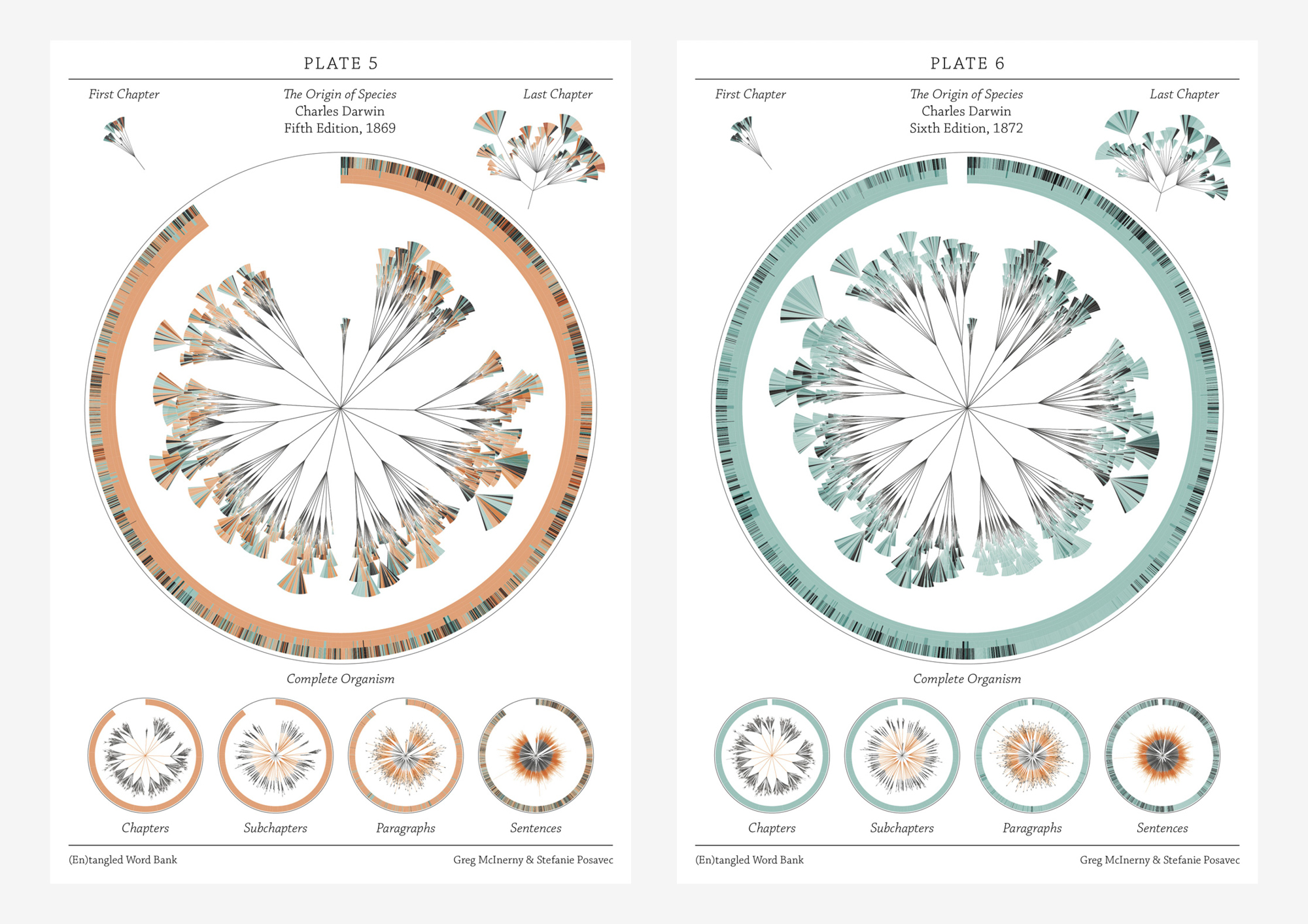
The (En)tangled Word Bank is a collaborative project between Stefanie Posavec and Greg Mclnerny that visualized the insertions and deletions of text through the six editions of The Origins of Species by Charles Darwin. Each diagram represents an edition of the series, and is modelled on the ‘literary organism’ structure used for On the Road by Jack Kerouac. The visualization essentially represents the meat of the text, where chapters are divided into subchapters (as per Darwin’s original text), and these subchapters are divided further into paragraph ‘leaves’; the small, wedge-shaped leaflets represent sentences, where they are colored according to whether that sentence survives to the next edition (blue), or deleted beforehand and not be within the next edition (orange). Some of the executions of the diagrams were published as large banners, where each depicted a specimen plate per edition, mimicking a botanical illustrative design. Each plate shows the original diagram, first and last chapter excerpts from the original diagram, and four extrapolations of the diagram detailing the chapters, subchapters, paragraphs, and sentences in each edition.

This design initially appealed to me from a visual perspective–I hadn’t quite evaluated or digested the data that was being represented yet, and did not really decide whether or not the design template was practical or appropriate for the data subject. I felt it was visually strong–well-executed and very organized without being overwhelming. Upon reading the intent and description, I feel what is the most successful and amusing aspect is that the tree structure is used to represent The Origin of Species of all possible texts: there is the implementation of nature in both subject and interface, especially reminiscent of taxonomy structures in biological sciences. In this way I feel like the overall design is strong in combining aesthetic appeal with its slick branches and leaves, and relevance to the subject being presented. I also like the layout of the printed banners in organizing multiple circles focusing on different depths of information. entangledwordbank

entangledwordbank2

entangledwordbank4

entangledwordbank8

entangledwordbank11

arialy-lookingoutwards07

screen-shot-2013-01-30-at-12-20-34-am_o

http://rachelbinx.com/Facebook-Stories-Virality


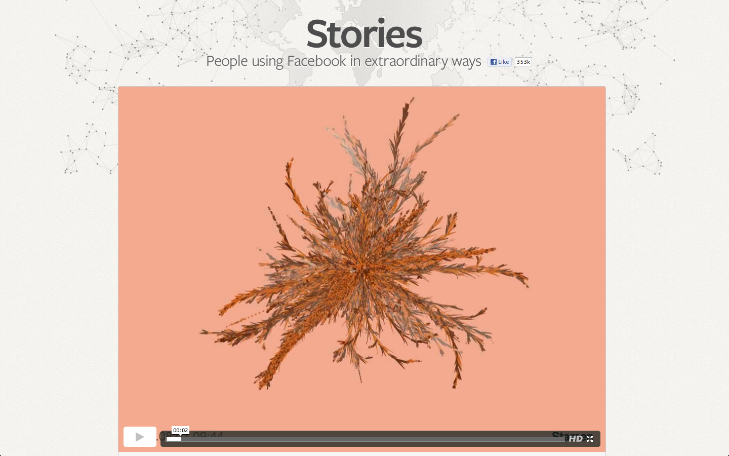
After struggling to create even a scatterplot in D3, I’m mesmerized by pretty much any data visualization. But even without that sidenote, Rachel Binx’s representation of viral Facebook stories is really beautiful. The color choices are well thought out (and it’s nice that the different colors actually reflect the data, in this case gender).

Catlu – LookingOutWards07

Fleshmap (2008) – Martin Wattenberg collaborating with Fernanda Viegas and Dolores Lab

capture

I found the Fleshmap project very interesting because of the nature of the investigation. Sex and desire are subjects that are so embedded in our culture right now, but at the same time they’re still treated with a heavy taboo in regards to talking about sex in daily conversation and with the treatment of sexual education in the school system. Visually I find the first graphic of the most desirable places to be touched (man and woman) to be very engaging, and although the data (from Mechanical Turk) isn’t surprising, it does help the viewer more palpably understand the erotic nature of the data. The other part of the project I found really interesting was their analysis of the mention of different body parts in different genres of music. The information you can draw from this visualization (2nd image), gives surprising insight into the way sex factors into cultural and musical trends. It’s interesting to consider the popularity of hip hop right now combined with the visualization that it’s one of three genres that do not list the eyes as the most mentioned, and instead most mentions the ass, as opposed to the other two that mention hands most. This is fascinating when thinking about how the eyes are called “the window into the soul” and are often associated with love and emotion, while asses are most often are an object of desire. I think Fleshmap is a meaningful project that shows the pervasive and popular nature of sex in the current cultural environment.

Krawleb-LookingOutwards07

This week’s looking outwards, I’ve chosen to write about Stefanie Prosavec, someone whom I’d heard of before, but really changed the way I thought about visualization and introduced me to code.

I first stumbled across her work about two years ago, and was immediately drawn in by the intricacy and artistry of her visualizations, that treated the product as a piece that was meant to be equally beautiful as it was informative. Specifically, her projects: writing without words, which looked at quantifying and visualizing text in a way I’d never seen before.

The visualizations she created were not so much exact and measured as they were textural and interpretive, providing comparisons that could be felt between texts, which created a sort of visual persona for different pieces of literature, and even recognizable visual styles for different authors.

Ironically, her work was created ‘by hand’ in illustrator rather than being coded, and after seeing how powerful this form of visualization could be, it only underscored the importance of programming as a design tool for exploring and communicating information.

http://www.stefanieposavec.co.uk/personal/#/writing-without-words/

Lumar-LookOutwards07

Sob! D3 is……strangle worthy. So much respect. I’ve always loved Amanda Cox’s work. I love it even more now.

(she’s been shown in class – the NY times designer)

Here’s another of her compatriots – SARAH SLOBIN, a data visualist  for Wall Street Journal who calls herself a ‘visual journalist’. She calls herself a visual journalist because at the Times graphics editors do their own reporting, so these are many pieces she herself pitched and produced. Over the course of her profligic career, she has done everything from “infographics that span two pages of newsprint, to long-form multimedia stories to deep data-dives to designing front-ends and coding back-ends, from breaking news to new products.”

screenshot2016-01-01at4-46-19pm

the billion dollar startup club is an interactive, immediately dramatic visualization of the biggest (monetarily) baddest startups around.

Xastol – LookingOutwards07

A project that I’m particularly interested in is Lev Manovich’s “SelfieSaoPaulo” (2014). In this project, Manovich collects thousands of selfies taken from individuals living in Sao Paulo, Brazil and displays them on a building within the city. Although his collection of mass data is intriguing, I’m particularly interested in how he is able to further his audience by involving people of the city. Additionally, the topic of facial recognition still interests me, as his program is able to recognize thousands of selfies (with varying quality of photos).

Another project of his that seems connected to “SelfieSaoPaulo” is his most recent piece, “Inequiligram”. In his project, he collects social media data from New York City, New York and finds patterns of inequality. How he is able to recognize these patterns in such a large concentration of data is astonishing and sets the current bar for mass data collection.

SelfieSaoPaulo: http://lab.softwarestudies.com/2014/06/selfiesaopaulo-new-project-by-moritz.html

Inequiligram: http://inequaligram.net/

Lev Manovich: http://manovich.net/

cambu-lookingoutwards07

screen-shot-2016-11-03-at-2-16-49-am

click above to play around with it 

The prompt for this looking outwards is especially difficulty for me because there are so many great examples out there + I’m very aware of where/how to find many more. I recently found out the co-creator of Processing & founder of Fathom, Ben Fry, attended CMU for Communication Design and CS.

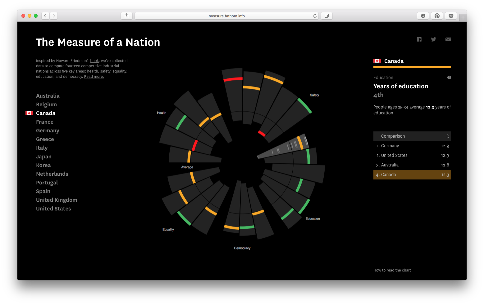
Hence, to make it easier, I decided to scope in and select something from Fathom’s incredible portfolio of work. One of their pieces, The Measure of a Nation, stuck out in particular for both its interesting mobile and web interactions (click here for video) and the ease by which it allows the comparison of complex information.

The piece isn’t immediately ‘understandable,’ and normally that would bother me, but I like that it becomes more comprehensible as you play with it longer. This reminds me of something Dan Boyarski told our C-Studio I class last mini, it went something like this:

‘Have a conversation with the viewer […] provide them the respect to believe they can come to understand your message […] it’s not necessarily a bad thing if your work asks something of the viewer’


kander – LookingOutwards07

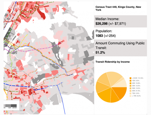
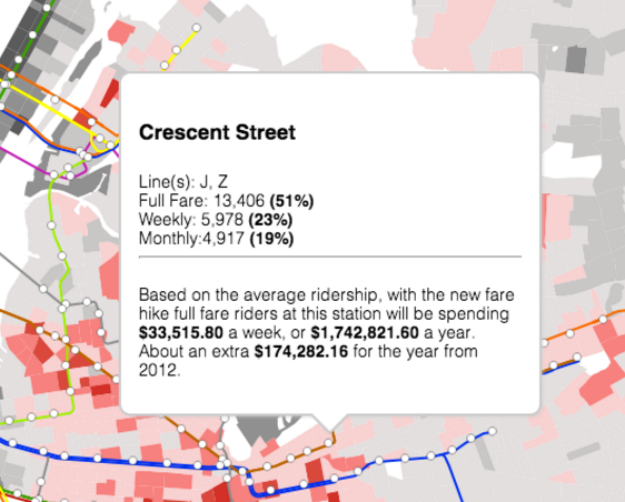
For this Looking Outwards assignment, I looked at the work of Ingrid Burrington (who, it should be noted, has”lifewinning.com” as her web domain name). She doesn’t focus exclusively on visualizations, but she has a really interesting map-based visualization that seeks to measure the impact of a hike in the public transit fare in New York City. There are a few issues with the visualization, and I think it could be synthesized a little further, but I enjoy the nature of the data that she chose to analyze.

Burrington’s map allows you to zoom in and out of different areas of NYC, which is broken up into it’s different census tracts. Mousing over a tract brings up on the side information about the median income (the map is also color coded based on this data), percent of public transit uses, income of those riding public transit, and population. Clicking on a station brings up a little pop up that tells you the type of pass bought at each location, the total increase in spending by full-far riders that would result from the pay hike.

Visit the project here

info_vis1

info_vis2

I think there are a lot of parts of the visualization that could be less confusing. First, it might be a good idea to break it up into several visualizations — perhaps one about ridership and types of passes and one about the pay hike — or otherwise have a way to pare down the data that is shown. Additionally, I don’t feel it was necessary to color code the subway lines (maybe if I was a New Yorker, I’d feel differently). I think it adds confusion.

I also think that this high number of types of of data muddies the message, and drowns out perhaps some more interesting facts that could be drawn from the visualization. For example, it might be far more revealing to have a visualization that shows the ratio of average cost increase per public-transport rider to median income of the area. Or perhaps a comparison between the amount that an area would pay and the percentage of the pop. that actually took public transport. It felt like a lot of simpler visualizations crammed into one, but without a larger synthesis.

Still, there are some very redeeming aspects of the visualization. Each of the individual elements is done well and clearly, and the overall aesthetic is pleasing. Public transport fare increases, and which areas would pay the most, is a very interesting data set, because it’s hard to conceptualize how much money actually stands to be made from a small fare increase on each rider. Furthermore, all of this data existing in the same text-based document or spreadsheet would be absolutely impossible to interpret, so this visualization is definitely a step-up.

Additionally, I perused other parts of the website, and I love the informal, ever-so-slightly flippant style in which she writes and speaks (the use of the word “hella” in a description of one of her projects really sealed the deal for me). Her Seven on Seven talk with Meredith Whittaker, which includes a discussion of magic, is pretty cool as well.

Antar-lookingoutwards07

Chris Harrison

Bible Cross-References & Biblical Social Network (People and Places)

This week I looked at the work of Chris Harrison, a CMU professor for Human-Computer Interactions. I took one of his intro classes last semester and really enjoyed learning more about the history of computer science and how both hardware and software have evolved. While I’ve always understood him to be an impressive researcher and a highly regarded computer science professor, I never knew that he worked in art and design. Of his work, I was particularly intrigued by his work with the Bible. Once I began to look into this piece, I began to understand the dimensionality of professor Harrison.

Created in collaboration with Christoph Römhild, a Lutheran Pastor, the work illustrates the range and complexity of the connected network of information in the Bible. The first piece shows a rainbow of connected verses, where the colour of the arc is determined by the distance between the two chapters. With 63,779 cross reference, the piece is fairly illegible, but communicated the detail of the Bible superbly. I admire Harrison and Römhild for taking the artistic and aesthetic route to data visualization rather than the practical. While religion, and specifically Christianity and the Bible have lead art through the centuries, I think that this piece creates an interesting tensions where the beauty has to due purely with the quantity of the information, and has little religious connotations. While the western christian idealism has been brainwashing the art world for centuries, it has begun to reach the point of being boring and overdone. Yet this work is a refreshing reminder that the Bible can be appreciated for its power, even if you don’t agree with its message or its messengers.

The second piece, Biblical Social Network (People and Places) is equally fascinating and impressive. The graph contains over 10,000 connections and handles the quantity elegantly with the appropriate line weight and opacity. This piece offers for more legibility than the last and can be served to some degree as an information tool. However, the usability is still limited, with only about a couple dozen names legible without zooming in. I think the most interesting part of this was the fact that “Jesus” was so small. While I was surprised at first that “Israel” was the largest, it is perfectly logical.  I also enjoyed the play in figure and ground based on the font/background colour. There’s a luminosity to the information web that taps a bit more into the religious/christian aesthetic.

I think there’s also a quiet elegance to this work that is seen anytime technology is used to create religious art. I believe there’s something interesting to be said about humanity after the fact that we can take this book that is thousands of years old, and translate it in our modern ways to be completely reinterpreted. Even more, this reinterpretation repurposes the Bible from being used as a preaching tool of conversion, to a display of a vast quantity of information. It allows for a new appreciation of just how big the Big Book is. Since the work is largely artistic rather than practical, it doesn’t seek to even inform the reader of the information in the Bible. It simply displays the levels of vastness, complexity and detail for what they are.

Guodu-LookingOutwards07

Nick Felton // Computational Information Visualization
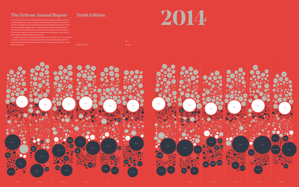
far14_101415a-1-1-1024x640 2014 Annual Report

Nick Felton, or Feltron, is a data visualizer who is known for his personal annual reports of mapping his self-tracked data (how much sleep he gets, how much he codes, where he’s been, how many pictures he’s taken etc.).

I was almost going to write about his annual reports and just how much I appreciate the fact that he has not only visualized data but aesthetically visualized data, but I think this is plain obvious after exploring his website. Feltron has both a code and design sensibility. He’s really the middle man between designers who can’t code and coders who can’t design. Goals.

PhotoViz Book
screen-shot-2016-10-30-at-9-56-39-pm

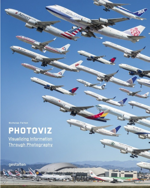
I then became really interested in PhotoViz, another project that was just released in May 2016 that explores the intersection of photography, infographics, and data visualization. Trying to find out what’s inside the book, I think it’s more of a collection of other people’s work, and I’m not sure if Felton included any of his own projects related to photographic data viz. I’ll have to purchase the book to find out.

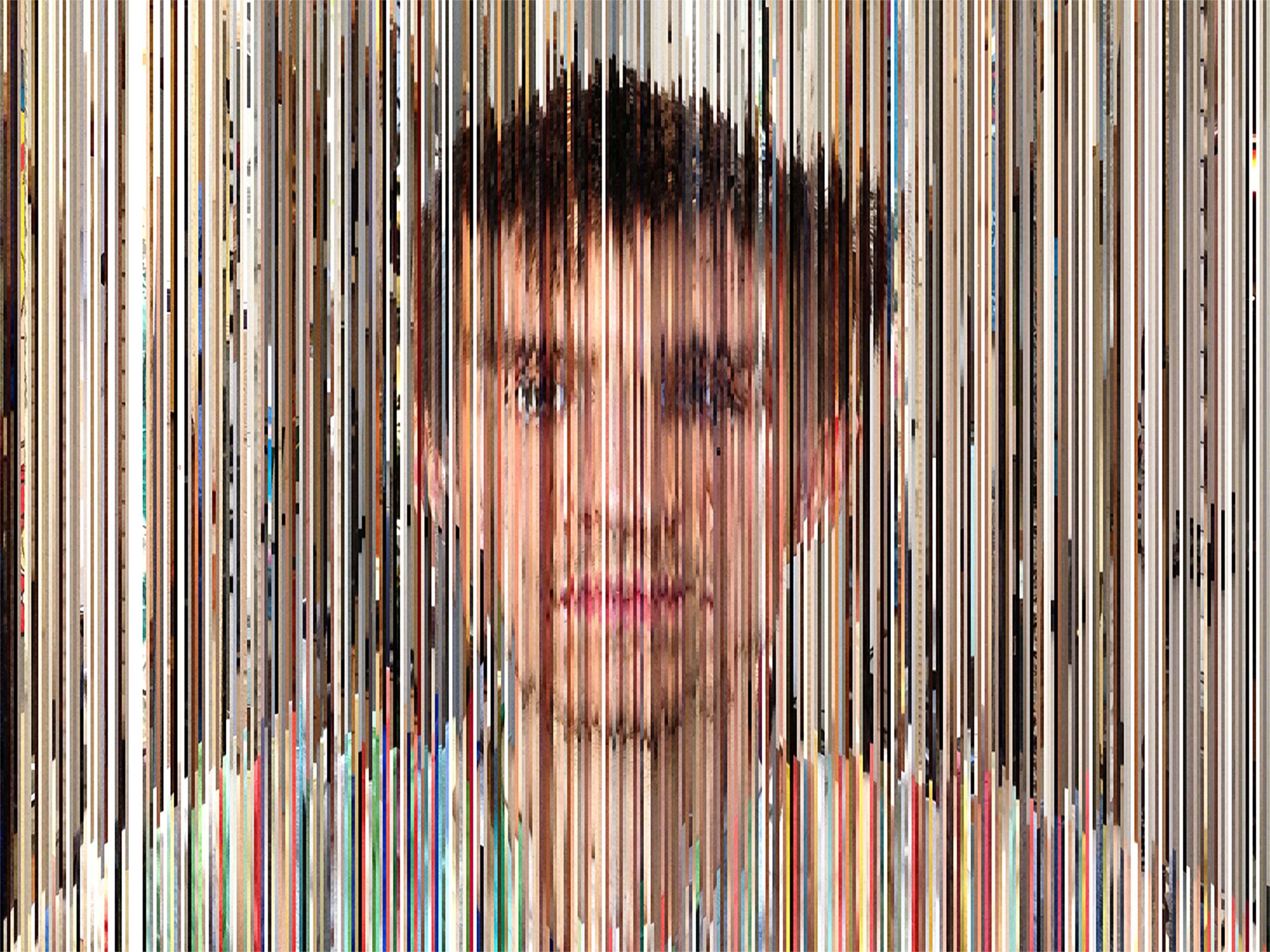
What’s fascinating is that with the proliferation of smartphones and thus amateur photographer with selfie taking abilities, people aren’t just taking photos at one decisive moment where they are limited to only 10 shots, they are taking many photos because they have cloud or 128gb of storage and need. There’s even cameras that are persistent cameras, meaning they can take a picture every few minutes for let’s say a month or year. It’s almost like surveillance and it’s meant to document rather than to artistically frame a shot. “In 2015, people around the world took a staggering 1 trillion photographs, according to research firm InfoTrends. By 2017, 4.9 trillion images will be stored online” (source). This opens up a lot of conversations about what to do with all this data and how to tell the story or identity that this data represents.

The overlap between photography and data visualization is blurry, and that’s what PhotoViz is.

photography <———–> data visualization <———–> code

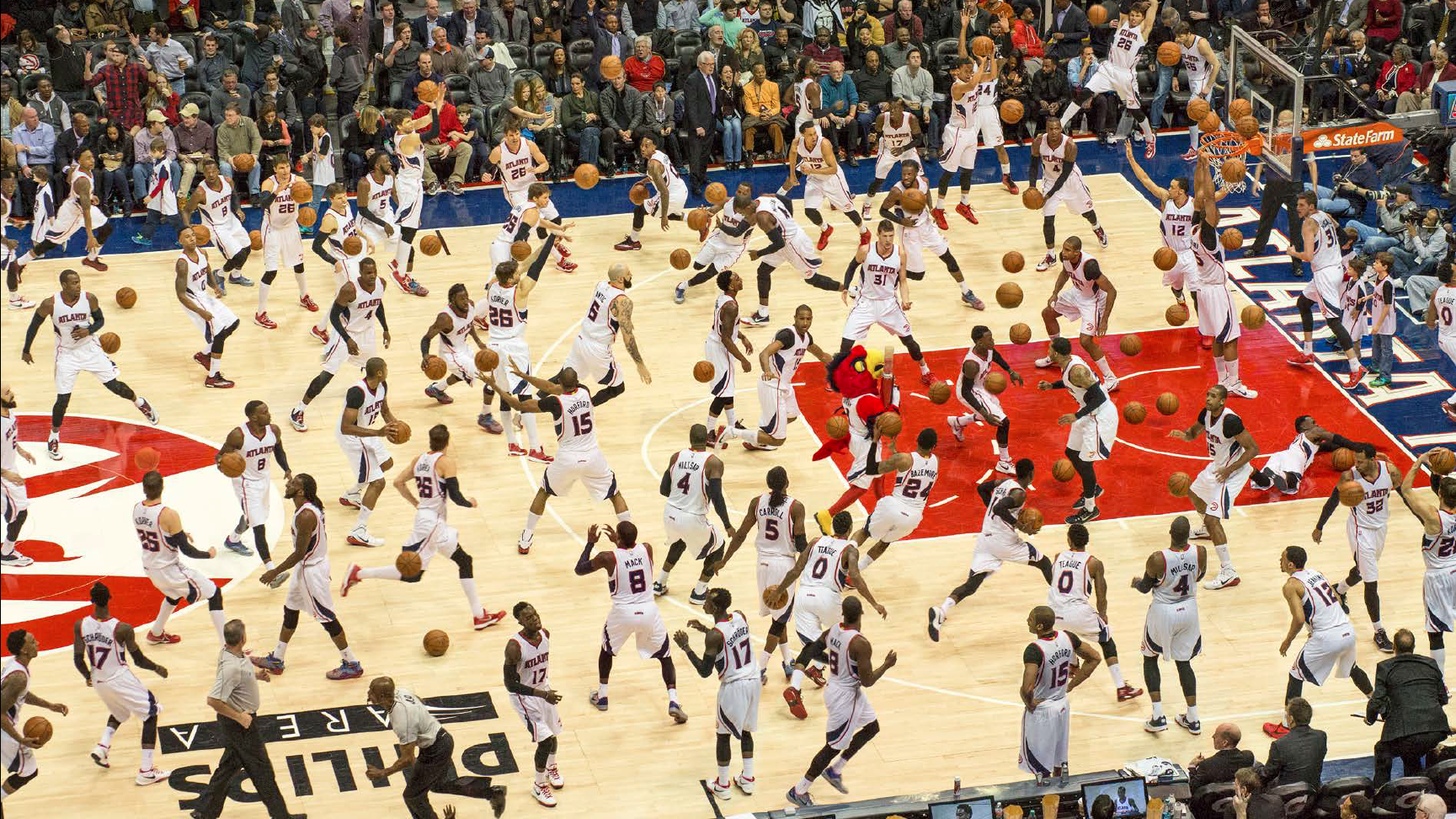
Photography can successfully visualize data, like the cover of the book where all the planes within a 6 hour timeframe fly through LAX, but it isn’t necessarily grounded in code. In fact, the photographer painstakingly photoshopped each airplane. Photomontages of Olympic athletes also help visualize the unseen, the steps that go into a blink of the eye routine. Yet photoshop can also be used or photomontage softwares. Overall, I found a handful of examples of the books that have striking visuals, but I can’t tell which one’s were created through code or by hand, except for Tega Brain’s project. Either way, I think PhotoViz is going to be a thing soon.
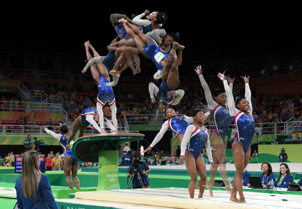
screen-shot-2016-10-31-at-1-30-30-am Simone Biles Photomontage photoviz_dylanmason_p032-033 365 Selfies, Dylan Mason

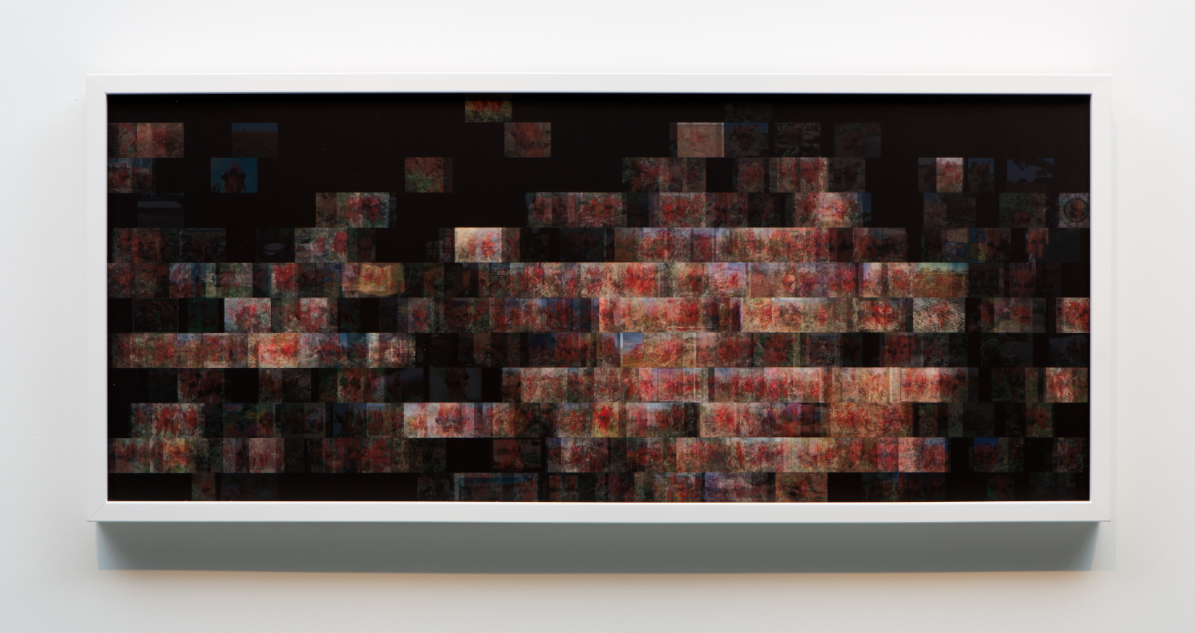
screen-shot-2016-03-24-at-2-40-00-pm-e1458854519898

Singapore Sunset, 2016. All Rights Reserved. Singapore Sunset, 2016 screen-shot-2016-10-31-at-1-49-59-am “Since early 2008, roughly 40 million images have been uploaded to Flickr® every month making a rich, ever-growing digital collection that documents a vast range of human experience including our observations of other species. Keeping Time is made from over 5000 of these photos taken during the years 2002-2013.” (Tega Brain)

_____________

More on PhotoViz in this 30 min vid … Nick talks about his conception of Photoviz: here

There was a particular line that Felton said that struck me, “I think of data as the new wood, as a material. Historically designers worked with text and image, but now that’s not enough, you have to play with data. It’s like wood, you can use it in many different and precise ways.”

It made me think about what being a designer will be like in the next 50 years. It used to be the letterpress, and now, it’s data viz, what’s the next medium?

screen-shot-2016-10-31-at-12-45-45-am-copy


Deliverables 07 (Due 11/04)

This set of Deliverables is due at the beginning of class, Friday November 4.

There are 5 parts:

  • 1. Reading (excerpts by Edward Tufte)
  • 2. Research: Review D3 Blocks
  • 3. Looking Outwards #07: Information Visualization
  • Visualization Projects
    • 4. Warmup: a Map (CANCELLED)
    • 5. Visualization. (…This is the “main” assignment)

Also, some reminders:

  • Hiroshi Ishii Lecture, Thursday 11/10
    http://www.design.cmu.edu/designthefuture/hiroshi-ishii/
    I strongly recommend you see this lecture by Hiroshi Ishii, professor at the MIT Media Laboratory. He’s been a leading innovator and pioneer of tangible media and physical computing for more than two decades. His lecture will take place Thursday 11/10 at 5pm in McConomy.
  • Georgia Lupi Lecture, Saturday 11/12, 7pm in Carnegie Library
    https://www.carnegielibrary.org/event/dear-data/
    Georgia Lupi directs a world-class information visualization studio in New York City, and has made a large amount of lovely, heartful and impactful work. She has also been an Eyeo speaker in 2013, 2014, and 2015. You should secure your free ticket beforehand at this URL.

1. Reading: Excerpts from Edward Tufte.

  • Please read chapter 1 from this collection of excerpts from Edward Tufte’s The Visual Display of Quantitative Information. This is about 20 pages of reading, most of which is pictures.
  • There is no writing or other deliverable for this reading assignment.

2. Research: Review D3 Blocks.

Please review the following sites of D3 “Blocks” (demonstration examples):


3. Looking Outwards #07: Visualization

Our Looking Outwards topic for this week is computational information visualization. You are asked to identify and discuss an interesting project in which an artist, designer or other researcher has created custom software in order to collect and/or visualize a dataset. Some persons you might wish to consider include:

There are also a number of collections and prominent blogs specifically devoted to documenting computational and interactive information visualization, including:

Please name your post nickname-lookingoutwards07, and use the wordpress Category, LookingOutwards07.


Visualization Projects.

For this set of deliverables, we will be using data from Healthy Ride PGH, and visualizing it using D3. This data describes the rides, riders, and bicycles that are used in Pittsburgh’s municipal bike rental system. The data can be found at:

4. Visualization Warmup: a Map

This sub-assignment has been CANCELLED. 

As a warmup, you are asked to create a cartographic map from this data set.

You may find the following code example(s) helpful:

5. Visualization:

You are asked to create a visualization, preferably something other than a map, which reveals something interesting about the Healthy Ride data. Your job is to:

  • Be curious. Ask an interesting question of the data.
  • Develop craft. Successfully adapt the data to a suitable D3 Block, in order to answer this question.

Take a look at these sorts of examinations that Todd Schneider has created:

D3 Resources

Don’t forget, you’ll need to run a local server on your laptop in order to have D3 load and display files. On a Mac, you can use this command:

python -m SimpleHTTPServer

More information about running a local server can be found on the p5js website here.

Here’s my “countRidesPerStation” Processing + D3 tutorial:

https://github.com/golanlevin/countRidesPerStation

Comments Off on Deliverables 07 (Due 11/04) Posted in