A dataset I find interesting: A More Perfect Union by Luke DuBois


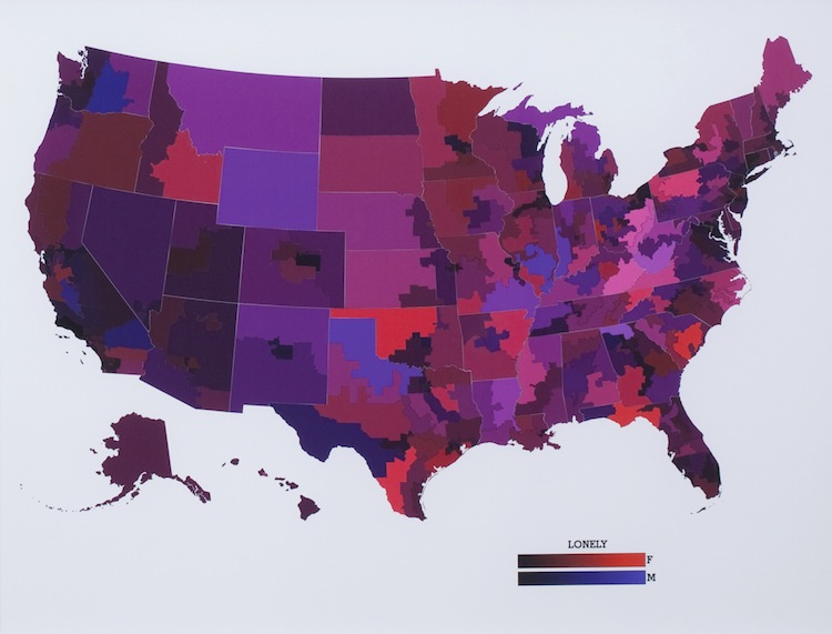
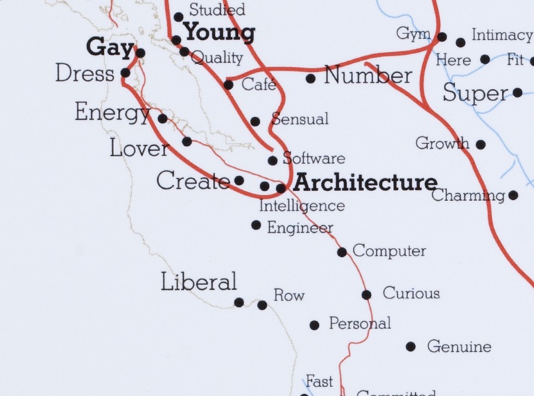
If I could, I would just classify this as an interesting dataset, provocative project, and well-crafted work and be finished with my Looking Outwards entry–but I won’t. In A More Perfect Union, DuBois used data collected from 21 different dating sites to create a “a road atlas of the United States, with the names of cities, towns, and neighborhoods replaced with the words people use to describe themselves and those they want to be with.” He also created national maps that were color-coded based on how frequently a certain word was used in a person’s profile. It’s amazing to see the sheer wealth of data contained in these maps, and the portrait they paint of the single (or not) dating site users of the United States is, at the same time, beautiful, heartbreaking, and amusing. With the growing community of online dating users, it would be interesting to see how the data changes from year to year. To push the idea even further, it would also be interesting to see how the data differs from country to country. (Though it’s unlikely this project can be developed further because when DuBois visited our class last semester, he mentioned running into some trouble with the online dating sites later….)
A project I find well-crafted: Spamghetto wallpaper

Described as “inappropriate”, “intriguing”, and “irresistible”, Spamghetto is a special type of wallpaper which, as the name suggests, manages to put spam into some use by exhibiting it in an aesthetically pleasing manner. What appeals to me about this project is that it is both a visualization of information and serves an artistic / decorative purpose–this makes it a project that is as beautiful as it is interesting. The fact that the information is not visualized as a simple poster, but an entire wallpaper that spans an entire room raises our awareness of how we are bombarded with spam and the like on a regular basis, which I believe is a unique and well-crafted way of visualizing information.
A project I find provocative: 138 Years of Popular Science


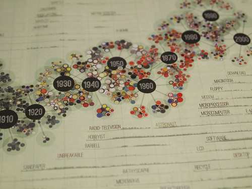
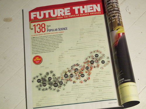
In 2011, Jer Thorp was asked by Popular Science magazine to make a graphic that “explored the archive of their publication”, and decided to make something that demonstrated how the “different technical and cultural terms have come in and out of use in the magazine since its inception.” His design certainly has visual appeal, but it is thought-provoking at the same time because it shows how tech-culture has evolved over the years. Additionally it is interesting to see how the color schemes of the magazine covers (represented by the nodes surrounding the years) also went through an evolution as the decades progressed–what I found particularly fascinating was how there was suddenly a lot of color in the mid to late 1900’s, but as the years progressed, the colors began to revert back to the less saturated ones reminiscent of those found in the earlier issues. Because the magazine’s publication spanned almost 140 years, compiling the information was a long and arduous process–when he talked about how he had to organize the data, compile custom datasets, and go through a “mountain of iterations” before achieving the final product, I suddenly realized just how much work InfoVis requires. From that, I gained a newfound admiration for the InfoVis designers and applaud the above artists for creating works that were both informational and visually appealing.