Summary
Chromatic habits of my three years on Pinterest. (Website) (Github)
Video
(Soon to come!)
Process
I didn’t do a lot of sketching, but I did a ton of brainstorming and writing. Here’s the first brainstorm writeup I did (trying to explore general ideas), and here’s a second (when I focused specifically on exploring a visualization around poetry and rap). I’m taking a natural language processing course right now, so I was initially very excited by the idea of analyzing languages and developing a simple n-gram model to compare/contrast different poets/artists and make poetic mashups of different styles. But after feedback and some thought, I realized it was a topic that was very difficult for me to pin down into a visually interesting form. It would have also meant a lot of time getting the data and processing/annotating it, and less time actually developing the visual form.
Challenges in this stage:
- Defining a project that focused on the visualization, and not just an interesting exploration (the question of similarities between rap music and
- Being specific and isolating a manageable set of data (when I was exploring the
Coincidentally and conveniently, a Pinterest designer and CMU/IACD alum came to visit CMU for a few days, and after talking to him, I decided to explore a visualization with my Pinterest data.
Pinterest is actually my most significant source of personally-interesting data. I faithfully carried around the Fitbit and Fuelband, but my fitness habits are fairly mediocre and don’t offer a lot of insight into my habits, and don’t bring up unexpected representations or ideas or ways of seeing my life (the “weight of rain”). However, I’ve been using Pinterest fairly regularly for about 3 years, and it has the potential to provide interesting information on what I’ve been visually fixated on over that time.
I pulled together a CSV of all the things I’ve ever pinned and spent some time looking at different D3 design patterns, but I ended up mostly hacking together a Javascript production with D3 used mostly to bind data. I felt a lot of the D3 visualizations I found required me to force my data into a specific format, and make it feel more statistics-y.
Challenges in this stage:
- Kept on forgetting what it meant for Javascript to be asynchronous
- Figuring out what data to use—I stored a ton of information, but ended up really just using the dominant pin color, medium-size image, URL, and timestamp. I realized a lot of other information (e.g. boards that pins came from) were not as interesting for me, or the forms I tried to put them in were more static/artificial.
- Deciding how to organize the data. I ended up just organizing by hue (into main color groups) and over time, but this was largely due to technical constraints and my lack of knowledge/time. I think it’d be really cool to look into other (more interactive?!) ways of arranging colors.
Findings

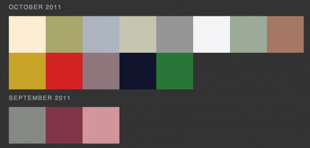
Partly due to how Pinterest calculates dominant pin color (it’s usually the background hue, so a colored subject on a white background is assigned the dominant color white), but also due to my fondness for pinning a lot of products (with white-backgrounded product shots), I ended up with a ton of neutral-colored pins. It seems to be a slightly more recent phenomenon: my early pins are a bit more colorful…

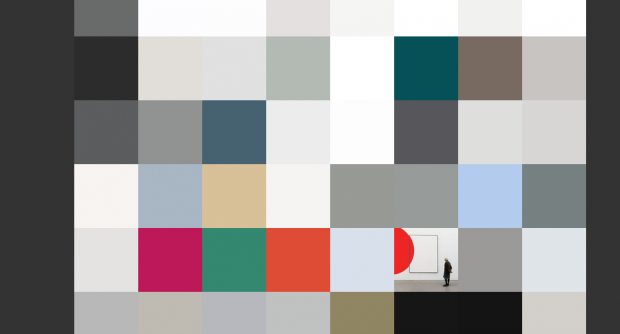
It’s also interesting to see the small periods of bright colors within a sea of neutrals. Some of these are particular patterns—I have a ton of bright purple pins from when Pantone announced the 2014 color of the year was radiant orchid, and I got excited and found a bunch of purple things. Below, there are some bright spots of illustrative poster design in a sea of fashion/architecture photography.
