Category Archives: Uncategorized

Andre Le

27 Mar 2014

For my final project, I want to explore the power of computation to recognize biofeedback patterns and present them to the user in a recognizable way.

I’ve been working with an EEG headset called the MindWave, which is a single-channel wireless EEG sensor. The headset outputs EEG power band values such as Delta, Theta, Alpha, Beta, and Gamma waves. I’ve successfully been able to output these features to Wekinator, a machine learning application that allows for discrete classification of input features and outputs OSC messages. With this, I have been able to train the system to recognize colors that I am thinking.

What I would really like to do is map a person’s mental state such as emotions to a social feed of memories. For example, I could display several images from a person’s Facebook feed to train the system. Then, as the user lets their thoughts roam, the application would pull up other related images, videos, and posts as a way for the user to visually see what they’re thinking.

Some questions about this:

  • Does seeing these memories allow you to maintain to these emotions?
  • Can you control what you’re thinking?
  • Can we build 3d environment to fully immerse yourself in your “thoughts and memories”?
  • What if you can invite others to “experience” what you’re thinking?

Reference:

http://frontiernerds.com/brain-hack

http://www3.ntu.edu.sg/home/eosourina/Papers/RealtimeEEGEmoRecog.pdf


Chanamon Ratanalert

19 Mar 2014

Capstone Research

Making this blogpost might be a little difficult for me considering I don’t know what I want my Capstone project to be. I’m going to assume for now that it’ll be along the lines of my interactivity project but extended further. I assume this because my general thoughts about what I want my interactivity project to be are what I want to do for any project (it’ll maybe make sense below). Also, this will provide me a deeper learning process because I’ll have learned from the interaction project and can carry those learning points into the capstone project.

What I imagine I want my project to be is based on creation. I want the user to be able to interact with the project in a way that they are creating something. I also want to pick a specific mood for the project to convey, most likely calm and happy, so that the interaction can be a soothing and memorable experience.

Here are 3 projects that I’m inspired by and wish to create my project off of some of these projects’ ideas (a couple of them are repeated from previous blogposts):

The Little Prince
What I really enjoy about this project is its overall experience. Emotionally, the game very much keeps the innocent cuteness that the children’s book of which it is based. It provides an interactive entrance into a internationally cultural idea and executes it with the vibe that the book is giving off. Aesthetically, the illustrations and animations are flawless. Keeping the hand-drawn illustration remained true to the book and each animation and movement flow well with the style of illustration as well as the interactions that cause them. Technically, the project covers a wide range of interaction, from clapping to mic-blowing to face positioning. It truly immerses the person into the project and, more importantly, the story.
I wish to create my project that immerses the player into the “story” (may it be a story or just a general theme) and gives off the emotion I want.

Your line or mine – Crowd-sourced animations at the Stedelijk Musem
This project is wholly amazing in its root idea. Culturally, it provides a means of communication and collaboration for anyone who visits the exhibit. Aesthetically, I think it could be a little more communicative between each drawing, since you kind of only watch the dots moving back and forth in the video. The idea that everyone’s pictures get put together in a video is nice, but as one of the contributors, I would like to be able to see my contribution for more than half a second. I love that this project is very simple in its technical aspects, but speaks so much with just a scan of an image and a video.
The project fuels my inspiration (and determination) to create a project in which the user is creating something. If I could make it as contributory as this project in which anyone who has ever interacted with the project form one whole creation, that’d be great–but I have to discover that idea first. Nevertheless, I really enjoy the idea of my project’s interaction being the user creating something.

La Monde des Montagnes

Continuing with my interactive storybook idea, this project very much captures the essence and feeling of what I would like to achieve. I really like the magical feel of what the project creates from just a book being see on a camera. The illustrations and animations themselves are visually spectacular and quite mesmerizing. Technically, it is very simple (in a sense) but makes great moves for what it is.

Rise and Fall

Another storybook idea, this project shows the other aspect of what I would like to achieve: telling a story. This project is more along the lines of what I’m looking for because the user is able to unfold the story with their interactions. I really want to capture the essence of a story by having the user encompassed by the interactions and uses them to expand the story so it’s as if they are creating it themselves. The animations and illustrations for this project are astonishing and I would like to look further into how they created them parametrically, especially with part where the birds follow and loop around the balloon. Technically, this project starts from a very simple idea of flipping a book right-side up and up-side down (as well as showing its back) and transforms it into a great interactive experience.

Alz

This slightly haunting “game” is similar to what I want to create in that the user unfolds the story themselves. Of course this one is just a progression of scenes and only requires the right arrow key and the space bar, but the story was already built before the player got there–they just opened up the story and ran its course on their own.

Andre Le

16 Mar 2014

I’m still working out the details for my final project, but I’ve always been fascinated with the ability to gain “superpowers” from technology. For example, being able to perceive something that coexists with us in the real world, but is undetectable with human senses.

The following projects have inspired me to see how else we can map invisible world, such as electromagnetic fields, radiation, or air quality. What if we use the Oculus Rift and a sensor array to map, overlay, and experience all of the real-time sensor data in the world?

What can these technologies tell us about ourselves? From a quantified self approach, what if a wearable heart rate or galvanic skin response sensor can detect your stress or excitement level and relay that to your Pebble watch?

Does knowing this undetectable information change your behavior? Does the behavior change last even without the augmentation? Is it possible for wearables to re-wire our brains and act as extensions to our bodies?

EIDOS
(http://timbouckley.com/work/design/eidos.php)

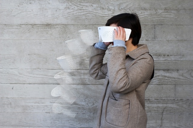
Eidos Vision is a project by Tim Bouckley, Millie Clive-Smith, Mi Eun Kim, and Yuta Sugawara that allows users to overlay visual echoes on top of their vision. This allows users to perceive time visually, and become aware of their temporal surroundings.


The Creators Project: Make it Wearable: Becoming Superhuman
(http://thecreatorsproject.vice.com/blog/make-it-wearable-part-4-becoming-superhuman)

The Creators Project has a great blog post on several other wearable technologies that allow people to sense the world in ways that were previously impossible. A notable one was with Neil Harbisson, who is compensating for his colorblindness with a device that maps color to sound.

Spider Sense Suit

The Spider Sense Suit is a collection of ultrasonic distance sensors and servos attached at various locations on the body to provide feedback on the proximity of the wearer’s environment. This project was created by Victor Mateevitsi and showcased at the Augmented World Expo 2013 where I witnessed a live demo. Aesthetically, it wasn’t much to look at, but the possibilities were impressive. By mapping distance sensors to pressure, his body was able to quickly and automatically adapt to the stimulus around him.

Yingri Guan

06 Mar 2014

I thought this art work gives some inspiration about visualizing sound. It is giving particles of the visualization abilities. Normally we see the particles as bits and now are seeing the actual particles rise upwards, giving meaning to the music.

I also love the idea of the project “Connecting Copenhagen neighborhoods using morse code”. This can create a lot of the social interactions and I like the platform for interaction. However, I am not sure about the translation into morse code. Does it mean that certain people are not designed to understand the tweeter feeds that are sent to these machines? Also, if it involves encoding, can we use other codes too?

Communion is another really great interactive art which I admire. Computational systems are used to continuously create these related but entirely differentiated creature that are then mapped 360 degrees across the room to create very interesting contemplation. Also I love the concept of transformation from simple to complicated.


Afnan Fahim

06 Mar 2014

For my quantified selfie assignment, I have been recording all my calls for the past month. I was interested in finding out more about my calling habits and speech patterns. I thus decided to use an Android app called RMC: Android Call Recorder. This app saves all my calls as MP3s, and automatically Uploads them to a dropbox folder once I connect to the internet.

For this assignment, I have recorded a total of 210 calls which were made in the past one month.

Preparing the Data

I took a snapshot of the dropbox folder where I have been recording all my calls. I then converted all the files into WAV format using media.io.

All the files are saved in the following format

“[incoming/outgoing] – [caller name] – [date of call] – [call id].wav “

I then wrote a python script to scrape this information. In addition, the script also calculates the length of each of the WAV files in seconds, and then generates a csv file that contains all this information.

I imported the csv file into excel and then started playing with numbers to figure out different things about my calling patterns.

Answering my Questions

I started feeding numbers into a csv file and started visualizing using d3.js

Incoming vs Outgoing – The first visualization I did was to see how whether I received more calls or sent more calls. No great revelations here, I only got to see that I was making slightly more calls than I was getting.

cap1

Who do I talk to most frequently? – In this visualization I analyzed which people I call or receive calls from most frequently. I sorted the people i’ve been talking to based on how many calls have been exchanged between us. The results were surprising since, even though I only spent two days in Doha, a sizeable portion of the contacts I’ve been calling were from Doha, showing that my heart is still stuck in Doha.

cap2

Are these calls or conversations? – While it was very interesting to see who i’ve exchanged most calls with, I feel these numbers still don’t measure the depth of the conversation since each call could have lasted a few seconds or an hour. I thus calculated how long i’ve talked to each person and sorted the results to get a better understanding of who I really talk to the most. The results were very different. In particular one of my college counselors,, J. Duffy. Even though we had only exchanged two calls, she was number third on the list of people spoken to for the most minutes in total.

cap5

When was I making most calls? – This is where the results started correlating to life events. I visited Doha and being the popular person I am (jokes!, most of the calls were logistics related )I talked to a lot of people. More interestingly, a not so very emotionally positive event happened on the night of 4th February. I guess I am really reliant on talking to my friends in my nor very emotionally positive moments, so I saw my talking patters go up and slowly decline over the next two days.

cap3

Am I that heartless? – So that’s it? I got *coughheartbrokencough* and got over it in two days? That’s pretty sad,  I almost felt heartless. I analyzed the data even further to look at how long I was talking on each of these days. Surprisingly, Even though I made fewer and fewer calls in the following days, the total number of minutes I spent on the phone went really high, showing how I’m not entirely heartless, and that with each increasing day in that period, I had the need to talk to more people to feel better.

cap4

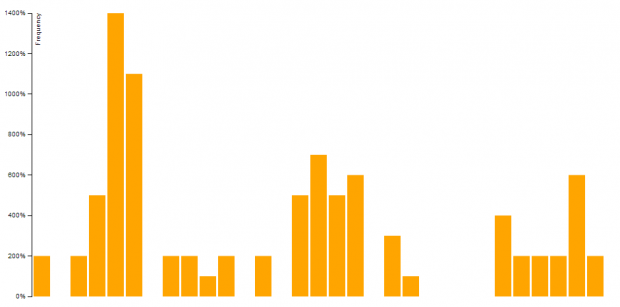
“Afnan you don’t keep in touch!” – Okay enough with my dramatic story, let’s look more into other aspects of my calling behavior. Next I decided to see when I make calls and when people call me. What I found was that the more calls I make in a day, the more calls I receive. I guess what they say is true, “you get the love you make”.
cap6 cap7


Nastassia Barber

06 Mar 2014

1. Augmented Reality Sandbox

For my project, I really want to do something that is tactile, and also utilizes something like a kinect to make this tactile experience feel new.  I like this project because it utilizes real sand, but makes the processes of building hills and valleys with the sand all the more magical because it projects a topographic map onto the sand.  I think the simplicity of these piece makes it all the more beautiful.

2. Murmur

This piece also adds a new dimension to a common experience– speaking.  When you make sounds, it translates them into light ripples on the far wall.  I like that this is meant to imitate sound waves, which already exist but are invisible until replicated with this project.

3. inFORM

This one isn’t quite as relevant, but I thought I would include it because it’s so interesting.  It’s almost like the reverse of what I want to do– taking some digital input and turning it into an imitation of a tactile experience.  This project consists of a board of 3D “pixels” that move when the user’s hands move, allowing him to remotely pick up and interact with objects.

Nastassia Barber

05 Mar 2014

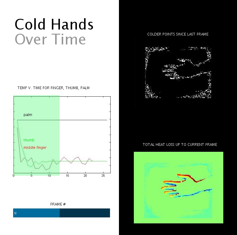
A visualization using an IR camera of heat loss in a hand in a box of ice over time

For this project, I learned a lot about data collection.  I wasted a lot of time meticulously collecting data from my personal life which ended up not being super-interesting for a visualization, mostly because I didn’t plan ahead enough regarding my data logging routine.  I changed my mind at the last minute and decided to get a series of IR images of myself getting colder over time, because most people who know me well would say that I am unusually cold-natured so that seemed like an interesting trait to explore.  I wanted to do full-body images but couldn’t because the resolution of the camera was too low for them to be interesting.  I then changed to just my hand, which brought a new set of problems because data collection was kind of painful (and eventually my hand started… vibrating?) and I kept moving.  If I had to do this differently, I would have stuck with my original general idea but collected the data better.  If I had more time with this data, I would have made the graph interactive so you could select a point on the image of the hand to show the plot for that point.

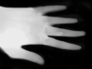
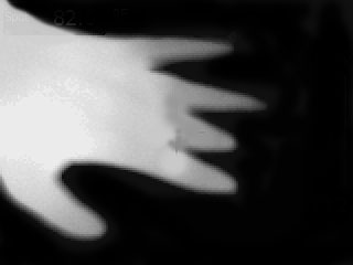
Here’s a couple of images from some preliminary tests with the IR camera:

test2_0000_IR_0211.jpg

test2_0004_IR_0215.jpg

I like the appearance of these images better than the ones I ended up using, but I had to stop before getting as pretty/dramatic results as I would have liked as the camera kept crashing and I was somewhat concerned about injuring myself.

From the video, you can tell that I learned A) my hands do get cold very fast (each frame is only about 2 seconds apart) and B) my fingers get cold much before my palm.  I guess the only surprising thing was really that my palm stayed literally exactly the same temperature in most places over time.  Yay, blood vessels!  There weren’t really any significant outliers, but there was a certain amount of noise, so I’m unsure if the oscillation I saw in the temperature at most points was a real phenomenon like my heartbeat, or just noise.

Here’s my video:

Aaaand free screengrab programs for windows seem to be very questionable so here is a higher-resolution screenshot.

final

Andrew Russell

04 Mar 2014

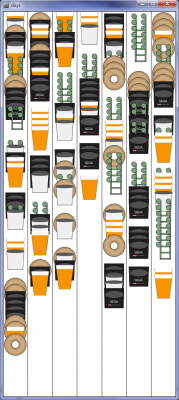
From January to March, I kept track of certain consumables I ate and drank as well the time I spent on certain tasks. The resulting selfie can be seen at the following URL:
http://iacd.ajrussell.ca/selfie/

This project was built entirely in HTML, JS, and CSS. Raphael.js was used for drawing, and jQuery.csv was used for reading in CSV files from AJAX calls.

I went through a few iterations of this project. First, I thought I would show a weekly calendar to represent my habits. However, I did not like where it was heading. Instead, I got the idea that I could use a sankey like visualization to show a timeline. I started some simple sketches and implemented a basic version in JS. I wanted each branch to represent a single time I ate a bagel or drank a coffee, however, the entire timeline was two months, and a coffee takes just one hour to drink. This means that each branch was only a small sliver before joining with the main trunk. I finally decided that the trunk should just grow every time an event happened.

days_screenshot

Initial Weekly View

IMG_20140324_192342[1]

IMG_20140324_192357[1]
Sketches of the Sankey

Github

Kevyn McPhail

04 Mar 2014

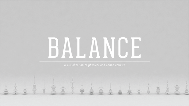
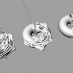
Balance – a physical visualization of my physical and online activity.

1-01

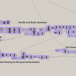
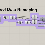
The initial goal for my visualized selfie project was to somehow create physical visualizations of my physical activity (acquired from my fuel band), and my online activity (acquired from my phone). Originally I wanted to add color to the visualization based on the recording of my mood that day, but I realized that it would only further clutter the visualization.

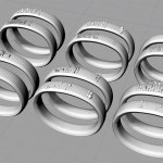
In my first attempt at the visualization, I took the fuel band data and mapped it to the surface of a torus, which subsequently deformed the torus. Then I scaled the torus based on my online data usage. The visualization did not end up working well and was really hard to read. The next iteration I mapped my fuel band data by physically deforming the surface of the display area of the fuel band. The intent was to attempt to draw a connection between the visualization and the fuel band itself. However, the visualization came out a bit muddied.

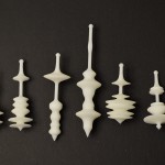
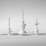
In the final iteration I made it my goal, to allow my data to physically affect an object. So to represent the balance between the two sets of data, I opted to create spinning tops. The fuel band data creates the contours for the top, and my online activity graphs scales the top to shift the center of gravity, allowing or not allowing some tops to spin.

git


Chanamon Ratanalert

19 Feb 2014

Interaction

1. Radio
In my spare time, I like to not-creepily stalk CMU students’ online design portfolios. One that I came across quite a while ago but has always remained in my mind is RADIO by current senior in industrial design, Ethan Frier (I don’t know him… let’s just leave it at that). In this project, he created tangible plaster forms of 5 radio stations: jazz, NPR, pop, freeform, and rock. These tangible stations are shaped differently to represent the radio station. The user takes a station form and puts it onto a dock, which registers the station through RFID tagging. The user can then move the form up and down the dock to control volume.
What could be improved is the solidity of putting in a plaster form. I feel like the audio beep is satisfying, but a physical form of click to go along with the physical aspect of the station would be a more gratifying experience.
I really appreciate this project because it required multiple levels of interaction. Moving a piece up and down to control volume is one thing, but to create separate, physical pieces to represent radio stations another. I like that the full interaction experience of changing and adjusting a radio station is created in this project.

2. Your line or mine – Crowd-sourced animations at the Stedelijk Musem

This interactive exhibit has pieces of paper with varying dots on them. People come along and draw lines, shapes, etc. that connect these dots. They then scan the page and see their creation combined with others’ on a large screen, progressing as the dots move and the pictures change. What I like about this exhibit is that it is not interacting with the art itself, but with others. Not only are you able to play around with the project, but you contribute to it. Additionally, I like how it’s more complex than it seems. In each video of the collection of people’s drawings, you can see there is great variance between what people drew. Connecting the dots is something we did as children before we knew how to draw, but this project takes it to a higher level and pushes thought through it. You can see people in the video really considering what they want to put to the page; what they want to contribute to the project. This project offered a guide for people to connect, but offered great opportunity to be creative and for people to do whatever they wanted.

3. Radiohead: Polyfauna – An immersive, expansive world of primitive life

Described as “a living, breathing, growing touchscreen environment, born from abstraction of the studio sessions from King of Limbs and the organic drawings of Stanley Donwood,” this project kind of creeps me out. It is an iPad app that moves in 3-d motion space and consists of environment scenery, sound, and touch interactions by the user. It’s hard to explain what it is, mostly because I don’t quite understand it (it’s that creepy), so take a look at the video yourself. I like this project because it combines multiple features: motion interaction (moving the iPad around moves the scenery around), visual environments, and audio. I wish this project were a little less abstract so I could understand why changes in the environment occur, but I guess that’s part of their abstract audio-connection visualization they were going for.