Category Archives: Looking-Outwards

Yingri Guan

23 Jan 2014

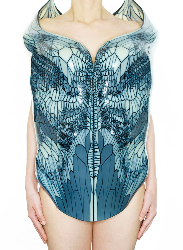
I found Neri Oxman‘s work are really inspiring. In my opinion, nature is always the best creator. Nexi and her group draw inspirations from how nature form patterns and study different biological systems to computationally construct designs that according to the context of these objects.

nerioxman_____01


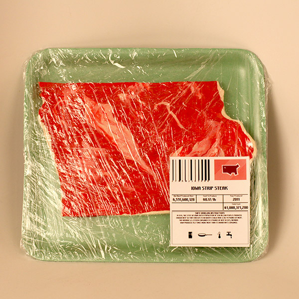
Beef Stakes which is designed by Sarah Hallacher is a piece of work that I found it’s easy to understand the data and context of the visualization. instead of reading graph and numbers, there is the direct visual experience and I understand immediately it is about beef production and its data. I think this work has targeted on the very important aspect of data visualization that the purpose is to promote understanding of the audience.

beef_stakes2

Tatiana Plakhova is another talented artist/graphic designer whose art work is influenced by mathematics, nature, physics and music.

e8bb4fed45f9266b1e347459c7606d97

snewgold4patt3_1hj_640


Brandon Taylor

23 Jan 2014

DatasetFangraphs Baseball Stats

I’m a huge baseball fan and really like advanced stats research.  Fangraphs has impressive datasets available, down to the batted ball data.  I’m not sure what I want to do with this, but I feel like there are interesting possibilities.

Provocative VizFamous Movie Quotes

Mostly, the Soylent Green (#77) plot makes me very happy.  Conceptually, I like this, but the execution isn’t great across the board.  The quantity helps on that front, but I think paring out some of the quotes that are more picture than plot (#66) would be better.

Well-Crafted Viz – Internet Maps

These plots just look nice.


Celine Nguyen

23 Jan 2014

Information Visualization

Interesting: Fathom’s ‘Colorful Language’

This project visualizes the different color terms of different languages, and how different color swatches are grouped by speakers of those languages. I’m taking a color theory class right now and find the display beautiful, and it’s really fun to look at the unexpected differences between languages (highly differentiated color sets, or colors unexpectedly together in a set).

I find this data set interesting because my parents (native Vietnamese speakers)  have a fuzzy delineation of blue and green (which to me feels illogical, as I’m functionally a native English speaker and used to a clear delineation). There’s one term for blue-green in Vietnamese, and you have to specify “the blue-green of the sky”, “the blue-green of trees” in order to convey if it’s green or red. I’m also pretty fascinated by the fact that the evolution of color terms in different languages usually follows a particular order.

Provocative: Romy Achituv & Fathom’s “The Emotional Life of Books

This project visualizes the emotional responses that people have to books in a particular library and maps out a history of emotional experiences from the readers as a whole. The books of the library are then rearranged according to their emotional histories.

I find this provocative because I sometimes resist (and I’m sure others do too) the idea of visualizing writing and reading and the content and the emotional experience computationally, since it seems like there are a lot of intangibles about what’s going on. But I like that this offers the idea that computational analysis of reading experiences can also offer some cool insights (and unexpected ones, because you turn up implicit patterns that people might not consciously acknowledge or see). In this project, depending on the categorization of the books in the library, the library is organized differently, so people’s emotional reactions are shaping to some degree how people find information in the library.

Well-crafted: Sam van Doorne’s “STYN”

STYN is an installation by Sam van Doorne where viewers/users/incipient artists lay down a piece of grid paper that gets covered with markings as they play pinball over it.

I like this and find it well-crafted because it visualizes the intangible experiences in everyday life. It’s kind of delightful to be able to see the patterns of pinball playing through the paint—it creates a very beautiful composition (art generated from human behavior!) and also serves as an abstract insight into physics and gameplay. I also love the idea of hacking existing objects into design tools.
Collin Burger

23 Jan 2014

Provocative: Ben Fry – ‘All Streets’
http://fathom.info/allstreets
Ben Fry’s ‘All Streets’ is a visualization of all the streets in the continental United States that looks like a topographical map.  Visualizing roads in this way might seem like it would just look like an unmarked map, however at this scale, the data reveals not only the topology of the United States, but also humanity’s relationship with the globe.  I think that Ben Fry’s  use of a very familiar data set to create a striking visualization represents a pinnacle of data art.

Interesting Data Set: Nand.io – ‘Identität: The Gestalt of Digital Identity’
http://www.nand.io/infosthetics/the-gestalt-of-digital-identity
‘Identität: The Gestalt of Digital Identity’ by Nand.io visualizes the digital identity of an individual in a physical format by combing online services for personal details to be used to dictate the composition of the structure.  I find the data sets interesting because they are personal, and reveal that the services that people use on the Internet have enough data about individuals to compose such complex structures.

Well-Crafted: Amanda Cox – ‘A Peek Into Netflix Queues’
http://www.nytimes.com/interactive/2010/01/10/nyregion/20100110-netflix-map.html?_r=0
Amanda Cox’s ‘A Peek Into Netflix Queues is a visualization of the popularity of films in different geographical regions.  While I don’t find the presentation to be particularly interesting or exciting, I want to recognize Amanda Cox’s work for consistently visualizing data in clean and thoughtful ways. I chose to this particular visualization because I think the data set is interesting.

Aside:
I have not seen any data art done with the “Megan’s Law” sex offender registries.  I think this is a really interesting data set in that there is a mixture of specificity and vagueness in the information that leads to a tremendous amount of terror.  There are images and exact locations present in the data, however the exact nature of the offense of each individual is not revealed. I have spent some time peering at photos of these sex offenders while trying to guess what their offense was.

Kevan Loney

23 Jan 2014

Data Visualizations:

After looking around a bit, here is a short list of inspiration/ eye catching data visualizations that I found intriguing.

1) Beyonce Self Titled Album Drop: Data Visualization

http://srogers.cartodb.com/viz/337d9194-6458-11e3-85b5-e5e70547d141/embed_map?title=true&description=true&search=false&shareable=false&cartodb_logo=false&layer_selector=false&legends=false&scrollwheel=true&sublayer_options=

Screen Shot 2014-01-23 at 4.36.42 AM


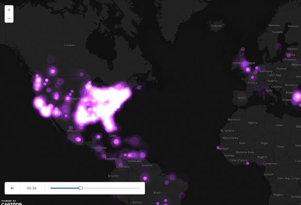
This visualization pulled Beyonce tags from twitter to fill its visualization. They tracked the world via twitter mentions of her name from hours before the release of her secret album through the day of. What I found interesting was how quickly the news of this secret album  spread like wild fire around the USA. It was like the whole East coast literally exploded for a moment. I think this layout, although simple, looks charming and elegant in its presentation.

2) Where We Feel Emotion: Visual Data

http://flowingdata.com/2014/01/02/body-maps-show-where-we-feel-emotion/

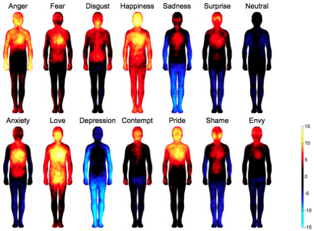
I found this data very interesting. Not only are the colors appealing and evocative of there own emotional response. The visual aid of seeing where these type of emotions take place in the body is a very interesting fact to me.

Body-maps


3) MTV Twitter Data: Tracking

http://content.stamen.com/kanye_west_is_an_a__hole_and_other_twitter_moments

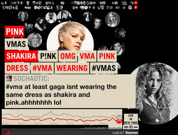
Although this is another data tracker following Twitter feeds. The pure thing that caught my attention on this piece is the visual appeal of it. The design alone caught my attention, which caused me to follow it longer and investigate further. I want my future data tracking to be presented in a way that is interesting in the data presented, but also visually appealing for the viewer. This will be my top priority while building!

pink_and_shakira_sm


Emily Danchik

23 Jan 2014

InterestingUntranslatable Words from Other Cultures
While this might not be as much of a data visualization, I appreciate how the author used images to replace the meanings that are lost when trying to translate the terms.

Provocative: Watch Your Language
I’m not sure where this graphic originally came from, but it hasn’t left my mind for the past five months. The infrograph takes an aggressive tone in showing native English speakers how messy English really is, and finally implores us to have patience for those who struggle with it.

Well-crafted: Lose Sleep, Lose your Mind and Mental Health
The use of color and image in his visualization really drive the point home. I also appreciate the callouts, giving related information that wasn’t quite relevant enough to make it into the main infrograph, but is still important.

Another well-crafted infograph is An Infographic Is. Short, to the point, and clear.

Andrew Sweet

23 Jan 2014

Provocative

While not fancy in any fashion, this collection of data brings perspective to how customers treat those around them. An aggregation of how many customers fractionally swear when dealing with an employee in a given industry, this simple collection brings up a lot about how we’re willing to by angered by certain professionals more than others.

Well Made

This captured dataflow from Foursquare shows the pulse of a city. With simple color coding and a dynamic key to the map, the view can easily get a good-looking view of motion, as well as different types of activities that happen around the city, and where they are clustered, without having to get into the details of the individual, but thinking of the population as a whole instead. Seeing the rush hour traffic versus the few hours of night where very little activity takes place really juxtaposes well visually.

Interesting Dataset

Take 10 seconds, and slow it down to three minutes. Then watch as the numbers fly rapidly across the screen in very organized, clustered back and forth motions. 10 Seconds of Extreme Trading in Blackberry shows just that. The visuals look like some old Atari game, with bright colors and fast moving parts on a black backdrop. The data itself though is fascinatingly fast. This extreme flow of numerous individuals predicting, guessing, and following the crowd as fast as possible. While this particular video isn’t completely understandable to the layman (like myself), the motion itself reveals much more than the individual numbers involved, making this representation of the particular data very well done.

Spencer Barton

23 Jan 2014

Interesting Toolset & Project: Circos

Example from http://www.ncbi.nlm.nih.gov/pmc/articles/PMC3877785/bin/pc_114553_f2.jpg

Example from http://www.ncbi.nlm.nih.gov/pmc/articles/PMC3877785/bin/pc_114553_f2.jpg

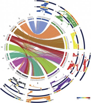
Circos is an interesting visualization tool/graph used in computational biology for showing connections between data. Because the objects are arranged in a circle connections can be drawn between all data points. Connection weights can be determined by color or stroke width. Further data can potentially be arranged around the circle as well.

I would potentially like to use these graphs for the visualization project.

XKCD: Congress

congress_large

I am a bit of a history buff so I love this chart. It presents a nice macro view that one rarely sees on historical data yet it also keeps all the micro details that make history fun. I enjoy seeing the connection between events and political power shifts. In terms of pure visualization, the use of the ribbons creates a nice sense of flow. The real enjoyment I get from this graphic is seeing how much he crammed in.

Interesting Dataset: American Heritage Time use Study

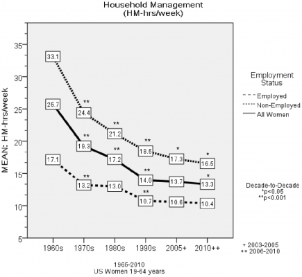
45-Year Trends in Women’s Use of Time and Household Management Energy Expenditure

45-Year Trends in Women’s Use of Time and Household Management Energy Expenditure

For the past 50 years a study has been collecting time use journals from homemakers. This has created a rather interesting historical peek into role of the homemaker. This data has so far been used in academic settings (as with the paper referenced above) but it could be a strong baseline for comparison to present day time journals.

Andrew Russell

22 Jan 2014

rescue timeGoogle Location History

Similar to Open Paths but run by Google. I have been using Google Location history since March 2012. I have traveled across the continent many times with it enabled and have lots of interested data to parse. To help me parse this data, I will be using Journey to the Moon, which gives basic metrics. However, I am more interested in parsing recent data, to figure out how many kilometers I have biked, and during what time frames do I bike. To do so, I will have to write a program to parse the data myself, and look for how fast I was travelling.

location_month

My location history for the last 30 days

Rescue Time

As someone with a degree in Software Engineering, my life would be incomplete without knowing how I spend my time online. This is where Rescue Time comes in. It is a webapp / browser extension that tracks every website you go to, and how long you are on each one. It then has a categorization for all popular websites, and shows you how productive / unproductive you are when you use the internet. Unfortunately, my old account was deleted due to inactivity, so I will be starting fresh for this semester.

rescue time

Datum

I have an addiction. It is to bagels. Which is why I am going to track every bagel I eat, where it came from (homemade, bagel factory, etc.), and what type it is. I am also going to track bike maintenance to see how often I pump my tires, get flats, oil the chain, etc. I may track other data (guitar time?, video game time?) but have not decided yet.

Looking Outwards 2 – Self-Quantification Tools

To monitor and quantify some of my daily actives, I’ve decided on tools that are built on open APIs for easy accessibility and hackability.

I’ve decided on the following three tools for now.

Fitbit : Monitoring my physical activity and sleep
I’m interested in visualizing my sleep patterns, and possibly the correlation between my calendar and sleeping habits. I chose Fitbit because it seems to have the most open API for developers compared to other trackers.

D3JS : Visualization tool
I think D3 is an awesome tool for building interactive visualizations. I haven’t had the chance to play around with it yet with actual data, I think this would be a great opportunity. Since D3 is a data driven tool, I found it to be the most appropriate javascript library for such a task.

IFTTT : Building workflows
IFTTT looks like an interesting tool for building contextually aware workflows. Since the data that we’re collecting in this project can be used to derive context, I think there’s a lot of potential for of integrating my daily activity data with IFTTT.