Category Archives: Looking-Outwards

Ticha Sethapakdi

26 Jan 2014

ofxEdsdk

ofxEdsdk allows for interfacing with Canon cameras from OpenFrameworks. This add-on enables people to control a Canon camera remotely, which is useful for project involving time lapses or photo capture at specific time frames. I myself have a high-quality Canon EOS camera at home; perhaps this add-on will allow me to put it to good use.


ofxKinect

The ofxKinect is, of course, something that would come in handy for many new-media artists. There is a growing number of artists that use the Kinect for their projects because of its many applications and its ability to bridge the real-world with the virtual world. The possibilities of the Kinect are endless, so the ofx add-on for the Kinect is certainly a useful tool to have. (I’ve also stumbled upon some interesting reference material that teaches you how to use OpenFrameworks with the Kinect)


ofxBox2d

Box2D is a very handy physics engine that can simulate rigid bodies and was used in popular games such as Angry Birds. I had experience working with Box2D in Processing and found it to be a pretty powerful tool that facilitates the process of handling the physics of a virtual environment. Box2D is mostly useful when you have to simulate a large number of bodies that collide and interact with each other in some way (e.g. particles). It might be an interesting exercise to make a small project that uses this with the Kinect….

Austin McCasland

26 Jan 2014

Interesting Dataset – PaperScape:
Despite my life being full of papers which I read and reference, I would never think to do data visualization about them. I sort of think of papers being independent of geography or context – but they aren’t! The reason why this data set is so interesting is because it reminds me that papers were written by real people in the real world.

Provocative – Exxon Secrets:
I think that this is a very provocative data visualization. The data set is so interesting – and I’m willing to bet the exxon guys hate having this information so easily digestible. What I love about this is that it takes the complicated relationships between money and power and breaks them down into easy to look at visualizations. Not as sexy as the facebook friendship visualizer below, but it definitely is more informative and edgy.

Well-Crafted – Visualizing Facebook Friendships:
Visualizing Facebook Friendships

The colors and transparencies chosen for so many datapoints work very elegantly with one another. It is a simple geographic mapping of data points, but the curves are elegant, and the colors are wonderful. The shapes that are formed are mesmerizing. Though it isn’t interactive, I could stare at this data visualization for a long time.

Haris Usmani

26 Jan 2014

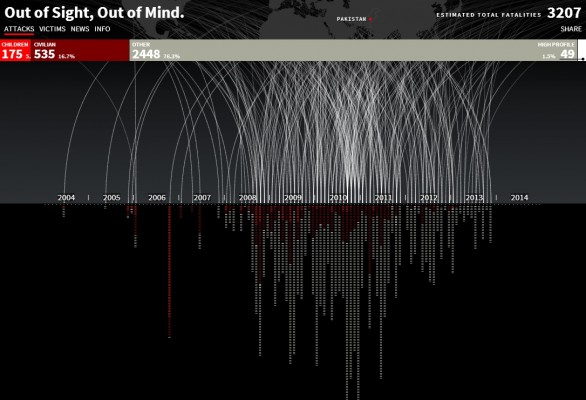
Out of Sight, Out of Mind by Pitch Interactive

drones_data

http://drones.pitchinteractive.com/

I found this narrative visualization strong in terms of its dataset as well as its presentation. It’s been put out in such a way that the numbers speak out for themselves. This visualization illustrates the outcomes of drones attacks in Pakistan, from 2004 to 2013. It explains how using drones is ‘politically much easier to maneuver’ and is ‘cheaper than deploying soldiers’ but its success rate is very low. The most important fact that says it all is that out of all the people killed, only 2% are high profile targets, the rest are ‘civilians, children and alleged combatants.’ This visualization does not speak for or against drone attacks, but only presents information about them in the most effective of ways. It even allows to browse thorough the victims of each attakh, and to learn more about the prominent ones.

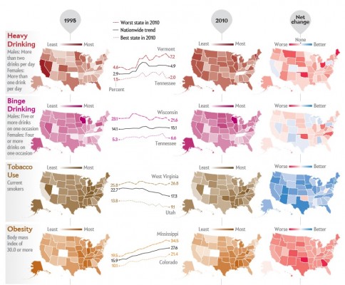
Americans Get Fatter, Drunker by Scientific American

fatter_drunken

http://www.scientificamerican.com/article/americans-get-fatter-drunker/

This visualization compared how the average American’s habits have changed from 1995 to 2010. It examines Drinking, Tobacco use, Obesity and Exercise and the results are rather alarming. Generally, the use of tobacco has decreased while drinking and obesity are still on the rise. This visualization is static (primarily designed for print media) but still presents its point very clearly- I liked the ‘Net Change’ column. It examines a topic that everybody would be interested in.

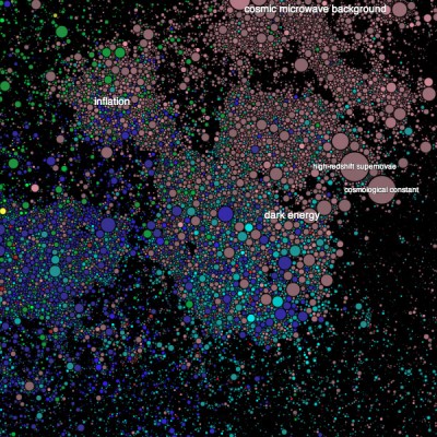
PaperScape by Damien George and Rob Knegjens

paperscape2

http://infosthetics.com/archives/2013/09/paperscape_an_overview_of_all_scientific_papers_submitted_at_arxiv.html

This visualization is actually an interactive map that provides a visual overview of all scientific papers submitted at arXiv. The thing I liked most about it was its Key- The more the paper is cited, the bigger its circle becomes. Along with that, older papers fade into a different color eventually while latest submissions start fresh. I consider this to be a great tool for students looking into doing a thorough literature review in a particular field. I wish the concept can be built upon and every scientific journal can present its publications in this manner.

Additionally I found this very interesting in terms of its interactivity:

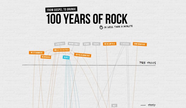
100 Years of Rock by ConcertHotels.net

music

http://www.concerthotels.com/100-years-of-rock

Ticha Sethapakdi

25 Jan 2014

Fracture IO

Fracture IO is a 3D Photo Booth that takes full-body scans of participants using Kinects and renders them in an intricate, abstract style. What I found captivating about this project was how they were able to create lovely organic forms, and I later found out that the 3D meshes were created using algorithms ascribed to crystal growth in nature. This technique immediately reminded me of Nervous System and how they used biological algorithms in creating organic designs. But while the forms generated by Fracture IO are certainly beautiful, I’m not really sure whether they can hold my interest. In conventional Photo Booth, people usually able to edit their pictures and add a variety of effects to them. Japan, in particular, is notable for its ‘purikura’ machines, which allow patrons to decorate their photos with a multitude of fancy stickers (sparkle warning for the link). I think what this project is missing is that variety found in Photo Booths and it would be nice to see the other types of organic structures they can construct using similar algorithms.


Tangible Color Music Instrument

Ryan Raffa, an MFA Design and Technology candidate and Teaching Fellow at Parsons School of Design, created an ‘instrument’ that interprets colored plastic pieces as notes and plays them. As the users change the configuration of the squares on the ‘radar player’, the rhythm and sound of the output changes, which creates an interesting study of how physical objects are encoded in music and rhythm. It is clear that, at the moment, the project is in its early experimental stage so I am eager to see how far it can go. There are a number of projects which investigate audiovisual experiences, but few that explore tangible audiovisual experiences–which is why I believe this project has a lot of potential.


Lego Calendar 

The Lego Calendar by Vitamins Design is adorable. Its name is pretty self-explanatory: it’s a calendar that uses Lego pieces to organize schedules and “visualize complex logistics systems”. In addition, it is synced with Google calendar which provides a convenient way for a team of people to see the changes made to the schedule. The Lego Calendar relates to the Color Music Instrument in the sense that they both use a tangible medium as an interface between humans and a computer system. Of course, the Lego Calendar is a more finished project with a practical application. Its simplicity and practicality, in my opinion, are its strongest points that make it an important contribution to the field. All it needs is a way to incorporate the two-peg brick to allow for a wider variety of time blocks.

Andre Le

25 Jan 2014

Dataset
YouTube Trends – https://www.youtube.com/trendsmap#sex=0&age=0&type=1

This dataset is compelling to see as video viewerships shifts from broadcast to user-generated content. While the amount of views and shares of videos may not tell us if the videos was good or not, it does give us insight on the cultural movements of the internet. What I really like about the trend map is how it ties these somewhat abstract number of view with locations. Somehow, the data feels much more grounded to see plotted geographically. Perhaps because internet users tend to be anonymous and faceless.

Provocative
Gravity Interest Visualization – http://whatspop.com/entry/gravity-interest-viz

This visualization was very interesting to see how interests brought friends together. It’s great to look at your friends and trace their lines back to common interests that you may not even know you had. It reminds me of the “6 degrees of Kevin Bacon” game, but flipped inside-out and visualized.

Well-Crafted
Points – http://infosthetics.com/archives/2013/06/points_smart_robotic_street_sign_rotates_to_direction_of_content.html

Points is a well-designed robotic street sign that can adapt to various contexts. It not only can tell you information about fixed locations, but also events and news. I love the fact that it can combine or split the screens up to visualize information spatially. This is an excellent example of what you can do with a single color display, but with lots of contextual information.

Crossman-LookingOutwards-5

oxfUI

Sometimes you need to be able to control your applications in case they become sentient and try to kill you. This library allows you to do just that by being able to easily place control onto your interface. Very useful stuff.

ofxSpeech

This is a wrapper for the build in speech recognizer on the Mac, so it only works on Mac, but this type of technology has many uses. You can use it to feed commands to an application, or create something like my VECHO project, but for the desktop. It could also be used as the basis for an interactive sound art piece. It also does speech synthesis for all your HAL 9000 fantasies.

ofxLibwebsockets

This library allows you to send and receive network traffic, of what appears to be all kinds, not just HTTP. This is great for any application that needs to communicate with another computer. You could use this to scrape content off webpages, and not just text like, but you could combine it with a computer vision library and process scraped images or other types of media.

Crossman-LookingOutwards-4

Below are some projects built with openFrameworks:

Clouds
[vimeo 42852185]
Clouds was a project Golan showed during a lecture last semester that demonstrated a unique take on filmmaking using a point cloud.

RealtimeOCR
[youtube=https://www.youtube.com/watch?v=S0CwYcHi26o]
This project uses openFrameworks to do real time optical character recognition. The demo is a little rough but the technology behind it is impressive. The video shows the character recognition at several angles at a decent framerate.

MadMapper Mapping Visualizer
[youtube=https://www.youtube.com/watch?v=UxyrUc9IuIE]
This video shows a demonstration of a projection mapping library in openFrameworks. The demo itself is not very impressive, and is a bit like a hello world to projection mapping, but none the less it shows you what is possible with openFrameworks.

Processing versus openFrameworks
[youtube=https://www.youtube.com/watch?v=NZG3g0NRR4I]
As a bonus this simple video shows how much more efficient openFrameworks is than processing. Two applications with the same functionality are ran in both platforms with a dramatic difference in results. Processing ran at 3 frames per second while openFrameworks ran at 45 frames per second.

Crossman-LookingOutwards-3

Dataset: New York Times Data

The New York Times API opens a lot of cool data from a variety of topics including government data, popular culture, and current and past events. The data is also very well structured so it is easy to parse and combine with other data.

Provocative Project: Livehoods

Livehoods is an interesting project that uses social media checkins to track where groups of people usually visit. It uses machine learning to identify patterns in behaviour and group people into small regional areas and develops neighborhoods based on where they usually go. With the data you has also infer which neighborhoods are related based upon where people go when they are outside of their home area.

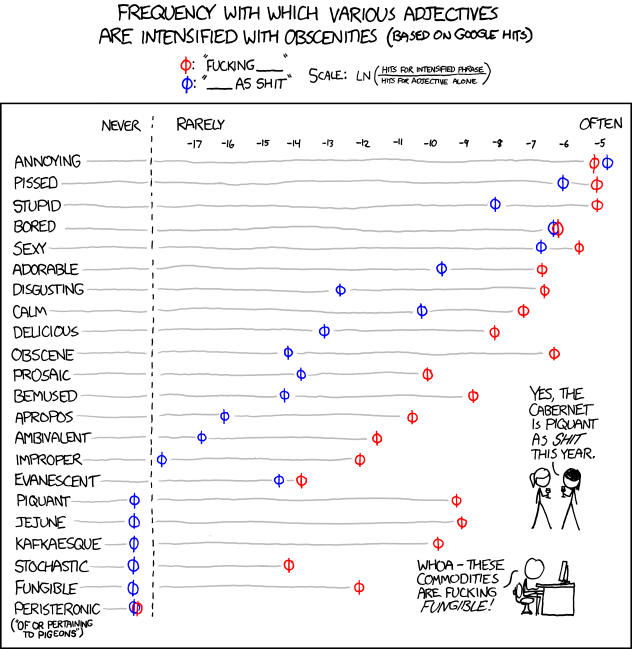
Well Crafted Project: Adjectives

I really like this visualization because it is using Google search results to gain insight into people’s and societal behaviour rather than its intended use of information look up. It was a good idea, and the results themselves are also intriguing.

Sama Kanbour

23 Jan 2014

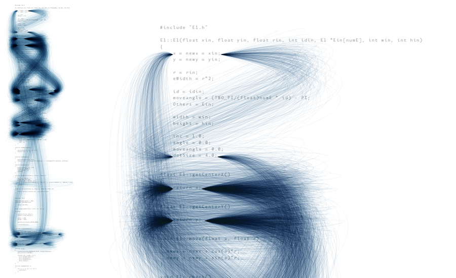
Interesting: Deprocess by Ben Fry

Description Ben Fry communicates through esthetic means the presence of code redundancy. He identifies patterns through the code and connects repetitive code with a blue line.
Message Emphasizing redundancy in code can serve as a good method to evaluating the clarity and cleverness of a code. Indeed, a clever programmer follows the DRY principle—Don’t Repeat Yourself. Thus this design not only visually communicates redundancy, but also cleverness of a code.
composite


Well-crafted: A Day of Muni by Eric Fischer

Description The designer communicates through geographical means the average speed of Muni, a public transit, on a typical day, in San Francisco. Black lines represent movements under 7 mph, red less than 19 mph, blue less than 43 mph and green depict speed above 43 mph.
Honesty and Clarity Using a GPS to track down the speed of the vehicle for a period of 24 hours, the data gathered appears honest. In fact, the city of San Francisco is clearly defined and an American citizen would not hesitate on figuring out the location upon which this graph is based. Data is summarized but not modified.
Message The designer does not use a single number in his graph, except in the legend. Yet, the information is clearly conveyed: in the center of San Francisco, Muni’s speed is minimal, whereas on the periphery, its speed is maximal. This graph, with minimal information, conveys a lot.
Visual Techniques The designer makes effective use of the color wheel: warm colors to represent low speed and cooler colors to represent higher speed. The overlapping lines effectively communicate Muni’s path.
Improvement The designer could include data summaries—for instance, the average speed of Muni. He may also include reasons why Muni’s speed fluctuates in the different parts of the city.

4521616274_5b2acb714e


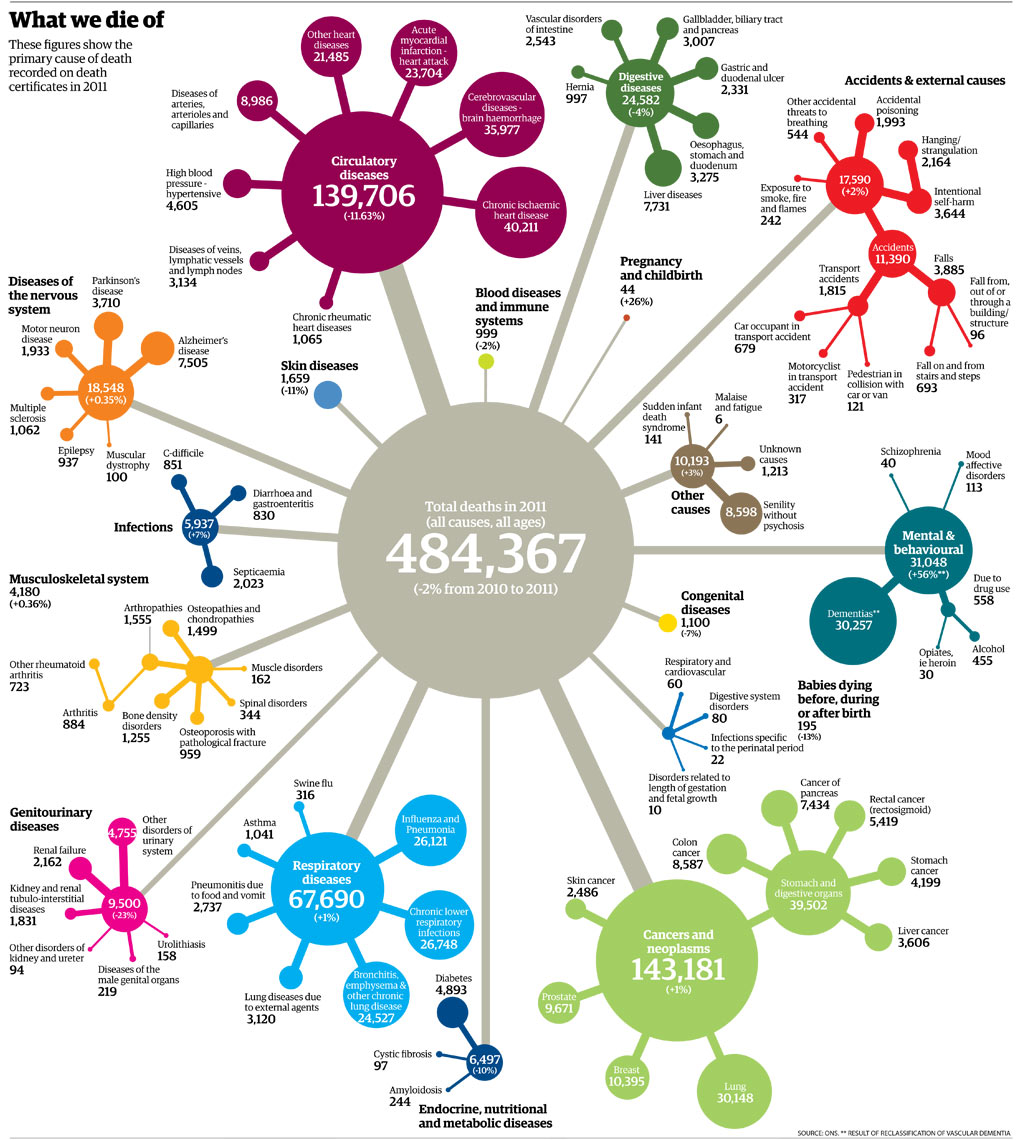
Disappointing: What We Die of by ONS

Description This hub-and-spoke design illustrates the causes of death for 2011 in the UK. It includes 17 official death causes, excluding old age, as the latter may be driven by one of the 17 causes.
Meaning The purpose of this info-graphic is to compare and contrast causes of deaths and identify their fluctuation since 2010. It appears that cancer was the first cause of death in the UK in 2011.
Visual Techniques Playing with figures, colors and relationships, the designer aligns his data-set to facilitate comparison.
Improvement The presence of multiple subsets may cause a clarity problem, as their relationship with the main hub is unclear. The fact that data is repeated in every node, for instance the number 316 that represents the number of deaths caused by swine flu, is also contained in respiratory diseases and in the root node, can lead to confusion. Perhaps this hub-and-spoke is trying to convey too much information, such as the different categories, sub-categories, their respective numbers and percentages.
Mortality rates big graphic

Shan Huang

23 Jan 2014

Cool data visualization projects


Online habitats

Online habitats visualizes Github/Stackoverflow/FriendFeed users clusters based on how closely the users are related. Aside from revealing the most influential users of these websites, this project surfaces the social structure of these online communities as well, and the result looks super fun!

Life is beautiful

This project is an interesting live visualization of the photo sharing app img.ly. For each user who is currently browsing a photo, the visualization creates a line between the user’s location and the location of the photo he is looking at. The long, curvy lines show the long distance information needs to travel before reaching a person, which is constantly ignored by most internet users because accessing data is so fast and simply nowadays.

The next big spill

A visualization of the Baltic Sea traffic. I think this video looks fantastic, although I don’t quite get the message it tries to deliver. Why the heavy Baltic Sea traffic indicates the next big spill?