OrgOrgChart (Justin Matejka)
OrgOrgChart visualizes the growth and restructing of an organization as a circular tree, charting the movements of employees into, out of, and through the company. I find particularly compelling the elastic motions of the tree as changes are made, which, combined with the cellular appearance of the graphic, really communicates the story of the organization as an organism, rather than the stiff bureaucracy traditionally associated with an organizational hierarchy chart. The project currently only maps data from AutoDesk, where it was developed, but it would be interesting to see an entire industry presented in this way, and watch the flow of personnel and the cycles of many different companies alongside each other. This project reminds me of a project I wrote about earlier, gource, which produces a similar tree-based animation of source control repositories, with a similarly-surprising organic feel.
On the Origin of Species: The Preservation of Favoured Traces (Ben Fry)

In Traces, Ben Fry presents the evolution of evolution, diagramming the editing made to Darwin’s The Origin of Species as it progressed from the first to sixth addition, over a span of 14 years. The degree of detail in the dataset is what blows me away for this project, considering that the records of Darwin’s drafts are from the late 19th century, and yet we are able to see small changes of even only a few words as they were worked into the text by Darwin. Interestingly, with the rise of Google Docs and version tracking in a variety of forms, we are almost at a point where a visualization like this could be easily generated for any work, even as it is being created.
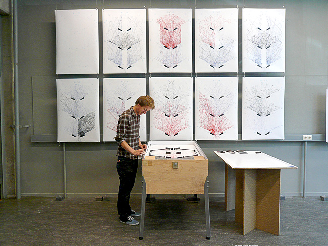
STYN (Sam van Doorn)

STYN traces the path of a pinball through the pinball machine surface simply by applying paint to the ball and letting the trail evolve. This project stands out from the others because it doesn’t rely on fancy computer transformations of the data; everything is generated simply by playing the pinball game. Because of this, anybody can walk up and be directly involved in creating the visualization, as opposed to the passive, after-the-fact involvement in other projects. One component that I feel is missing from the documentation of this project is video of the tracings actually being produced, somewhat like the iQ Font project shown during lecture. This would add another dimension to the visualization, showing its evolution through time.