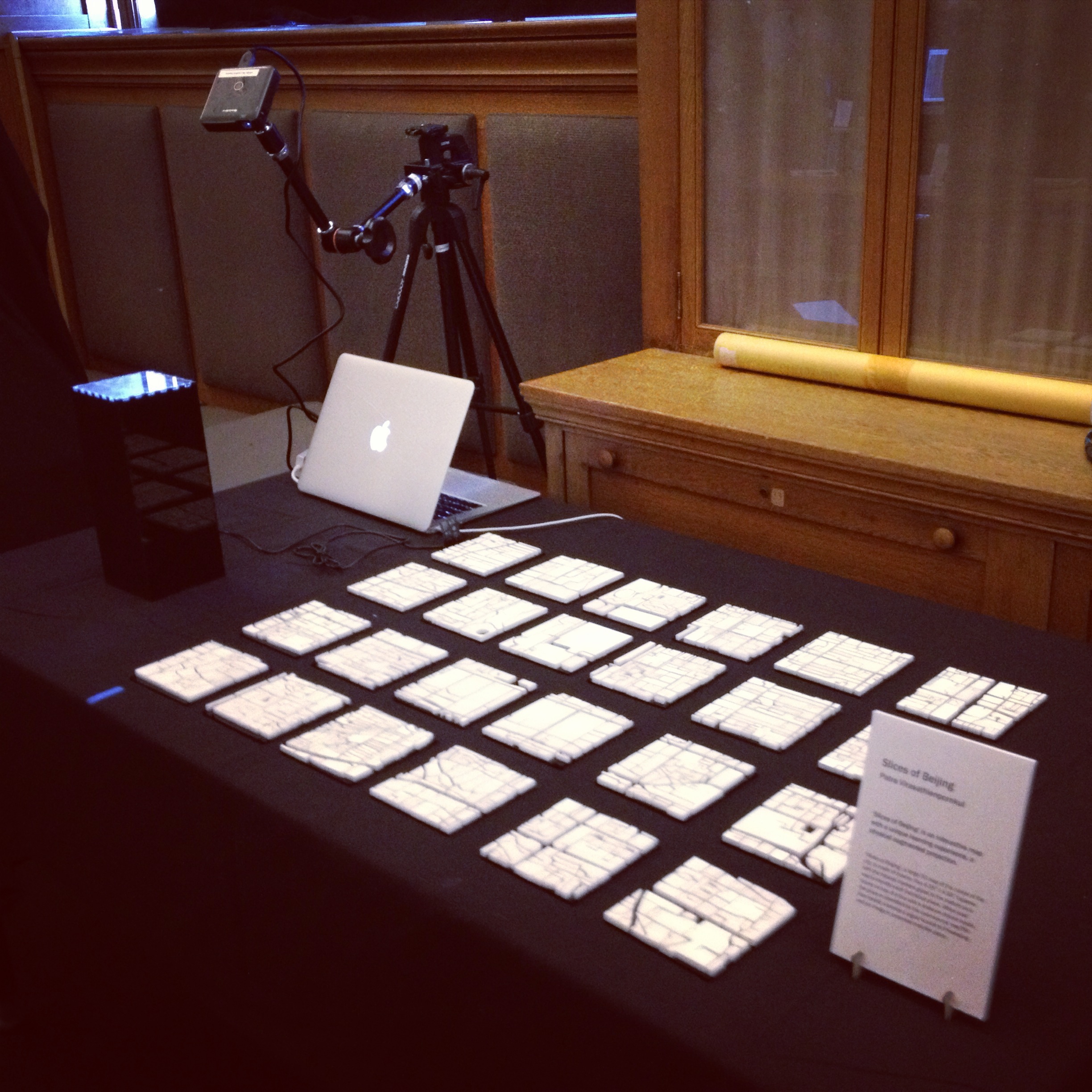
How the heck did I come up with this idea?
Spending ten days in Beijing over spring break was one very memorable experience, and the trip has been in the back of my mind ever since. I thought to myself, ‘what would be a better way to document the trip than making an interactive map of the city itself’. And that was how this idea came about. My goal was to do a project that is meaningful to me as well as educational to others. As a mechanical engineering student, I was determined to get my hands dirty for this final project, and I believe ‘Slices of Beijing’ carried out the plan successfully.
I had an idea. Then what?
As a non-art major, I was struggling to put my ideas together — to back up my concept. I knew I wanted to make an interactive map of Beijing. I knew I wanted to combine some sort of hardware and software into my project, but the concept didn’t really come together. Initially, I planned to make one big 3D map that would be divided and projected in smaller segments. People can interact with it either by moving the map around under the projector or by playing around with it on the computer screen. Things will be projected on the wall, and people can learn more about the city that way. When I told people about this idea, they asked me what was the point of the 3D map, and why wouldn’t I just focus on the software part. They could not piece together this physical map and the information projected on the wall. I guess at the time I couldn’t either. But but but.. I was so determined to make this physical map. I was ready to get my hands dirty. So ready.
And so Golan to the rescue.
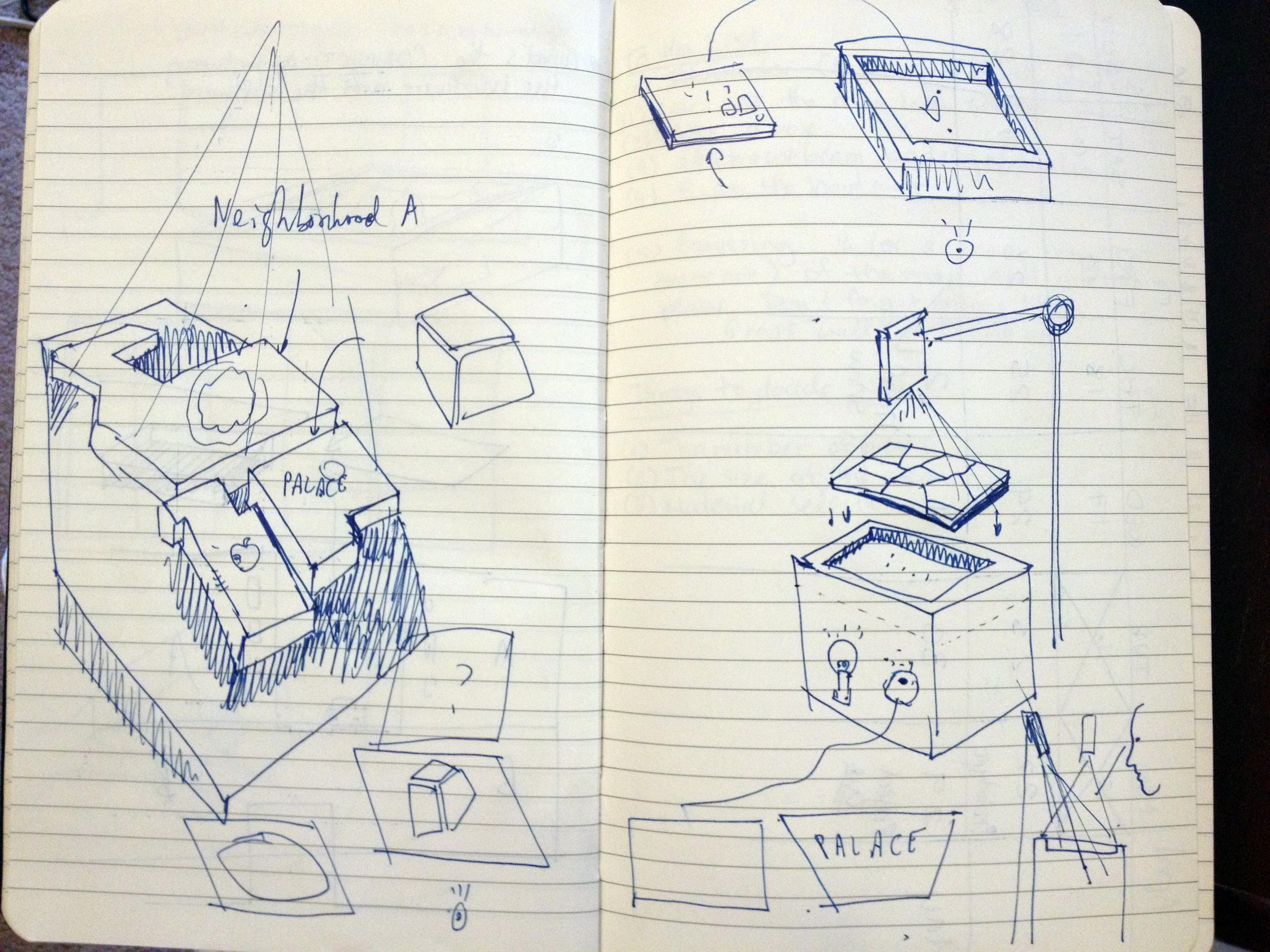
I stuck to making the physical map. Originally, I planned to lasercut the buildings out instead of the roads. Golan suggested to me to leave the roads out, and kept the buildings. And that instead of projecting information on the wall, just project on the map itself. Here are some sketches that gave me hope. After the talk, I knew exactly what I had to do. The idea was there, the plan was there, all that was left was the execution. And so I started working.
Here comes the painful part: How did I make these maps?
It was a pain in the butt. Don’t get me wrong, it was a lot of fun..making the first four. But the other twenty was driven by determination, and by my ‘strong’ belief that it would look really nice in the end. This is not me complaining, but more like reflecting on this whole process. It was a lot of learning and adapting. A lot of trials and (a ton of) errors.
Step by Step
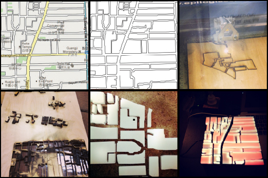
Step 1: GoogleMaps was my good friend for quite sometime. I screenshotted the area that I wanted to make the 3D map out of. I initially included the entire Third Ring Road, but had to cut down to the Second Ring Road due to the time constraint. For anyone who isn’t familiar with how the city of Beijing is organized, the city is divided into six different ring roads, with one ring enclosing the other (They are not exactly shaped like rings, but more like blobs).
Step 2: Organize each screenshotted image (side by side the way it would look on GoogleMaps) in Illustrator, and do a vector drawing of the outline of the map.
Step 3: Crop the big map to the desired size, and divide it into several same sized squares. I wasn’t too familiar with Illustrator, and I chose 4.35″ by 4.35″ squares not totally by choice but by accident. Now that I am more experienced, I would have chosen a less random number. But it worked out pretty well.
Step 4: Laser cut each square on 1/4″ thick white acrylic sheets. Experiment with the settings. I initially used wood, and with the wrong settings it got burnt pretty badly. I switched to acrylic. I didn’t get the settings right the first time, but it worked out after a few trials. Also, I think acrylic is better choice of the two — gives the map a more modern look.
Step 5: Laser cut twenty-four 4.35″ by 4.35″ pieces on 3/16″ thick black acrylic sheets.
Step 6: Take off the tape on the acrylic ‘building’ pieces, wash them, dry them, pamper them.
Step 7: Glue each individual piece on the black squares using acrylic cement. I recommend the weld-on #3 that is more fluidic to weld-on #16 that is more syrupy. I discovered that acrylic cement is one great invention.
Step 8: Use white matte wall paint to paint over the white acrylic pieces. Light diffuses on the acrylic surface, and it was impossible to focus the projected image. This solves the problem completely.
Once done with all 24 pieces: admire and cry a little.
Here goes the technical part
I lasercut a box out of black translucent acrylic using the layout I got from BoxMaker. This box is where this whole interactive game is stationed.
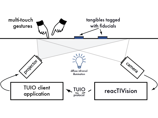
A small webcam is positioned at the bottom of the box. In order to identify each squared piece, a different fiducial marker is taped to the bottom of each map. Once a map is identified, a signal is sent to Processing. A pico projector projects the Processing sketch onto the map. Since the pico projector is not placed directly above the map, the image projected is distorted. Thanks to the Keystone library, the problem can be solved super easily using corner pin key-stoning technique.
This diagram explains how reacTIVision works really well.
What did I learn?
Oh I learned a lot.
A lot of my focus was put into making the individual twenty-four maps. I didn’t realize that the image that will be projected onto the map is as, if not more, important. With the time constraint that I had, it was difficult for me to manage my time efficiently. I also learned that making something beautiful takes a huge amount of time. And I want to emphasize on the word ‘beautiful’. I think it was hard for me to plan out my time well enough to know how long each process would take. I have a much better idea now, which is a good thing.
How can I make it more awesome?
The final show is one very interesting process of this whole project. Seeing people interacting with my work gives me a different perspective. Before I only had an idea of how I would interact with it, but not how others would. During the show, people interacted with it in different ways. Some tried to rotate the piece that is placed on the box, hoping that the projected image would rotate as the map rotates. Some were confused by the whole setup. I originally left a gap between two maps so that it was easier for people to pick up a map to put on the box. People had a hard time seeing that if all twenty-four maps are positioned side by side, they create one big map of Beijing.
Also, I received many valuable comments. One that I remember clearly is to make it more interactive — to have the projected map follow the position of the finger, where the image would project onto the map that the finger is pointed at. And so the box wouldn’t be needed in this case.
Here are the list of things I can do now:
- Make better projected images of the maps
- Make the images rotate as the map is rotated
And here are the list of things I want to do:
- Real-time projection mapping of the map of Beijing
- Finger-pointed interaction with the maps
- Think of ideas to make the project more educational
Final thoughts
I realized there are several things I can do to improve my project. Nevertheless, I am proud of the work I have done with the timespan that I had. There are things I wish I had known. But without experiencing it myself, there is really no way of knowing it.
I hope you appreciate the work as much as I do.

