I’m thinking about to generate some simple graphics by importing some pictures. For example, I import a pic which has bed, desk, and a bunch of stuffs on the desk. And using cv compute the general shape of the objects on the pic and then generate a bunch of such shapes to form the generative pictures.
I’m still thinking about it. I just want to make some simple but very beautiful things. And this is also a simple way to describe a pic by these simple shapes and colors I think.
So, I’m really interested in generative work that functions as an interplay between a controller who sets things in motion and a second group who produce some novel/unique result set. Below are examples of this sort of work utilizing different techniques and even species to fulfill themselves.
Terry Riley In C
This is an aleatory composition by Terry Riley in which musicians are given a selection of phrases to play more-or-less as they choose with minimal instruction from Riley’s score. The resultant structure of piece varies widely from performance to performance. This piece demonstrates the significance of meticulously considered input and algorithmic process in service of exceptionally beautiful output.
Hubert Duprat Trichopterae
Duprat’s project involves removing carapaces from fly larvae and placing them in enclosures with decorative materials (gold, precious stones etc.) The larvae utilize these materials to recreate their protective shells, which are then shared, shed and augmented by successive generation of larvae. The result of this process is the production of art objects whose materials are selected by Duprat, but whose form is created by the natural life processes of insects. Here’s a link to an article about the work in Cabinet.
A sketch I did of the truss in Rhino. The truss must reach the cylindrical pole to lift a load, and only touch the playing field at the opposite end. The colored lines are the springs of the truss. Using Grasshopper I simulated the springs and color coded each line according to whether it was in tension(reds and purples) or compression (greens) or unstressed (light blue).
The idea is to find the best (optimal) truss given a bunch of constraints and a specific loading. The truss is a mesh where each node is a connection between struts, and each edge is a strut, which is approximated as an ideal elastic spring. This is actually an assignment for a mechE class called Stress Analysis, but the nature of the project makes it perfect for creating a genetic algorithm for optimizing the truss.
The basic structure would be:
1)mate parent trusses two create a bunch of offspring.
2)Introduce mutations.
3)Test all offspring for fitness.
4)Select fittest offspring.
5)Repeat until solution appears to be converging (not changing very much compared to the previous solution).
The main goal would be to minimize deflection and weight of the truss.
In general optimization problems have a ‘cost function’ or a function that evaluates how good or bad a certain combination of variables is. For example a chair could have a few parameters like height, weight, softness, and some complex mathematical expression might describe how these parameters combine to make a comfortable or not-so-comfortable chair. In the case of a truss, where any number of connections are possible and the variables involve a large number of vertices and edges, determining such a cost function would be incredibly difficult. Instead my plan is to simulate the behavior of the truss with springs under an idealized load. The performance of the truss (like deflection, or maximum stress) would be quantified and used directly as the fitness of that truss. Thus the cost function would instead be a physical simulation. Run times may be an issue.
I was trying to do this in processing but realized that it really is not made for computing precise values. So I will do this in Matlab.
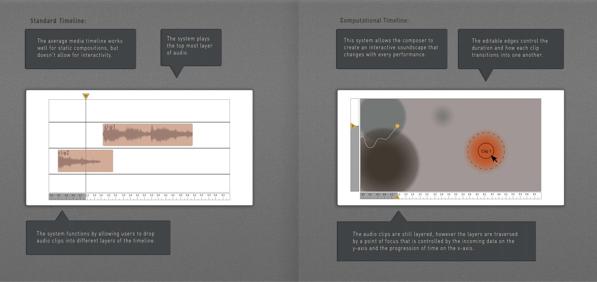
For my Generative assignment I want to create a version of the audio timeline that allows for input. So instead of composing for a track that will be the same each time it is played back, this program will allow the user to create a sound scape that will be different every time audio is plugged into some live data. Each blob on the right is linked to a track in ableton live, so the sound can be any mixture of synthesized and granular sound.
What: I was recently (last 2 months or so) introduced to the tulip mania of the Dutch Golden Age. Tulips, at the peak of the period sold for more than 10 times the wages of a skilled craftsmen in the Dutch empire, or what is today approximately 1 million dollars. One day in February, the prices of tulips fell like a brick: from 100s of thousands to a few dollars. the Dutch, who created capitalism, had the first ever Speculative Bubble and the first ever ‘bubble crash’. I think that this is extraordinarily compelling. That the pitfalls of modern civilizations were realized and forgotten, is something I wish to talk about in my Data-Visualization.
How: I envision a very long flowering bed of tulips installed in a place for everyone to see. I want to plant the tulips according to set intervals during the climactic peak and fall of the Dutch tulip mania.
I believe that this is an interesting subject and I want to create this installation with a mix of beauty and gravity.
In my last post, I was mixing and matching generativity and infoVis, and this post is really no different — hopefully between the two, I’ll have delivered a complete blogpost on both topics.
Heartbeats — realistically.
A powerful and biologically accurate simulation of the beating human heart, with applications in medicine, pharmacology, and general awesomeness. This is great data viz on a number of levels, from the code to the graphics to the articulate video describing the purpose of the simulation. What I particularly love about this model is that despite the complexity of the mathematics and biological phenomena involved on the back end — and without abandoning that complexity — the researchers have created a simulation that is so aesthetically pleasing, in a way mirrors the deceptively simple elegance of the human body itself. How many people actually realize that heartbeats are this nuanced?
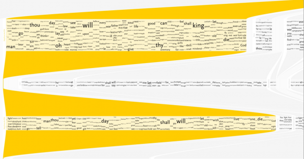
I’m a little bit bitter about anything in InfoVis that tackles Shakespeare, mostly because I’ve done a bunch of meddling with it myself, and then saw a kickstarter campaign with thousands of dollars of funding for essentially the same thing I’d abandoned. In //any// case, I really enjoyed these windows into William’s classic texts. They manage to convey a lot of data while still looking typographically appealing, which is something that a lot of word/language-based pieces seem to neglect. I feel an interesting tension when I look at these pieces. On one hand, they’re great (as the creator realized) as large posters; the immense amount of text contributes to visual interest. On the other hand, I wonder if I could learn something a little more meaningful if I weren’t shown //everything//. Making these interactive with more filtering options would enhance them a lot. My biggest lament? : Where is The Tempest?!
Another project with text that is easy on the eye, and curious in concept. I’ve always wondered how the number of silent letters varies from language to language. When learning foreign languages, one feels surprisingly aware of all the ‘stuff’ one is skipping over in pronunciation: french seems to swallow everything, whereas german seems like all sharp stops and well defined vowels. Yet it’s difficult to ascertain whether this is reality or just perception. In my opinion, the most successful iteration of this project is the version where the ‘silent’ letters are moved to the bottom of the page, so one can easily visually compare quantities. One qualm: very few of the silent letters are truly ‘silent’; removing them — even from the title word ‘silenc(e)’ — has a drastic effect on how the word is said. So I guess my question is: what are we really trying to filter for here?
Soccer Stats. Because soccer is awesome, but the data viz is so poor…?
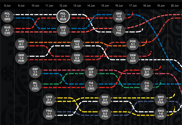
As somebody who tries very hard to coerce all my friends into playing fantasy champions’ league soccer while everybody else in the country plays fantasy NFL, and who therefore is always trying to answer questions like ‘who should I field this week?’ … ‘what’s a holding midfielder?’ … ‘offside?’… and ‘what country is [X] club from?’ I feel like I’m hyper aware of how hard it is to find good visualizations of soccer statistics, rules, and history. Below are two sort-of-nice but sort-of-anemic attempts at saying something about the world’s golden sport. The first actually tackles FIFA’s development work, which has the potential to be a fascinating socio-political resource as well as a sports’ resource, but the content is disappointingly shallow. The second is the interactive map from last year’s Eurocup, which I found charming, if simplistic. It’s also incorrect: Germany should’ve been the last team standing. [cough… hack… cough]
Originally I wanted to do something generative, but then I came across a question I wanted answered, so I decided to do that instead.
Progrmming Style is a somewhat loose term. Having good style helps your code look nice and clean, but honestly good style it subjective. There are many guidelines, and there are many languages. I am curious to find patterns in style across languages and over the course of time.
I plan on using GitHubs API (http://developer.github.com/v3/) to data on popular repositories. I mainly want to grab the individual commits for a specific file in the repos (which can be specified by the user of the Infovis).
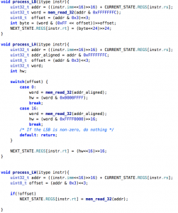
I then plan on abstracting the code into a bunch of colored rectangles based on syntax highlighting. The infovis shouldn’t care about the words in the code. Only spatial location of content is important. So imagine converting the code below into a bunch of colored rectangles.
Once I can map code to rectangles, I can show its change in a very abstract way. A new commit can be presented by animating some rectangles. I can emphasize or demphasize the location of comments and definitions. I can even show the negative space to the left side, showing the indentation scheme that was used.
I’m curious to see the evolution of style on different GitHub communities, communities which differ in language used, people, and application. We’ll see how this turns out!
Update:
Here is a very basic visual of mapping keywords to rectangles of a C file on my computer. Darker rectangles represent comments. Hopefully this can help clarify what I mean by blockifying code.
The interesting, and amazing thing about generative music, is that it has a 4th dimension. You can’t just put a screenshot online to describe what it is. And because it involves time, it is in a sense, interactive. Even if it’s not a direct interaction, it has an indirect interaction with time.
Scape – by Brian Eno
Turns out, the very person who coined the term : Generative Music, has a couple of iOS apps for making generative music. One of them is particularly interesting, because I think the way you interact with the app also is unique like the music.
Heart Chamber Orchestra
The Heart Chamber Orchestra – HCO – is a rather different piece of generative music. performance. It’s an orchestra, and it consists of 12 classical musicians. Using their heartbeats, the musicians control a computer composition, and the score is generated in real time by the heartbeats of the musicians. They read and play this score from a computer screen placed in front of them. Custom-made software analyzes the incoming heart-beat data and via different algorithms it generates the real-time musical score for the musicians, the electronic sounds and a CG visualization via 2 projectors in the space.
Quasar – Envis Precisely
Quasar is a midi-visualization app for iphone. However, the visuals, are also computer generated. So it’s partly visualization, partly generative. Makers of the app, did not take the usual route of creating a piece of music first and then find some visualization for it; instead both elements have been developed at the same time.
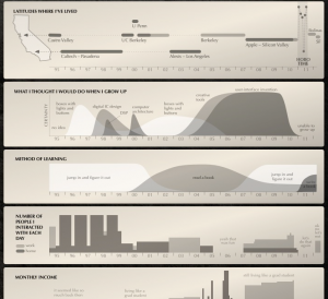
Brett Victor is awesome! Check out all of his work. The first thing I looked at when I visited his page a while back was this awesome Bio. Something like that one guy who charts pieces of his life, brett uses a simple timeline to show both the quantitative, like where he has lived, and mostly the non-quantitate like his certainty. I think its cool he is able to tell you a story about him using 6 graphs, most of which are hardly scientific.
I really liked most of the visualizations McCandless’s presented in the video. The one I’ll talk about is presented early on. The Billion Dollaro-Gram shows various economic spendings using tightly packed colored rectangles. The proximity and size of rectangles opens the door for users to make a multitude of interesting points. The effect of the financial crisis was actually tangible in comparison to all of the other expensive above it. I found it funny that Walmart revenues in that year were greater than the entire African debt. This reminded me how big our nation really was.
As a whole this work can serve as to explain the effects of global warming. That is not what makes it special. What I like about this work especially is the number of variables of change it conveys without confusing the reader. There is data about time, water height, elevation of cities, An ever changing world map, and information about what caused the sea level change. All of this data is important in understanding each other. I think this article is able to compress this material perfectly with little loss.
The n-body problem involves predicting the motion of celestial objects under mutual gravitation. With many objects, this simulation can be computationally taxing due to n2 force calculations. Here we simulate two hundred massive objects, using the Barnes–Hut algorithm to approximate forces in O(n log n). Using dynamic properties, we can easily encode speed using color, and velocity with a white arrow.
Generative Art Prints
This art prints are all comprised of very simple graphics and simple colors. But it’s very beautiful and I like this simple style.
An intuitive approach to network layout is to model the graph as a physical system: nodes are charged particles that repel each other, and links are dampened springs that pull related nodes together. A physical simulation of these forces then determines node positions; approximation techniques that avoid computing all pairwise forces enable the layout of large numbers of nodes. In addition, interactivity allows the user to direct the layout and jiggle nodes to disambiguate links. Such a force-directed layout is a good starting point for understanding the structure of a general undirected graph. This kinds of graph will be very direct for people to see and to know the relations between each node.