Category Archives: looking-outwards

Patt

15 Jan 2013

Project I admire: A Good Night Lamp

A Good Night Lamp is a family of internet-connected lamps, consisting of one big lamp and many small lamps. When the big lamp is turned on, all the small lamps turn on as well. The project started with a mission to be the first physical social networking tool, for people to connect with their families and friends living in different parts of the world. The lamp is used as a medium for communication — to send out subtle messages to a particular person or a group of people, whether it be ‘I’m already home’, ‘I’m leaving my office’, or ‘I’m ready for a conference’. I especially like the subtlety of the lamp and its use as a social networking tool. It appears to be just another piece of furniture, but it has a deeper meaning associated with it. It gives a new meaning to keeping in touch and staying connected with someone. It allows you to know the pattern of someone else’s day. I also like how it targets a wide range of audiences from family members to friends to co-workers. However, I think there should be a way to identify the small lamps to keep track of who they are belong to, in the case where there are several of them.


Project that surprised me: Constructable by Stefanie Mueller, Pedro Lopes, and Patrick Baudisch at Hasso Plattner Institute, Potsdam

Contructable is an interactive drafting table that allows users to interact directly with fabrication tools such as laser cutters and 3D printers. A hand-held laser pointer is used to draft directly on the workpiece, instead of having to use the CAD system. I like how Constructable tries to create a different working experience with digital fabrication. With this new way of working, artists and designers can see their work partially done and creatively make changes from what they see in the uncompleted work. The whole concept really interests me because nowadays, with more and more use of computer aided design programs, people are less likely to work with their hands. With this new tool, it brings back the old sketching, drafting, and making changes as you go. Even though it cannot completely replace a CAD system, it definitely offers an opportunity for users to interact and work more closely with their pieces.


Project that disappointed me: Beatoven by Viktor Jan

Beatoven was created with a hope to produce a cooking experience through making music. Users can put different tracks into the pot to play new sounds, adjust the volume by revolving the buttons on the ‘stove’, and close the lid to turn down the music. I think the initial idea is creative, but the execution could be better. I am disappointed with the overall look, and I wish that Beatoven could bring out a more realistic cooking scene. To me, the pot is the only thing that resembles what is in the kitchen. As an audience, I cannot really feel the connection between cooking and making music that the creator is trying to show.

Keqin

15 Jan 2013

Admire Project-Mill Touch

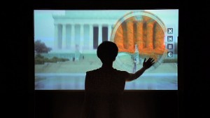
It’s a big touch screen that made of switchable glass, projector and infrared sensor. It can provide cool interaction for users who try to use it.

It’s a different way to implement a touch screen. Use infrared sensor to detect the hands’ position. And it’s easier for people to build I think. Because many other touch screen need more electronic stuffs such as Iphone, HTC etc. And also it provides a cool and fantastic user experience  such as the milky way. Every star in the milky way represent something and user can interact with it. Maybe just it’s so simple and common to interact with touch screen. So maybe adding a camera or something to make users whole body as a part of interaction. I think it will be cooler.


Here is the link of Mill Touch

http://www.themill.com/work/mill-touch/behind-the-scenes.aspx


Surprise Project-Throwable Panoramic Ball Camera


It’s a throwable panoramic camera that solves these problems. The camera is thrown into the air and captures an image at the highest point of flight – when it is hardly moving. The camera takes full spherical panoramas, requires no preparation and images are taken instantaneously. It can capture scenes with many moving objects without producing ghosting artifacts and creates unique images.

I’m surprised that I just think we can see something by changing our perspective. We want to take a panoramic picture. We can stand in a high place to do this. But if we don’t have a high place. What shall we do? Maybe throwing the camera is the easiest way to do this. So the author figured out a way to do this. It’s really amazing work. But I just think it won’t have a very high resolution. We can just use it for fun not for real use.


Here is the link:

https://www.youtube.com/watch?v=MtHCFkQ_V9A&list=UUN8Aax8XICzHJzLScciViWQ


Disppointed project-Pleiades


Pleiades is a visualization tool that allows for the exploration of Twitter communities, and an inside look at interesting dialogues and shared conversations. A twitter community is a group of Twitter accounts that often interact and converse. Pleiades can visualize communities formed around a single account (your community) or from taylor made lists.

The current version allows the visualization of networks formed around a single account, or formed by groups of accounts. To perform different queries the application receives a command trough the url.

It makes a great visualization of all your twitter relationship. I can search for someone’s relationship and see it directly. It’s not very beautiful and not works well. Can’t move single one of them.


Here is the link:

http://intuitionanalytics.com/pleiades/

Erica

15 Jan 2013

1. Still Life by Scott Garner

Still Life from Scott Garner on Vimeo.

This project involves turning a still life painting into an interactive exhibit. Instead of being a purely visual experience, the “painting” invites you to touch and rotate it. A spatial sensor detects the orientation of the “painting” and applies gravity appropriately to the objects within the “painting”. I was really impressed by the project and thought it was extremely successful both in terms of concept and implementation. Conceptually, it provides a connection between the “old world” medium of painting, particularly still life, and the new digital age. This connection can be furthered to the ideologies of older canonical masterpieces and their inaccessibility, and the ease of accessibility of the modern age. In terms of implementation, it has the look of a beautiful still life that would seem perfectly normal to have on one’s wall, and the gravity and response time of the tilt seem pretty spot on. Also, it just seems like such a darn satisfying experience to move this thing and watch the objects move around. The one issue that I wonder about with this project that is not mentioned or addressed on the project’s page is how the scene is reset. At some point, the scene might just be too chaotic to enjoy the experience and need to be reset. Also, the most satisfying and important experience of the exhibit is that first movement of the “painting”, when the still life is at its original position and then suddenly everything moves, so I would think that it would need to be easily reset-able.

2. Blow by Noa Dol

Blow from noa dol on Vimeo.

This is a fairly simple project that involves allowing the user to uncover hidden images by blowing using their mouth. From the video it seems that the artist is using faceOSC to detect when and where in the webcam’s screen space the user is blowing and then maps that to a portion of the image. This project pleasantly surprised me for a number of reasons (besides the odd choice of the project’s title). Firstly, I was surprised that was done with faceOSC; given that in the real world uncovering an image in this way would be a consequence of the breath that you exhale when you blow, I would have thought to use a sensor to detect your breath. Here, the artist is using the actual motions your face makes to detect the blow. I was also very impressed with the effectiveness of the application; there is a very nice, satisfying response on screen each time you blow. I think that it would be a very interesting effect to incorporate into a larger application, such as a game which is something that I might want to explore for a future project.

3. Revolution II by Pierre Marzin
This is a cool project that allows the user to create complex three-dimensional curved surfaces by drawing simple two-d curves with your mouse. It provides a nice experience for the user who gets to pretty much create something from nothing, and some very beautiful somethings at that. Still, there are some limitations that could be improved upon. Firstly, the application is not easily controllable. It is great for experimentation and creating pretty, complex shapes, but it cannot easily be used for any sort of “drawing” or pre-determined image creation. Secondly, the mechanics of the application could be better. As it stands, the user clicks and holds the left mouse button to draw a curve, then clicks anywhere to define an axis for the curve to be revolved around. However, if I had not read this, it would not be very intuitive that the second click defines this axis. Also, when the curve that the user draws is somewhat complex, the relationship between the curve, the axis and the resulting surface is less distinguishable. I think that which some more fleshing out, this could be a really neat tool for quick surface creation.

Joshua

15 Jan 2013

Bubble – The Constant Moment

This project consists of a giant bubble that lasts for around 12 hours and is five meters in diameter.  This is achieved using specially engineered film and climate control systems (which are undoubtedly digital in nature).  Although I found the site of the firm that did the climate control, http://www.transsolar.com/, I was unable to find any specific information about how this was achieved (I sent some emails, so hopefully I will find out soon).  The engineering behind must be pretty insane and I think it is rather fascinating to think about.  For example: what is happening molecularly that allows the membrane to last so long? Is it even using water, or is it composed of some polymer?  How is it kept aloft (maybe filled with helium and air)?  Also, what does it mean to create a system that is artificially prolonged beyond typical human experience?

http://en.aros.dk/about-aros/press/2012/exhibition-2013/ (scroll down to see blurb about artwork)

Crayon Creatures

This is a project that takes children’s drawings and converts them into three dimensional models with the drawings as textures.  These models are then printed out using sandstone (which allows for coloration).  The process involves selecting a contour, using the contour to inflate (in a simulation) a mesh and further smooth the mesh using physics relaxation.  This is an awesome idea. Except that kids cannot play with there creations.  This is probably because the sandstone is fragile and not a good thing to eat.  Given the current technology (with very few color 3d printer methods available) this is somewhat unavoidable.  However, it is still disappointing that the kids are unable to play with there own creations.  Making mementos for there parents is fine,  but the power of this concept is giving kids a new mode of creation.  If kids cannot use there own creations, it looses value as a tool.  (I guess this falls under surprised, since it looks so kid friendly but really isn’t).

The Ascent

http://theascent.co/


A person wears EEG brain wave sensor.  The device lifts the person depending on his or her level of concentration.  In addition, it creates increasing amounts of distracting stimuli as the person rises, thus increasing the challenge.  While this may not be amazing to watch, indeed rather disappointing  I find it compelling.  Coupling concentration tasks with something as simple (well probably not simple in the technical sense) as being lifted vertically is ingenious.  I remember imagining that I could fly using my mind as a child, and without a doubt one of the most insane lucid dream experiences is flying.  In the case of dreaming the mind really does seem to control flight.  So it is almost a realization of dreams, this device that lets one “fly” using the mind.  I would like to try it.  Hopefully its more fun to do than it is to watch.


Kyna

15 Jan 2013

Jeff Koons Must Die!!! by Hunter Jonakin

When I first saw this piece I was really intrigued by it. I’m not a huge fan of Jeff Koons, and I love video games so it seemed perfect. The graphics are reminiscent of old first person shooters like Perfect Dark, which is fabulous. However, from the gameplay I saw, the piece appears to have not very much to do with destroying art and everything to do with just being a flat out endless brawl with a basic AI that runs around in a couple different skins. If the goal was to draw attention to the implied destruction of Jeff Koons, then the addition of the enemies who run around with rocket launchers seems kind of a step away from that and a step towards something that comes off as an assigned project in a game design course.

Jeff Koons Must Die!!! The Video Game from Hunter Jonakin on Vimeo.

Still Life by Scott Garner

This piece struck me in its simplicity and cleanliness. The concept is not particularly thought provoking or interesting, but it is executed with such finesse that I can’t help but be attracted to it. The physics simulated by the items in the frame are pretty excellent, and I feel like if I saw this in a museum, I would spend a lot of time in front of it.

Delicate Boundaries – Chris Sugrue

I want this in my house. I love the simulation of life in art, and the simple action of touching a screen  allows these little bugs of light to crawl up your arms. I especially like the unforeseen events capable of taking place because of the technology used; i.e. a little girl passes her bug to someone else by touching arms.

Can

15 Jan 2013

Profoundly Admired – Subcycle Labs (Christian Bannister)

Subcycle Labs is a multitouch audiovisual break beat generator, synthesizer, blip shaper, and a modeller.

2 years ago, I came across with this visually stimulating, break beat generator. The moment I first saw this on vimeo, I couldn’t help myself but repeat the video till I deconstructed the whole project. Simply put, it is the perfect performance device. It has tons of sampled and synthesized sounds in it, and it has an amazing beat navigator.

You can scrub or rewind rapidly, and it has a blip shaper built into it. I loved this project, mostly because the audio and visuals are in a total harmony, and the multitouch feedback is almost flawless for a beat navigator & real-time modeller. Naturally, I imagined myself playing it in front of an audience, and their feedback. It’s interface is pretty easy, much like its setup, and it doesn’t require too much effort to play.


Surprised (hardware) – Blue Ice (Shout out Louds)

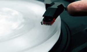
It is a vinyl record made of ice. Sustainability + Vintage + Music + Simplicity + Limited Edition + Ice  = Blue Ice = Win!.

ice-record-shout-out-louds

So turns out in Sweden, they know how to keep it hip. The band, Shout out Louds, sent a kit to ten select individuals along with a set of instructions on how to make the album along with a mold and a bottle of water. The record can be made by pouring water into a negative imprint of the master cut and left in the freezer for no longer than six hours. The frozen disk is then removed and placed on a standard record player. Aside from a bit of crackle and static, the album sounds surprisingly good, with clear beats and resonating vocals.

Just when I thought the vinyl can’t get any ‘cooler’, this project surprised me. I honestly thought good concept albums were already long gone. I think the idea behind this project is really ‘cool’.  First, the listener also is a part of the production process. Secondly, as soon as the record begins to melt, sound quality begins to diminish, so the listener has to pay attention to the song. Perhaps, it would probably be best to get everyone in the room around the speakers to listen at the same time. It’s a one-time deal..


Surprised (software) – Sonification of Everyday Things (Dennis D Paul)


I think this is a really simple, yet surprising instrument. The idea that it converts the objects into sounds is interesting per se, but looping them amplifies the fun.  It uses processing, a distance measuring laser, and a stepper motor.


Disappointed – Mill Touch (by TheMill)

gallery_3

Although I really like The Mill and their reel, I think this is a rather awkward project. Mostly because I couldn’t understand the purpose of this device. I do understand it’s functionality, and I can only imagine how cool it looks. But the purpose of this device is a bit too blurred. It’s a multitouch reel-showcase-o-matic built by and for The Mill crew? Growing in the heart of the creative advertisement industry myself, I know how important “showing-off” can be. However, this can only be used in the dark, and you can’t just put it into the lobby area of the agency building. For a creative advertising agency, the video quality and colors should also be important, but I think it lacks in both, (perhaps to make room for performance?) Swiping on the image reveals the chroma-keyed footage, but apart from that, I can’t see, truly how this can be used other than showing off online. If that was the case, I guess they did a good job.

Andy

15 Jan 2013

It’s my first Looking Outwards post!

Project I admire: I Love the Internet and the Internet Loves Me, by Jamie Allen. This is a fairly simple project – hook up a digital town crier to the artist’s facebook feed, and have the items on the feed broadcast into the harbor for all the ship passengers to hear. I like this project for a couple reasons, but honestly it first struck me because a status from Golan was read in the documentation video. The town crier reads a status and then inserts the valediction “Love,” followed by the name of the person who posted the status. The beauty of this piece is in its challenging of the appropriate places to share information. What makes sharing information with complete strangers in real life so much more awkward than doing so over the internet? If these are 140-character personal “love” letters, why do we allow them to be owned by a company which will forfeit them to anyone for enough money?

Project that surprised me: Play-A-Grill, by Aisen Chacin. For this project, Chacin took apart an mp3 player, connected a vibrating motor to the headphone jack, and mounted the pieces to a grill (the rapper kind, not the car kind or the barbeque kind). The user can control the music by pressing buttons on the roof of the mouth with his or her tongue, and the sound is transmitted via bone conduction to the ears. If the volume is high enough, though, the user can convert their mouth into a speaker. I was surprised by the fact that Chacin saw a need for such an obscure device, but the novelty of the work did give it some media attention. There are some admitted flaws like a lack of bluetooth support and the fact that a wire must currently stick out of the user’s mouth, but if the completed concept can deliver then I’m definitely getting this for my next white elephant gift exchange.

Project that disappointed me: Alerting Infastructure!, by Jonah Brucker-Cohen. This project is pretty much just a pneumatic jackhammer hanging near the interior wall of a building, which is activated for a second or two every time that association’s website receives a hit. Over time, the jackhammer will deal increased damage to the wall, showing how virtual spaces are slowly replacing and thus destroying their physical counterparts. I thought the concept of the piece was brilliant, but the jackhammer used in the documentation didn’t seem to be doing any major damage to the wall. It was unclear to me that any damage was being done at all until I read the description. In order to communicate with more clarity, I would have liked to see the artist doing more interior damage.

Ersatz

15 Jan 2013

Sweatshoppe Video Paint
Blake Shaw and Bruno Levy

This project uses electronic paint rollers created by the artists to create the illusion of painting on walls. The custom software developed tracks the position of the rollers and digitally maps the images to project them onto walls. I really admire how this project merges digital art with the physical environment, using the painting metaphor to highlight the transience of the artwork. While it is expressive, it lacks the permanence typically associated with graffiti. I think it would be more effective if they projected more meaningful content, as graffiti art such as that of Banksy’s is typically aimed at producing some level of social commentary. This project emerged shortly after French designer Aissa Logerot developed “halo”, an LED light spray (http://www.designboom.com/technology/led-light-spray-halo-by-aissa-logerot/), to write messages much like that of graffiti artists.


Firewall
Aaron Sherwood and Mike Allison

In this interactive media installation, the artists project a fire-like visual onto a stretched sheet of spandex, allowing users to push against the screen and experience depth in their interaction with the digital glow. While simple in concept, this piece was surprisingly beautiful as it slows down an interaction and brings a level of reflection to the experience. I did enjoy how the music paired with the texture of the glow, but would have liked to see color used to set the mood as well. The artist, who draws inspiration from music and dance, created the project to be interacted with by dancer Kiori Kawai as part of a performance art piece.


“Because You Asked”
Alan Bigelow

because_you_asked
Project Link: http://www.webyarns.com/BecauseYouAsked.html

This interactive self-portrait piece allows users to click on a series of icons to activate sound and text that ultimately covers the image to reveal the portrait of the artist. After the text covers the image to reveal the portrait, the user can erase the image to reveal the words “Because you asked”. I think this project explores interesting topics of digital identity, but I found the interaction slightly disappointing and overly jarring. The icons lacked meaning for me and the text felt redundant as it was expressed through audio and visually. The process of erasing also seems fairly inorganic and slightly anti-climatic. The artist draws inspiration from digital stories and poetry by bringing together text, sound, and visuals digitally.

Caroline

15 Jan 2013

Profoundly Admire: Tall Ships, by Gary Hill 1992

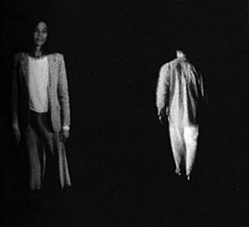
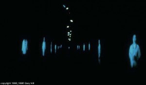
In this piece there is a long hallway of projected figures. A sensor is triggered when an audience member goes by and the figure approaches, appears to almost speak, and then retreats.

ghts2 tumblr_lelws72SCP1qz8y11o1_1280

I like this piece because I think it conveys a simple poetic interaction un-jaded by skepticism and technological gimmick. I enjoy the fact that it was made using laserdisks and monitors with projection lenses. I like the human scale and direct address of the subject matter juxtaposed with the lack of physicality and dismissive gesture of each individual. I think it is particularly suited to the etherial medium of projection.

As an artistic context for this work I would like to reference Thecla Schiphorst’s Body Maps and Paul Sermon’s Telematic Dreaming.  Neither of these pieces are as successful as Gary Hill’s tall ships, but they are also steeped in the idealism of early interaction.

Surprise: Millefiori by Fabian Oefner

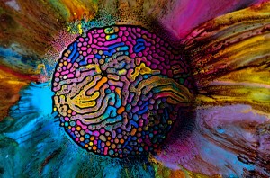
Oefner created a series of colorful photographs by injecting watercolor into ferrofluids (an awesome magnetically charged liquid). The resulting images are psychedelic images that resemble diffusion patterns found in nature.

13508f5c5cb8a756622f73dd2fd7edab


I find this project exciting because of it’s materiality and pseudo-science aesthetic. However the images are pure stimulation. The color palettes aren’t innovative, instead they are simply bright and harken back to the 70s. I would like to see this technique applied to a live sculpture rather than still photographs.

Oefner said he was inspired by the sculptures of Sachiko Kodama.

Also I personally find magnetic putty very exciting.

Disappoint: Perpetual Energy Wasting Machine, by Niklas Roy

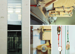
In this piece Roy makes a rube goldberg like machine that causes an elevator to be in an infinite loop, constantly travelling between each floor. Meanwhile a thermal printer in the elevator documents the lost energy of the elevator in a long continually growing strip stretching into a trash can bellow.

perpetual_energy_wasting_machine

This piece doesn’t actually disappoint me. I like the way it is built on-top of preexisting mechanisms of the building and how it is constantly exerting itself over its futile task. I mentioned here more for its potential; I think there is a lot of potential to integrate the secret workings of preexisting structures into a kinetic piece.

This piece reminds me of some of the machine based works of Roxy Paine (except less aesthetic)

http://www.todayandtomorrow.net/


Yvonne

15 Jan 2013

“Admired Profoundly”
Spine

This is a pretty cool project, almost a bit creepy, which is probably why I enjoy it. The setup is beautiful: an old empty building with an otherworldly object suspended in space. This object serves as your only means of light and responds to your presence, but not necessarily in a welcoming way. I admire this project because it manages to evoke a wide variety of feelings without being overdone. I find it to be beautiful yet scary, grounded yet surreal… it just feels “alive.”

“Surprising”
Firewall

Despite its seeming simplicity, I found this project to be surprisingly alluring to me. Initially I thought it was a series of strings in tension, then I quickly realized that was impossible. It is really just a stretched piece of spandex and projection mapping, that when combined, created an interactive surface that deforms in a beautiful, unexpected way.

“Disappointing”
VR Glove

I really like the idea of using projection mapping and a game to highlight architectural features, and to allow users to interact with the built environment in a different, unexpected way. I thought this was a neat idea, but I can’t get myself to fall in love with the means of control. I feel the VR glove doesn’t really embrace all the ways a hand can move as it limits controls to a tilting motion. Perhaps, it is just the choice of the game; after all, pong only allows you to move right and left. It would have been interesting to see the game hooked up to the person’s entire body, rather than just their hand. Maybe instead of tilting your hand right/left, you run right/left. That would be exhausting, but fun.