Looking Outwards

by blase @ 7:09 am 22 March 2012

soak

Soak, Dye in light. by everyware (2011)

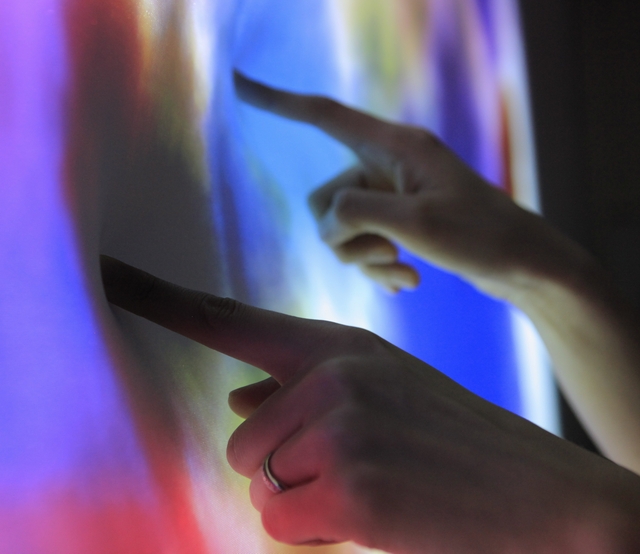
In this project, there is a large, elastic canvas. When an observer pokes it, a Kinect notices this distortion and then uses a GPU to calculate a pattern of paint “soaking” based on an accelerated cellular automata algorithm. It is touted as a a new way to paint a canvas.

While I do think the paintings made using it look cool, I’m not sure that the person interacting with this artwork really has the fine grained control to make new artwork that it implies. Whereas I would think this would be a cool project for someone who doesn’t want to have much control over the colors on screen but wants to make something cool, e.g. a kid, I’m not sure someone who likes painting would really enjoy it. In that sense, it works as an art project, but maybe not as an interaction project.


The Poking Machine by Jasper van Loenen & Bartholomäus Traubeck (2012)

Continuing my poke-themed Looking Outwards, this project converts Facebook pokes (wait, is that still a thing?) into IRL pokes. The project consists of an ATtiny microcontroller programmed using the Arduino software, a servo (to move the poking nub), battery, and bluetooth module inside a box. This bluetooth module connects to an Android phone running Processing, a combination of platforms that is certainly sure to be free of bugs.

The cool demo video, in the art hacker aesthetic with upbeat music and lots of camera jumps focusing on the construction of the device, is nice to watch. However, I’m not sure it really shows us much about the design decisions, like the yellow lasercut box that seems a bit unsightly. Also, I question the choice of platforms, and whether Facebook pokes are still part of the public consciousness.


Van Gogh’s Starry Night Interactive by Petros Vrellis (2012)

This interactibve version of Starry Night normally uses Open Frameworks to basically animate the famous Van Gogh painting. However, when a person pokes the painting, they deform it. The painting is animated as if each stroke were a particle in a fluid simulation. The multitouch tracking is made possible using the OFXkinect library.

While also mostly poke-themed, I think this project succeeds more than the other two projects because it’s simply really cool to look at. I think the animation brings out the iconic characteristics of the original painting (the long strokes), making it appear in new ways. I like it.

Luci Laffitte – Project 4 – Looking Outwards

by luci @ 8:44 am 20 March 2012

[youtube https://www.youtube.com/watch?v=aGsmFLCcDSw&w=560&h=315]

Make a Chemical Reaction

Create a Chemical Reaction is an interactive exhibit in the Science Storms wing of the Museum of Science and Industry in Chicago. Using specially-tagged pucks, visitors can grab atoms from the periodic table and combine them to cause chemical reactions.


[youtube https://www.youtube.com/watch?v=cbEKAwCoCKw&w=560&h=315]

Fun Theory- The World’s Deepest Bin

“To throw rubbish in the bin instead of onto the floor shouldn’t really be so hard. Many people still fail to do so. Can we get more people to throw rubbish into the bin, rather than onto the ground, by making it fun to do?”


Google Map enabled exploration:

State Parks- http://naturevalleytrailview.com/

Museums- http://www.googleartproject.com/

Alex Rothera | Interaction | Looking outwards

by alex @ 1:28 am

Just for now I want to throw on a bunch of interactions I like. I will try and narrow down my interest soon. These are my early thoughts.

Linked is the work of Touch. Simple work of applying tags to objects for recognition and controls in virtual space.

I like this age old technology of light painting. It seems that BERG approached it in a nice way of creating this fun app that just tests the water for the potential of light painting animation.

This is a Grad from the Royal College of Art: Interaction program. This piece is used to harness an lightning strike into heat power for branding. The device is therefore transforming this powerful event into a personal banal branded scar.

Again a work by Andrew Friend. This is a bulb that drops ink onto passers below if the company’s stocks are low. Forcing Interaction through mystery. This was one of my first views into this field of “Speculative Design.”


“The Future” By James Auger

“Thermal image data from various points on the face are fed into the computer. Algorithms turn this information into motion of a stepper motor. This is turn rotates the final output dial.”

–note to self. I like that there is raw data captured from onlookers. But it is represented in a new way that doesn’t correlate exactly.


“Interstitial Space Helmet” By James Auger

Auger is really one of the fonder of this Speculative Design field. This project is amazing is how serious it is pitched, but what it is really talking about. Theoretically users can change their face in real time according to how they want to be perceived virtually.

[youtube https://www.youtube.com/watch?v=5HQ9ZOqGGmc&w=560&h=315]

Spencer Finch ” WEST (SUNSET IN MY MOTEL ROOM, MONUMENT VALLEY, JANUARY 26, 2007, 5:36-6:06 PM) ”

Classic Piece by Finch. I’m sure most people have seen this. I’m noting it personally as a piece that uses familiar technology to express visuals that evoke something greater. We have such a familiarity with television that to break out of its regular connotations and realize that it is beautiful just as project color is quite nice.

[youtube https://www.youtube.com/watch?v=0NLLRKGVDl4&w=420&h=315]

KelseyLee-LookingOutwards-4

by kelsey @ 4:05 am 19 March 2012

Sonumbra de Vincy, Responsive Light Emitting Environment

by Loop.pH

[youtube=https://www.youtube.com/watch?v=CF9rqiHNDuA&list=UUN8Aax8XICzHJzLScciViWQ&index=1&feature=plcp]

This sculpture has its lighting pattern and musical composition determined by visitor’s position underneath the umbrella net of fabric. The persons movements will alter the electroluminescent fibers. I like the way that this piece is integrated into the environment of the visitors. The tree-like, form, the canopy of light that results, the structure is unnatural and yet somewhat organically incorporated into the environment. The interaction is fairly basic, but at the same time, very natural, creating an experience that is delightful and fun, and yet nondisruptive to the world that exists around the sculpture.

Snake the Planet!

by MPU
technology: openFrameworks

[vimeo=https://vimeo.com/37637793]

This piece involves projecting a snake playing board onto walls that includes obstacles generated from real life obstacles, for example windows on the wall will have bounding boxes created around them. Originally I had been looking for pieces with strictly user interaction, however this made me shift my focus to begin thinking about how the environment’s interaction affects a piece. Utilizing both player controlled snakes and environmentally generated game boards, Snake the Planet! shows how two different dimensions of interaction come together.

Starfield

by Lab212
technology: openFrameworks, Kinect

[vimeo=https://vimeo.com/36892768]

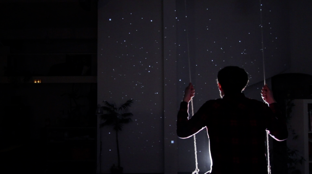
In Starfield, the person sits on a swing to view the piece. As s/he swings back and forth, the projected starfield before him begins to move at a pace determined by his swinging speed and possessing forwards/backwards movement that mimics her/his own. With 3D glasses it’s as if s/he is immersed in the field of stars. I liked the idea of adding a swing to the visitor environment, to set the stage for the interaction. In my mind the piece can mostly go anywhere, but that one addition is what will determine if the piece can exist and be experienced as intended (since the projection can be done almost anywhere).

John Brieger — Looking Outwards 4: Interaction

by John Brieger @ 3:50 am 6 March 2012

Siftables and Cubelets

One of my favorite pieces of interaction design, Siftables comes from MIT media lab. It’s an interaction platform unlike any other: a series of customizable and rearrangable blocks that can be used for a variety of computing applications:

For a more robotics-oriented approach, CMU’s Co-D lab produced a project called Cubelets.

Wooden Mirror

I did a Daniel Rozin project for my first looking outwards that was non-electronic, and now I thought I would put up his wooden mirror project (1999) that was part of a series of 4 mechanical, electronic mirrors he produced. This video is from a commission for a recreation of the work which he did in 2005.

Treachery of Sanctuary:

Strobe Flower

Circque Calder:

Poultry (Paltry) Internet

Alex Wolfe | Looking Outwards | Interaction

by a.wolfe @ 9:30 pm 5 March 2012

Fabric/Paper Speakers on Craft Magainze

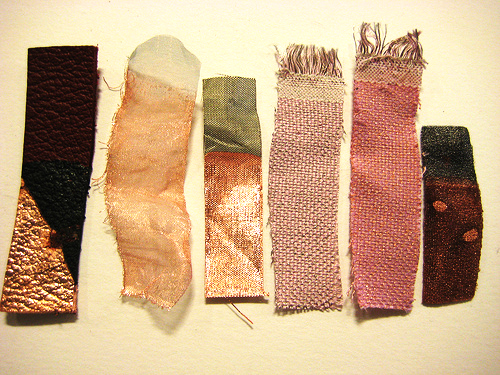
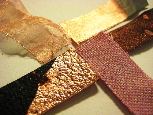
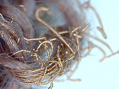
Electroplated Textiles/Thread and an Open Source spinning Machine by Dreaming Robots


Playtime – Ying Gao

Light sensitive dresses that blur the silhouette when a camera flashes.

Joe Medwid – Project 3 – Artificial Evolution

by Joe @ 9:08 am 1 March 2012


Almost a year ago, an inconspicuous Tumblr blog called the PortraitDex caught my attention. It challenged artists, primarily webcomic artists, to create “Pokemon Self Portraits.” Translating the immensely introspective task of portraiture into the evolutionary design language of Nintendo’s smash hit game proved to be an incredibly enjoyable and rewarding experience.


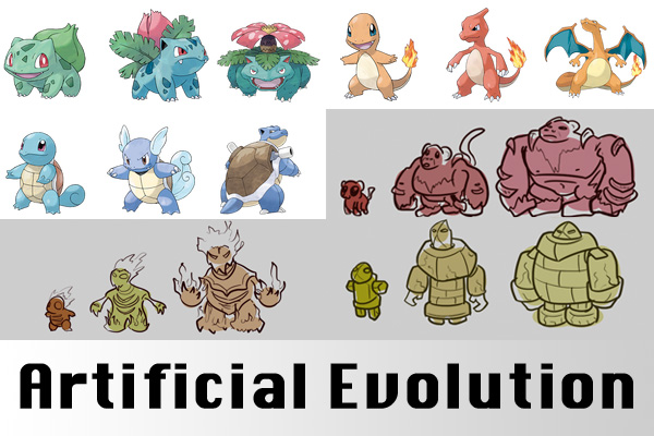
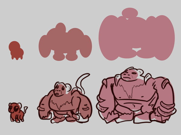
Evolution Example

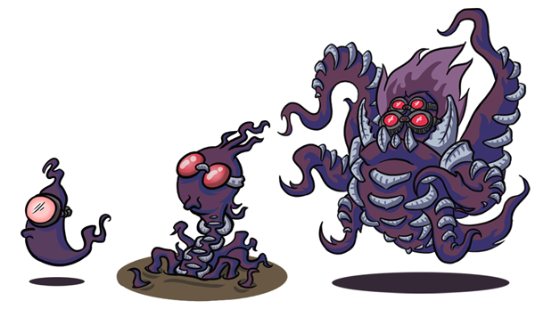
PortraitDex Submission


Creating my piece really got me thinking about the design language involved in the design language of these evolutions, the very deliberate ways in which forms grow and transform. When you approach these little critters as a legitimate design space, it quickly becomes obvious that each stage changes both the morphology and personality of the pokemon, resulting in a dramatic change from the first to final stages. I even managed to find a scholarly article on the topic. Inspired by concept artists who use simple silhouettes to quickly generate starting points for their creature designs, I decided to explore the evolutionary process of pokemon design as my generative assignment.


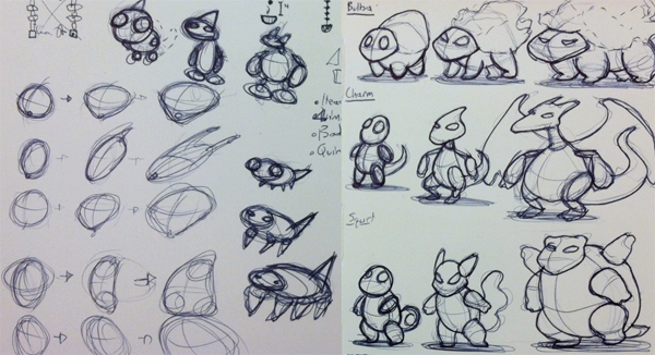
Exploratory Sketches


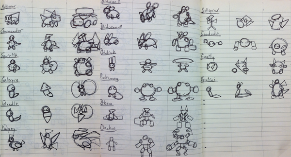
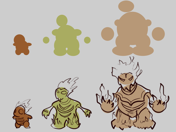
I began by really digging into the basic geometrical changes of the 16 original pokemon with 3 stages of evolution. I choose to stick to the original 151 pokemon as they were the work of a single illustrator and have served as the template for the 500-some additions that were to follow over the course of a dozen years of games. Reducing the creatures to their basic forms revealed some commonalities – Rounded bodies and large, friendly eyes in the first stage, slender bodies and elongated limbs in the middle, and powerful, confident forms as the monster achieves its final form.

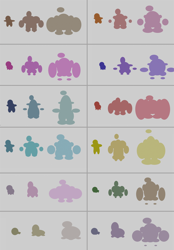
The Beasties


Identifying a number of basic elements (Head, Torso, Arms and Legs) I created a simple processing applet that would, as much as possible, generate forms similar to those displayed in the designs of actual pokemon. I initially explored using Box2D or Toxicglibs to create these forms, but was unable to wrangle them into the simple parts I required, ultimately ending up with an elementary series of ellipses.


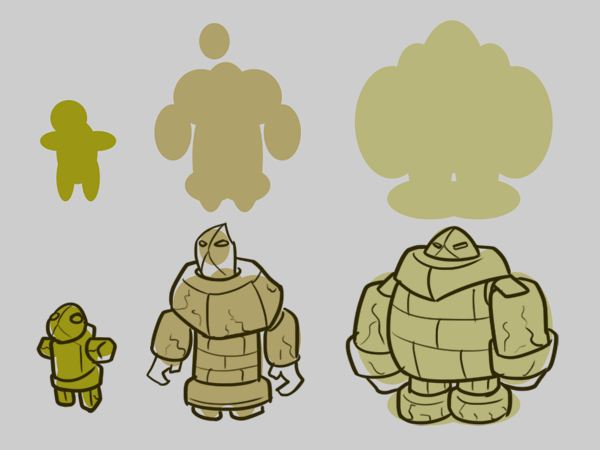
Riffing on Silhouettes


Once many many silhouettes were generated, I decided to incorporate the concept artist’s methods and actually create a few rough sketches of potential pokemon based on the program’s results.

Nick Inzucchi – Project 3 – Disconnected

by nick @ 8:41 am

[slideshare id=11808588&doc=slides-120229225632-phpapp02]

90% of my day is spent staring at screens. It’s been months since I’ve spent time outside, or even took a quiet moment to collect my thoughts. I designed Disconnected to explore this tension. I was interested both in how digital technology can distance one from nature, and in how these digital experiences eventually begin to blend into one’s reality. I wanted to create an experience that would make the viewer explicitly aware of this conflict.

The system works by sensing the user’s emotional stability and using this to dynamically deconstruct a placid, natural scene. The concept is that stress, anxiety, and general lack of calm will manifest themselves as digital interruptions in nature. As static and digital patterns obscure the scene, this directly reflects the mental instability produced by overuse of technology.

The background was shot from one of my favorite spots in Schenley Park. It’s a place I used to go to think, relax and meditate, back when there was time. This view represents a kind of pure connection to nature, something I feel I’ve lost.

The system uses biometric input (skin conductance and heart-rate variance) from a WildDivine IOM USB sensor. It abstracts these values to judge whether the user’s level of arousal is above or below normal, modifying the visualization in turn. Each time the system is used, it records all readings in an external XML file. This archive comes to represent the user’s ‘baseline’ arousal, allowing the system to judge whether on any particular use their state is above or below normal.

Based on this judgement, the system takes several steps. An ofxCameraFilter blurs the screen, modifies contrast and adds noise. A ofxDelaunay mesh constructed from randomly positioned points also fades into view. Each vertex uses perlin noise to randomly shift about the screen, and the intensity of this movement is also modified by biofeedback. I love that they came out looking like gnats over the lake. Lastly, the system crossfades between two soundscapes, one clean and the other heavily distorted, depending on the user’s state.

A.Rothera | project 3 | Simulation

by alex @ 7:20 am

My original inspiration originally game from a moment recently when someone asked me “what did you love when you were little.” For some reason I immediately remembered k’nex. I remember day after day coming home from school to spend hours alone building and creating. I’ve been thinking about this in respect to my current/long lasting want to build new ‘things.’ Alot of my work involves this act, of the build and the unbuild. Most specifically I remember this game my father and I used to play with k’nex, a game I think I’ve subconsciously held onto.

I’m also thinking about the current increase in 3D printing. How printers in every form and size are being made, with concerns of resolution. I think about necessity and material. Of how the world will change if 3D printers do become a common tool for every family. Where will all the plastic come from… and go.

With this I think about materials that we have and exist for form. Both forms we understand and forms we can fabricate or refabricate.

Untitled-1

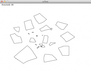
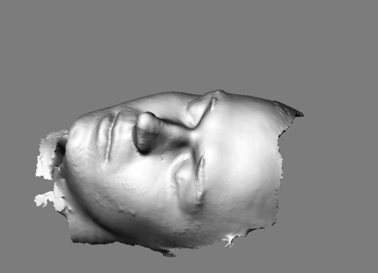
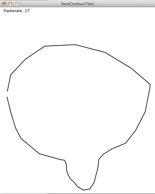
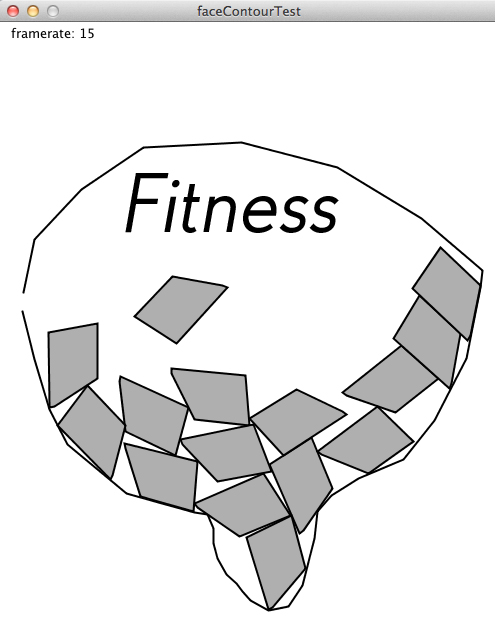
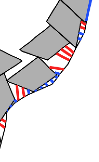
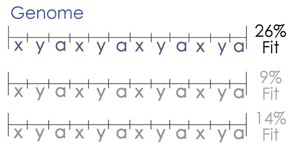
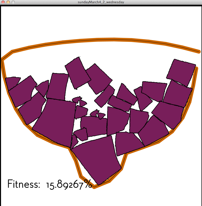
This simulation can work well because the “fitness” of the different stages of the layouts are very computational. There is a definitive percentage that can be calculate between the distance of the edges of the shapes to the contour.

Alex Wolfe | Project 3 | Generative

by a.wolfe @ 8:26 am 28 February 2012

[vimeo https://vimeo.com/37591698 width=”600″]

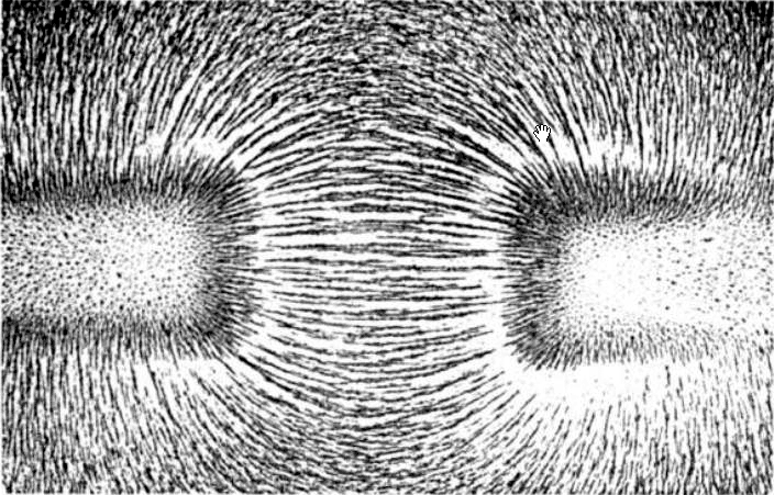
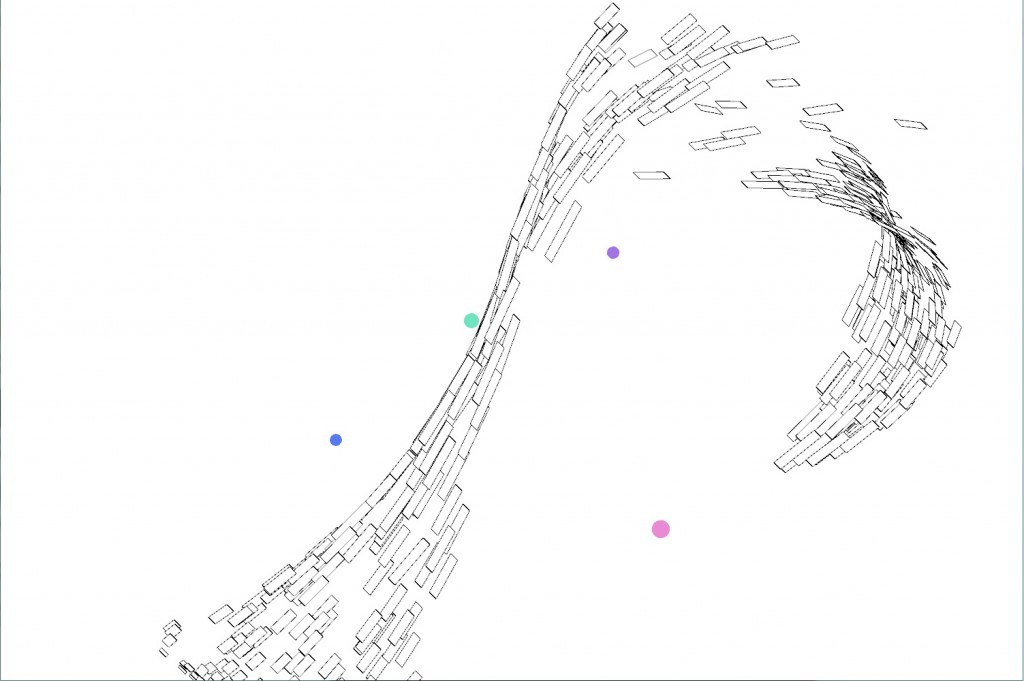
So, full disclosure, I love particle systems. I think it’s one of the best/easiest ways to get generative organic flowy motion when coding. When I’m making art by hand, that’s generally my aesthetic, and I usually want it to carry over into my computational art as well. Of course with this sentiment also comes a total abuse of perlin noise, which accomplishes much of the same feeling with significantly less math/hard work. So for this project I wanted to code up a real physics system that wasn’t just based off of perlin noise/ flocking rules and hopefully get some different behaviors/motions. I decided to focus on magnetism, since magnetic particle paths also have a very curvy graceful motion.

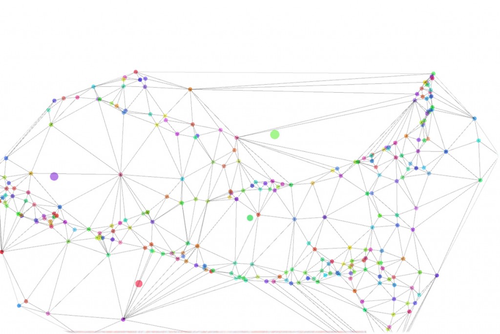
So my initial sketch had user placed gravity wells, which are those really cute brightly colored drops. The user can click to place them, drag them around, and then right click to be rid of them. Unlike boids in the flocking algorithm, these particles have no behavior of their own, but are entirely controlled by these external forces. Unfortunately, the final result didn’t look that different from any other swarming/ perlin noise flock despite following  a completely different rules. However I did have this pretty powerful/adaptable system so I started exploring other ways I could create something useing the underlying interaction to power it.
My first instinct was just to create a delaunay triangulation and mesh it. However this was still kind of eeeeeh, though I did have fun working with the Toxiclibs color library to get a really nice palate. I’ve been in an illustration/comicy sort of kick lately. In my hand drawn work, I tends to cling to super ornamental patterns and really bright colors.
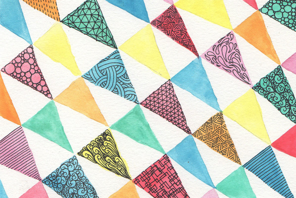
And as much as I love their effect, I hate drawing them! They are tedius and take a  ridiculously long time for an effect that is purely decorative. I’d love to have a tool where I could just get fast combinations of them in different arrangements on the fly that I could use for background effects, whether just for gutters or fillers on dresses and cloth, similar to this sketch here.

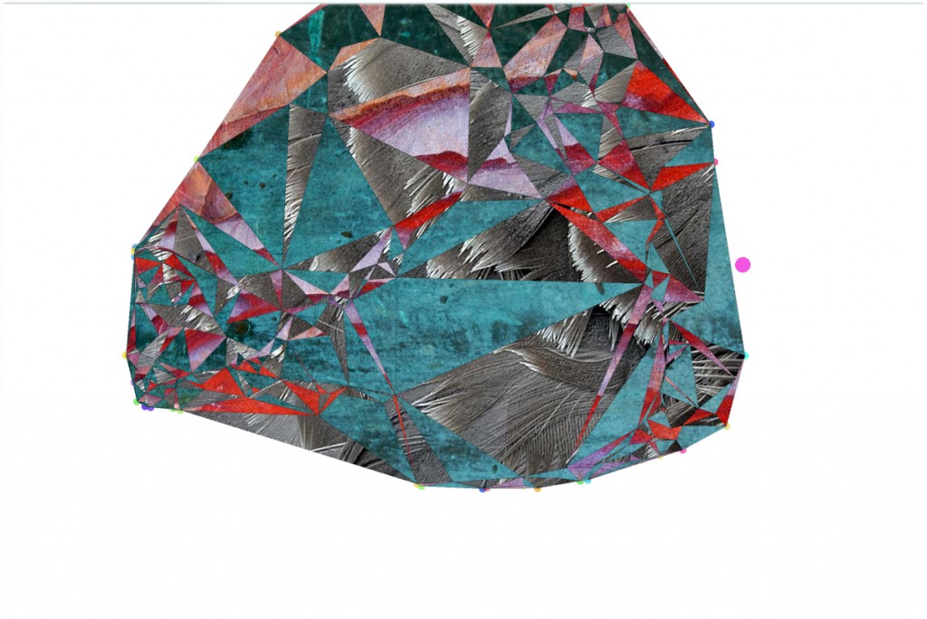
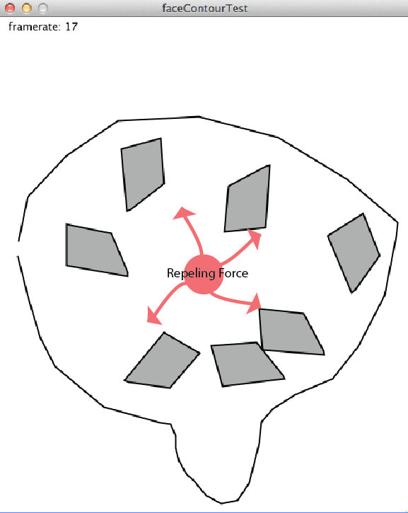
So I added repeller gravity wells where you could just drop in, for example, a comic panel or some other element that they system would then do its best to avoid.

And I started playing around with different texturing systems. I came across this idea rather late in the design process so I didn’t have time to hand watercolor the large swatches of pattern I would need to execute my above pattern, so I experimented just using various texture files from my graveyard folder for such things on my drive.


« Previous PageNext Page »
This work is licensed under a Creative Commons Attribution-Noncommercial-Share Alike 3.0 Unported License.
(c) 2023 Interactive Art and Computational Design, Spring 2012 | powered by WordPress with Barecity