Joe Medwid – Project 3 – Artificial Evolution
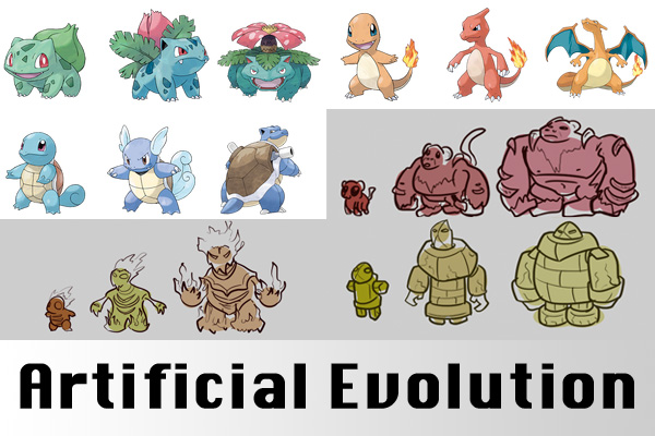
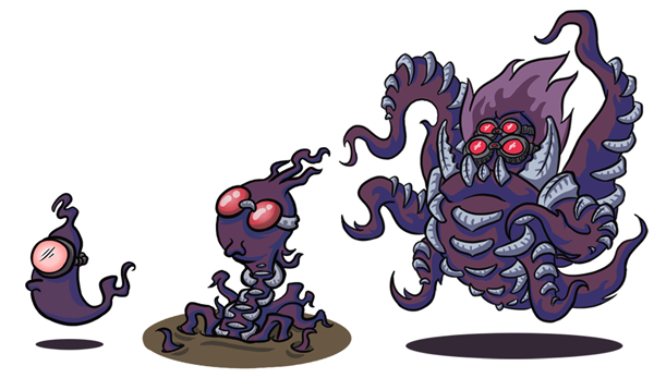
Almost a year ago, an inconspicuous Tumblr blog called the PortraitDex caught my attention. It challenged artists, primarily webcomic artists, to create “Pokemon Self Portraits.” Translating the immensely introspective task of portraiture into the evolutionary design language of Nintendo’s smash hit game proved to be an incredibly enjoyable and rewarding experience.
Evolution Example

PortraitDex Submission
Creating my piece really got me thinking about the design language involved in the design language of these evolutions, the very deliberate ways in which forms grow and transform. When you approach these little critters as a legitimate design space, it quickly becomes obvious that each stage changes both the morphology and personality of the pokemon, resulting in a dramatic change from the first to final stages. I even managed to find a scholarly article on the topic. Inspired by concept artists who use simple silhouettes to quickly generate starting points for their creature designs, I decided to explore the evolutionary process of pokemon design as my generative assignment.
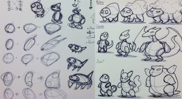
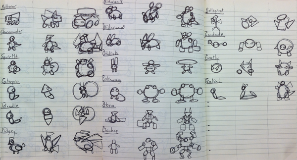
I began by really digging into the basic geometrical changes of the 16 original pokemon with 3 stages of evolution. I choose to stick to the original 151 pokemon as they were the work of a single illustrator and have served as the template for the 500-some additions that were to follow over the course of a dozen years of games. Reducing the creatures to their basic forms revealed some commonalities – Rounded bodies and large, friendly eyes in the first stage, slender bodies and elongated limbs in the middle, and powerful, confident forms as the monster achieves its final form.
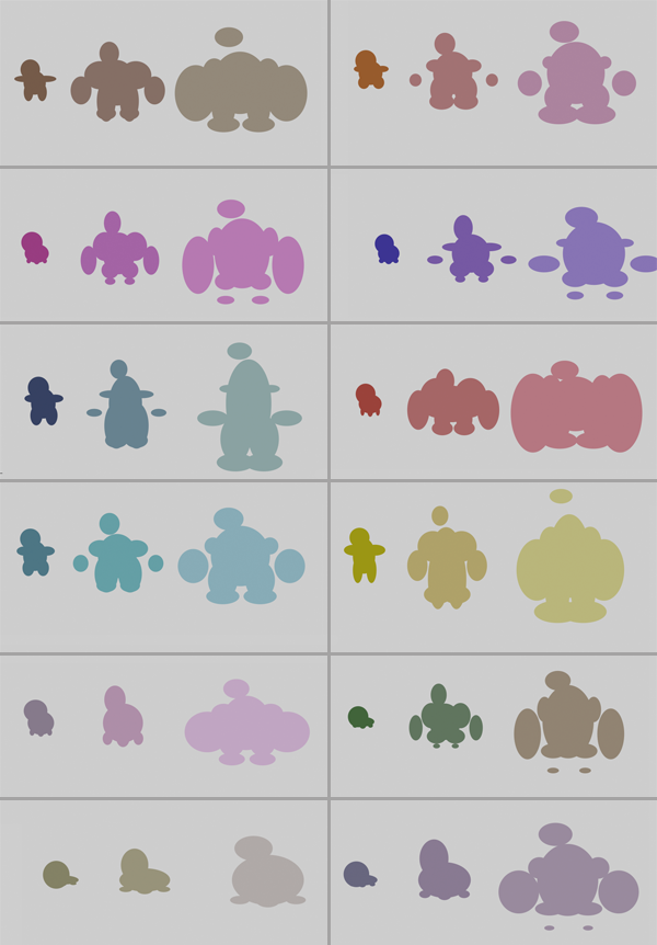
Identifying a number of basic elements (Head, Torso, Arms and Legs) I created a simple processing applet that would, as much as possible, generate forms similar to those displayed in the designs of actual pokemon. I initially explored using Box2D or Toxicglibs to create these forms, but was unable to wrangle them into the simple parts I required, ultimately ending up with an elementary series of ellipses.
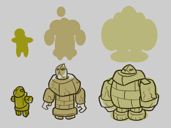
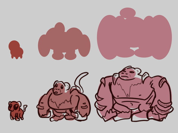
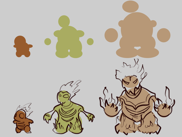
Once many many silhouettes were generated, I decided to incorporate the concept artist’s methods and actually create a few rough sketches of potential pokemon based on the program’s results.
WOW. this is pretty cool. your research into the shapes seems pretty thorough!
Herman Cain would fund your research.
Interesting idea/design generator. (nice name too!)
That’s awesome how you went all the way from the visual design to the code to build on those patterns.
Check out this gallery of minimalist pokemon designs, they’re doing a complementary approach to the character design analysis: http://pldh.net/gallery/the493
Looks beautiful! I love your comics.
great way to build sources of inspiratio. The combination of the sketches with teh processing generated sillhouettes is a nice effect! :)
Joe, I love the renderings of the silhouttes into developed characters. Do a whole gang of them when you have some time.
This is a really cool start. I think Golan’s suggestion is right that introducing additional limbs and other body parts would be great as a next step. I also think messing with bezier curves would produce some interesting variation.
One thing I find interesting is how it reveals the very formulaic nature of beastiaries like the pokedex. Did you include an element of mutation within the rules? It seems like it would be fairly simple to have small chance of something random happening like losing or gaining limbs, or increasing or reducing the number of points in the polygon (ellipses are really just polygons with lots of points). What happens if you evolve them past the third stage?
the is s a cool avatar generating technique, could be used in a lot of games, i think kids would be really into the drawing over it part as well
Maybe another way to generate variations would be morphing among the different types.
I already like this presentation. Pokemon AND tumblr? whut??+1
I like this concept ALOT. 3D wouldn’t be too bad to implement with just the basic things you have now, like entirely made of primitive shapes in a single color, but if you aren’t familiar/comfortable I think it will just make a bigger
obstacle to evolving the idea. For example, its more difficult to work with color, like having spots or patterns evolve would have to be done with textures and applied to the mesh which can look really janky unless its done well.
I think you can stay in 2D and just include more elements and the piece would be equally/more powerful. Especially since Pokemon make much more compelling illustrations. I always like the gameboy/cartoon versions better than when they bumped them to 3D. (Pokemon Stadium for the 64??)
And then really, inspiring the hand drawn element is the best part of this! And you don’t especially need 3D for that. Especially if you play with deforming splines with evolution and introducing more shapes. Like pokemon start out all
cute and round and usually get progressivly spikier/more dangerous with harder and sharper angles as well as fatter. I think spline deformation and additional primitives can show this better than let’s say, mesh subdivison.
Unless you want all your evolved pokemon to look like Jolteon.
^lulz (joe)
totally badass sketches. I really like the scripting of your presentation. You did a good job of working within constraints to produce something impressive. Very Rorschach. Eyes would be a good way to give them more character.
this is great! pokemon! hahah i like how the “badass” pokemon get fatter
diggin the sketches! and I like your particular pokemon as well. From your point of view, do you think your generative program helped you develop to a great extent new and interesting pokemons? From an artist perspective, I see this a tool for cranking out pokemons if you wanted to focus on the detailed variations.
You would enjoy the work of Takeo Igarashi.
I love the idea of using generated shapes as inspiration for more detailed hand drawings. It’s a great inspiration source if you don’t know what to draw. For working with simple shapes, the silouhettes are very “realistic” (i.e. they look like shapes of actual Pokemons). You might be interested in the work of illustrator David Revoy, who uses a program called Alchemy ( http://al.chemy.org/ ) to generate random-ish forms which he then draws on top of. http://www.davidrevoy.com/index.php?article72/alchemy-sketchbook-dump
Not generative, but the concept is similar.
Here’s a library for scripting in illustrator: http://scriptographer.org/ The rules you’re applying to the overall silhouettes can also be translated to the generation of your vectors, and illustrator may be a more comfortable environment for that.
i like how you identified the base shapes for these creatures.
You have a good concept and strong initial results. I recommend you level-up the processing program to use 3D ellipsoids. It’s really not that hard. And from there, a toon shader of sorts is relatively easy too.