What if you could see color?
What if you could do more than just look at color? To perceive it, understand it, analyze it, really see it, color needs to be visualized.
My name is Sankalp, undergraduate Mathematician + Designer at Carnegie Mellon and I plan to do just that. The first question we must ask ourselves is, how can we possibly visualize something already visual? The answer I found can be summarized in four steps: First, treat color as data. Second, interpret this data as information. Third, graph this information. Fourth, notice patterns in graphs.
“Treat color as data”
In order to treat color as data, we must quantify the the qualitative. To do this, we must reference basic color theory. Every color that we digitally see can be broken down according to the RGB model. This model yields three distinct values according to a particular color’s Red, Green, and Blue hues from any given blended color. For example, the color Black has 0 hue increments in Red, Green, and Blue and thus has an RGB value of (0,0,0). Whereas, the color White has 255 hue increments in Red, Green, and Blue and thus has RGB value of (255,255,255).
“Interpret this data as information”
To interpret this data, we need to increase the scope of color to palettes. A palette is simply a range of colors used by artists, designers, and other creatives. In design, palette consists of around 5 different colors. These colors are usually brought together for their contribution to a palette’s overall mood or theme. Because of the nature of palettes, designers tend to create various versions in pursuit of a specific quality. In fact, at Kuler, designers from around the world can submit their individual palettes with “tags” relating to the mood or theme they interpreted from the palette. Kuler even has the option to organize the available palettes by “Most Popular” (in relation to how many times that palette was downloaded), “Highest Rated” (in relation to how many stars out of 5 the palette averaged), and “Newest” (in relation to the palettes most recently submitted). This online tool is widely used by artists and designers and will serve as the perfect host for our information visualization.
“Graph this information”
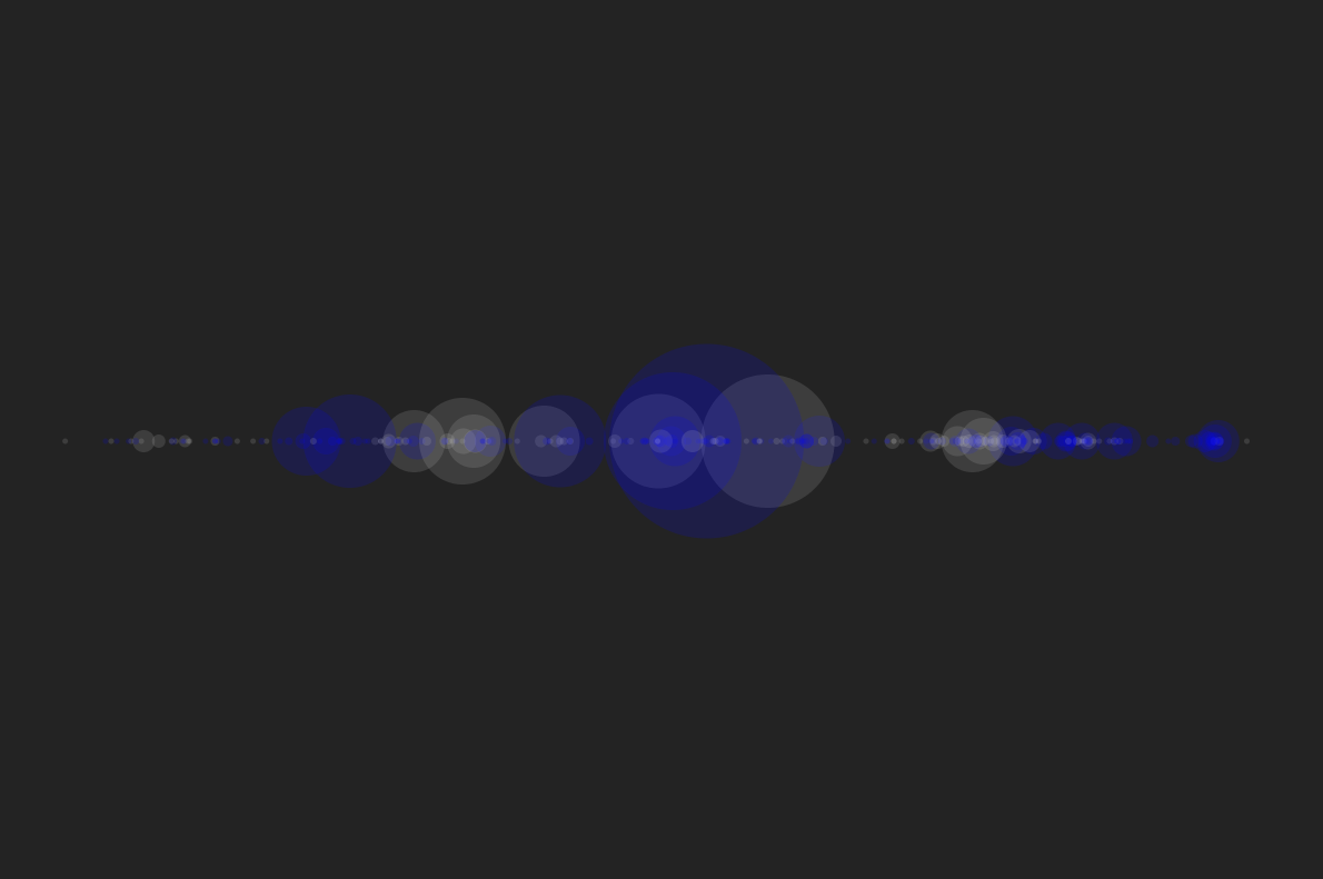
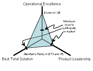
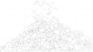
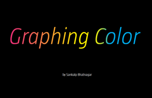
Graphing palette date requires an understanding of some geometry. Consider any color you’d like. This color will have a unique RGB value expressed as (r,g,b) where r, g, and b are any integer, distinct or not, from 0 to 255. To continue further with our project, we must convert these r,g,b values as coordinates. Luckily, if we frame our values using intermediate coordinate geometry, this conversion comes for free! If our graph has three axes 120˚ apart that share a mutual minimum value of 0 and distinct maximum values of 255, we can plot 3 points on this plane. Then, we must only generate a triangle with these 3 points as the 3 vertex points (an apex, a base right vertex, and a base left vertex). This triangle would look similar to this images (without all the economics jargon):
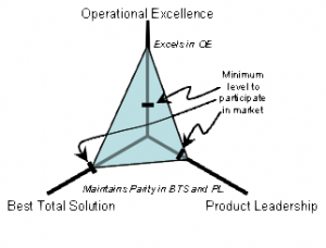
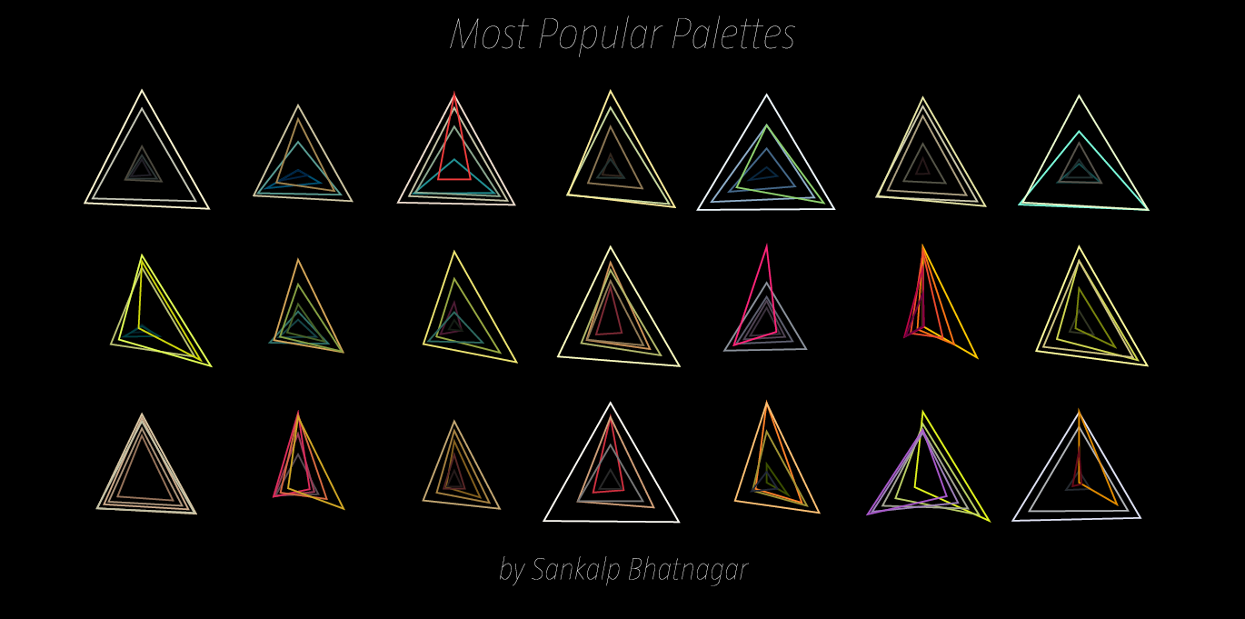
Now that we can conceptualize a single color, if we expand our vision to an entire palette full of colors, and their overlapping triangles, we can begin to theorize the possibilities of shapes that may emerge. However, to fully grasp the effect of the color palette, we must also represent that color as we usually know, by sight. Where filling each color triangle from each palette with its corrsponding RGB color could quickly lead to a clustered inaccurate graph, simply changing the stroke color to that color triangle’s particular RGB color will succeed in both efficiency and visual simplicity.
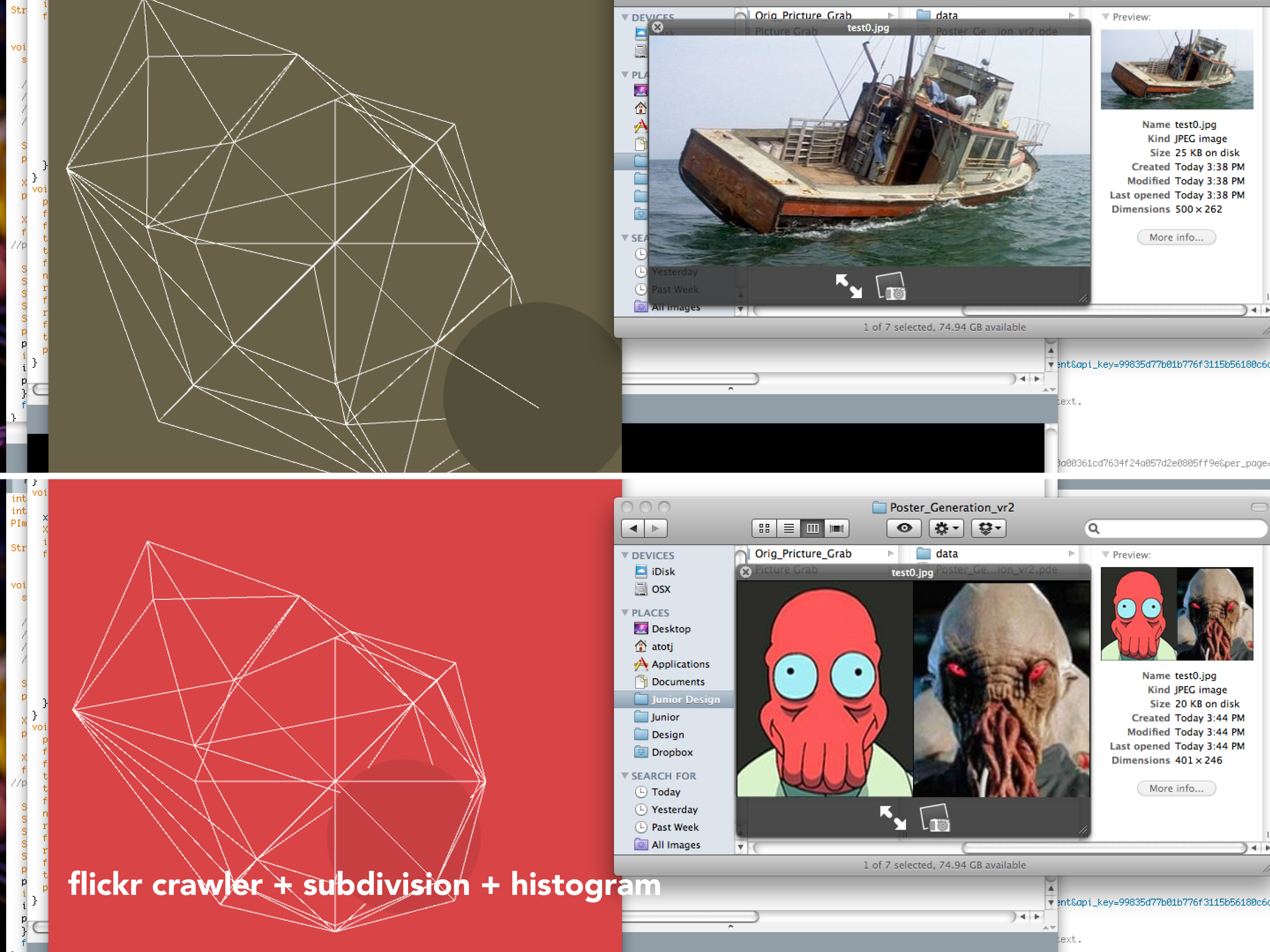
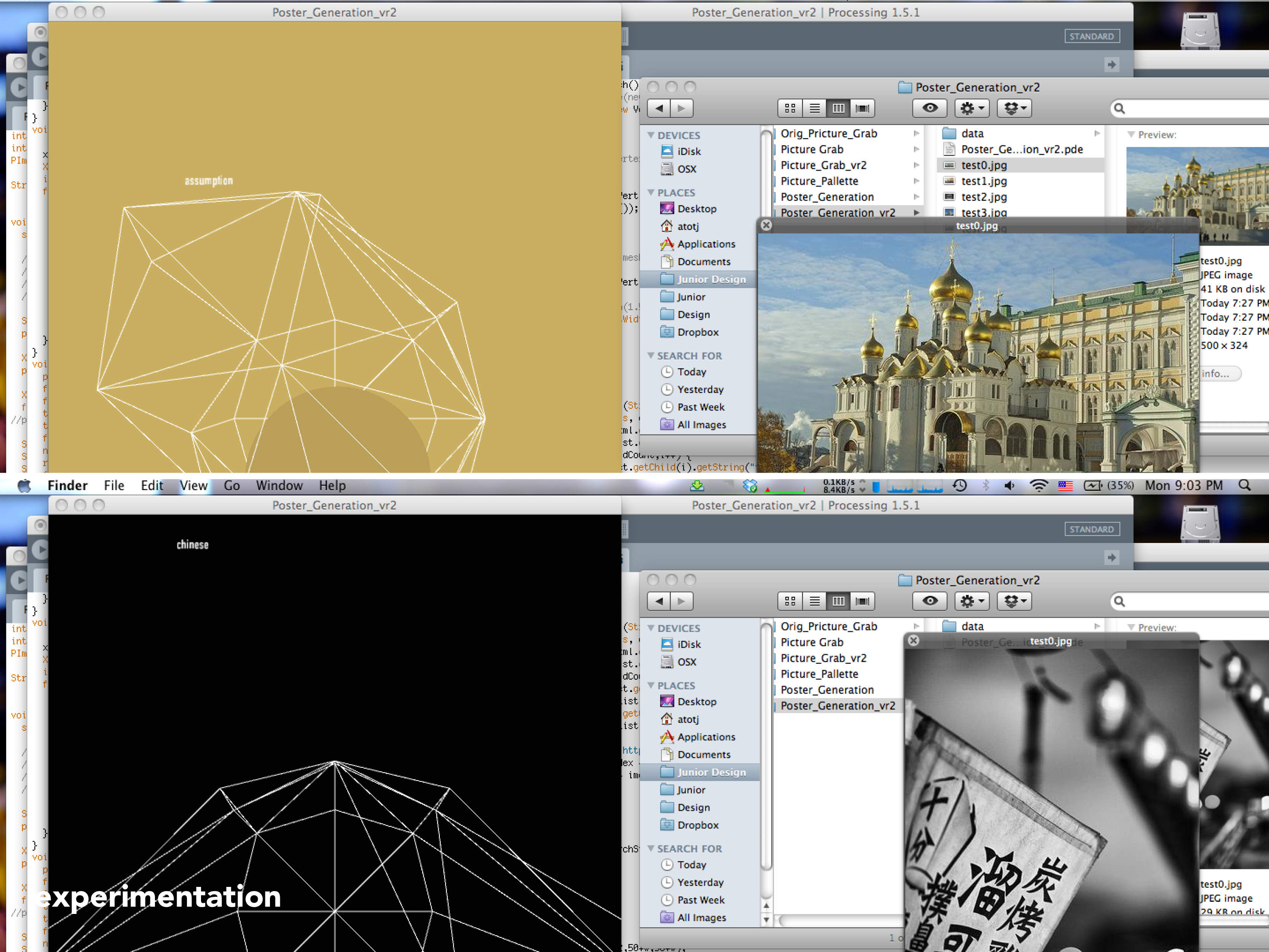
To efficiently graph these palettes in a way that was visually effective, I used the Vormplus colorLib library for Processing language. I also needed access to Kuler’s API, which I requested and received from their API Key Kuler Services page. With these tools, I wrote code that would use an array of every palette, with its own array of 5 color RGB values, of the top 21 palettes returned from Kuler after a given search to generate colored triangles as described above. Essentially, the program I wrote takes in 21 palettes and outputs each palette as a series of overlapping triangles, with no fill, placed in sequential order where the top left-most set of triangles represents the 1st palette Kuler returns and the bottom right-most set of triangles represents the 21st palette Kuler returns.
“Notice patterns in the graphs”
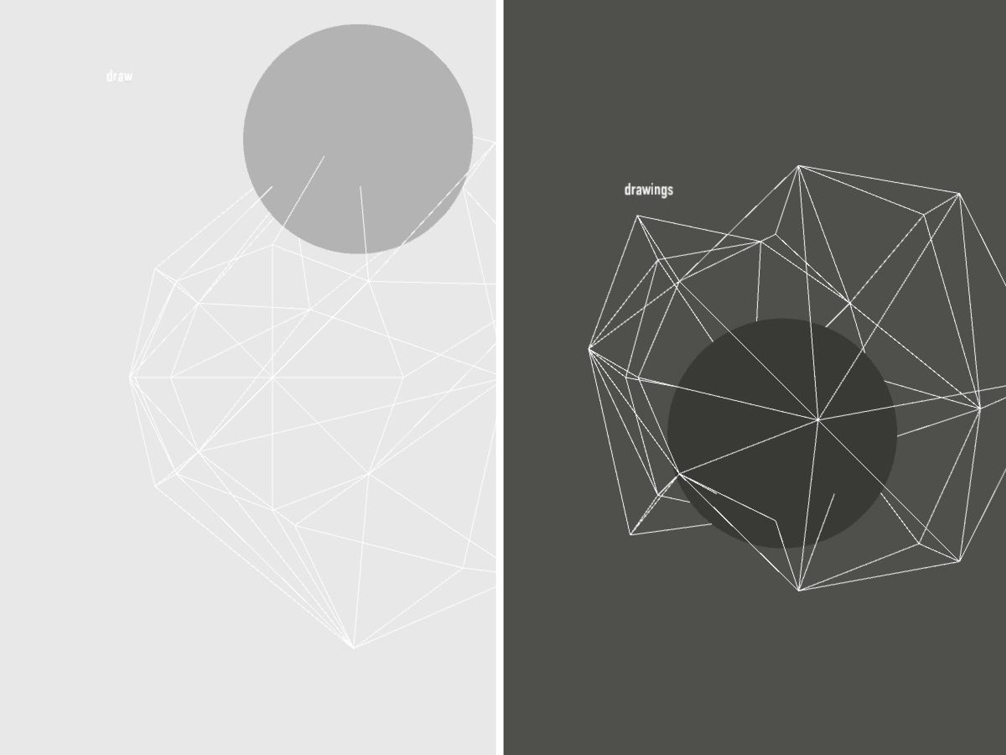
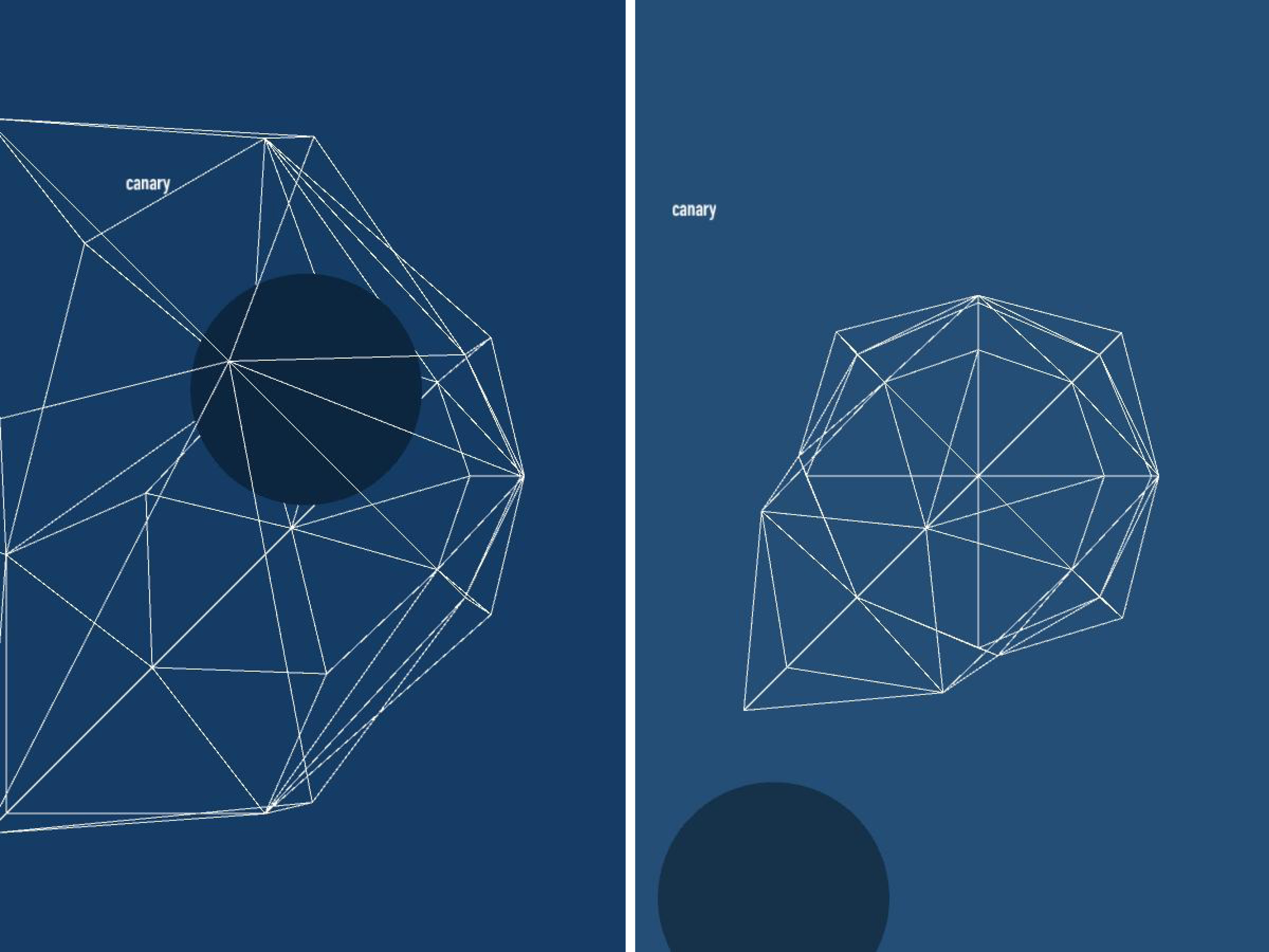
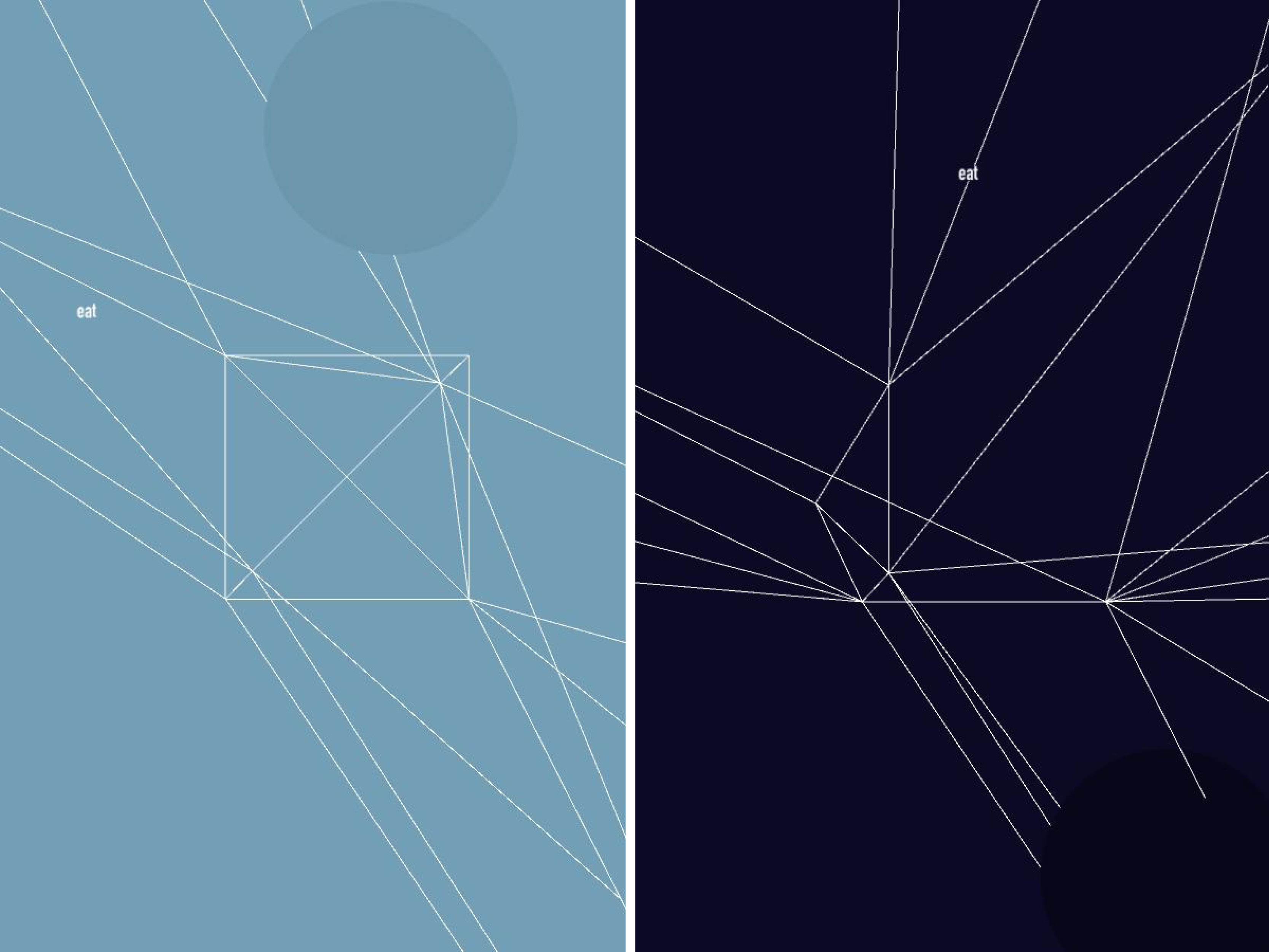
The following images (and below high quality .pdf’s) are results from several iterations of my program with various search queries:
Most Popular Palettes:
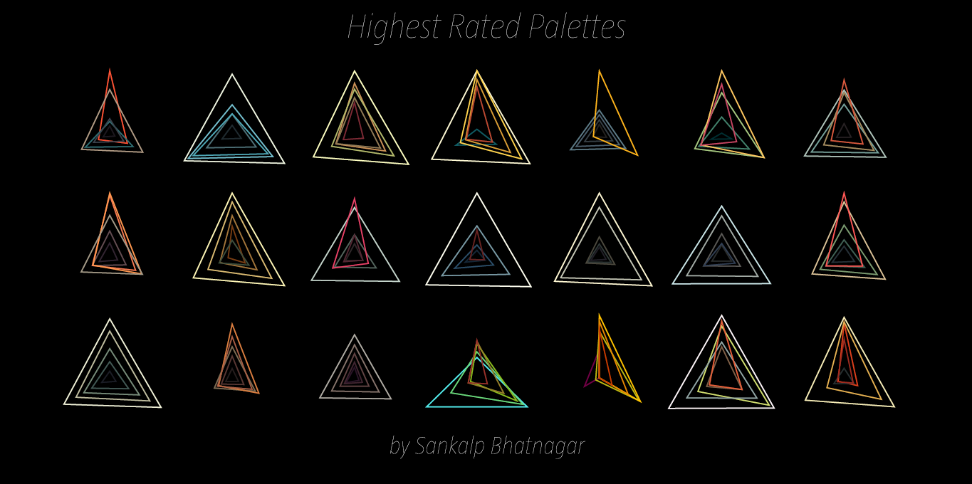
Highest Rated Palettes:

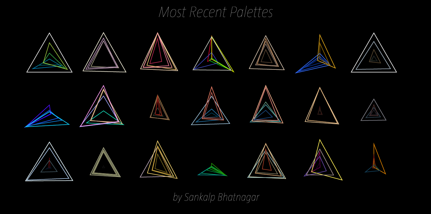
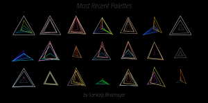
Most Recent Palettes:
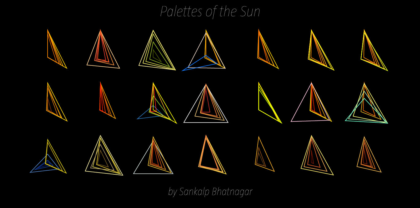
Palettes of the Sun:

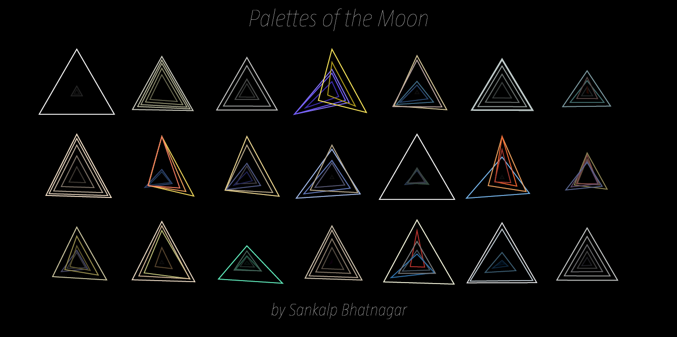
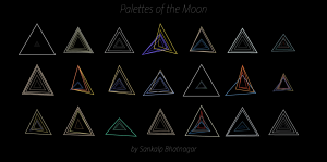
Palettes of the Moon:
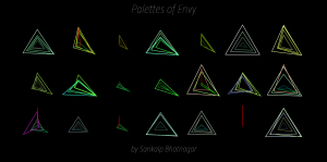
Palettes of Envy:
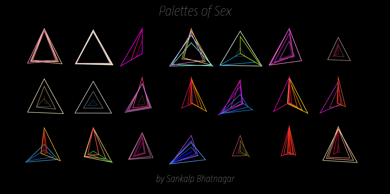
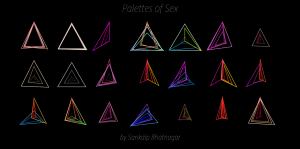
Palettes of Sex:
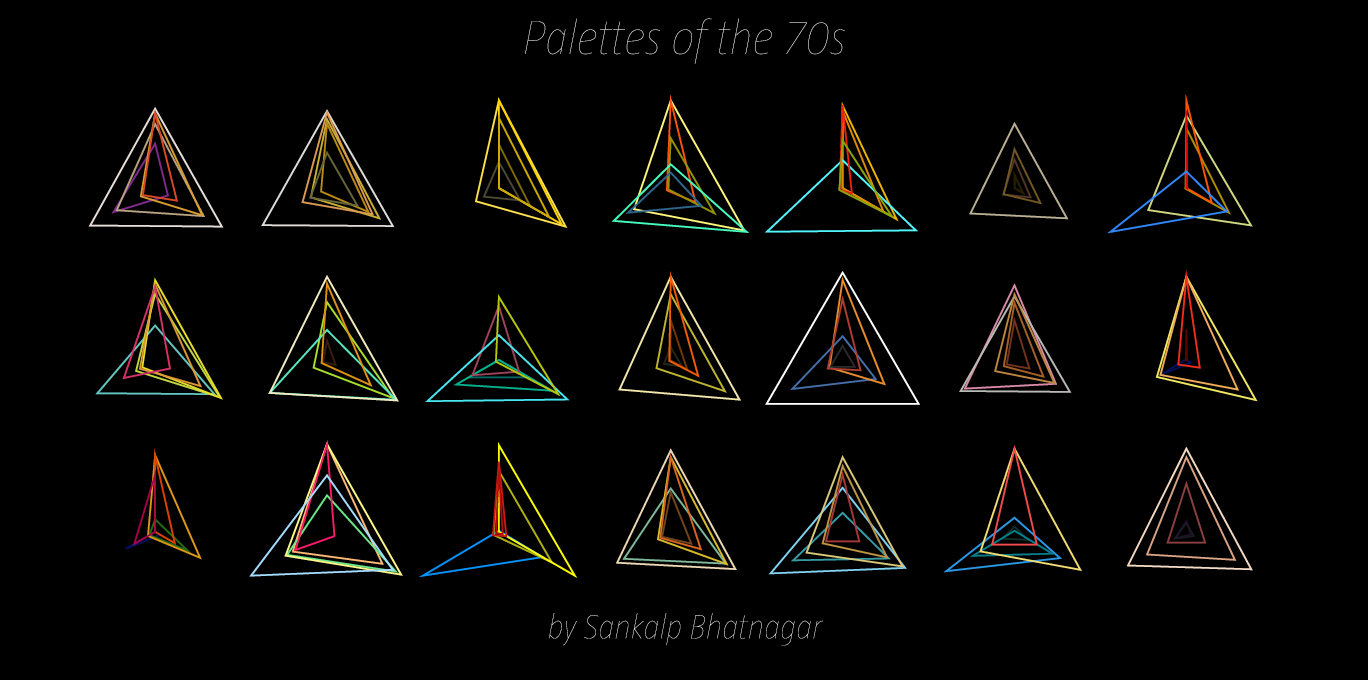
Palettes of the 70s:
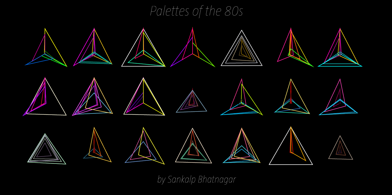
Palettes of the 80s:
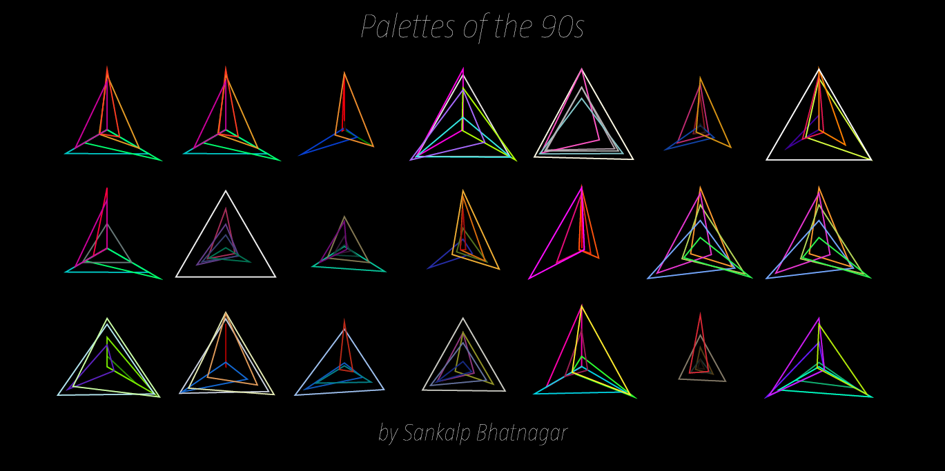
Palettes of the 90s:
“Conclusion”
With a graphs like these, we can
finally begin to
see color for what it is and furthermore, what role it plays in a total palette. Given that I have been studying coursework in both Mathematics and Design, this type of visualization is right up my alley. I am really happy about how it turned out and furthermore, excited to link patterns in color to patterns in geometry. Ultimately, I do plan to keep working with this down the road, and throw in stuff like
Heronian Area formulas to sort the palettes by maximum total area, but for now, I’m
more than satisfied with the above results. If you would like to see a complete PDF of every generated palette posted above in High Resolution, please download it
HERE.
P.s.
This assignment really pushed my skills to their max. A lot of work and a lot of iterations of this project were made until I got this program working correctly. But in the end, regardless of how long it took, I learned a lot. Before this assignment, I had no idea what an API was and I had little experience with such large arrays, but after this project, I’m very proud of the programming skills I had to pick up quickly given the time constraint of 2 weeks. To me, this assignment represents persistence. Had it not been for Golan’s motivational advice a few days before this assignment was due, I would have given up entirely out of stress or intimidation.So thank you Golan.