MadelineGannon-Project2-Visualizing the Burst of the Housing Bubble
Visualizing the Burst of the Housing Bubble
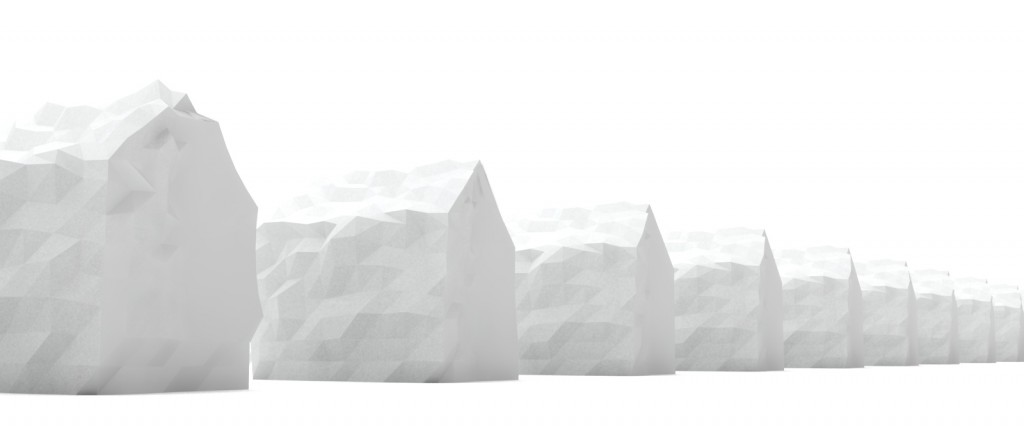
The impetus for exploring the burst of the 2006 American Housing Bubble came from the personal effect the market collapse had on me and my family. My part of the US (S. Florida) was hit particularly hard, with my hometown (Fort Myers, FL) leading the nation in mortgage defaults… This fiscal disaster has been more damaging than most of the natural disasters that have hit this region in my lifetime, and this data visualization is an attempt to convey the perverse distortion of the home, from nest-egg to toxic asset over the decline of the housing market.
[flickr video=6845886229 w=588 h=238]
[flickr video=6846041285 w=570 h=230]
This process video shows the way I manipulated a digital house to reflect the decline / malignant growth of the American housing market from its peak in 2006 to its current index value today. The iterative deformation is based on the S&P/Case-Shiller House Price Index, a national standard for gauging the state of the residential real-estate market. The 20-City composite index shows quarterly values calculated through the volume of repeat sales of single family homes. The second quarter of 2006 held the all-time historic high for the market, the apex of the housing boom, and was followed by 12 straight quarters of collapse. The past 8 quarters have begun to stabilize, and are currently trending around the 2003 index rates.
[vimeo 36455412 w=600&h=400]
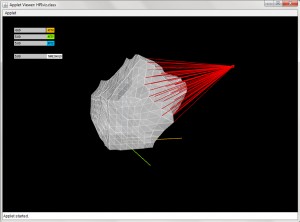
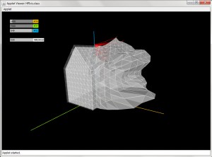
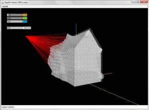
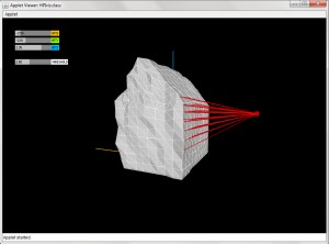
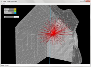
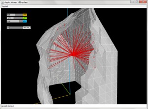
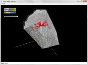
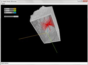
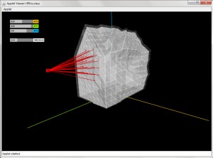
The percentage of change from quarter-to-quarter determines the strength and distribution of the forces from attractor point. A drastic decline (roughly 9% change) pushes the attractor threshold to its maximum strength, and thus effects a larger number of mesh points by a magnified offset. Less drastic declines (1% – 3%) lower the threshold value to effect more localized points by a weaker offset. For the quarters that show slight growth, the attractor is brought to the centroid of the house to choose the points least modified to begin to smooth the roughed surface.
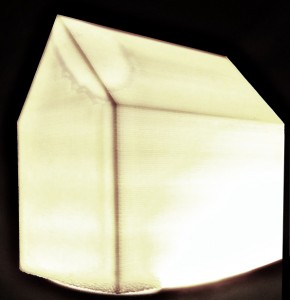
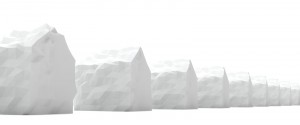
Screengrabs while exploring form generation/deformation:
========================================
10. Madeline Gannon: Visualizing the Burst of the Housing Bubble
nice description of your concept and process
what’s the basic model? looks like monopoly houses.
cool idea. I think it would be really cool if instead of a timeline you had different houses represent different cities in the US. You could “melt” them to a degree related to the damage done by the housing crises in those particular cities. Doing this quarterly makes the crisis actually look less severe than it is. I think greater variation in deformation will make this more compelling.
really nice aesthetic, even the virtual model +2
not sure i understand the scope. looks great though!
really cool storybook kindof effect, it might be cood to add in the lanscape around the house a bit, you go girl
Beautiful objects and serious technical skills!
Maybe base the model on your own childhood home in ft myers. (in response to golan’s suggestion that you personalize the dataset)
Also, maybe have a neighborhood of homes and have some more affected than others vs. timeline. Since not everyone experiences a default…
I’d also like to see one about increasing homesize over time… in the 70’s it was about 1000sf, and now more like 3000sf which I think is tightly linked to the housing bubble–people getting more house than they can afford.
The renders are beautiful. I wish all the houses could be visualized at once, so we could form comparisons between them.+1 I love the smoothing process / calcification you described to represent the healing market. We lack any way of translating the distortions into numbers (e.g. a key or refrence point), but maybe that’s what you wanted? Great work
A nice interpretation of data that we always hear on the news but don’t internalize. I like how you are using the house as the actual vehicle for the metaphor and your intention to 3D print them. I can’t wait ot see them finished! It’s always more compelling to hold the powerful data in your hands.
Good concept. :D Very compelling representation of the data, but it’s hard to see what’s going on, I think, partially because of the low contrast, perhaps. I love that the representation doesn’t revert to a previous state just because the current state is similar to a previous one, acknowledging that history in the visualization is great. I would love to be able to play with this visualization. Have a single house with a slider below it that I can slide up and down and watch the house deform and repair itself over time. I could see myself sitting at my computer sliding this thing up and down to see what happens to the house.
( )
Nice Peter Jackson camera work on the animation. -_- I think the thinning wall idea still works better, partly because the idea of a house is to be solid and to be a robust shelter. If you have thin walls that literally and metaphorically takes us to a crisis ^ scenario.
Very beautiful. What does the deformation reflect in terms of the people’s lifes impacted or lost houses falling into disrepair? I guess I’m curious to hear a deeper analysis of the metaphor.< -- YES talk about the "perversion of the housing system," make that part of your description. I would suggest you get more feedback before printing, easier to iterate in simulation first rather than sit around waiting for all that plastic. The detail is fantastic - the houses look very cool, and the fact that you modified 3D models for the sake of the visualization is great. What if you use a material that has more of a tactile history. A material that is not just tech driven machines. If you were to mill out old books (bad example: http://www.thisiscolossal.com/2011/12/carved-book-landscapes-by-guy-laramee/?src=footer) But really if you could use material that were part of foreclosed homes.
Theaster Gates is maybe the most popular rising sculptor today for his piece “In case of a race riot” in which he created an emergency case containing a hose used against civil rights protestors. The casing was made of delapitated wood from fallen black neighborhoods. http://blog.art21.org/2011/03/09/what-i-learned-at-the-armory-show/
Awesome presentation!
Really interesting presentation, really compelling data, very provocative results. I have one major disappointment, which is that you didn’t mention — in your blog post — that your hometown is the mortgage default capital of the USA.
I think having more shading or coloring might have helped with the virtual viz. The concept and data is awesome.
I appreciated seeing the tool you used to generate the models; for me, this is as interesting as the result.+1
They look almost like crumpled paper houses which is a very nice effect. Maybe you could make the differences in the models more drastic? It’s not immediately apparent that they are all different upon first viewing
the movie since it is very subtle.
interesting information. house models created look great. the video is really great!
I love the idea of making this into a series of physical objects. Very cool. I really like the subtelty of it and the aesthetic simplicity of the visualization. It might have been pumped up just a little bit to make the effect more impressive in aggregate.
** Agree.