by eli @ 11:27 pm 13 February 2012
This is a title sequence by Dvein. They are a very cool animation studio made up of Fernando Domínguez, Teo Guillem and Carlos Pardo. The title sequence feature some amazing organic animation blended expertly with live action. The editing and sound design are typical of a lot of their work.

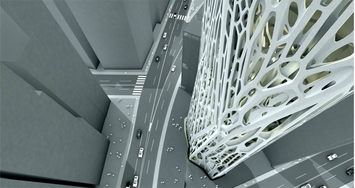
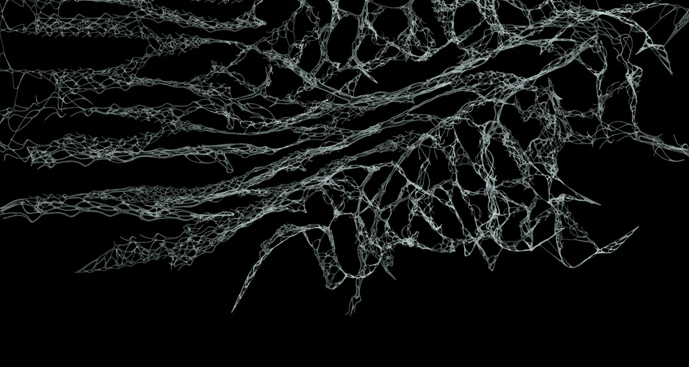
This is a generative architectural project I came across from Kokkugia, an architectural practice with offices in NYC and London. As they put it on their website, “the shell’s articulation is algorithmically generated through a cell division procedure in response to the tower geometry.”
This is very cool. Petros Vrellis animates the strokes of Vincent Van Gogh’s Starry Night. They flow in the direction that they were painted, effectively capturing the morion of the piece. The piece can be manipulated on a touch screen and the sound apparently responds to the changes in the flow of the brush strokes.
Comments Off on EliRosen – Looking Outwards3
by jonathan @ 11:11 pm

http://tvmny.blogspot.com/
Very cool. Seeing physical generative artwork reminds me that there is more to computational art than what is on the screen. In general, I think when computational art begins to exists equally in the tangible realm as the intangible realm, that’s when the magic begins to happen. What is so striking about this particular piece is, as well as Marc Fornes’s other work, is it’s an organic form derived from a very non-organic process (speaking about using the computer as a tool here). I think there is a greater possibility for such computational driven forms to be applied to actual problems. Perhaps I’m getting ahead of myself now, but I think I’m coming from a biomimicry perspective. If we can simulate evolution via computers, it’s possible to derive new innovative forms.
This is some pretty interesting stuff. I think this is kind one of the more conventional things people think of when they think generative art: “hey let’s make a living organism!” Not to poo poo this at all, I think it’s beautiful and a wonder of programming (in my eyes at least), but it is something I want to avoid at least. One aspect I really like about it is the ability to fool around with the parameters and customize your creation. It’s not a static piece, per say, but one that any user can play with to see what happens. I always like that user engagement. It’s more than just thinking, it’s doing too.
I really love this one! In design it’s always a delicate balance between being boringly obvious and confusingly obtuse. I think the MIT Media lab new logo is a brilliant example of somewhere in between. Though the logo(s) were not designed by hand, the beauty of the logo is evident in the code that creates it. I know some of my peers would argue that then what happens to the typical designer in a world of computer driven design. My thought is, you gotta adjust. I actually think this particular project excites me the most because it shows how a designer who knows how to write and understand code will be invaluable in the future. You can’t just make form anymore. You have to learn how to program form as well.
Comments Off on Looking Outwards
by ju @ 9:41 pm


The Drawings are created by the artist Onur Cobanli. Cobanli implemented the algorithm Avatar Bes to generate these series of generative artworks. The works are example for generative artwork where the art pieces are composed in an algorithmic way with the use of defined processes. I like this generative series since each different color is associated with different emotions and senses of the artist. Through this artwork, Cobanli attempted to create mind maps to form the artwork. I think it is great to create a system to generate series of an artwork.

This is Human Factor drawings by Eno Henze. It is one of the generative art series by Henze, and he usually works on texturing patterns of large-scale abstract works. He explores the aesthetic and philosophical implications of man-machine cooperation. He creates drawings, installations and performances that oscillate between human and machine origin, digital and analogue, determinism and intuition. I personally think his unique patterns of abstract works are beautiful, and even though the works are 2D, they look very vivid so that they seem tangible. I am not sure how he implemented the algorithm to generate the texturing patterns of the artwork. All of this series are beautiful, and they remind me of photographs of ink drops.

This is an artwork by Pascal Dombis. He initially worked with simplistic rules: drawing a straight line for instance. But then he used digital tools to reach the wildest proliferations possible. Visual forms appear (they are not intentionally programmed) out of the excessive enforcement of autonomous and simple rules. So Dombis does not consciously conceive a structure in advance. He lays down simple rules and lets them go through a series of interactions. His work clearly shows his thinking process (starting from drawing straight lines) in completing the project.
Comments Off on Ju Young Park – Looking Outwards
by luci @ 8:40 pm
SPAMGHETTO

http://www.spamghetto.com/gallery.php
“Spamghetto is the inappropriate, intriguing, irresistible spam-based wall covering that turns the bad ideas flooding your inbox into patterns of insight into the human nature.”
This wall and print art is generated with phrases from a spam folder from an email inbox. I find it interesting because it turns something that people HATE into something that is beautiful and something that people want to BUY?!
The type treatment and design are really what make this. It looks hand-drawn and created every time even if it is computer generated. What I am unsure about is how this is made… the site doesn’t make it clear whose inbox the spam comes from and if you can have your own inbox be the source for the generative text.
PIXEL CITY
http://flowingdata.com/2009/05/14/pixel-city-computer-generated-city/
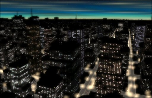
Pixel City is a procedurally-generated city by Shamus Young. For the non-coders out there, this essentially means that based on a certain set of rules, this 3-D city is generated dynamically each time the program runs.
This shows a project of a generative cityscape. A video shows the steps Shamus went through to create a believable environment (generate standard buildings, generate modern buildings, create a grid of street lights etc). I find this interesting because he makes it seem so easy to create a large and realistic environment just by creating a set of constraints, while I had always imagined it to be a long and laborious process to create virtual environments. This has inspired me to look into other generative terrains projects. Although he admits that he doesn’t lnow what to do with this, I see the potential for many practical applications such video games.
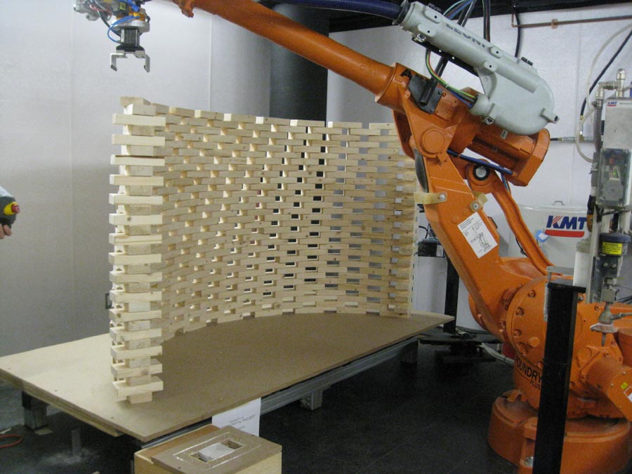
“On the Bri-n-k” Robotic built wall at the GSD

http://www.dezeen.com/2009/05/11/on-the-brinck-at-graduate-school-of-design-harvard-university/
Professor Ingeborg M. Rocker of Rocker-Lange Architects and students at the Graduate School of Design at Harvard University, USA, have used a robot to build an undulating double-wall structure. The robot arm was programmed to place 4,100 wooden bricks to create complex double-curvature walls.
This is a cool project because they created a design for a structure and then a robot actually constructed it! It is an impressive combination of computer generated design and computer aided construction. The structure has beautiful curves and shows off the potential for little blocks (“bricks” to create organic and complex forms). And although the structure seems to be impractical and uninhabitable, this project breathes potential for computer aided construction of many kinds… (robots building homes in the antarctic? africa? space?!)
Comments Off on Luci Laffitte – Looking Outwards- 3
by Evan @ 3:36 pm

I don’t think I could participate in a discussion about generative art without brining up chaotic systems and Fyre. Fyre is a tool for generating beautiful images from the Peter deJong equations. It was written by my roommates in college after David—one of my roommates—took a course in Chaotic Dynamics & Nonlinear Systems. They were invited to SIGGRAPH that year (must have been about 2004) to present that project.
This project has a lot of personal meaning to me because Fyre and Dr. Liz Bradley’s course on Chaotic Dynamics were my first real exposure to a lot of things that led me to take this course: nonlinear systems, fractals, and cellular automata. It was this course that introduced me to Conway’s game of life, which I now never tire of reimplementing—or trying to, at any rate—on any platform I come across.
[vimeo=https://vimeo.com/22681027]
So this one is both interactive and generative. The large nodes with a + inside generate pulses. The pulses travel down edges connecting those nodes to the smaller nodes. When the pulses reach the smaller nodes they generate sound. Connections between nodes are determined by proximity. Distance also determine how long it takes a pulse to travel the edge and reach the node, resulting in different rhythms.
You can throw a bunch of these nodes out onto the board and just let it make whatever music that generates. You can also turn on movement and gravity of the nodes onscreen. As they shift on screen new edges between nodes are created and old ones are removed, resulting in different phrases and melodies.
Via Creative Applications Network.
Buchstabengewitter
[vimeo=https://vimeo.com/34613976]
I’m not entirely certain if this qualifies as generative, but this blog refers to it that way, so here it is.
Mainly I like this piece because it’s fun to watch. Personally, I enjoy typography, so typographic art appeals to me, but I suspect a lot of typographic art is uninteresting to the population at large. I admire a lot of the projects I see coming from Letters Are My Friends because they make typographic art more appealing to what I perceive as a wider audience.
One thing that attracts me to computational art in general is its capacity for making things that are not traditionally thought of as art—such as data or letterforms—more obviously beautiful.
Comments Off on Evan Sheehan | Looking Outwards | Generative
by sam @ 1:28 pm
[youtube https://www.youtube.com/watch?v=Zpekscwi0wQ]
Joseph Nechvatal’s viral symphOny is an interesting example of generative music. Working with a team of audio engineers, programmers, and composers, Nechvatal developed artificial life software based on the viral phenomenon model (objects or patterns that are able to replicate themselves or convert other objects into copies of themselves when these objects are exposed to them). viral symphOny is composed in 4 distinct movements that sonically illustrate the replication and repetitive processing of the original “virus.” While I find this kind of music interesting, I can’t say that it is a pleasing thing to listen to. I wonder if there is a reason why I find many generative forms in art and architecture to be aesthetically pleasing but have not yet come across a piece of music written by an algorithm that I though was beautiful.
Les Objets Impossibles – Objet 2 (excerpt) from Abstract Birds on Vimeo.
This visualization of Les Objets Impossibles is really compelling to me because of my interests in architecture and music. The software used to visualize this composition renders and animates the composition in a 3-dimensional form. There are 24 microphones recording the performance and the visualization reacts to each of these unique audio inputs. To me, this visualization goes much further than standard “iTunes visualizations” and actually creates architectural forms with a relationship to the music. The idea of architecture mimicking music and vice versa is not a novel one, but computation can make these connections more apparent and accessible.
Comments Off on Sam Lavery – Looking Outwards – 3
by heather @ 1:28 pm
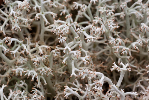
1. Lichen photography by Jessica Rosencrantz

What generative art assignment would be complete without the inclusion of Mother Nature herself? Lichen photographs by Jessica Rosenkrantz, see complete photo collection here: http://n-e-r-v-o-u-s.com/blog/?p=1950 — she creates a great deal of generative art and sculptures (e.g. unique lamps or jewelry) so it is interesting to observe how her perception of mother nature interweaves with the visual and algorithmic output of her various works.
She writes:
Some people describe a lichen as a fungus that has taken up farming, growing sugars in little algae patches throughout it’s body, in contrast to the decomposing habits of normal fungi. If fungi can be described as living inside their food, then lichen are essentially fungi turned inside out. Their food lives inside of them.
But I find it more intriguing to think of lichen as a fungus trying to be a plant. Like a plant it has photosynthesizing portions which produce food (the algae or cyanobacteria) but also structural components (the fungi) which protect and arrange the photosynthetic elements. As a photosynthesizing organism, lichen are under a lot of the same constraints as plants. They have to effectively collect sunlight and water. They have to be rooted to something, they have to resist gravity… Correspondingly, lichen have independently evolved very similar body plans to plants…..despite have an entirely different chemical and biological makeup.
2. “A Confidence of Verticies” by Brandom Morse
[flickr video=2399356089]
Buildings at generative war, the ebbs and flow of their fight creates natural drama and sympathies. This implementation runs in single sequence, but one could imagine a version where each building is imbued with various ranges of characteristics and each blow has a distinct probability of success. Citiscapes brought to life with the flaws and strengths of boxers. I enjoy the way this project unifies generative behavior with the sense of interacting agents. It also introduced the idea of curating the output of generative art, rather than just always selecting whatever the algorithm provides. Jer Thorp had an assistive tool for designing parks that he would use to breed possible design solutions, but he would subselect the best at each stage and “breed” them together. Artist-technology collaborations.
Source: http://www.generatorx.no/20080409/structural-tension-brandom-morse/
Various additional works: http://www.coplanar.org/work/
3. “Decorative Growth Pattern” by Allison Kudla

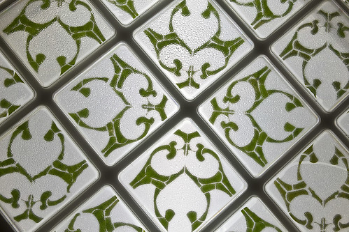
Finally we join computational art with Mother Nature in Allison Kudla’s “Growth Pattern,” also currently on display at the Miller Gallery on campus. Here she prepares biological squares of geometric leaf cuttings in a nutrient solution, visually reminiscent of spanish and moroccan tiles. Some cuttings sprout new leafs, others with less complete sterilization sprout fungus and by the end of the installation, they all die. Visiting it on a single day does not tell the story, but over its lifespan it becomes unpredictable, beautiful and evocative.
Additional images and details: http://allisonx.com/2011/01/growth-patterns/
Comments Off on HeatherKnight – LookingOutwards4
by a.wolfe @ 11:00 pm 12 February 2012
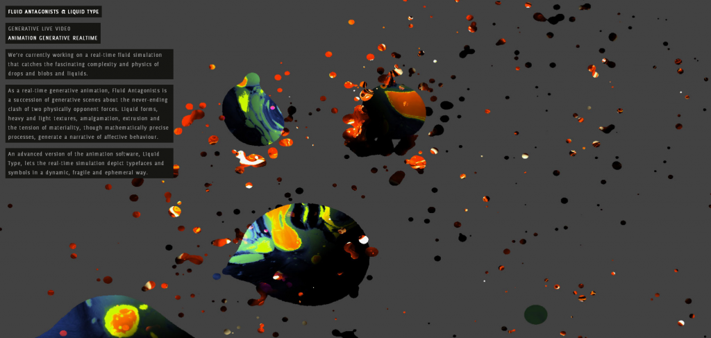
Generative Fluids by field.io
[vimeo 1870521 w=600]


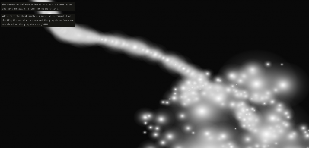
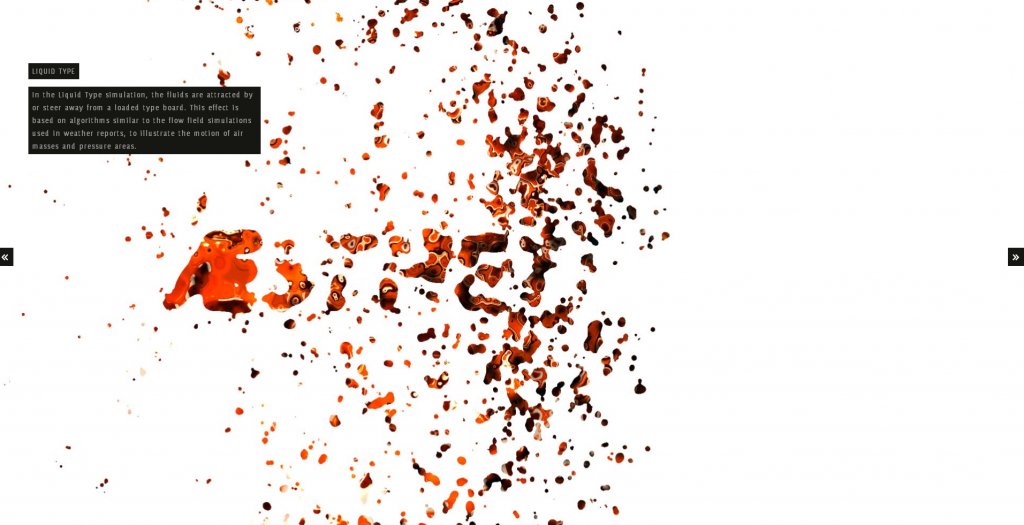
I think this is a particularly beautiful fluid simulation. Rather than use a complicated physics engine, the approximation is based off of particle metaballs, and the texture is created by a combination of shaders and photographs. Its not quite realistic, but a close approximation using a much simpler method, with a very stylized look and feel. They later took the same simulation and altered it slightly so that the particles would be attracted to text in the background to create some very interesting font effects
Sonic Acts IX Identity by Coup


This generative process (although analog) produced stunning visual results. The image was created by progressively zooming out the original and then overlaying it in a different color over the original.
“Starting point was a process that would generate the design. With every printed item an extra layer was added to the printing sheet containing a zoom-out of the same design in a new pantone colour. All items have been cut in several ways from that same printing sheet, which results in different crops of the design for each item.
As a result of this process, the final item (the book cover) was cut from the complete message containing seven solid pantone colours.”
Kokkugia | Swarm Matter


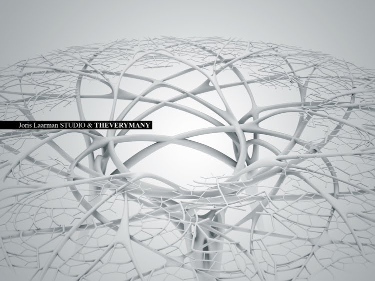
Swarm Matter creates forms through emergent patterns. Kokkugia uses this logic on several of their larger architecture projects using the paths of people or traffic through the space as the “particles” to generate the larger forms. I think even these ornamental pieces are beautiful.
Comments Off on Alex Wolfe | Looking Outwards | Generative
by deren @ 10:50 am 9 February 2012
http://www.themorningnews.org/gallery/cartographies-of-time
Comments Off on some cool timeline examples
by luci @ 8:45 am
[slideshare id=11502902&doc=beastlyproportionspresentation-120209134454-phpapp01]
Inspiration-
Animal encyclopedias & reference books always list species height information, but it can be hard to imagine just how big a donkey is, especially when it is described as 3′ 5” from the shoulder. Many people find it hard to understand this information out of context and are much better and understand height in comparison to themselves. So I was inspired to create a life-size interactive size comparison chart to allow people to explore this information in an easy & relatable way.
Method-
I used a kinect sensor with a OSC program called Synapse (also required openNI/openNITE) to get readings on where the users right hand was. (With help from Dan and referencing a project that I found http://openprocessing.org/visuals/?visualID=33885 I was able to track the users right hand height with the simple variable- rhy). I used processing to check if there was an animal in my database that is as tall as the users hand height, and draw the animal. I projected this image on top of a 7 foot scale on a large white wall in my studio over.
Reflection:
I was really excited to do this project so I could experiment with the kinect. Once I got all of the required software downloaded (one of the biggest hurdles) I had a lot of fun imagining the potential of this technology.The second big hurdle was getting all of the animals to the correct scale because of different methods of animal measurement (from the shoulder, from the head etc). I learned a lot during this project through researching all of the software being developed for the kinect and was amazed by how many methods I could have used to do this project. Looking forward, I am glad to have this experience with the kinect, so I can created more sophisticated interactions in the future.
I think I could have improved this project in many ways. I would have loved if the animals faded in and out in an elegant manner, or if they could be little video clips or animations of the animals. Also I realized that if someone ‘plays’ with it for too long their arm gets tired.
