Alex Wolfe | Project 2 | Death Stare

by a.wolfe @ 8:13 am 2 February 2012

Some Quick Exposition

So for those of you who are unaware, Marina Abramovic is a extremely well renowned performance artist who had a retrospective in the MoMa about two years ago. For the duration of the exhibit, Abramovic  performed “The Artist is Present”. After wandering through her life’s work, a visitor could sit across from Marina and behold the artist for as long as he or she could stand it. In return, Marina presents you with the world’s most perfected deadpan

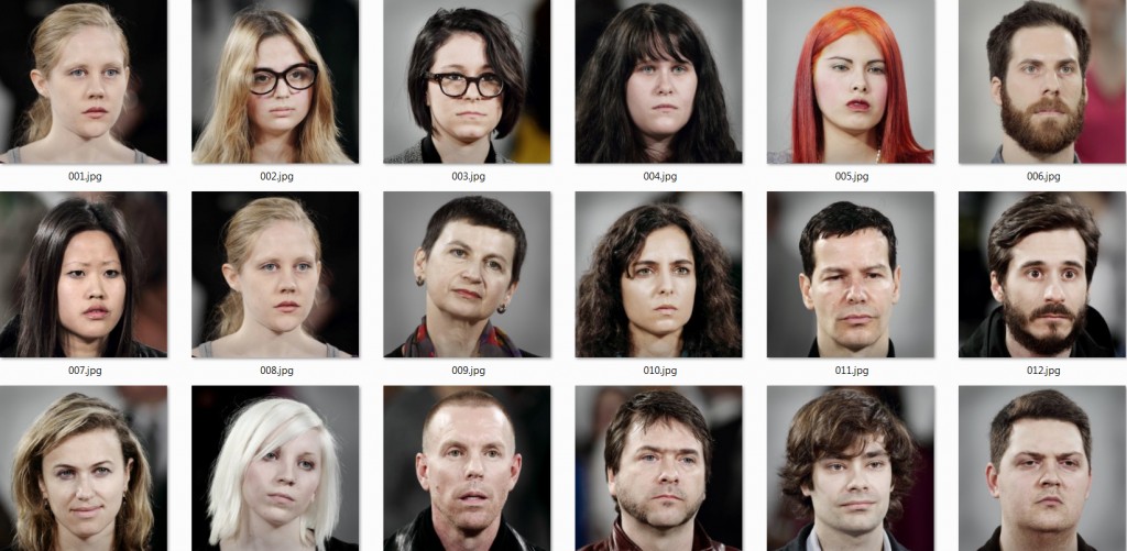
The MoMa kept track of every person who sat across from Marina in the form of a headshot and a small note of how long that sat for. These are all available on Flickr, for your scraping pleasure.

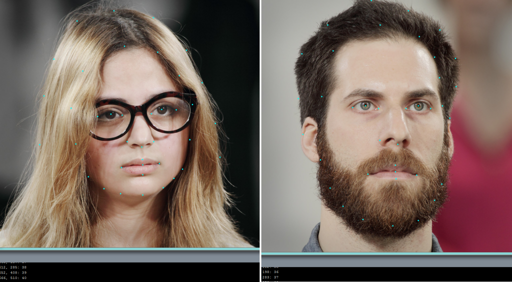
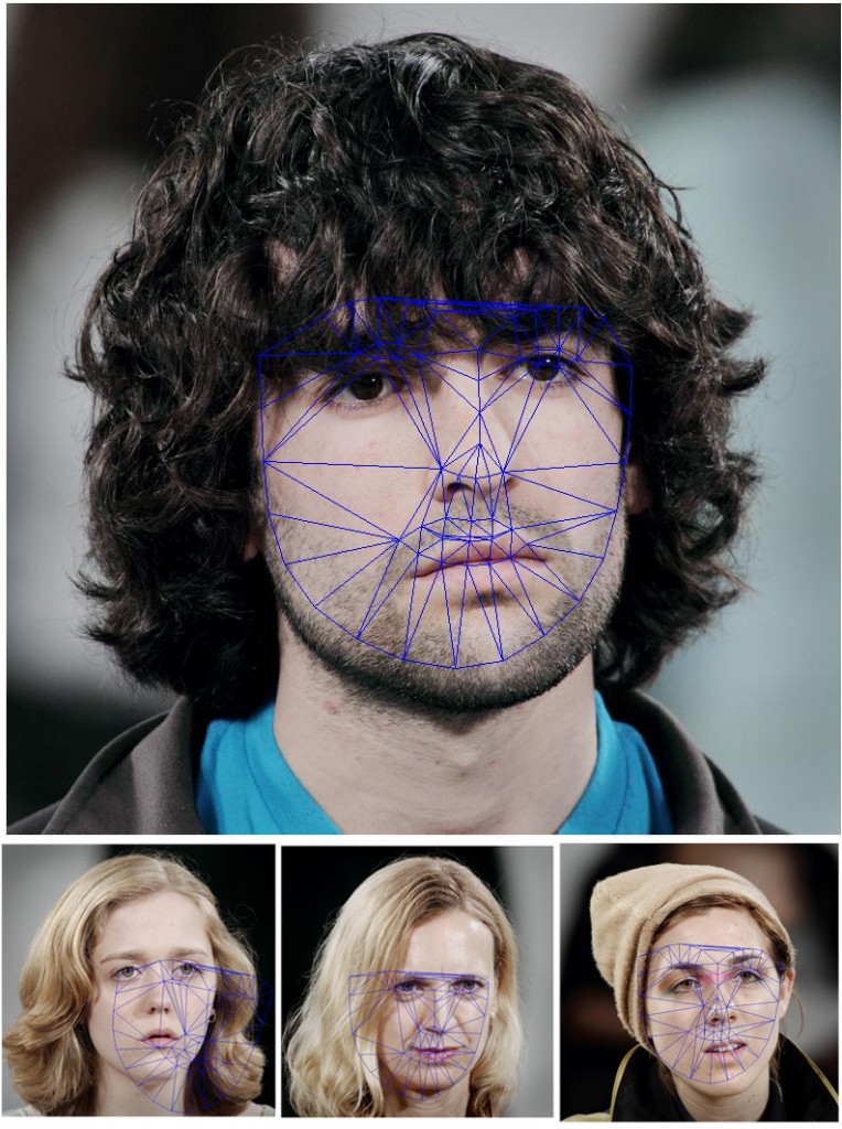
Just to test the face morphing algorithm, I manually defined some basic control points on a small subset of this data. Corresponding points should be on relatively the same area of the face, so consistency is key. The more points you define, the better the final average, but the process is pretty laborious so I settled for around 40.


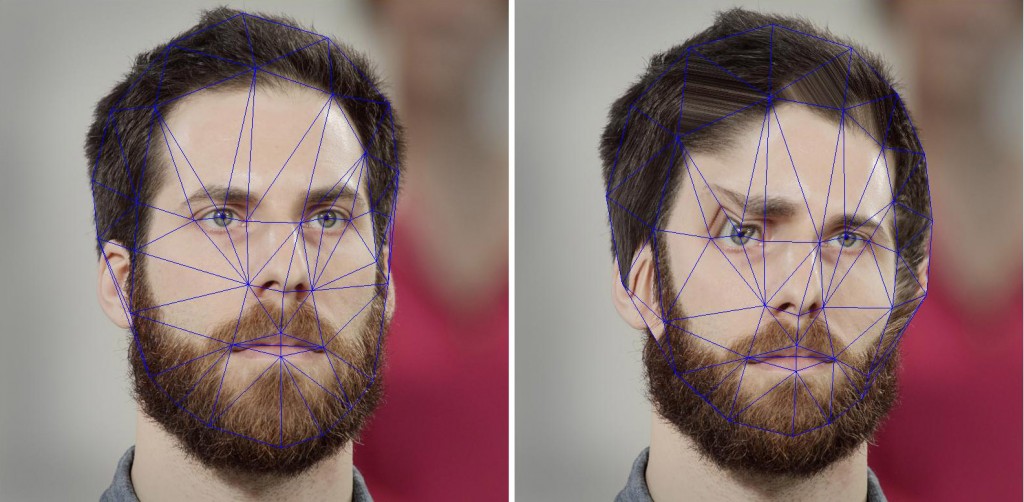
Taking these points, I determined a delaunay a triangulation of each face, and also a triangulation for the “average” face. In order to make a clean composite, I morphed each face to the average face by using an affine transformation on each of the triangles. Since my super useful point label sketch had glasses, I forgot to point define the eyebrows, so the eyes look a bit distorted here, but with a better point cloud


So the next step is to take an average of all of the points given, and then morph each face to that average, by interpolating the pixels inside each of the corresponding triangles. The small set I was working with while testing this algorithm was decidedly female, so the two girls below don’t suffer too much distortion, but the man in the middle gets very squished.

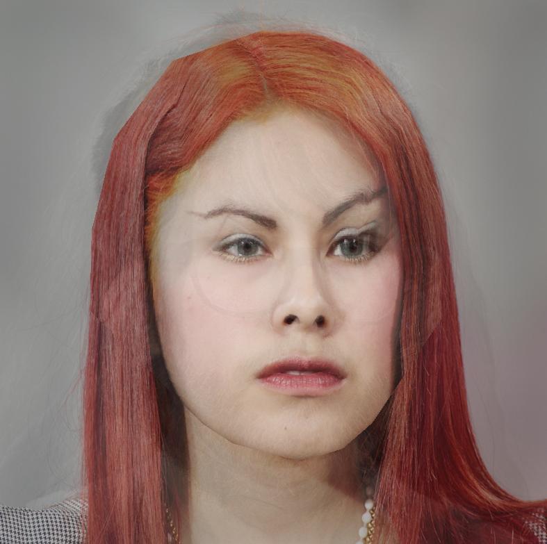
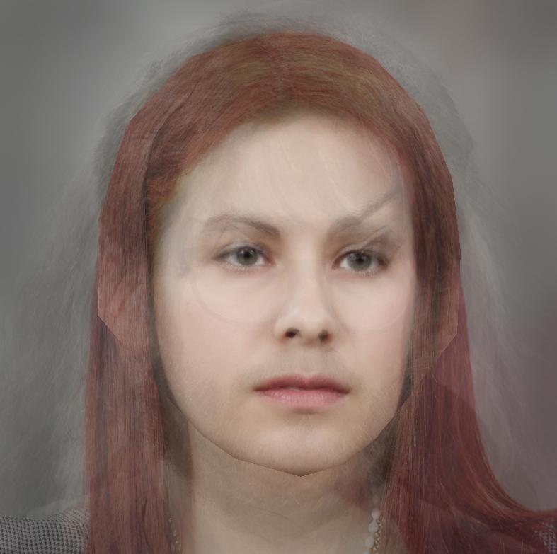
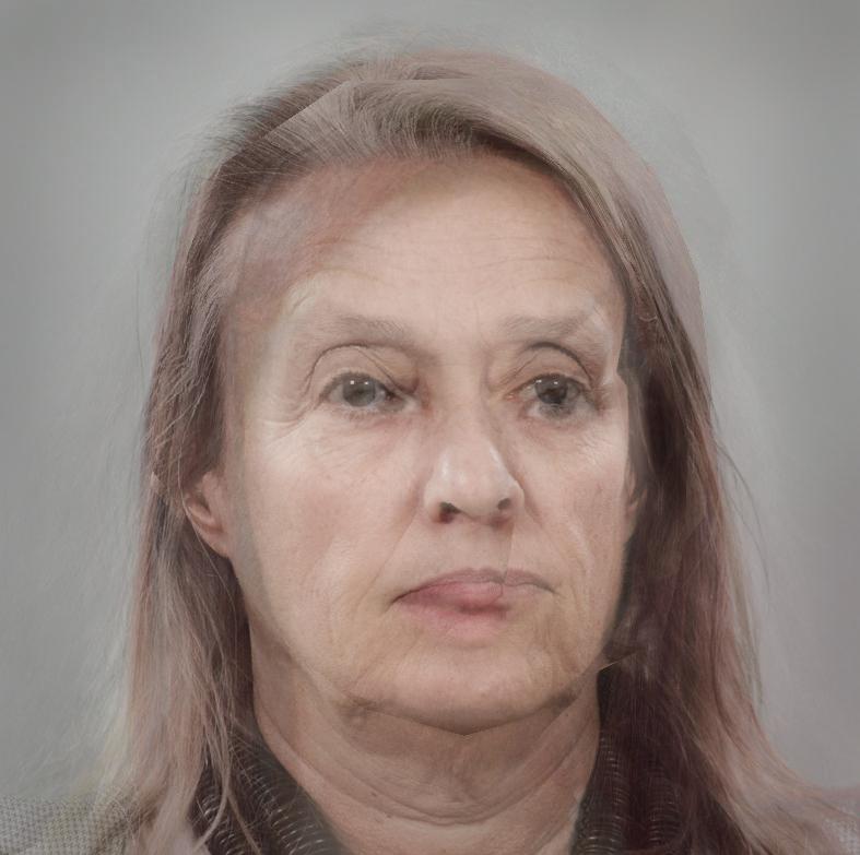
When you overlay all these morphed images on top of each other and blend, you get something like this

(sample set of 8 images unweighted)

sample set 8, weighted by time

sample set 25, weighted

Scraping Points with Face OSC
[vimeo https://vimeo.com/36338138 w=500&h=400]
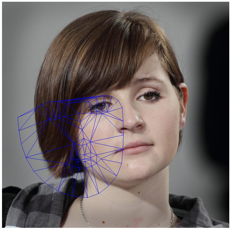
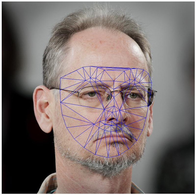
Next I batched processed the 844 images and threw them into FaceOSC in order to automatically pick out control points. The output files averaged around 237 points, so it was far superior to my 20.


Unfortunately, in exchange for bulk, a bit of accuracy was lost. Though most face meshes generated looked like they could approximately fit the face, very rarely were they perfectly and accurately lined up in the way required for facial averaging. Most look something like the one above.

However the nice thing about the algorithm is that if you average enough points together, you get pretty close to the mean, regardless of extraneous data.

Average Face points from 250 faces

Face to Average

Twitter API Resources

by heather @ 7:48 am

Start here with Jer’s tutorial:
http://blog.blprnt.com/blog/blprnt/updated-quick-tutorial-processing-twitter

And/or Golan’s instructions from last year:
https://ems.andrew.cmu.edu/2011/a/unit-50/tweeting/

API Stuff I might use:
screen_name
retweet_count
favourites_count
followers_count
location
statuses_count
profile_background_image_url
— the tweet —
text
id
in_reply_to_user_id
in_reply_to_screen_name
in_reply_to_status_id

example using one of the above:

https://dev.twitter.com/docs/api/1/get/statuses/retweets/:id

Sean @big_sean: Good Morning to the Chicks that got a Breakup Text Saved in her Drafts waiting to see if he gone get his S*** together!

Navdeep@pnavdeep26: Valentines day is two weeks away!! You still have time to breakup n save money!!! Wat say??? :) :)

Laugh.@WereJustTeenss: Saying “we can still be friends” after a breakup, is like saying “hey the dog died but we can still keep it.” … -.-

MadelineGannon-Project2-sketch

by madeline @ 10:21 pm 1 February 2012

Visualizing the Burst of the Housing Bubble

For my visualization project, I’ve been exploring data sets that have the potential directly inform the growth or decay of a digital object. I’m interested in creating a visualization that goes beyond re-presenting or re-associating quantitative data (despite it’s effectiveness at transforming data into information.) My goal is to have a visualization that translates cold, hard quantitative data into some sort of qualitative/emotive response from a viewer. I believe this can be done by crafting a collection of tangible objects that exhibit aggregated change over time.


Visualizing

I’ve been looking more and more into the statistical trends leading up to the 2006 housing bubble as a viable data set to visualize aggregated decay. The bubble-burst is of particular interest for me, as my part of the US (S. Florida) was hit very hard, with my hometown leading the nation in mortgage defaults. This fiscal disaster has been more damaging than most of the natural disasters that have hit this region in my lifetime.

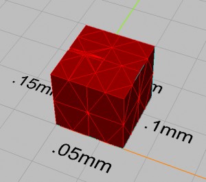
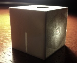
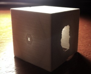
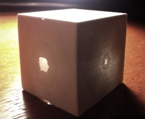
I began experimenting by misusing a plaster 3D printer to convey the sense of neglect / collapse / erosion / detritus that this data set quantifies. The images below show a series of tests that thinned areas of a printed wall beyond the material tolerances of the fabrication machine. I was surprised that the hexagonal mesh structure was expressed through the printing process, however I found that I can have systematic control over how and where the material fails, as well as the levels of opacity/translucency/transparency emitted:

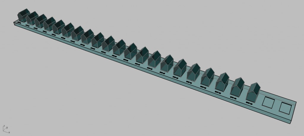
I’m thinking of printing a series of objects, one for each quarter since the bubble-burst, that are deformed based on the corresponding S&P/Case-Schiller index value (with places for future indices as the market continues to find an equilibrium):


Data Set

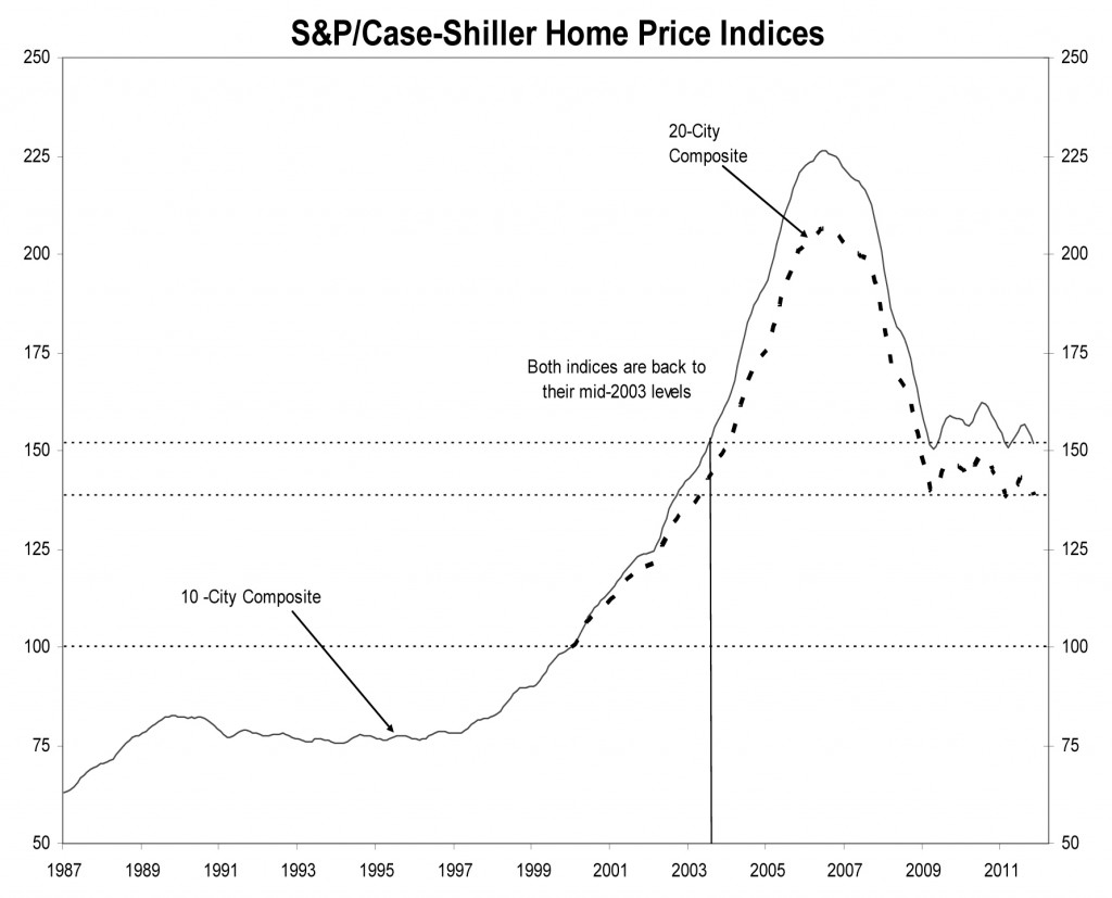
The S&P/Case-Schiller House Price Index is a national standard for gauging the state of the residential real-estate market. The index here shows the 10 and 20-City composite indices, and are quarterly values calculated through the volume of repeat sales of single family homes. The second quarter of 2006 held the all-time historic high for the market, the apex of the housing boom, and was followed by 12 straight quarters of collapse. The past 8 quarters have begun to stabilize, and are currently trending around the 2003 index rates.


Case-Schiller Home Price Index History_013118

HeatherKnight – LookingOutwards2

by heather @ 7:46 am

Below I present three gorgeous and structural explorations of data visualization spanning a traditional flat graphic, the surface of a building itself that brings its features into focus in a new way and an unusual setup for holstering a tree that brings into  focus the drivers of its growth and its sugar maple strength.

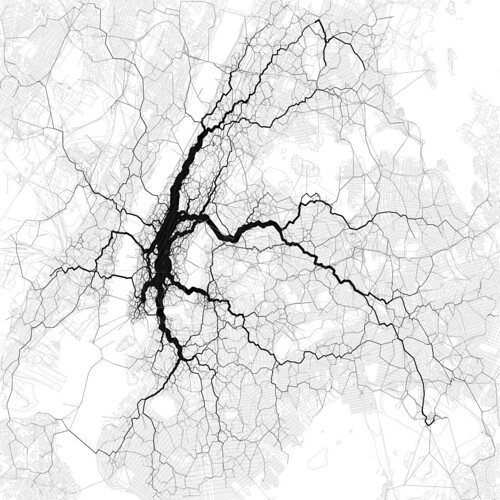
Visualizing 10,000 geotagged tweets in NYC for most popular travel corridors, by Eric Fischer, seeks to explore peoples working and commuting patterns.

via: http://mashable.com/2012/01/27/nyc-geotagged-tweets/

So this is how they get people to go to churches these days. Height visualization.

via: http://www.neatorama.com/2012/01/31/the-cathedral-of-light/

Natalie Jeremijenko’s Tree Logic at the Massachusetts MOMA

via: http://www.massmoca.org/event_details.php?id=29

« Previous Page
This work is licensed under a Creative Commons Attribution-Noncommercial-Share Alike 3.0 Unported License.
(c) 2023 Interactive Art and Computational Design, Spring 2012 | powered by WordPress with Barecity