AAAGH LOOKING OUTWARDS EVERYWHERE

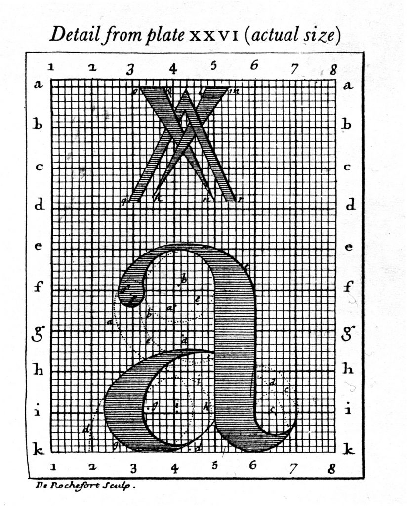
Designers traditionally use grids to help their design of type. Type, even humanist type is still/can still be broken down systematically with math and geometry. How might I use computation to aid in design? Or to manipulate current types?
Other than that, the details of serif, stroke weight, relative x heights, ligatures, time period, etc all contribute towards a personality that each type holds. Great communications designers should be able to use them as they would aesthetic and communicative forms not merely words. When would you use one over the other?
What would I like to analyze/explore in computational type?
Create a new display type? Explore the anatomy of type? It’s history and cultural weight?
This is a particularly interesting example of the exploration of type anatomy:
MetaFont was possibly the world’s first parametrized typeface (created in 1977). It was created by Donald Knuth for the typesetting of his life-work The Art of Computer Programming. Most fonts are created by designing the outline of the font. When a typeface has to be created in different weights, you cannot just “grow” or “shrink” this outline computationally. A designer has to sit and create new outlines by hand. MetaFont takes a drastically new approach. Instead of being described by its outline, this font is represented by a series of variables inspired by handwriting:
- Pen
- Weight
- Slant
- Superness
- Curlyness
By manipulating these variables you can create very different styles of the MetaFont, as shown in these screenshots.
In creating type in 3d, Ortho Type is a prominent example. It allows the user to manipulate the 3D view, width, height, depth, thickness and color of the typeface via UI controls. You can try it out here.
My only issue now that I’ve thought more about computaitonal type is….WHY? WHY DID I THINK IT’S A GOOD IDEA? Well, in our communications mini, we just started on our more in depth typeface project. I figured learning more about it in studio could be better compounded with exploration in 60212. Agh. I don’t know though. Any computational type I make I feel will not do what type is meant to do (which is be readable) while meeting the invisible standards of aesthetics that would make it valuable as art as well.
So….what am I going to do????
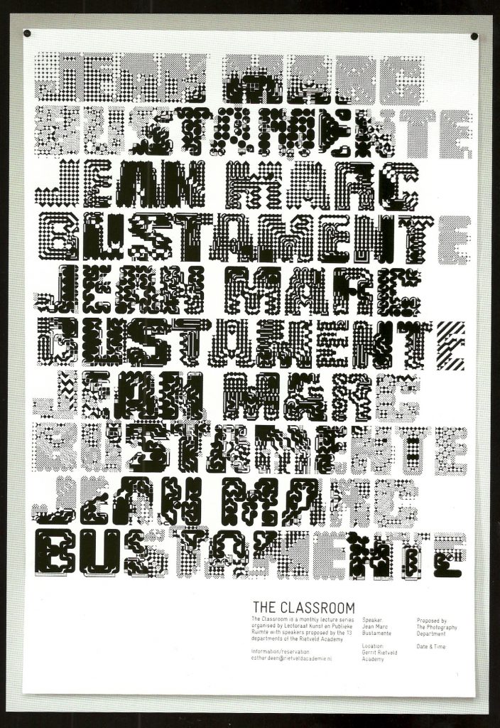
Jonathan Puckey has some very interesting things type-as-visuals that I think bypasses the usual hurdles computational type faces.

I love Professor Kyuha’s work – I just don’t know how to make it more than simply ‘decorating’ or making it ‘pretty’ with an added computational aesthetic.
http://code-type.com/play-with-node/Type_Spin2/
Ben Cho (he made some really nice rule-based computational type amongst many other accolades and positions) , John Maeda and Stephen Benton wrote a paper together on computational type. It’s really long but quite interesting:
http://acg.media.mit.edu/people/pcho/thesis/pchothesis.pdf
…..anywhoo. This is a fun video that I just wanted to include.


