Category Archives: project-1

Anna

16 Jan 2013

// Pushing people away and bringing them together //

Robotic Spider Dress
(http://www.fashioningtech.com/profiles/blogs/robotic-couture)

I was drawn to this dress the instant I saw it; I’m fascinated by spiders, and I’m also interested in biomimicry in design. Spiders have such a compelling and elegant way of moving — even if it does creep some people out — and the idea of being able to infuse our own bodies with some of that haunting grace through robotics is highly attractive. When I read the associated article and the artists (albeit brief) thoughts about “themes of ‘personal space’ […] control and privacy” I became even more intrigued. One of the most powerful aspects of art—regardless of medium—is its ability to deeply attract and repulse an audience on a purely visceral level. This piece takes that concept and physically manifests it, actually luring in people and then pushing them away again.

My biggest regret with this piece is that the video does very little to capture the functionality of the dress. It’s so focused on clichéd editing that one can’t really witness the dress luring or attacking anybody, and so it’s difficult to make a final judgment about how well the dress achieves its artistic vision. All in all, I’d have to say I deeply admire this piece purely based on aesthetics, but am also very disappointed, possibly owing purely to poor documentation.

21 Balançoires (21 Swings)

And so, we move from a piece that focuses on isolation and personal boundaries, to a piece whose primary aim is to bring together all sorts of people in the name of music. Somehow, I wasn’t expecting a whole lot from the idea of ‘musical swings’; I think I’d seen enough repetitions of the ‘musical staircase’ concept to become jaded, and, typically, I’ve found that auditory art installations seem to produce random noise more often than pleasant compositions.

The melodies and harmonies created by these swings–while repetitive–are beautiful and deeply textured. Add to that the activity of swinging. Swinging is a children’s pastime for all ages. Swing-sets have the power to draw in everybody: little kids, elderly couples looking for a place to rest, otherwise apathetic teens who need a place to loiter. People compete to see who can swing higher. People push each other on swings. People interact with swings—and with each other around swings— in a much deeper way than they do with staircases.

It’s also a clean and compelling video. Count me impressed.

Les Belles Infidèles
(http://www.turbulence.org/Works/belles/)

The concept of this last work is one that I have adored for ages: exploring what details, nuances and feelings are lost in the translation of stories from one language to another. Bear with me while I share a few anecdotes. 1) My father, who is German, didn’t take well to the (objectively amazing) rendering of Gollum in the Lord of the Rings trilogy, because when he’d read the books as a child in German, the presence of the article ‘Das’ in front of the name ‘Gollum’ was enough to make him picture an entirely different creature. 2) In high school I accidentally wound up with a British translation of Crime and Punishment while the rest of my English class read from an American translation, and the number of very significant stylistic changes more-or-less blew my mind. Same thing happened when I read ‘The Little Prince’ in French and then again in English.

As the text changes, so does the experience.

This application is deceptively simple, and aesthetically horrid. But the content it contains is amazing. By taking the same story and allowing it to be translated in and out of the same language several times over, you end up with different grammatical structures, narrative structures, and imagery. I admire this application, bare-bones as it is, for making it so easy to see the ‘translational metamorphoses’ in action.
Michael

15 Jan 2013

David Bowen – Fly Blimps

In this installation, several inflatable blimps drift about an open space, unknowingly piloted by small swarms of houseflies.  Light sensors detect the motion of the flies, and these signals are used to control the propulsion of the blimp.  Each blimp contains the food and water necessary to sustain the fly community.  Many of Bowen’s works (and others such as Ian Ingraham) also contain organic or living elements, and this particular project is quite similar to Swarm.  I admire Fly Blimps because it physically embodies the collective behavior of a community of organisms.  Additionally, this singular embodiment can interact physically with the embodiments of the other communities.  I would like to see how the blimps change behavior if overcrowded, starved, overfed, or disturbed.  Unfortunately I don’t see that these avenues are explored or documented.


Sachiko Kodama – Morpho Towers

Morpho Towers consists of iron cone-shaped towers.  The towers have grooves and conceal electromagnets in their bases.  The basin below the towers contains a reservoir of ferrofluid.  Ferrofluid is a suspension of ferrous particles that is attracted to and shaped by magnetic fields.  When the magnetic fields are activated to music, the fluid ascends the tower and takes on a spiky, amorphous texture.  This project surprised me because I initially assumed that the spikes were a result of complex field shaping and programming.  In reality, the spiky surface is a natural property of the ferrofluid, and is dependent on its surface tension and particle size and the magnetic field strength.


Parache and Diel – The Stranger

The Stranger is an interactive art installation intended to explore the concept of anonymity online.  The face at the end of the corridor tracks the participant and whispers facebook status updates with increasing volume as the participant approaches.  The walls are also meant to visualize social connections from publicly available information.  This project has a lot of promise, but I remain somewhat underwhelmed by the video alone.  I think the installation achieves its desired creep factor independent of its goal to explore anonymity.  As an example, if someone told me that this installation was about capitalism and corporate influence, I might believe them.  I also think the graphics on the walls could display richer information, including pictures in addition to words and lines.  In short, the installation suggests the proper amount of immersion (possibly submersion?) but not necessarily in the subject, which is anonymity and information.  Then again, there could be more to this project than is shown in the video, in which case some of the trendy fades and blurs should be replaced with shots of the installation performing in unique ways.

Caroline

15 Jan 2013

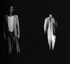
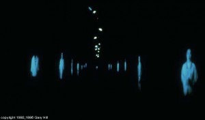
Profoundly Admire: Tall Ships, by Gary Hill 1992

In this piece there is a long hallway of projected figures. A sensor is triggered when an audience member goes by and the figure approaches, appears to almost speak, and then retreats.

ghts2 tumblr_lelws72SCP1qz8y11o1_1280

I like this piece because I think it conveys a simple poetic interaction un-jaded by skepticism and technological gimmick. I enjoy the fact that it was made using laserdisks and monitors with projection lenses. I like the human scale and direct address of the subject matter juxtaposed with the lack of physicality and dismissive gesture of each individual. I think it is particularly suited to the etherial medium of projection.

As an artistic context for this work I would like to reference Thecla Schiphorst’s Body Maps and Paul Sermon’s Telematic Dreaming.  Neither of these pieces are as successful as Gary Hill’s tall ships, but they are also steeped in the idealism of early interaction.

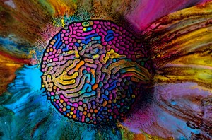
Surprise: Millefiori by Fabian Oefner

Oefner created a series of colorful photographs by injecting watercolor into ferrofluids (an awesome magnetically charged liquid). The resulting images are psychedelic images that resemble diffusion patterns found in nature.

13508f5c5cb8a756622f73dd2fd7edab


I find this project exciting because of it’s materiality and pseudo-science aesthetic. However the images are pure stimulation. The color palettes aren’t innovative, instead they are simply bright and harken back to the 70s. I would like to see this technique applied to a live sculpture rather than still photographs.

Oefner said he was inspired by the sculptures of Sachiko Kodama.

Also I personally find magnetic putty very exciting.

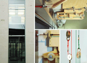
Disappoint: Perpetual Energy Wasting Machine, by Niklas Roy

In this piece Roy makes a rube goldberg like machine that causes an elevator to be in an infinite loop, constantly travelling between each floor. Meanwhile a thermal printer in the elevator documents the lost energy of the elevator in a long continually growing strip stretching into a trash can bellow.

perpetual_energy_wasting_machine

This piece doesn’t actually disappoint me. I like the way it is built on-top of preexisting mechanisms of the building and how it is constantly exerting itself over its futile task. I mentioned here more for its potential; I think there is a lot of potential to integrate the secret workings of preexisting structures into a kinetic piece.

This piece reminds me of some of the machine based works of Roxy Paine (except less aesthetic)

http://www.todayandtomorrow.net/