Category Archives: looking-outwards

Marlena

20 Jan 2013

Auto Chasing Turtle – HirotakaSter

The Auto Chasing Turtle is a small autonomous robot that has the ability to recognize peoples’ faces using a Kinect, OpenFrameworks, Android, and other assorted software. Upon recognizing a person, the turtle perks up and scurries in their direction. The user can also see what it’s seeing by connecting the turtle wirelessly to an iPad and using the Kinect as a video camera.

This project’s a lot of fun for a couple reasons: first of all, it’s a home-made hack. Though it definitely shows that this robot was cobbled together out of various bits of hardware, it is in an impressive and admirable way. It’s always really cool to see what can be made out of relatively commonplace tech. It also incorporates a couple of preexisting software hacks; this video is actually a response to a Kinect/Android hack from which it almost certainly acquired some of the code. Not only is this a cool project from the community standpoint, but from a more personal perspective I find it incredibly cute–as it waddles towards the user or jumps in recognition I can’t help but want to cheer it along.

It’s not a polished project but what’s excellent about hacks like this is that it’s left a lot of room for improvement. It could go in a lot of different directions in terms of both improvement of function and in use. Right now it’s just wandering around the hacker’s house; it would be cool to see it in perhaps interacting with strangers in a public space or as part of a performance piece. It would also be interesting to add other animal characteristics and allow for autonomous movement outside of following people. It seems like a work in progress, though, so hopefully the hacker will continue improving the design and posting updates on his channel.

Funky Forest – design-io.com/projects/FunkyForestSAM/

Funky Forest is an installation piece that was built for the Singapore Art Museum where visitors can become part of a virtual forest–the site describes it as “an interactive ecosystem where children create trees with their body and then divert the water flowing from the waterfall to the trees to keep them alive”.

It’s a great application for kids–it’s an interactive piece that gives them a goal to work toward rather than just offering them a camera to flail their arms at. It also has a great environmental tone without being preachy; it and the other exhibits at this museum all offer a playful interaction with nature.

It might have been interesting to somehow combine this project with a physical interface, especially one that was made of real plants. If it could be done in such a way that prevented the plants from coming to any harm it would certainly drive home the idea that your actions directly influence your surrounding natural environment. As it stands, though, it’s a fun contribution to the museum and a good use of the technology that OpenFrameworks has to offer.

Dérive – http://www.francois-quevillon.com/html/en

Dérive is an interactive piece that shows the user through both audio and visual feedback the realtime environmental changes to the displayed urban areas. It attempts to show the blending of the digital and corporeal sectors on a city-sized scale.

I love how this piece looks and the concept of combining urban realities on and off of the web. I’m frustrated, however, by how it’s unclear from the videos as to what extent the user can interact with the piece. I’d like to see how easy it is for the user to maneuver around the city and how much information they see fluctuating as they explore. I’d like to see more about the actual information that is processed in the generation of this piece.

I do appreciate this artist’s style, though. Other pieces of his like Ciels Variables also sample huge amounts of data for relatively simple and elegant simulations. Though I would have preferred to have more of the data information in the visualization I still appreciate these works for their attempts at blending the real world with the digital.

Patt

20 Jan 2013

Monde Binaire “Hello World !!!” by Media Design HEAD

Monde Binaire “Hello World !!!” is a 36-paged interactive comic book, with 22 hidden animations that can be accessed through a mobile application. This openFrameworks application really attracts me because it takes a simple object and modifies it into something more engaging. When reading a comic book, you are usually engaged to the content of the story and the beautifully-drawn graphics. This application goes beyond the norm by adding a new and interesting interactive experience to the common act of reading cartoons.

Fun Race Machine by Getorade Run and Thomas Inc, Japan

Getorade, with Thomas Inc, Japan, developed this ‘Fun Race Machine’ — a unique treadmill machine, with arrayed 3D LED and sound that synchronize with runner’s running steps. I really like it simply because it just looks really fun. It definitely changes my attitude towards this not-so-amazing workout. It makes you believe that you are not actually doing what you are doing, and are not where you think you are (as in you are not actually running on a treadmill, but are dancing in a nightclub). I can only think of what a cool experience it would be to exercise on a machine like this. I would work out every day if I had this. I really would.

A Journey – Dublin by Kimchi and Chips

I don’t think ‘A Journey – Dublin’ is an important contribution to the field, but definitely is one interesting experiment. Visitors draw images of their private journey and arrange them in the box, where the images are being scanned. The light traces the drawings, representing the trace of a unique memory. I like the fact that it is not only interactive, but also gives an emphasis on personality and individuality.

Anna

20 Jan 2013

Audience – rAndom International from Chris O’Shea on Vimeo.

A few weeks back, Mike sent me a link to this webcomic about the process of coming up with new and off-the-wall ideas. It made me pretty happy — as did the protagonist’s almost manic enthusiasm about the possibility of letting the stars see us.

This project doesn’t quite make it to the stars, but it’s a powerful, whimsical and ‘reversive’ installation that makes us consider the purpose of objects and the purpose of ourselves.

The idea of having mirrors turn their faces to follow a person isn’t all that extreme — we see similar types of motion with solar panels following the sun. In my opinion the success of this installation is all in the details: the decision to give each mirror a set of ‘feet’ instead of a tripod or a stalk, or the fact that each mirror has an ‘ambient’ state as well as a reactive state (see video). They are capable of seeing you, but they weren’t made to see you — they seem to pay attention to you because they decide they want to, and so their purpose transcends their task, in a way.

There is a strange subtlety in their positioning too–clumped, but random, like commuters in a train station or traders on Wallstreet. Everything comes together to give the mirrors an eerie humanlike quality, and makes the participant want to engage — because maybe something really is looking back.

The Treachery of Sanctuary by Chris Milk

I’m probably being really obvious about my tastes, posting about this installation right after gushing about how much I loved the spider dress. Even though at face-value the idea of giving someone’s silhouette a pair of wings seems—I don’t know, adolescent and cliche, maybe?—there’s something elegant, bleak and haunting about this piece. Think Hitchcock, or Poe. I’m less drawn to the final panel (the one where the participant gets wings) than I am to the first two. I really enjoy Milk’s commentary (see video HERE) about how inspiration can feel like disintegrating and taking flight. And there’s something powerful about watching (what appears to be) your own shadow—something constant and predictable, if not immutable—fragment and disappear before your eyes. The fact that Milk has created the exhibit to fool the audience into thinking they are under bright light, rather than under scrutiny from digital imaging technology, lends the trick this power, I think.

All in all, the story Milk tells about the creative process works, and puts the ‘wing-granting’ in the final panel into a context where it makes poetic sense, instead of just turning people into arch-angels because ‘it looks cool’. (It does.)

Sentence Tree from Andy Wallace on Vimeo.

This is a quirky little experiment that organizes sentences you type into trees, based on punctuation and basic grammar structures. The creator, Andy Wallace, described the piece as ‘a grammar exercise gone wrong’, but I wonder if the opposite isn’t true. Even as a lover of words, it’s hard to think of something more boring than diagraming sentences the traditional way: teacher at a whiteboard drawing chicken-scratch while students sleep. I like the potential of this program to inject some life into language and linguistics. Think of the possibilities: color code subject, object, verb, participle, gerund. Make subordinate clauses into subordinate branches. Structure paragraphs by transitional phrases, evidence, quotations, counterarguments. Brainstorm entire novels or essays instead of single sentences! This feels like the tip of an iceberg.

Can

20 Jan 2013

The V Motion Project


It’s an interesting project about interesting music and not-so-interesting (even classical) gestural input.

The project uses kinect, and that part is pretty standard. However, the fact that it uses it live, to perform in front of an audience got my attention. First of all it’s a street art, he is (or they’re) performing on the street, by triggering notes with his arms. The interface and the performer, together makes the whole experience like a music video. Interactiveness is so good, that it pretty much allows the performer to do anything he wants with the song. (If only it’s not a smart, planned, deceiving video)


FROST

http://3xw.ole.kristensen.name/works/frost/

Frost, is a really different reactive scenography. I liked the way it represents its name very well, with the cold colors and choreography. The stage reacts purposely slow, but well to the dancers. They used 3 diffused infrared lights, and 3 cameras with ir pass filters coupled with a bright projector. I think they expressed the idea on stage very well. In addition to the 40 minute awesomeness, their source code is also available online, with a note that says : “It’s messy, it’s the first time we did something in cocoa and obj-c, but it’s there.”


Grid

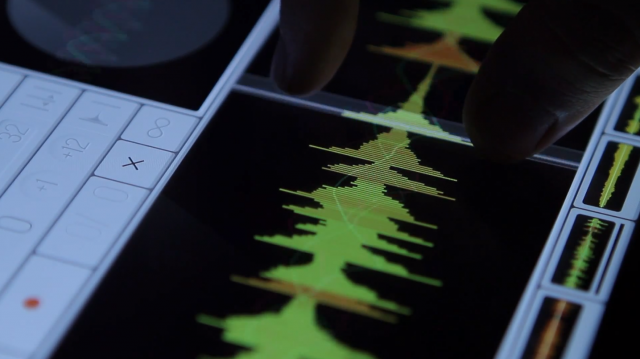
It’s an interactive multi-touch sound visualization controller, made for the band Mathon. It’s for live events, and it looks like traveling at the speed of light. The controller’s UI looks incredibly organic for a sound visualizer. It gives the sound a TRON-esque look. Sounds are partly electronic, partly sampled, and I think the half user controlled, half computer generated approach totally complies with the half electronic half sampled sounds.

Kyna

20 Jan 2013

MSA Fluid by Memo Akten

dddd


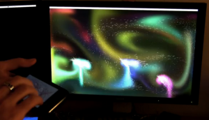
A really, really impressive simulation of fluid dynamics! The artist uses the iPhone as a control panel for the currents in the simulation, and OSC for communication over wifi to run the software in real-time. Using the touchscreen capabilities of the iPhone, the user can drag, poke, and twist to introduce new forces into the simulation. The user can also use more than one finger as a controller simultaneously.

MSAFluid for processing (Controlled by iPhone) from Memo Akten on Vimeo.


OpenFrameworks 3D Flocking by MultiRutele

This project isn’t particularly unique or groundbreaking, but it does illustrate a very graceful execution of 3D flocking, which I have always found to be very visually engaging.


Bloom Skin by Wow Inc. Tokyo

I think this is a really elegant example of an installation. The use of the flowing fabric really does instill a sense of organic flowing motion reminiscent of some sort of deep sea organism. My only complaint is that the music in the video appears to hide the noise of the fans, which I feel would likely take away from the natural, ethereal feel of the piece.

Yvonne

20 Jan 2013

Project 1: Important contribution
GPYou

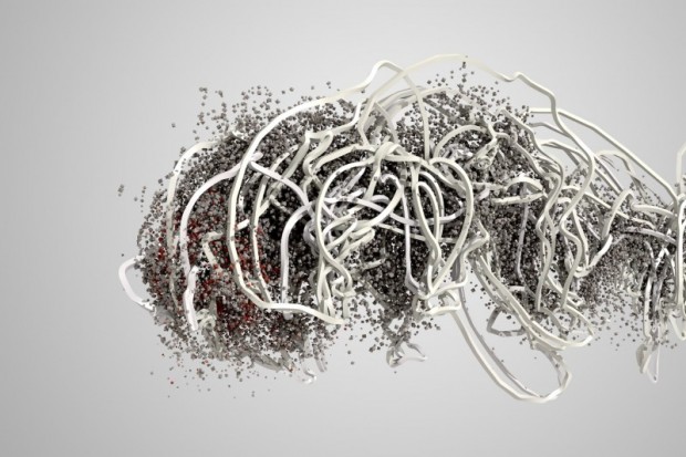
I don’t really know what classifies as an “important contribution”, this is all new to me… I haven’t been in this field long enough to know what is old, what is new, and what is really on the breaking edge of things. I can say I think it’s impressive that it’s generating a million particles real-time with skeletal tracking. Just thinking of that many particles from a rendering standpoint makes my head spin (I tried particle rendering in Cinema4D to generate steam for a project and the render penalty was simply insane). It’s really well done too, quite artistic, I like it.

Project 2: Quick but interesting sketch or experiment
Kinect Hack: Kinect

I don’t know if this is a “quick” project or not, because I can’t read Japanese. But it seems like a quick Kinect hack that I believe is done really well. It feels almost “magical”, and that is probably why it appeals to me. Parts of it look like he’s about to cast a spell… yeah, that sounds a bit silly, but I guess that’s just me and my obsession with magic. Even though it doesn’t have a refined video and appears to just be a demo, I find it to be quite beautiful.

Project 3:
I Spy

This is an interesting project in my opinion, I think it has a good premise (our tablets monitoring our activity and habits). I like the use of the tablets and how they form a disjointed face that follows you around the room. However, I wish the face was capable of expressing emotion in response to the presence of the human. Or perhaps, maybe, it’s just meant to stare that way, in the same blank manner we often stare at our own devices with.

John

20 Jan 2013

Okay three projects:

Forms by Memo Akten:

forms11-03
This is just really cool. Akten is using footage of athletes from the Commonwealth games to produce large scale interactive video pieces. I really like how abstracted the final products are while maintaining the dynamism of the original footage/human performance. While it’s hard to discern the exact nature of interactive control from the video below, I like how simple the interaction appears to be.

Pennant by Steve Varga (puchased by Topps)

Pennant was originally a Masters project at SVA’s Design and Technology Program. I really like it because it feels designed to meet needs as opposed to being just a pure technology demo. At some point, Topps (the baseball card company) bought Pennant and now maintains it on the App Store.

Fabricate Yourself

This project is not massively impressive from a technical standpoint, but very cool considering the potential end user applications of chaining together depth cameras with 3D printers. In the video above, such a system is used to create 3D photo booth style relief prints. The prints are cleverly designed to act as puzzle pieces, encouraging users to create several prints. In a few years, it’d be easy to imagine such a setup encapsulated at a bar or party or wherever you might find a more traditional photo booth today.

Nathan

20 Jan 2013

So I think I’ll start with a quick sketch that holds a lot of merit for me: Pigmento a work by Giuseppe Burdo, Emanuele Libralato, Salvatore Santaniello, and Achille della Grazia is a beautiful (albeit maybe not that interesting) experiment that kind of represents a new physical and tactile area that is being explored by the oF community. I think that this and the next project I Spy by Neil Mendoza are both great examples of an interaction that surpasses a screen. I Spy may not be the most wonderfully made object installation in the world, but it sure has some poetry. Unlike Pigmento, I Spy has a sort of unexpected and successfully surprising result. The imagery might be a little steeped with stereotypical connotations but it is none the less a powerful statement is made about surveillance  individual privacy and public access.

Next I looked for something that is an enormous contribution to the field of New Media as a whole and I went at it with a sculpture perspective. I think I found it when the only words that came out of my mouth were “Fuck this is beautiful”. Missing is an interactive installation by Kyle McDonald. I really hope it is using openFrameworks as I am not sure. But the project speaks louder than any code that could be behind it. It is more than a way to listen to music. It is more than an installation. The individuality and sever exposure to attention I believe to be at the heart of what this work is about and what the world that oF is creating may be aiming for. An interactive experience that equals more than the sum of its parts. Check it out and imagine yourself being alone in that room in the center of the speakers. Absolutely stunning.

Meng

20 Jan 2013

I appreciated the naked eye 3d and mobile multiplayer interaction, eventhough I cannot think about how openframeworks integrate in to the game. Using the most accessable tools, in this case the cell phone, to play with others in a AR setting is will be prevailing in the near future.
https://www.creativeapplications.net/iphone/music-boxel-iphone-ipad/

A work was done two years ago using oF.It reminds me of the old shadow silhouette. It is a very nature and in a story context. Playful and fun.

Interactive Puppet Prototype with Xbox Kinect from Theo Watson on Vimeo.

The following three videos are all related to using algorithms representing to flocking and swarm simulations in openFrameworks. When I was looked outwards watching video, I found out I encounter so many examples in this kind. I write about these three, because It is let me think tht openframeworks may have a lot of applications in generative art or sound visualization.
https://www.creativeapplications.net/openframeworks/silo468-permanent-light-installation-in-helsinki

One Second Before Big Bang from openFrameworks Lab on Vimeo.

https://www.creativeapplications.net/openframeworks/silo468-permanent-light-installation-in-helsinki/


Ziyun

16 Jan 2013

{Admired}:

I think this is a very well-done project. It has invented a new way of controlling to adapt to a new control interface – touching screen. The controls are very intuitive and of high usability while I wish the colors were prettier….


Samplr – by Marcos Alonso

{Suprised}:

This piece is so elegant, yet the technology behind it is so simple. I like the the way the user used the magnets and created such a poetic piece. Watching the slow movement of the metal cube, I feel like time stops..

moving objects | nº 502 – 519 by: Pe Lang

Gearmotor, magnets

Size: 660 x 540 mm
Year: 2011, Galerie Mario Mazzoli – PreviewBerlin