Kaushal Agrawal – Project 3 – Battlefield Simulation
This project is an effort to simulate a battle between two armies. I had planned to simulate an army which comprised of the infantry, cavalry, archers and catapults. I eventually ended by doing a battle simulation with just the infantry. My idea for driven by one of my looking outwards – “Node Garden”, where a set of curves would twirl in space to create nodes. Based on the feedback I got, I focused on simulating the behavior of the infantry.
Bow-Tie Problem
I decided to move the infantry to its nearest enemy. This resulted in biased results, where the infantry turned to the fastest enemy.

Simulation
Simulation


The simple aesthetic works really well for your project – I like the contrast between the two army colors while they’re clashing. The UI also looks really slick.
Very fluid work. Seems to flow together without any random deviations. Nice touch on formation changes.
Nice development from the initial sketch. The behavior control is working very well. I think we talk about MASSIVE in group(http://www.massivesoftware.com/).
The basis of your sketch is much like this and probably available at much less cost.
I love the graphics and trails !
This is really nice looking and intuitive. I like that you can adjust the settings and see the new results
It’s great that you can control the parameters and run simulations from within the applet.
Looks like something I would like to play with and try out!
Can you make the labels for the controls so they have spaces between words? (BLUESOLDIERS -> Blue Soldiers). It’s more legible.
It sounds like a great idea that can be applied in game applet. Visualization is simple and easy to understand.
a very chill and sexy/sleak UI, nice job! ^_^>+1
Love that you can adjust different variable with sliders, good design.
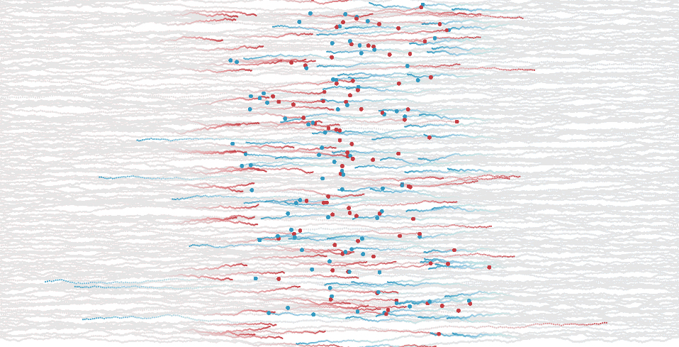
It is great to have those dots remaing on the screen after the battle ends.
** I Agree. I would add an explicit “BLUE team wins!” after the game ends.
^ yes! or I was even thinking maybe displaying the number of survivors?
Would be cool if you could have an initial line-up set, and then control it by dragging using the mouse. So the user can create custom line-ups and test them.
First of all, the interface is pretty nice and I appreciate that you spent the time to make it look good. one thing that’s realllllyyy picky, it would have been nice if you changed the red army’s bars to red, but actually, it doesn’t detract from your project at all. Regardless, i like how you can play around with your project
I appreciate how you visualized the paths of the soliders with a gradient of color (grey- blue/red)
Very nicely designed! (I would changed the color of the input bars for the red army to red however, and make it more clear which formation option is selected)
Did you try other line-up formations aside from the spear?
Did you look into algorithms for Real Time Strategy Games? I know you didn’t since, I asked you about RTSs and you had no idea :P
Put a video on the blog post! The applet is a lot more dramatic than the still you have now. +1
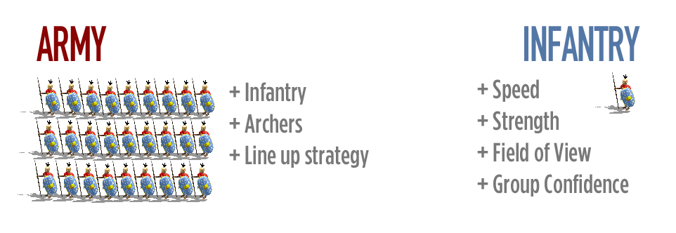
I like how you outlined what was influencing the particle behaviours.
It would be nice if the death dots stayed visible for longer. I think there are probably interesting patterns in where soldiers die, but the points disappear too quickly to see them.
On the other hand, the fading paths are a very nice effect and help prevent the display from getting cluttered.
Nice graphic design, I wish soldier’s speed remained constant in the end game. It seems like the last stragglers speed up. There could be a great sense of drama at the end if that wasn’t the case.
I like that your UI makes it into a generalized tool for exploration. It’s way more interesting to try and test your hypotheses than it would be to watch something predefined and static. Good work
Nicely designed, I agree. Would be interesting to have other factors represented in the simulation somehow, like the effects of command structures (“generals”). Also bravery (who turns back?), and soldiers who assess the situation and surrender. Not everyone has to die — some are captured and others flee or return…
I know you were up wicked late working on this, but I really wish you had diagrams of the algorithms. It’s such a cool simulation to watch, and it sounds very clever, but it’s hard for me to track how the algorithms work just listening to you talk about.
great idea to give the possibility of diffrent formations. The produced pattrens are really intersting to observe.
interesting to see them finally converge on eachother… wish it could be slowed way down to better understand what’s happening. maybe be able to select/tag/highlight one unit and have it color them differently or draw it out, etc… Or maybe show the decisions of the highlighted one
This is amazing. I love the aesthetic and think it is really fun to watch. It makes me want to run the simulation in different constrained maps and with more different formations. I would like to run it in scenarios where one army is surrounded or when on enemy has to attack through a narrow corridor. It could become a kind of strategy game. Very cool.
I’m curious/ thinking about where this fits into your life or user’s lives. It seems like a fantasy game than anything, it might have relavance historically, but you didn’t mention the research. It seems hard for a user to approach. It walks the line between being a game and/or being a simulation. It is aesthetically working well ! I just want more to hear about or more to see a “take away” from this.
really cool to watch, it would be interesting to incorporate levels or set of armies that fight in rounds