Project 3: Instant Graphication
I initially started the project with a desire to somehow generate actual 3D forms. Let’s just say that didn’t go so far… Anyways, I settled on satirizing my own field of study, design.
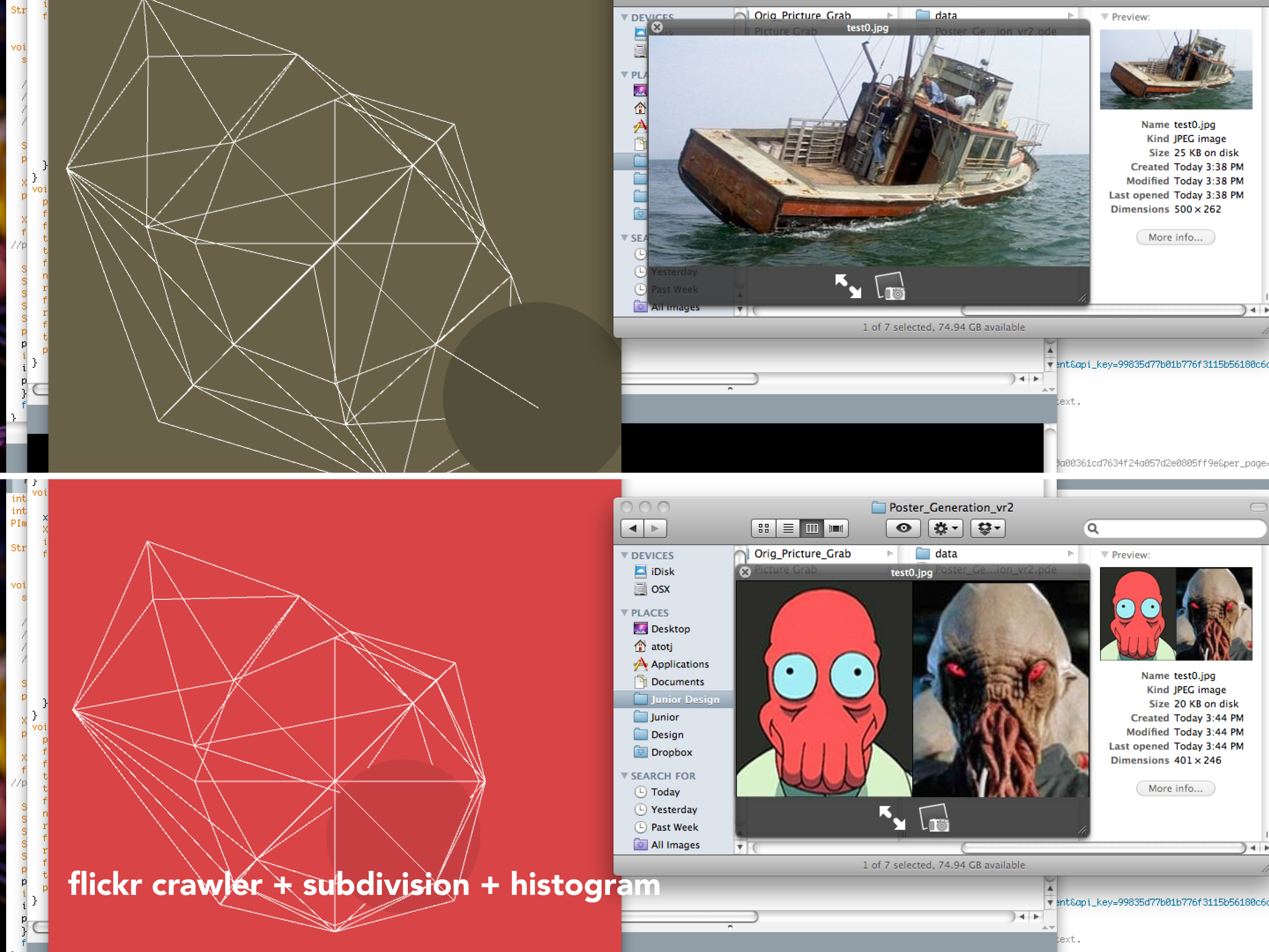
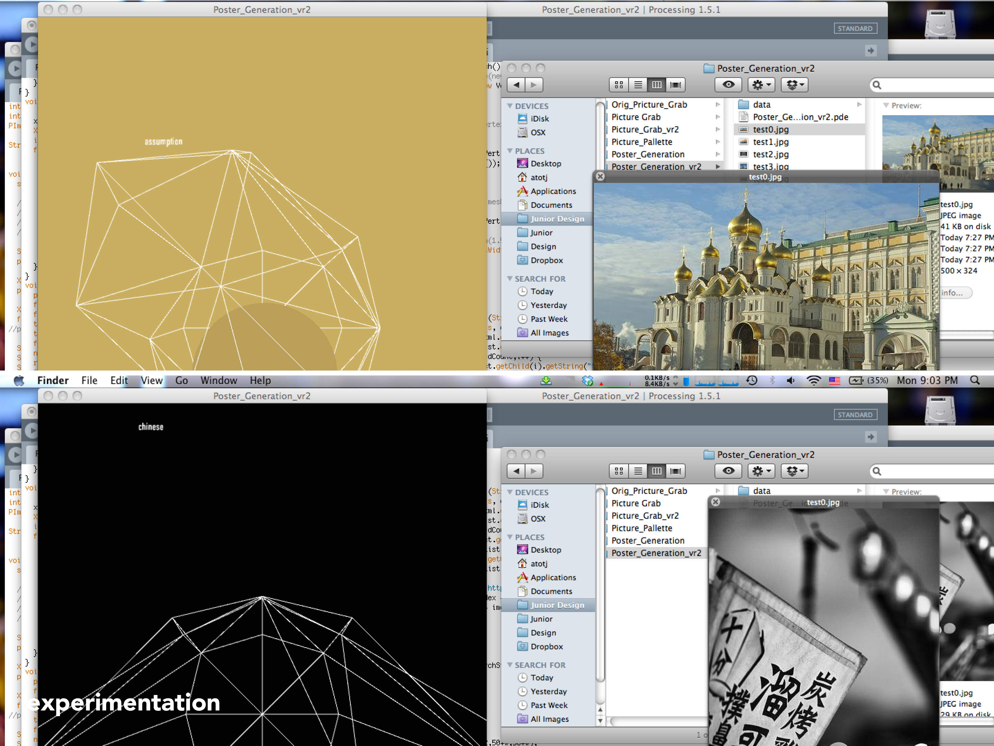
In a pretty straightforward process, I created essentially three gimmicky graphic elements: a grid of facets, a circle, and text. My intention was to trivialize the graphic system of creating ‘cool’ designy posters by assembling these three graphic elements at the click of a button. Indeed, it was a pretty superficial goal, but primarily I was unsatisfied with the state I left my last project and I really wanted to make something that looked good and worked (I guess it’s still a superficial goal, but hey).
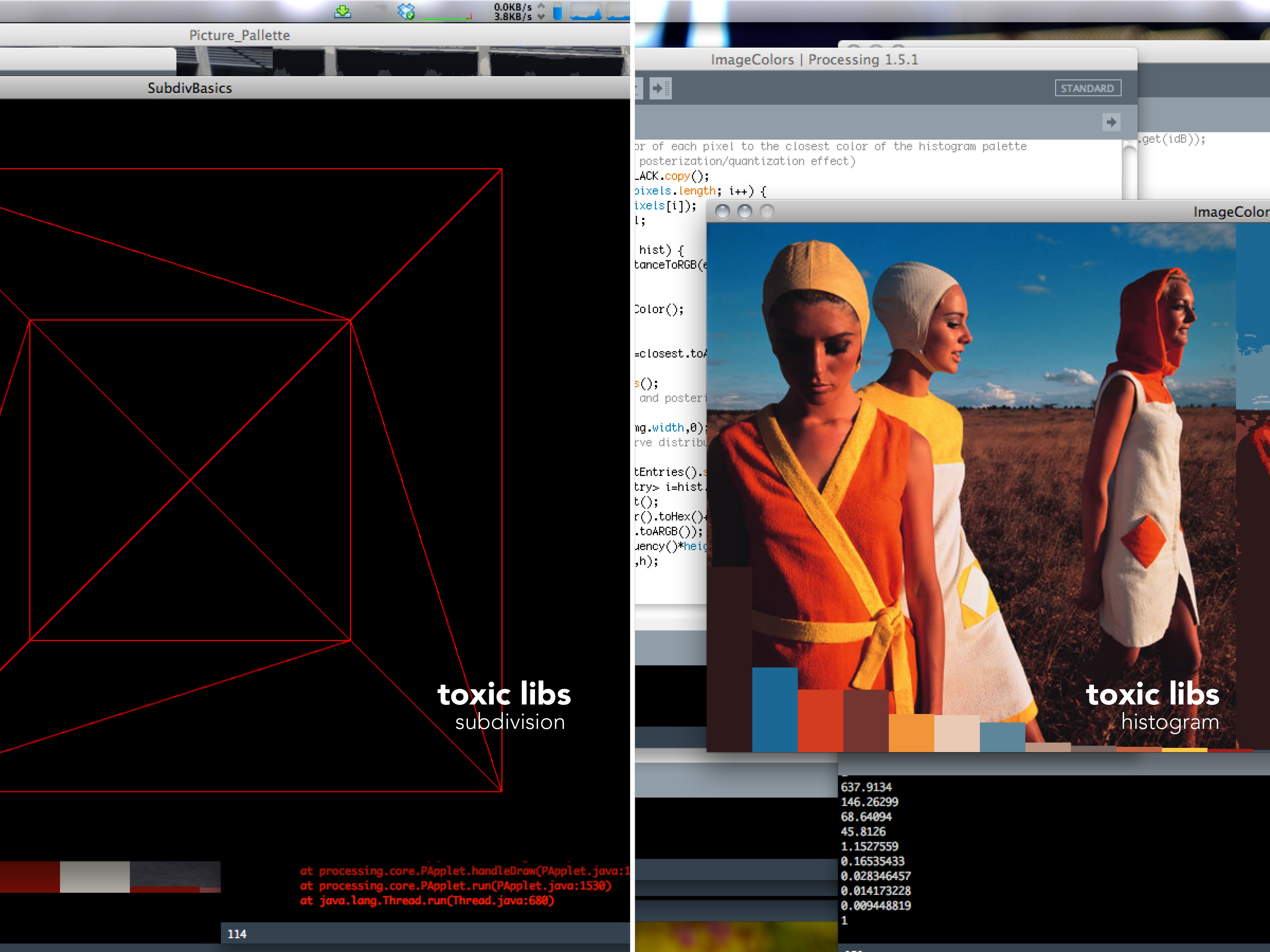
I dove into experimenting with toxiclibs and the crazy amount of things people have done with the comprehensive library.
[vimeo https://vimeo.com/37573779]
[vimeo https://vimeo.com/37573778]
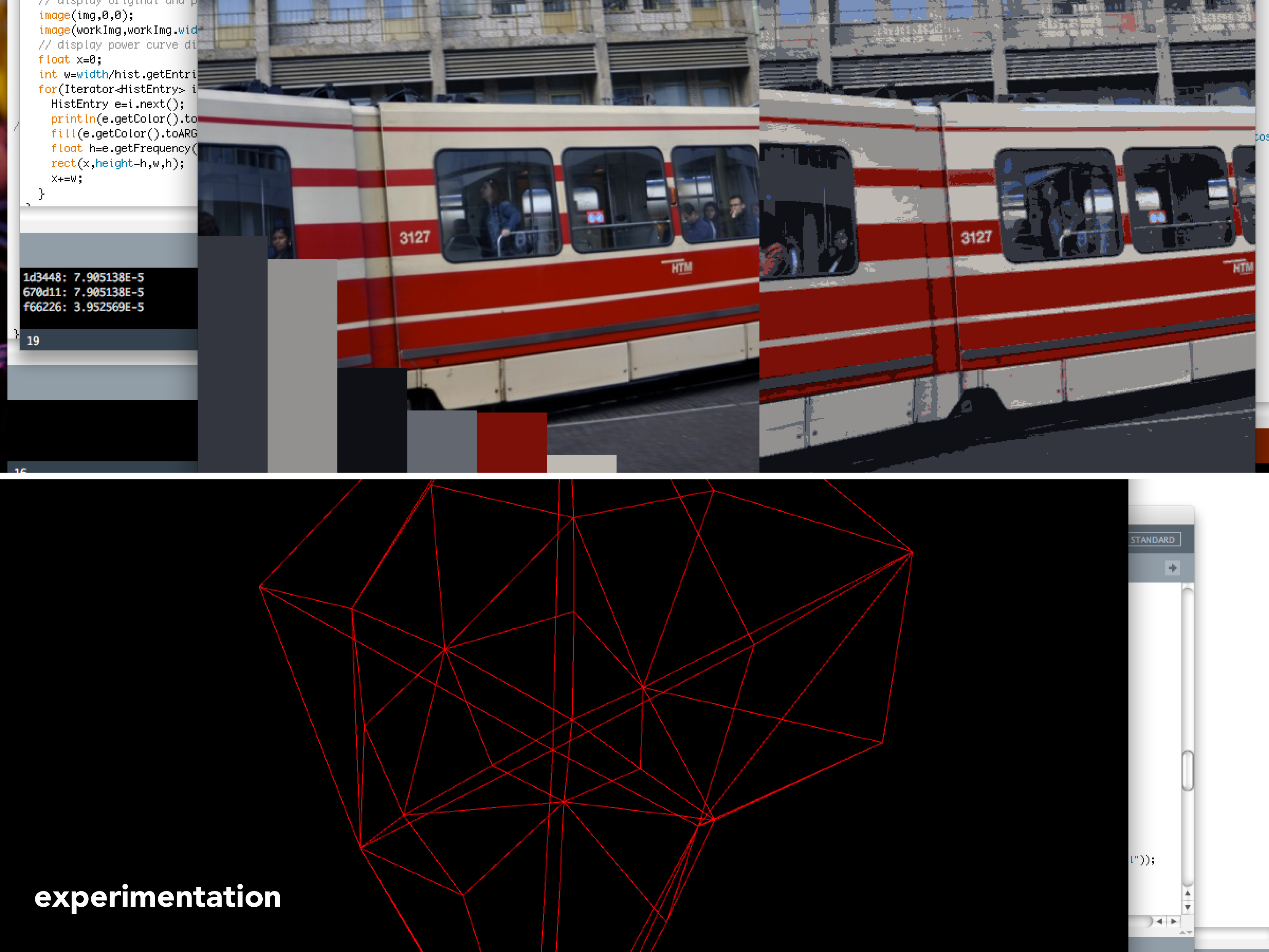
Second set of experimentation.
All in all, it was enjoyable to actually have an idea of what problems I needed to figure out and the methods to do so. I only wish I could have devised more relationships between the photos I grabbed and the resulting graphic poster. Then again, superficiality was my intention wasn’t it?
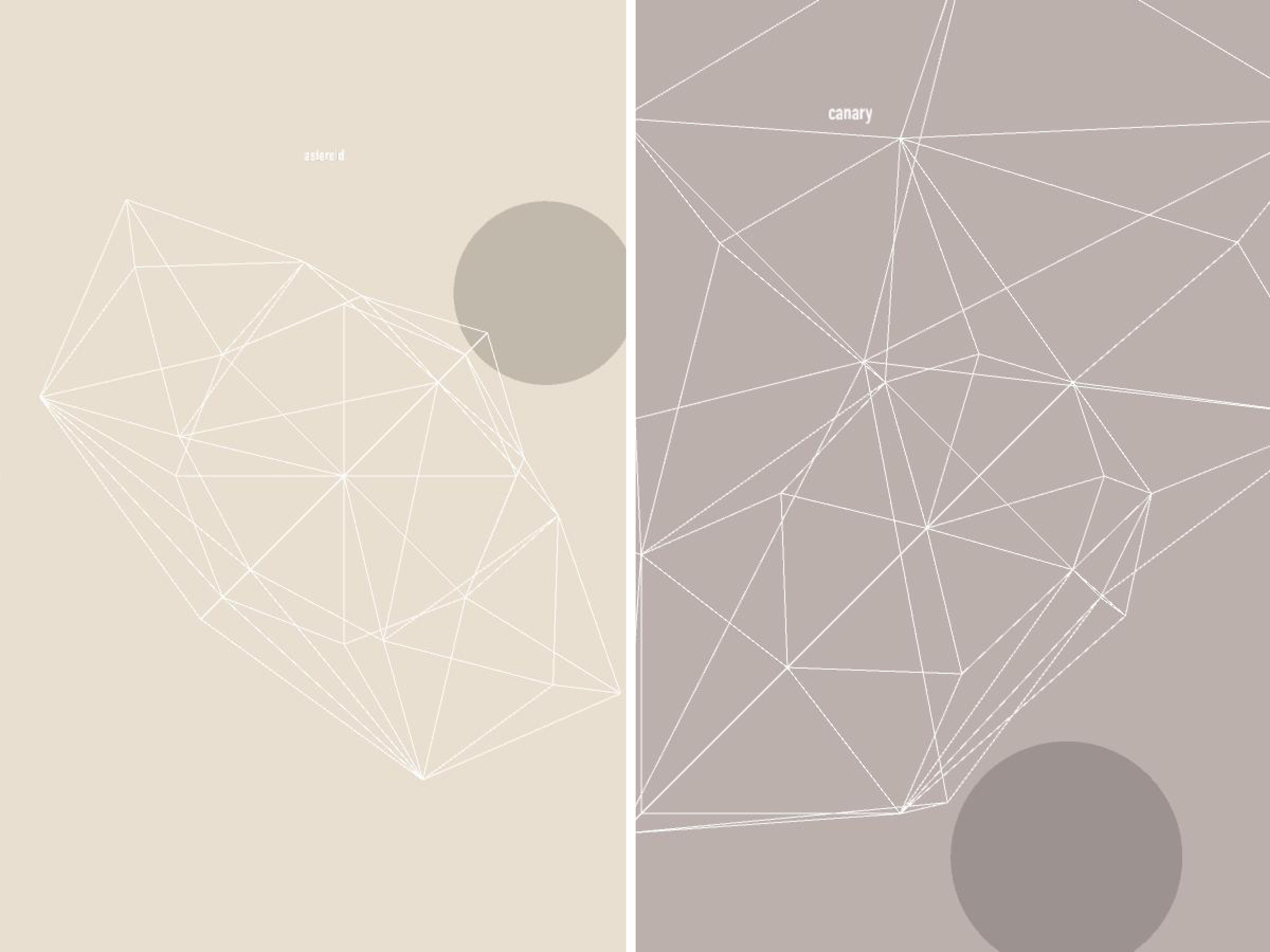
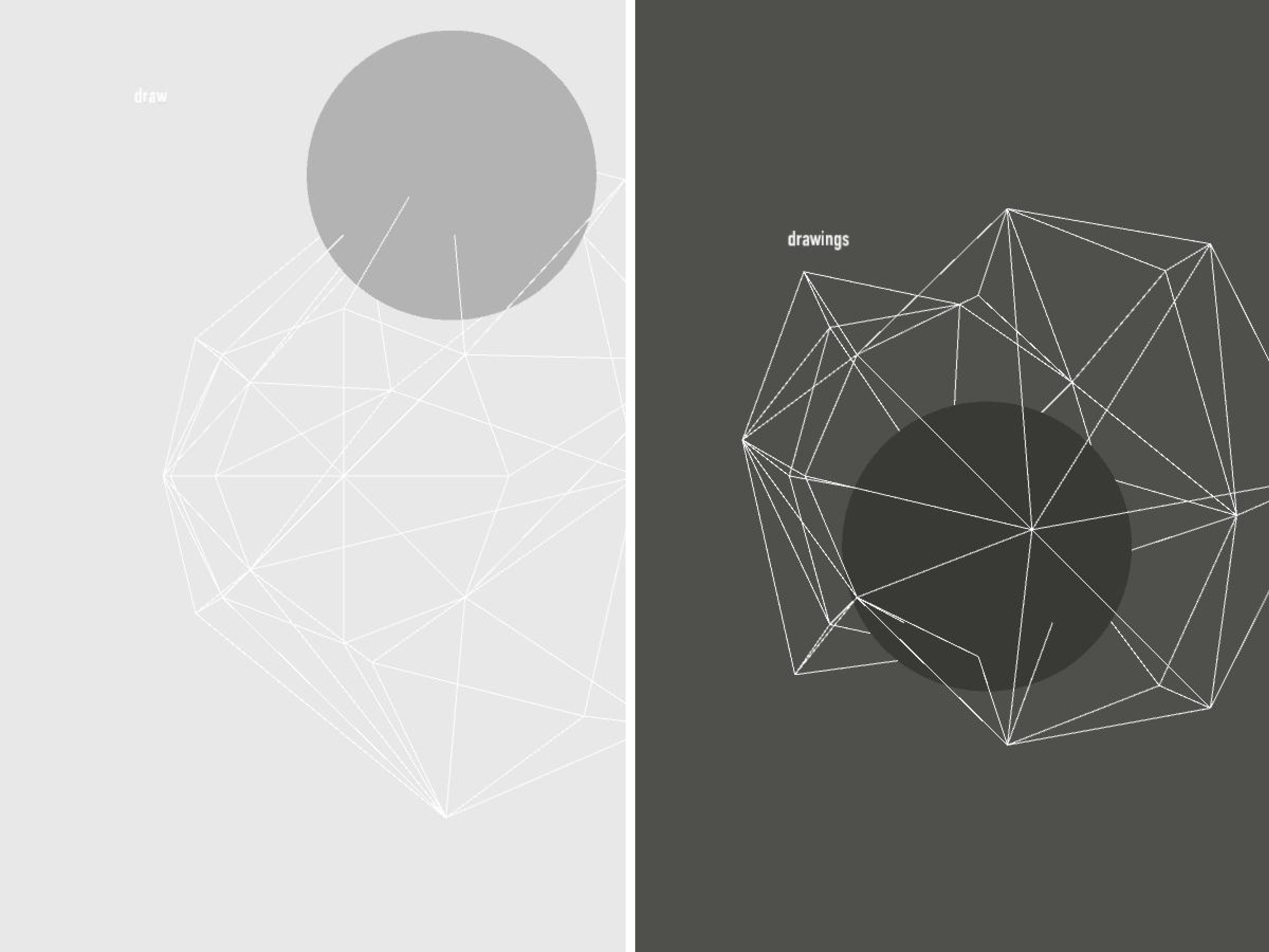
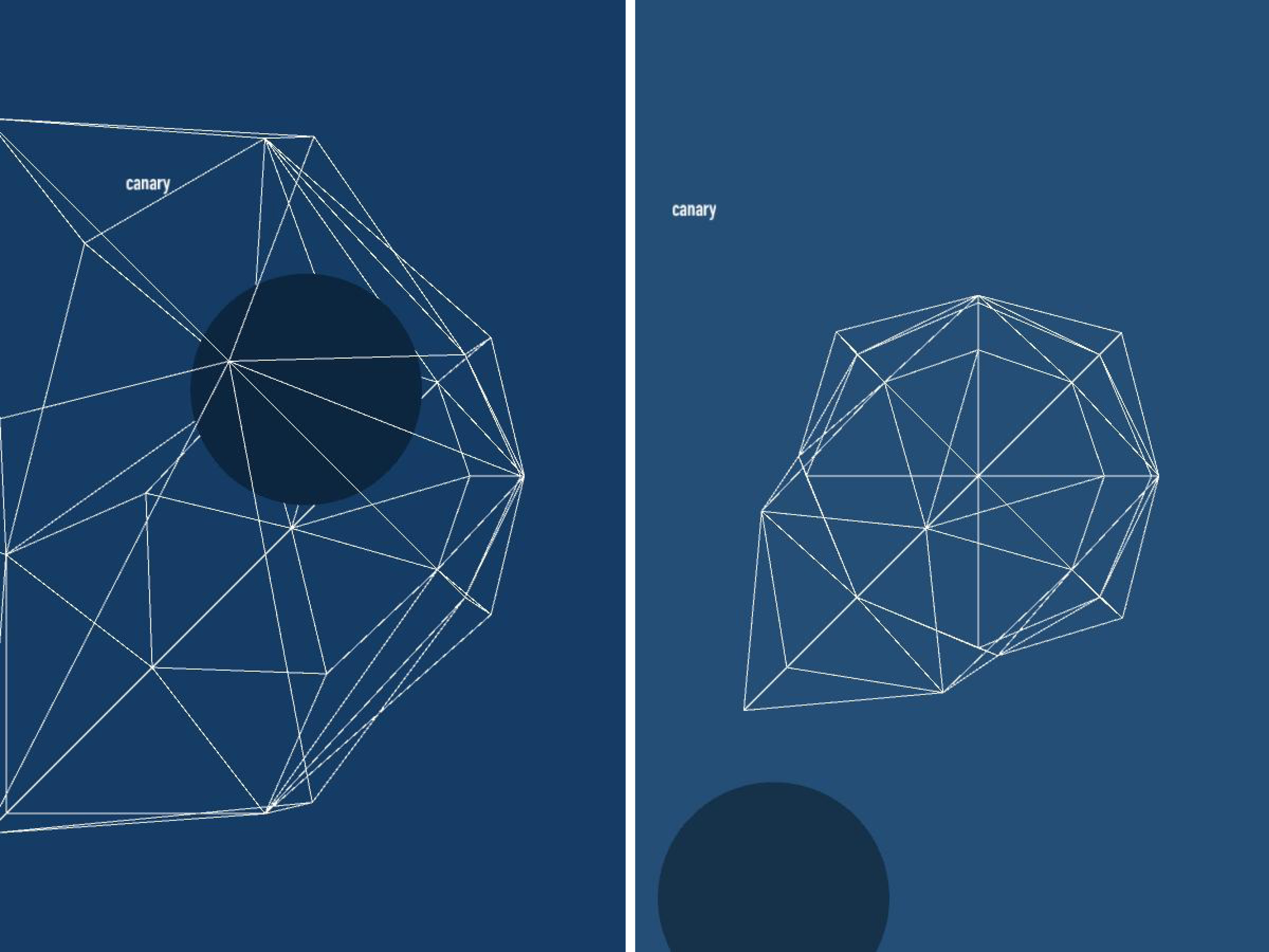
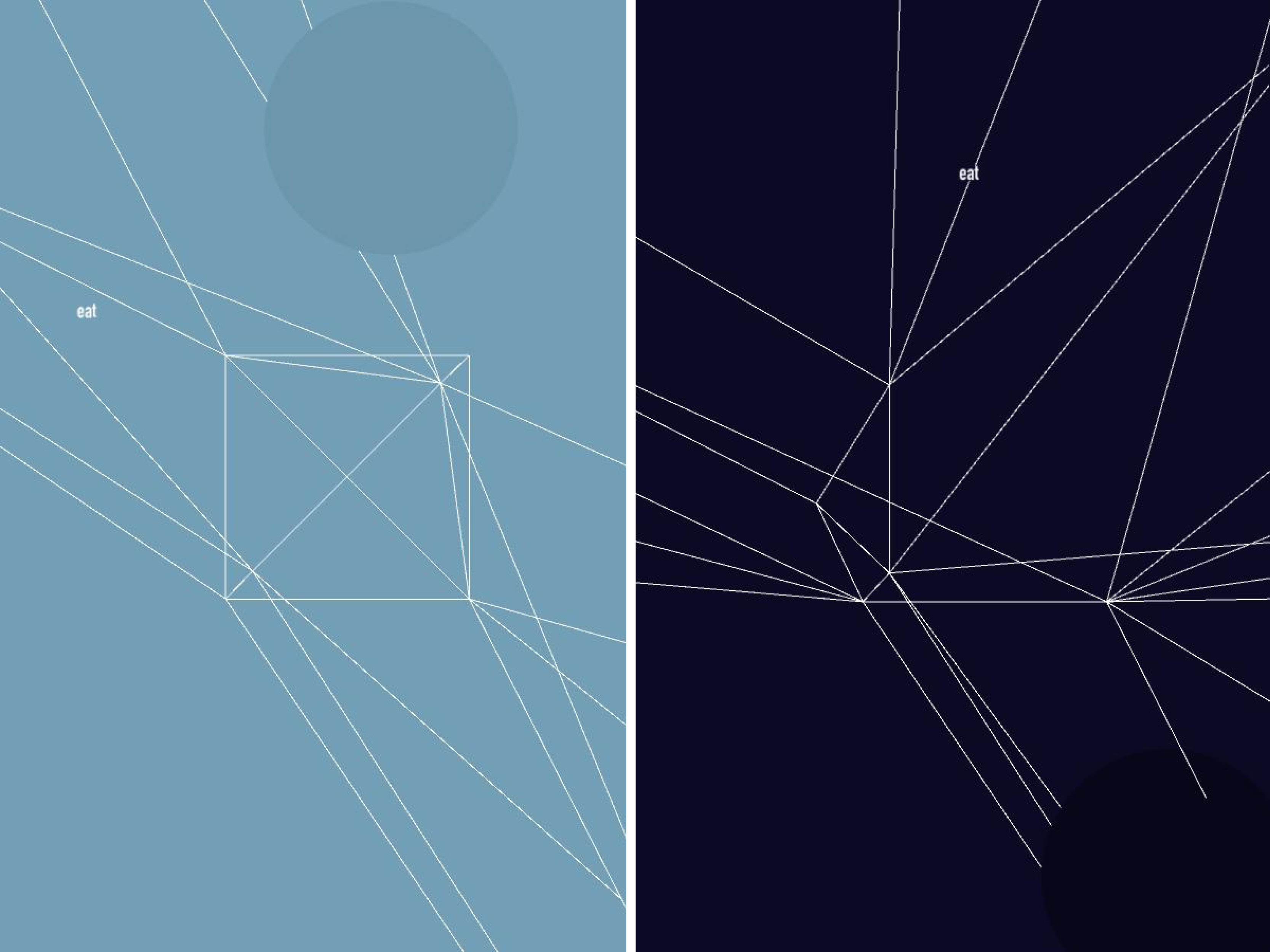
————————–
Why do the meshs all look so similar? is this on purpose or are they supposed to be different?
nice interface design… maybe you could slow down the creation of the polygons…
— Agreed, the expanding text cicle is a really nice touch++reallly nice
— yes, I want to steal it now for a project
The project is a little cynical (is this a bad thing?) Not exactly a bad thing, but it seems like a lot of coding to get results that don’t exactly communicate much, except the futility of communication…
If even one of those triangles was textured with a fragment from the retrieved image… it would communicate so much more. Like a little image shard that acted like an aperture into another universe.
It seems odd that the panels of the meshes aren’t filled in. I remember your original sketches were more 2D planes of images. For me these look too directly like meshes, your use of color currently is working but filling in some of these triagles would be nice.
I feel like the histograms of the images probably have much richer color information than shows up in the final poster. How did you choose what color to use? Is it just the one that appeared the most? Mabe if you worked the other colors in somehow…
The images are nice; it’s a neat way to generate posters. But the thing I think I missed is: why did this interest you? Perhaps that is related to the discussion you had with Golan about the cynicism. These images are visually appealing to me because they look very mathemtical (and I’m a nerd), but in reality they just sort of appear to be mathematical because you’ve created a highly abstract rendition of an image. It may be that dichotomy which gives me the impression that this was just a project to do for class and had no strong personal meaning for you. Maybe.
I think this is an interesting project but could potentially be expanded more.
I like the design, which you are indeed trying to do. It would add value if there was more relation to the image, maybe a image mesh.
These came out really polished looking in the end, but you could definitely need a stronger connection between the image and the mesh. Maybe you could have a clearer connection between the points you are pulling out to create the mesh and the image. You could do some edge detection maybe?
could see this on http://synapticstimuli.com/category/design/ easily…
————————-
I like how the search box scales with the number of characters in the search string. VERY DESIGN-Y +1
Satirizing Design trends is the new design trend. < lawl+1 ^ everything We're being meta-cynical++ SO Meta. So meta-cynical that it's sincere in an ironic way...? Douple Plus Hipster Points for you!Layers and layers.It's called inception.Silliness :-) If this were marketed as an unironic app, it would take off like WHOAH. All the hipsters would post it to their tumblr feeds, knowing exactly how secretly ironic it was.Does this make me a hipster!? How do the vectors relate to the picture? Golan has a few projects that sample points from images to generate meshes (flong.com) that may be helpful for more carefully relating vectors to source image How is the mesh being shaped? Where do the vertices come from? What did you do with the other components of the histogram? How is the circle parameterized? I want to know a lot more about your algorithm right now. i wonder if the images could be the faces of the 3d box sides with the color being some sort of filter. design choices were good. the posters look great. looks nice and clean. i agree that the posters don't convey a lot of meaning but i like the visual aesthetic and originally when you spoke of it you wanted it to be poking fun at design. I think that approach in presenting the project is an interesting perspective and one that you should definitely stick with. ------------------------- The tech is great also the interface. Personally, I would love the output to be more colorful. or maybe the parts of the mesh could be a portion of the pitctues. I like the symplicity and elegance of the output. This kind of reminds me of The Noun Project (http://thenounproject.com/). I wonder if you could have leveraged that?
I think the designs that you generated are very nice, though irrelevant to the search term.
* yea, I think you are one step away from connecting what feels like its missing in this project. I liked Golan’s suggestion of adding just one part of the image from the search term.
Maybe using edge detection to position the vertices of the mesh?
I like golans idea of mapping the images onto the object- like a repetitive tiling of different bits of the image.
————————-