Project 2; Academy Awards Acceptance Speech InfoVis
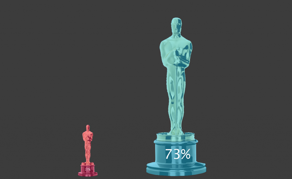
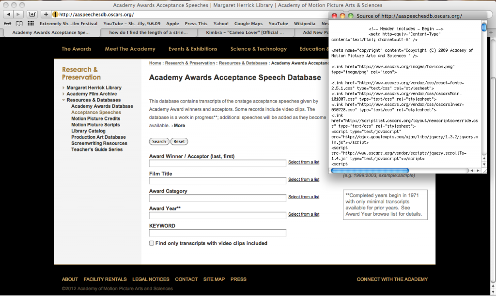
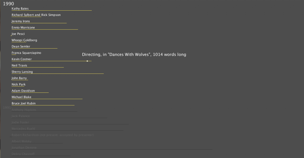
In my search for what data set to use for this project I found the archive of acceptance speeches from the Academy Awards since 1971 (and a few pre-dataing then too). I wanted to visualize the rambling and crying that usually occurs at this yearly event as well as play into how heavily publicized it is. The transcripts of the speeches are unfortunately cleaned up so I instead decided to focus on the length of the speeches, content and the gender of the speaker.


[http://www.openprocessing.org/visuals/?visualID=51811]


========================================
9. Sarah Keeling: Academy Awards Acceptance Speech InfoVis
good description of you interest in the Oscars for this project
What’s the color?
Think there’s a big missed opportunity to examine the content of these speeches (as you mentioned). It’s a great niche language use case and that could have been really fun to visualize. Wow oh wow I want to thank God and my Mom. They love me! Length is probably not the most interesting attribute here.
Instead of number of words, could you show time duration? +1
could you show the sex with color in the line chart? That could be interesting to see at a glance…
Maybe do some simpler, smaller charts like # of times a person said “wow”… Or number of times someone says “thank you”… As you glanced through the data you saw something curious/interesting/funny–so latch on to that and bring it out. the app doesn’t always have to be a giant monolithic system that does everything…
Agree with golan: sorting can be a really powerful technique… Maybe sort by length of speech
Someone mentioned “ego” as a dimension… how about analysis of # of personal pronouns “i”,”me” etc… Who is the biggest egomaniac?
great to see your process of experimenting with vis types
looks really pretty +1
I think it still conveys a lot of information, I wonder how much can you do with it.
Impressive that you were able to incorporate an element of interactivity! Your process is really well documented and shows the exploration of many different ideas. I also like the element of exploration that it was a process for yourself as well. A very simple design and nice to have an actual print perhaps!
The charts are simple, but the colors and layout are very clean, elegant, and easy to read.
**hells yeah. agreed
The meaning of the negative lengths is not immediately obvious to me. Are they people who were absent at the awards? For the gender breakdown, I’d love to see it by award. Modulo best actor/actress, I wonder if there are statisitcally significant trends: most academy award winning directors are men, most academy award winning costumers are women (as a stereotypical guess). It would also be neat to correlate that data with data from somewhere like IMDB about the general film population, e.g. percentage of women directors vs percentage of academy award-winning women directors. Another thought that occurs: I’d be interested to see these lengths grouped by different categories, not just ordered by year. By year, it mostly looks noisy, but what about grouping by gender, or by award.
I think you were able to get a lot of good information that you were able to get from the data.
I know you learned a lot to create the project, in terms of object-oriented programming, text processing.
You mentioned, visually, that this isn’t what you hoped. That seems fair, since there’s a lot to the words themselves, as well as to the visual quailty of the associated domain (academy awards).
It would be interesting to analyze these against readability stats to see who’s scripted, gifted, or maybe drunk. Then you can give them a grade. Given peoples facination with celebrity, a grading app could tie into about 6 billion websites.
It’s great that you looked at this data in a lot of different ways. I think the source data really has a lot of potential for interesting, revealing visualizations. If you pursue this further, I think the “non-speech” (“wows”, “ums”, repeated “thank yous”) is a good area to explore.
It would be nice if you include a visual of when the MUSIC begins to play from the orchestra. The classic cue to get off of the stage. To then see who is bold enough to stay on past the orchestra/ for how long.
Interesting topic. Other than length of speech, consider coloring the speeches with red or blue. I don’t see the importance of multi shaded yellows being the color of lengths.
It is interesting to see the lengths especially in the extremes. All the average ones are not as interesting.