KelseyLee-InfoVis
Comparing International Tweets
[youtube=https://www.youtube.com/watch?v=cbdOCodVFMI]
For my project I wanted to compare a singular word across different languages. I started imagining comparing antonym pairs across languages, something that I had been interested in since seeing Chris Harrison’s visualizations, which involved antonym pairs and words associated with each of the words. But after obtaining and playing with the data, I found that without context the words weren’t very interesting, so my idea evolved into comparing how people speak about a singular concept(/word) in different languages. For example, using the word ‘Love’ I wanted to examine if there were cultural differences when an English speaker and a Spanish speaker spoke of love. While words may be translated across languages, the cultural significance can vary and in that way examining how thoughts on a singular topic, originating from multiple languages would be an interesting project.
I started by using Bing Translate to accept a query word and traslate it from English into a bunch of other languages. I would later have problems with character encoding and so my final project sticks to only comparing across 10 languages (including English). With the translated word, I then searched the term using the Twitter API. I felt that long excerpts of text, while more meaningful and with more context, was not a great strategy for a visualization. With the Twitter character limit I could achieve a similar affect that would be more easily conveyed visually.
With the Tweet, which I specified as originating from a certain foreign language and containing that translated word via Bing Translate, I scraped the tweets and then fed them back into the translator to see what the sentiment was in English. While this may not convey the exact meaning, and while this system is flawed because Bing translate doesn’t always work, it did provoke a lot of thought.
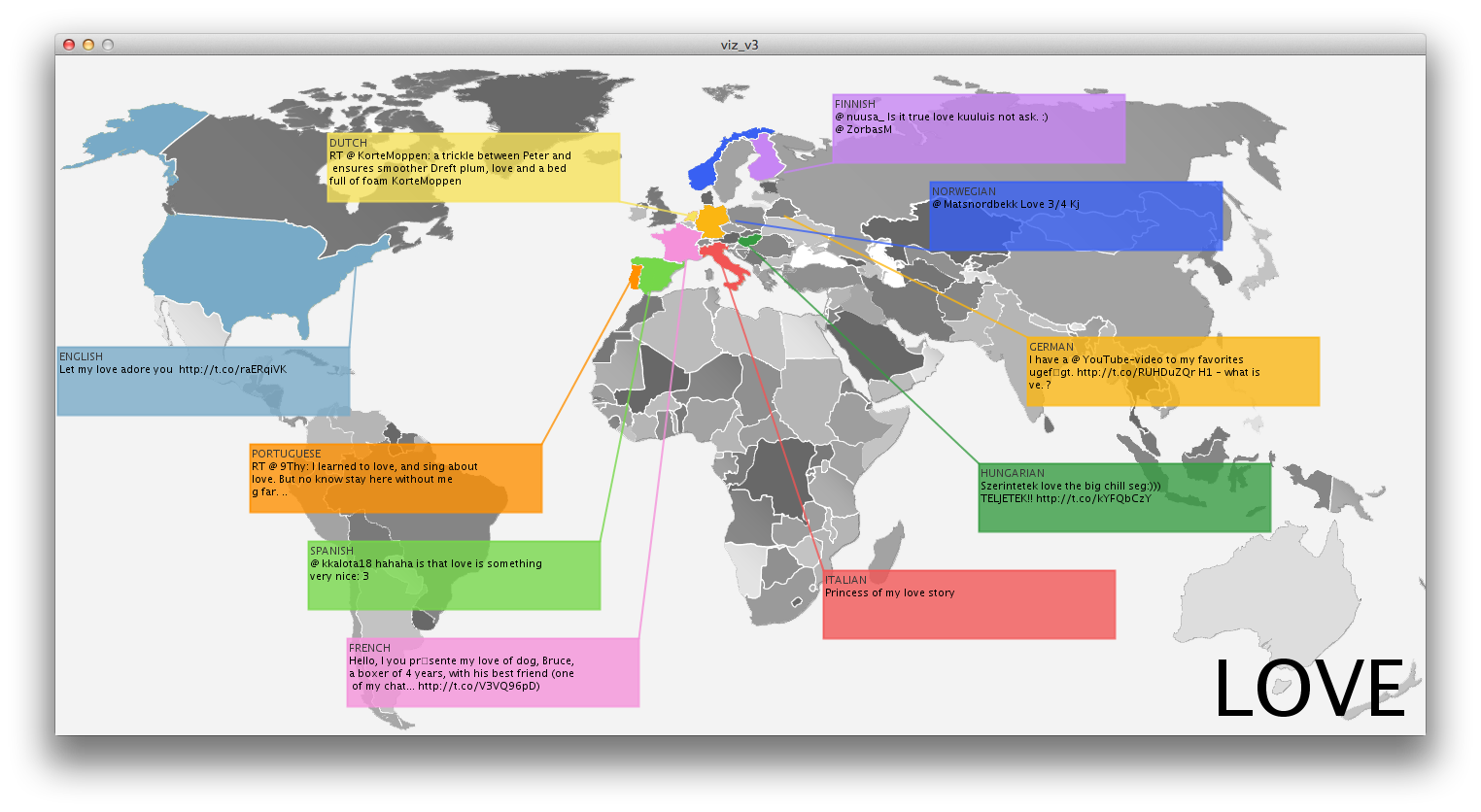
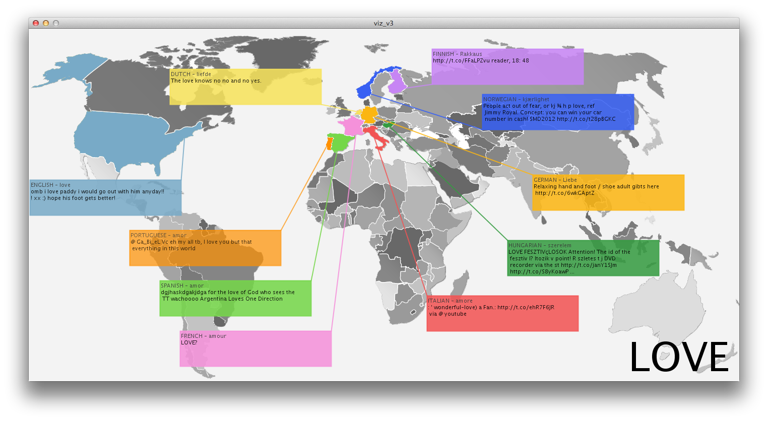
In this example, I quered ‘love’. After every round of Tweets, these same languages would be fed with new Tweets, after seeing 3 Tweets in each of the languages it would recycle.
In the process of creating this visualization I took some liberties, assuming that if a tweet was tweeted in Italian that it was from Italy, etc. to allow the visual impact of comparing countries across the globe to really take effect. The visualization starts as a colored map, with Tweets slowly fading in one-by-one until all 10 languages are represented once, and at that point the Tweets begin to fade one-by-one, until the screen is again empty. At this point, the screen will repopulate and continue to loop until all of the scraped tweets have been seen.
I ran this query of ‘love’ many times through running the Processing application, often getting different results as new Tweets became available. While I do not have the screenshot now, I remember reading a tweet from Spain about God’s love, which seems to reflect the deep Catholic culture there. In another instance I found it interesting that Italy also celebrated Valentine’s Day.
- English – love – omb I love paddy I would go out with himanyday!!! Xx :) hope his foot gets better!
- Dutch – liefde – The love knows no no and no yes
- Spain – amore – “The time that has been given to us in our life is precious to discover and perform good works in God’s love” (Pope Benedict XVI)
And after creating the application I especially enjoyed reading people’s more meaningful tweets, a Spanish speaking Tweeter said, “love is priceless, however many find it hard to want to”. Compared to many of the English derived Tweets that I read, this was more heartfelt and genuine, truly respecting the word for it’s meaning as opposed to trivializing it with overuse.
While it did not seem like any one language’s derived tweets were particularly indicative of the langauge itself, there were definitely connections between the language the Tweet was spoken in and the culture from which it originated, and by being able to compare and contrast them to other cultures or even to other Tweets within the same culture, the resulting deliberation becomes that much more meaningful.
Happiness
- English – happiness Astrology: Libra represents partnerships, marriage, love and happiness
- Portuguese – felicidade – learn find joy in the joy of others the secret of happiness.
- Spanish – felicidad – Happiness is to realize that nothing is too important
[youtube=https://www.youtube.com/watch?v=SCm9RUSzcNQ]

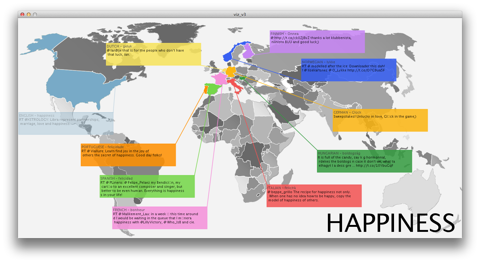
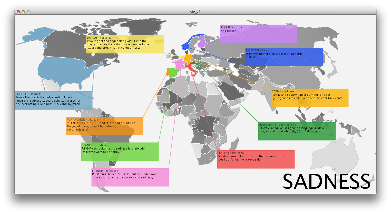
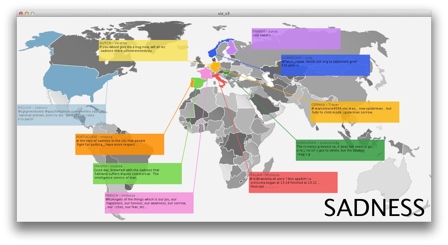
Sadness
- English – sadness – Seems like hurt is the only emotion I have anymore. Sadness appears daily as I search for the everlasting. Happiness is beyond my reach.
- Spanish – tristeza – Sadness is a reflection of a fear wanting to be happy
- Portuguese – tristeza – at the time of sadness in the city that people fight for politica…have more respect
Self Critique
I would say that my intended, getting to understand how people who speak different languages perceive the same word/idea was successful. The Tweet length is the perfect size for a visualization and through these tweets culture definitely shines through. A few things that I wish I had time to improve are, integrating eastern languages as well as Hebrew, Arabic, Russian, etc. There was a problem with the character encoding that I couldn’t solve in a reasonable amount of time and so I gave up on that. It was really interesting though, that because Chinese/Korean/Japanese characters stand for a whole word, the translations are quite a bit longer and more meaningful, this would have provided a really interesting contrast against 140 letter Tweets.
I would also have liked to implement some way to parse out less meaningful Tweet. At times the Tweets weren’t very indicative of anything, at times being dominated by a link or mentions, being able to sort these out and still have a sizable pool of tweets (and doing so in a timely manner) would have been nice.
In the future I would also like to implement a query box, so that the hardcoded word can be modified by the user.
========================================
Kelsey Lee: Comparing International Tweets
Pretty visualization. Don’t listen to Golan, the map is awesome.
Map is very well done. Unclear if it is interactive/computationally generated map or whether it is manually composed.
I’d appreciate a key of some sort on your maps. What does gray mean (and what do different levels of gray mean)? What do the different colors mean (or are they just randomly assigned to countries)? What does the difference between gray and color mean? < -- maybe the countries are only shown when a tweet is shown?, agree the gray pallet is a little confusing Also, some clarification (indication) that the tweets have been translated would be helpful. Are you familiar with Twistori? http://twistori.com/ This is a real-time stream of tweets using a single word (not internationalized though).
“The colors are randomized”: NOT GOOD, because the eye doesn’t know that; it looks like real information! < +1 I would say language doesn’t appropriately correlate with geographic location. A French tweet could be coming from Canada, Algeria, Switzerland… ^twitter can specify geography, she may be using the language within the geographical location, which is logical. <- i thought she said they weren’t geotagged ^well, easy solution then Visualization is clear and informative, but I am not sure with how the colors correlate with each other. For example, there are varied colors of ‘gray,’ and I am not sure what those colors represent, but I still like the idea of translating different languages and visualizing them. There’re some interesting emergent patterns with your translations. I would have liked to hear more about your concept or intent with this project though. What were you trying to show or say?+1 Maybe reconsider your color choices, it’s a little overwhelming. <- i like ‘em :-) I’d like to see some text analysis on the results from each language… what are the collocations (commonly occurring word pairs)… Do context analysis, i.e. the words that surround love (e.g. i_you; i_*, etc)…. Also do things change over the time of day Why are some of the grayscale countries in different shades of gray? Is this meaningful data? If not, maybe make all the same color? How about doing simple analysis that looks for the number and type of pronouns (i,me,…; individualistic vs. communal… Flags vs map possibly because people in the US could be tweeting in chinese. Are you filtering by country or by language only? Need to look at the distinction. This is an attractive visualization (maybe too colorful though) but I think you could have analyzed the data more to find more trends and inferences. Maybe compare and normalize the number of times certain words are tweeted in each country and display that. Working with single tweets makes it more intimate but less of a generalization. Why aren’t any African or Asian countries represented? This would make a great piece to explore, especially if you enable searching via your own query. I agree with your use of Twitter instead of blogs because it captures a more powerful snippet of text than a long blog post would I wonder if you could focus the visualization more on the differences between countries by doing an analysis for other significant words in each tweet and doing a tag cloud, rather than just plotting tweets geographically. I feel like looking at individual Toots on a map does not give me a good sense for any overall usage or meaning as it varies by country. I also suspect that cacheing toots over a longer period of time could enable you to tease out some more interesting trends, since Twitter doesn't give you access to toots older than about a week. Be cool to see the data not only by country, but by season, time of day, &c. I'm also inclined to take all of the ones that seem "philosophical" and searching to see if they're song lyrics or lines from a poem. But maybe I'm just getting cynical in my old age. haha I like the map and how the colors clearly connect the tweet to the "country", maybe you could alter the color scheme though i am confused how it works- does it pick different tweets everything you load? are there differences in how many tweets there are from each country for each word? could you show this AKA: tweet 1/2,300 i think you may be making vast generalizations/assumptions about american tweets. The coloring is great for the countries, but I would want to see better grouping of subjects and similar words so we could see simultaneous trends in different parts of the world. For example, what words for each country are more frequent than for any of the other countries? Translating tweets is an interesting problem because Twitter users often use abbreviations and other shorthand. Did you have problems with this in the translation? Do most of the foreign tweets make sense automatically translated into English? If you're just using several countires, maybe consider only showing those on the map? On the one hand, most of the map is unused. On the other hand, the world map is familiar and you have plenty of space to show the text of tweets. How did you choose the countries? I remember reading that Brazil has the fastest growing population of Twitter users, or something similar. If you choose languages from countries with a lot of tweets, you might get better results, Re: Finland not returning tweets. I think aggregate differences across many tweets for each language might have been interesting: so getting a lot of tweets for love in man languages and then comparing them. that said this is still pretty cool! I think it would be really interested to play with the translations more and their incongruencies. So if you take a tweet and you translate it from Finnish to Italian to Japanese to Korean to Spanish and then back to English does it maintain the same meaning? Maybe dists between meanings? I love the visual of the map, colors and callouts. I would add some kind of a soundtrack to the video. It always adds a lot to the presentation. **agreed. I like the map and the color usage, but sound is key too. ** consider speeding up video to show us these trends you mention The visuals are nice. I think you have some good ideas for next steps (cleaning the data further, and allowing to search for other terms). It would be interesting to see what people are saying in different languages about any term that comes to mind. did you use words other than love? like hate? ** yea i would like to see other words as well, or if there is a way to search for most common words/themes **or at least antonyms it would be kinda silly, but maybe the colors could also change based on mood ring colors of what they are about I would find a way to visualize all the conclusions you have reached (just like Golan is saying just now) - how can we see these trends in the tweets? Since the viewer can see only one tweet at a time from each country, it's a bit hard to draw those conclusions you have made yourself. How could you skip Canada!? (And associate English with America and not the U.K.? :) )