Alex Wolfe | Looking Outwards | Project One
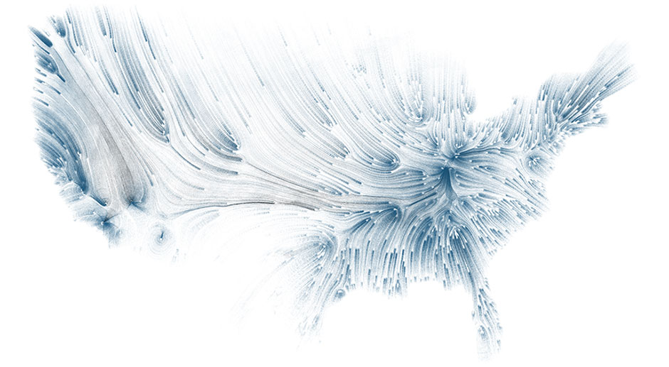
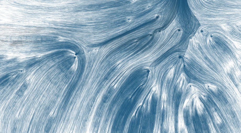
Drawing Water visualizes the movement of water across the US, from where it falls to where it is ultimately consumed. The graphic was developed in Cinder by David Wicks for the UCLA D|MA thesis exhibition Tell them nothing of the things I thought about and created while I was sleeping and uses water consumption data provided by the USGS and rainfall data provided by NOAA/NWS scraped and parsed in Python. I like this piece particularly for its clarity and visual impact. It is difficult to find visualizations that are beautiful and yet still give a clear impression of the data from the first glance.


My Daily Palatte
A very simple non-techy sort of info visualization that I quite like. Jacobo Zanella, divides his body up into 100 squares and denotes what colors he is comprised of that day, every day.

Cinemetrics
Film visualization has been done before in many forms, but Cinemetrics stood out for me as being one of the most clear and comprehensive while still being visually beautiful. The visualization is an interactive application that displays film palates throughout the course of the movie, its chapters, and the intensity of movement in those sectors.
This installation uses static data collected from one voyage over Lake Superior. Recording wave g-force and acceleration data from the trip, the movement of the water is recreated via mechanical grid.