Luci Laffitte – Looking Outwards 2
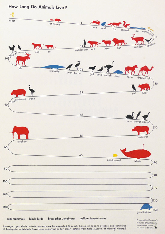
How long do animals live?
This simple print infographic compares how long different animals live on average. I think this is interesting data and enjoy how the animals are simply placed along a line.
The piece tries to add additional information, by color coding the different types of animals (mammals, birds, other vertebrates, invertebrates) but it is easy information to miss because the key is small, in black&white and at the bottom.
I wonder if this content could be beefed up with interactive filters or tangible menu control.. does the size of the animal or other factors affect its life span?
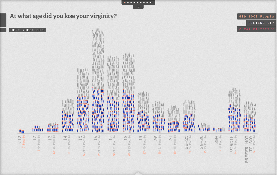
The Sexperience 100
http://sexperienceuk.channel4.com/the-sexperience-1000#/
“Welcome to The Sexperience 1000, an interactive journey through the sexual experiences and preferences of one thousand British individuals. What’s the favourite sexual position of iPhone users in the North? Do country music lovers over 55 prefer to do it in the dark? Explore the 20 questions of our survey and discover what the great British public get up to between the sheets…”
I like this interactive infographic because it animates a bunch of little people moving around as you change the survey question or filter. At any point you can hover over a person and get their age and location. This make the statistics seem more real & trustworthy, because you can SEE that real people answered the questions. It is also interesting that you can watch specific people move between the different filters… you can *star* a person to follow them throughout all of the questions, or see their answers to all of the questions.
There a tons of layers to explore in this infographic, that makes a somewhat taboo subject easily accessible and friendly. This is a good example of a social experience that friends would enjoy gathering around, and comparing reactions.
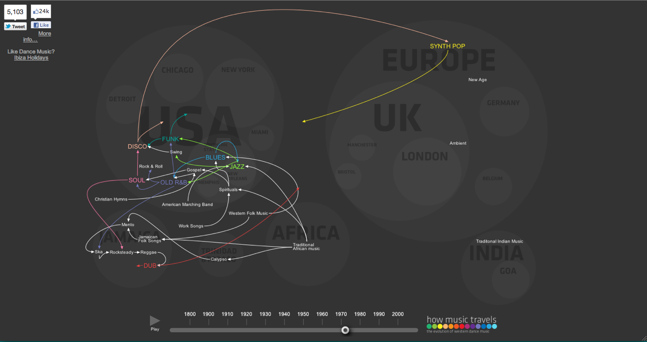
How Music Travels
http://www.thomson.co.uk/blog/wp-content/uploads/infographic/interactive-music-map/index.html
This animation visualizes the time and place of music style/genre origins and trends. It shows how music evolved and moved across the world, changing & morphing as it encountered different areas and influences. I enjoy how the spread of sharing really picks up after the 70s and this change of pace is visible in the animation.
I think this could be improve if the different lineages were clickable & could be isolated or learned about. Or if you could play clips of what the music was like.


