Guodu-Visualization
Data Visualization for Pittsburgh Healthy Ride
Initially I was interested in how do customers or subscribers choose their bikes? Do they examine the newness / wear and tear of the bikes? Of course our data set did not have a rating of the bike’s physical condition but maybe a trend in the bike ids would show something?

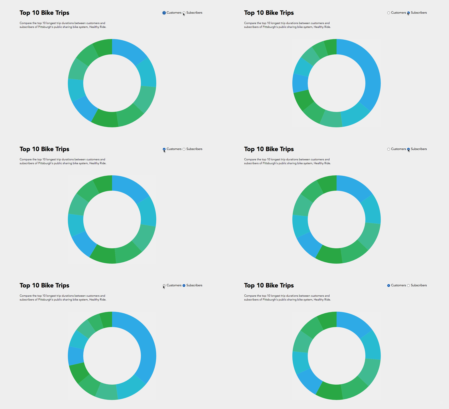
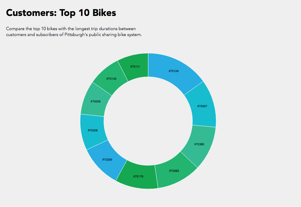
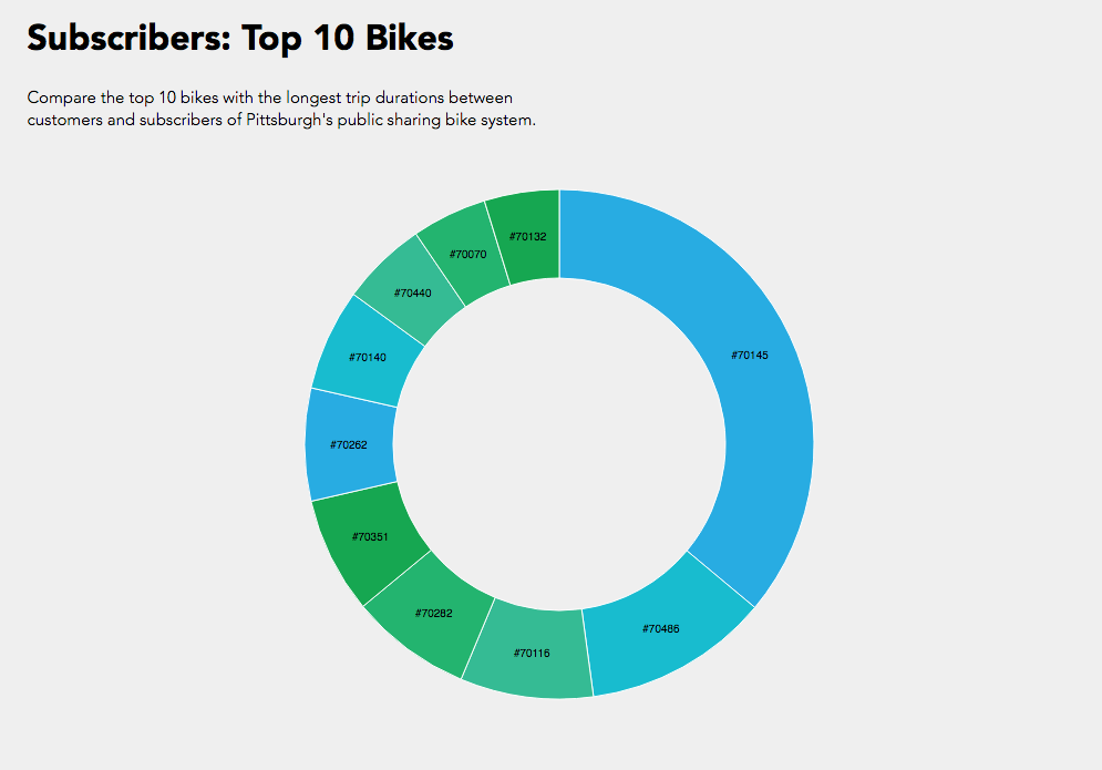
In the end I compared the top 10 bike trip durations and their bike id’s between customers and subscribers. While I was able to achieve the simple interactive component of toggling between customers and subscribers, I could not manage to get the text working like the following where I was exploring static d3 bl.ocks.


Overall a bar graph would have been more effective for understanding what the information where the trip duration is numerically visualized instead of just proportional section, or another bl.ock where I could include more information like start and end stations. While it’s interesting to see that subscribers logged a lot of hours in bike #70145, if this bike was placed in the customer pie chart, it would have been more than half of the pie chart.
Hope I can one day ride the legendary #70145 bike.
__________
Just for some fun because I was thinking how I could get other people interested in data visualization about bikes…
It’s impossible to read the text though… 😛