arialy-Visualization
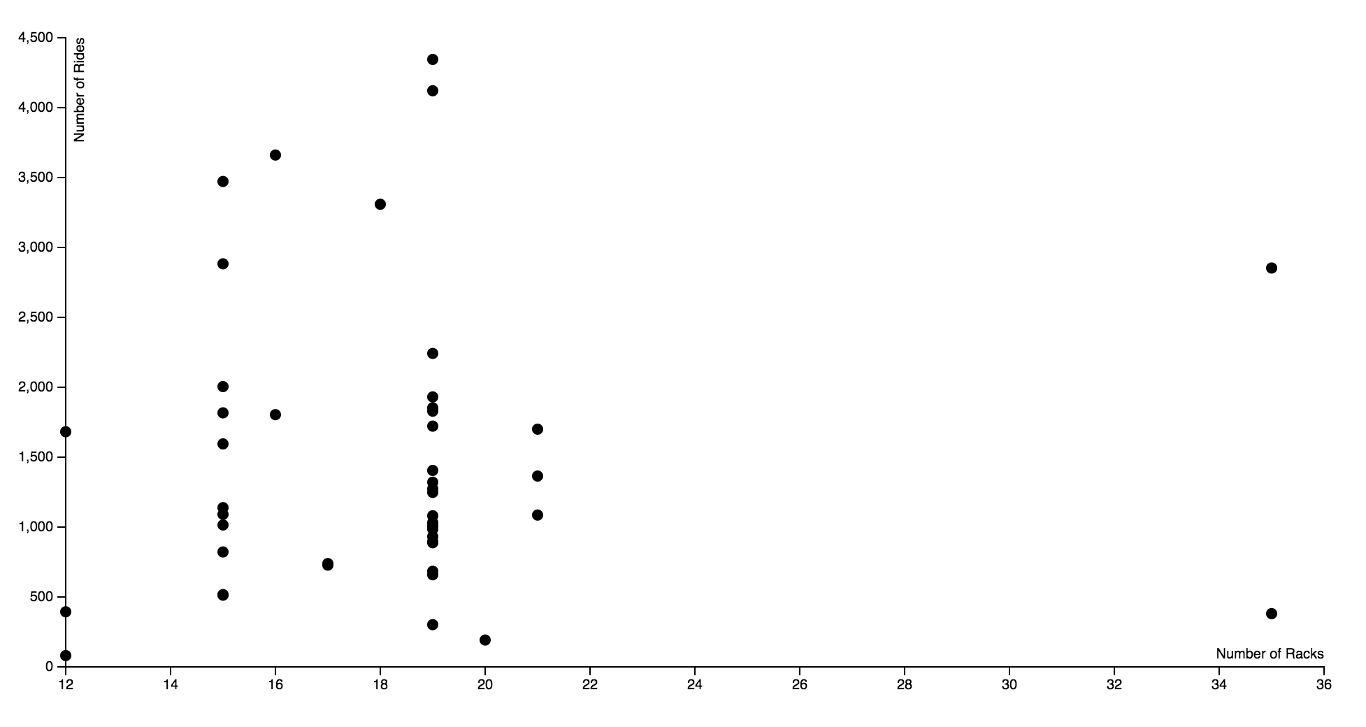
I used the bike data to visualize the number of racks against the number of rides each station had. I wanted to see if there was a correlation between the number of racks and the popularity of the station. It turns out this is not the case, as the popularity of the 19 rack ranged from over 4000 and under 500. The number of racks seems rather arbitrary, so it questions how much thought went into the installation of the bike racks. Ideally I would have like there to be an interactive component to this data, where you’d be able to hover over each dot and see the station name it represents.
