Sam Lavery – Looking Outwards – 4

by sam @ 5:41 pm 11 March 2012

[youtube https://www.youtube.com/watch?v=AklKy2NDpqs]

The reacTogon is an interface that enables people to build arpeggios using hexagonal blocks. The blocks are placed on a board that represents all of the notes on the harmonic table. Some blocks have certain effects that alter the sequence or direction of the arpeggio. There are also controls for other aspects of the sound. This is similar to the augmented reality project Golan showed in class but allows the user to make more refined sequences and patterns.


http://gizmodo.com/5111630/panasonic-gel-remote-concept-slippery-slimy-and-occasionally-erect

Despite the not-so-subtle innuendo that is evident in the design of this remote, the idea of having objects that become alive only when you need to use them is intriguing. This remote in its sleep state turns into a floppy gel but becomes rigid when the user grabs it. I think there is probably a use for this type of interaction but Panasonic has not found it.


Last but not least, my favorite tangible interaction project ever.

useless box

Looking Outwards

by jonathan @ 11:01 am 8 March 2012


Harvesting your own bone… With this particular speculative project, the user can insert extra bone cells into their arm to grow their own artifacts for them to share with other people or just to keep for yourself. Though highly speculative, I think it is an interesting perspective to use our own flesh and blood to create artifacts or actual products.

[vimeo https://vimeo.com/6792724 w=500&h=400]

Another project by Mike Thompson, this lamp interestingly seeks to make people aware of the value of light. Like his other bone project, this lamp more or less seeks to create a discussion about the particulat ethos of such an object. I think for the sake of discussion it’s really provocative, and the interaction is an appropriate one, but from my point of view, it doesn’t really do more than the initial surface level discussion. I guess the extreme depth is not what I sense.

http://labs.teague.com/?p=1451

Here’s an example a very functional (albeit a bit difficult to wrap your head around at first) type of interactive design. What’s neat is that it’s also open source! Free to incorporate or alter into your other projects.


Billy Keyes – Looking Outwards 4

by Billy @ 11:00 pm 7 March 2012

My set of interactive projects unintentionally ended up as a set of physical objects.

feelSpace

feelSpace is actually a cognitive science research project at the University of Osnabrück, but I think it is a strong inspiration for artistic interaction. The project consists of a belt lined with vibration motors and an electronic compass. The section of the belt that points to magnetic north is always vibrating slightly, which allows the wearer to feel his or her heading. After wearing the belt for six weeks, users reported that they became accustomed to navigating with their sixth sense.

So while it was designed to research how the brain adapts to new sensory sources, there’s a lot of artistic potential in making intangible information always present to us as “new” senses. As an aside, this project inspired the Stalker Sensor, a belt I made that gives the wearer a crude approximation of the distance of object behind them.

Optocoupler and other New Needs Devices

[vimeo 25769471]

These projects by Ludwig Zeller also take on psychological and cognitive science topics, but come from an art and design perspective without a focus on research. The three devices, Dromolux, Optocoupler, and Introspectre explore how technology can be used to alter mental ability as a reflection on the intended and unintended consequences of living in an always-connected world. I particularly enjoy Optocoupler (pictured), which is designed as a “digital depressant” or relaxation chamber. I can’t speak to how well it actually works, but I think the form is interesting (sticking your head inside a TV) and the light patterns are beautiful. Very reminiscent of scenes from Kubrick’s 2001: A Space Odyssey

My little piece of Privacy

[youtube=https://www.youtube.com/watch?v=rKhbUjVyKIc]

Niklas Roy’s My little piece of Privacy is a great example of the fun to be had in overengineering. Roy’s studio has a large window facing the street and to gain some “privacy”, he mechanized a tiny curtain so that it would move to block the view of passerby. This instantly creates a game where people on the street are distracted by something moving as the walk past and then try to outsmart the curtain and see into the studio. As a result, there’s probably even less privacy, but despite the title, I don’t think that was the point. I like this because its fun, conceptually simple, and the engineering is well done and well documented.

Bridge 1

Last, we have Michael Cross’s Bridge 1. The interaction here is purely mechanical, but I find the result incredibly compelling. Inside an old church flooded with water, visitors walk across a bridge that appears in front of them and disappears behind them, leaving them apparently in the middle of the water with no way back. So while there’s nothing computational about this piece, I include it because its one of my favorite interactive pieces and the feelings it evokes and explores can inspire many other projects.

Joe Medwid – Looking Outwards – 4

by Joe @ 10:49 pm 6 March 2012

Zombie Frog Drum Kit

[vimeo=https://vimeo.com/31923751]

The name… says it all? A MIDI drum kit is used to coordinate electrical shocks directed at the bisected bodies of preserved frogs. Morbid? Sure. An ingenious interaction? Undoubtedly.

Rope Revolution

[vimeo=https://vimeo.com/26217095]

A collaboration between the MIT Media Lab and the Harvard School of Design lead to this little gem, a series of video games based on rope-related activities throughout the world. In the age of Kinect and Wii, it’s refreshing to see an input method so thoroughly grounded in a tactile medium.

Spyro The Dragon: Skylanders

[vimeo=https://vimeo.com/30858589]

You need to fast-forward quite a bit to get the point of this clever video game / real life mashup. The gimmick here is that you can buy physical action figures which are then “Transported” into a video game, unlocking the figurine as a playable in-game avatar. Not only is it an ingenious marketing strategy, it redefines the concept of “downloadable content” and playfully blurs the line between game and reality. If I were ten years younger, I would be eating this stuff up.

Looking Outwards 5

by sarah @ 4:43 pm 2 March 2012

Pranav Mistry: The thrilling potential of SixthSense technology

[ted id=685 lang=en]

I though the TED talk by Pranav Mistry from MIT’s Media lab about the “Sixth Sense” project was interesting to think about while brainstorming for the next project. I think he brings up some good points about possibilities in human interaction with digital media. His ideas span from useful tools for everyday life to games to occupy idle time while on the subway. He is invested in getting the digital world away from just existing on a screen and making it a more tactile experience. If you have the time and haven’t seen it yet I’d recommend it!

Interactive City Map of Berlin

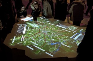
I mentioned earlier in the year that I am interested in suburban and city planning and I wanted to see what kind of interactive art/projects were out there about this topic. From this search I found ART + COM’s work. They made a media table for the Red Town Hall in Berlin, Germany in 2009 which allows visitors to interactively view the cities history and cultural attractions. While this project seems very fitting for its purpose in the town hall, it’s not quite what I am personally interested in. I think they succeeded in making an engaging informational tool, but I don’t really view it as an art piece.

Drawing Machine, by Lab212

Lab212 created a drawing machine for the public to interact with, which was installed on front facade of the French Institute of Morocco to celebrate the international festival of short animated films. There are many electronic drawing machines out there, but I thought this one had an interesting take in its scale and simple interface. It seems like it would be a fun experience to be a part of a drawing that big and in a public space. (Don’t get how it relates to short animated films though, but fun anyway)

Duncan Boehle – Looking Outwards 3

by duncan @ 8:45 pm 21 February 2012

Bohm

Bohm is an experimental game based around interactively growing a tree. Unfortunately the game is still in development, so this teaser video is the only way to see it in action:

[vimeo=16065687 width=550px]

Similar to Cloud and Flower, this game tries to break away from traditional game conventions in order to create a primarily relaxing experience, rather than one fueled by adrenaline or addiction. According to the developers, the player interacts with the tree while it grows, influencing the paths of its branches and overall shape, while adaptive music plays in the background. As of now, they’ve already achieved some form of generative artwork – they have a tree with virtual growth in a beautiful dream-like world, but the key to their success is putting the player in a state of meditation. The developers describe the gameplay – slowly manipulating the branches, creating new ones – as if it were an artform, like sculpting a bonsai tree. Empowering players with creativity, but freeing them from competition, risk, should make for a very immersive and unique experience.


PixelJunk Eden

PixelJunk Eden is a game where players explore an alien-like garden full of growing plants and flowing creatures to collect glowing items. The game has a very minimal aesthetic – it has distinct palettes in each garden, and makes good use of blur and glow to create a dream-like ambience. The art director, Baiyon, also created a dynamic techno soundscape that responds to the player’s progress in the garden. You can look at the official trailer on Steam to hear him describe the inspiration for the game.

PixelJunk Eden Screenshot 1

Baiyon’s clear artistic vision is evident from the tight coupling of the music and visuals, and it works together to create a fascinating experience. But I’m not convinced that the initial mechanics are successfully translated into a good game. The control scheme was ported from the PS3, but the platforming controls just don’t seem as responsive on the PC as they should be, especially when the game is about exploration. The gravity-bound avatar and collectible orbs also seem to distract from the experience of just watching the environment grow and animate; it’s as if they’ve already achieved half of what Bohm was trying, but tried tacking on a game to try to make t more accessible.

PixelJunk Eden Screenshot 2


Looking Outwards- Synthesis, Simulation, Morphogenesis

by blase @ 12:25 pm

Tim Blackwell’s Swarm Music (2001-2002):
Swarm Music

In a few different series of compositions, Tim Blackwell uses swarming and flocking algorithms to generate music. He explains that in an ensemble that is improvising is essentially performing a sort of flocking behavior, wherein the entire group as a whole is moving in some direction, led by the musicians responding to each other. Based on these principles, he synthesizes MIDI compositions in which the instruments swarm/flock to create music.

Overall, what attracted me to this piece was the idea of creating a composition in the same way jazz improvisers create music, with each voice in an ensemble responding to the others. I think this work is quite successful, although I wish these pieces were updated with modern synthesizers. It’s very clear from listening to these decade-old compositions that MIDI and other synthesized audio technologies have come a long, long way in the last ten years.


Jon McCormack’s Morphogenesis Series (2011):
Link to series

This series of digital prints synthesizes flora using genetic algorithms, with Australian flora as a starting point. He notes that the types of flora that were produced from this series had familiar characteristics, yet would probably be impossible in nature. He seems to use a nice renderer/shader to go from the models that are created, as shown in a detailed image on the site linked above, to the final version.

The idea of synthesizing biological creatures that are familiar yet impossible is an attractive idea, and I think McCormack executes it well. As someone who’s not familiar with Australian flora, I perhaps can’t appreciate all of the subtlety of what was produced by the genetic algorithm, as opposed to what actually is characteristic of Australia. Regardless, I think the images are very pretty, and I would appreciate seeing these printed out rather than on a computer monitor. (There are prints available). I think mediating this sort of art with a screen, even though it was created on a device whose interaction with us is mediated by such a screen, doesn’t do as much justice to the images as printing them out on high quality paper might.


Deborah Kelly, Beastlines (2011)
Link to Beastlines videos

Beastlines is a series of short animations taking biological mashups, in a cut-and-paste style, and animating them. In essence, it’s a commentary on new lifeforms and genetically mutated life. It takes the opposite approach from the two other projects I’ve looked outwards towards today. From the artist’s description, I think the most striking phrase used it “biology is no longer destiny.” It seems that this phrase is a major driver in this work, animating biological deviations.

On its own, I think the individual figures aren’t very striking. However, in animation, taking on bizarrely human and dance characteristics, I think this piece becomes more compelling. There are a few moments when the characters seem to be dancing, juxtaposing their distinctly mashed-up, non-human form with what I perceive as an inherently human movement.

Looking Outwards 4

by sarah @ 9:24 pm 20 February 2012

Matthias Pliesnig
http://matthias-studio.com/sit/sit.html

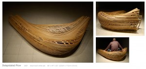
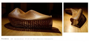
I am thinking of doing something with generative furniture design for my project and Matthias Pliesnig’s work came to mind while I was doing some research. He doesn’t give too much information about his design process, but some of the works seem that they could lend themselves to generative design. (And even if they’re not generative works I thought he was an interesting artist to share.) I think the way he treats space and a person’s interaction with his piece add interest to his work and his craftsmanship is very impressive! Some quick background information: his studio is in Philidelia, PA and has taught at Anderson Ranch in Colorado (where Golan taught too).

I recently saw this video from a friend who is taking Ali Momeni’s Digital Fabrication this semester. Phil Cuttance creates molds and objects through a process contained on a mobile cart. The forms that are produces from it are interesting and mix digital media with hands on craft.

Pipe Cleaners by Lars Berg was made with openframeworks and ofxMarchingCubes. I thought Berg was able to create really interesting and tangible movement and texture for these creaturelike things. However, the image appears blown out at times and I wish that the contrast and maybe color of the piece was altered so that it would be easier to see the movement and details. It would be great to see these put in some kind of context.

Coplanar

http://coplanar.org/work/achilles.html

Achilles from 2008 by Coplanar is visually interesting. It’s odd to see what appears to be steel-like bars melting and folding like fabric. This project reminds me of the “Curtain” on OpenProcessing by BlueThen.

Looking Outwards 3

by sarah @ 9:38 pm 16 February 2012

Simon Katan created an interface that allows the user to alter and play with an environment that visualizes sound in real time. It’s a simple sketch, but I thought he achieved some interesting results. I really liked that he incorporated how the object effect and play off of one another in the later part of the video. I think this could be a fun installation piece for a children’s museum (or maybe regular) at a large scale projected on a wall that visitors were able to interact with.

http://www.puntoyrayafestival.com/pyrformances11_eng.php?pyrformerID=31

(Sorry, having trouble embedding this video, visit the link above to view the video. I will keep working on getting it to work in the mean time.)

On the same theme of visualizing sound, Rikkert Brok and Maarten Halmans combine analog and digital techniques to produce a live performance for Punto Y Raya this year which is an abstract line and dot film/animation festival that takes place in Madrid. I really like some of the animations that come out of the festival a bit more, but for the sake of generative/simulative I thought I should post one of the performances.

Joel Lewis (who once one of the presenters at Art && Code last year) along with his partner Pete Hellicar were commissioned to create the Turner Prize Twitter wall by the Tate Britain.Their project allows visitors to comment on the work within the show. These comments are then projected on a wall within the museum and stream in real time so that other visitors can see the opinions of other visitors. This project strongly boarders on a datavis, but I thought it was worth including because of its potential to generate a more critical conversation about the work in a museum with a larger audience that typically occurs in the moment while viewing the exhibition.

http://www.hellicarandlewis.com/2010/10/15/turner-prize-twitter-wall/

Looking outwards 2

by deren @ 11:59 am

http://www.openprocessing.org/visuals/?visualID=28848

this is neat, i like the concept behind it, but i’m not sure if it works best with logos. maybe something more personal like a name tag…

the ascent

http://www.futurefeeder.com/2011/05/the-ascent/

this is really crazy, not quite sure how it’s working or what is happening though. i like the idea of mind control to generate actions. i would maybe do more of an augmented reality thing and not a physical harness mechanism

http://www.shanecooper.com/Feed/index.html
this is a really neat idea, “a garden that grows from the light of a television. i think it would be really eat if people could have some sort of input and control to the amount of light on the screen

« Previous PageNext Page »
This work is licensed under a Creative Commons Attribution-Noncommercial-Share Alike 3.0 Unported License.
(c) 2023 Interactive Art and Computational Design, Spring 2012 | powered by WordPress with Barecity