Eli Rosen – Final Project – Civil War
Civil War
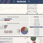
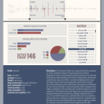
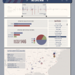
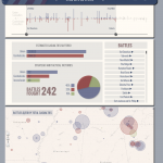
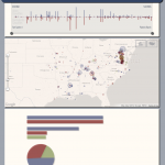
This interactive data visualization allows for self-directed exploration of the battles of the American Civil War. The aim was to facilitate an understanding of the conflict on multiple scales from the entire war to a single battle. The interactive data visualization is live at www.elibrosen.com/civilwar. Here are a few screenshots of the web application:
Here is a video of the web application:
Inspiration
The American Civil War is to this day the costliest (in terms of casualties) of all American conflicts. The records of the war have been scrutinized and documented extensively by historians and the events of the war have inspired countless novels and films.
Amongst some, there is an almost cultish obsession with the history and personas of the Civil War. Maybe it is a romanticized notion of war and bravery that stirs people’s passion, or perhaps it is an understanding of the war’s profound impact on our nation’s history. Whatever the reason, people seem to want to relive and recreate the war in vivid detail. It is this desire that has spawned projects like Ken Burns’ 11-hour documentary, the iPad app The Civil War Today (which delivers daily Civil War news 150 years late), and annual live action reenactments.
I wanted to tap into this existing desire to understand the events of the war by creating a visual tool that would allow users to explore the battles of the war chronologically, geographically, by the victories, and by the number of casualties. I had come across this visualization by Gene Thorp for the Washington Post (http://www.washingtonpost.com/wp-srv/lifestyle/special/civil-war-interactive/civil-war-battles-and-casualties-interactive-map/) and felt that it could be strengthened by including some of the other dimensions of information available about the battles. For example I had captured information on which side won each battle and who the commanders were.
First Iteration
My first attempt to visualize this dataset focused on the commanders. I plotted the battles chronologically on a timeline and for a selected battle I drew connections between the current battle and all other battles that the commander fought in. This tool provided some insight into the record of a commander across the war but the result was messy and a bit hard to interpret. This version was also built in processing which made it more difficult to share. Here is a screenshot and video of this first prototype:
Redesigning the Visualization
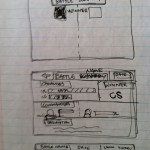
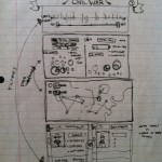
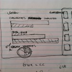
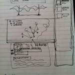
Here are a series of sketches and screenshots as I redeveloped the design:
I wanted to keep the timeline element but transform it into a navigation tool. The timeline I decided should be a way to focus in on a battle or portion of the war that was of interest to the user and should also give the user a quick impression of how the war unfolded over time. Instead of plotting the battles as circles along the timeline I plotted each as a bidirectional bar graph, pairing the casualties for the Union and the Confederacy for each battle. This gives an impression for the scale of the battle and for how evenly casualties were distributed. For a method of selection and filtering the data I arrived at the design of a dual slider. The dual slider acts as a range selector, and as it is adjusted the changes to the data are reflected. This allows for an interaction where the changes in the data can be digested over time as an animation.
To the timeline I added a map where the battles are plotted geographically. Here I colored and sized the battles as I had in the first iteration of the visualization, with color indicating who won the battle and area indicating the total number of casualties in the battle. Hovering over the battles provides summary information, while clicking on the battle opens a new window with a brief description of what happened. This allows a user to search for battles in an area of interest and answer questions like, “what was the furthest north the war went?”
For the final panel of information I wanted to provide summary statistics about the selected range of battles. Statistics include how many battles are fought, the total casualties on each side, and the victories on each side. These statistics allow the user to understand who was winning the war across a range of selected battles. A list of selected battles is also provided if the user wants to read about a specific battle. When hovering over a battle in the list the battle is highlighted in the timeline view and its summary information is displayed on the map. Clicking the battle name again brings up a window with a battle description.
Ball Pit Visualization
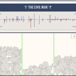
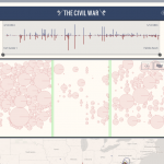
I also toyed with the idea of an alternate view where each individual battle in range would be visualized as a physics object. In this view, which my friend Evan Sheehan has termed a “ball pit visualization,” each battle would have been represented as a pie chart dropped into a “pit.” Each pit would correspond to who had won the battle. The idea behind this approach is that it would provide a fun (if slightly unscientific) way to show the victories on each side normalized by the importance of the battle (where total casualties stands in for importance). In the screenshots below you can see the Union victories on the left, inconclusive battles in the center, and Confederate victories on the right. In the final version the circles would have become pie charts showing the percentage of casualties on each side. The pie charts would have been selectable, allowing a user to dig through the ball pit as a form of navigation. As the timeline sliders were adjusted battles would have popped into and out of existence so that the balls in the pits would have been shifting constantly over time.
How it was Built
I was able to parse the data from www.civilwar.com using a python script. The data was pushed into an XML document. I used HTML5, jQuery, JavaScript, and the Google Maps API to create the web application. The website features custom built widgets drawn on the HTML5 canvas, including a double slider, a scroll bar, a pie chart, and animated bar graphs.
Future Direction
I had some performance issues in integrating feedback into the Google Map. Ideally I would have the battle highlighted in every one of the views (map, list, timeline, graphs) no matter where it is being selected or hovered over. This is a functionality I will have to explore further moving forward.
Although I want the visualization to be a tool for exploration rather than simple data retrieval, after seeing how users interact with the application it is clear that many people want to validate their existing knowledge of the Civil War. People often wanted to find Gettysburg or Antietam in the data but were not sure where to start. Addressing this issue will mean providing more convenient ways of retrieving information on a specific battle. The solution is probably as simple as providing an option to sort the list of battles alphabetically, but this is a feature I would like to implement in the near future.
I would also like to incorporate the narrative of the commanders more fully. Adding a filter for individual commanders would provide another layer of interest to the application. Seeing the number of casualties inflicted and suffered under a particular commander could prove to be quite interesting. The same goes for looking at victories and defeats on a commander-by-commander basis. You could identify the commanders with the highest winning percentage or isolate instances where an experienced commander was defeated by an upstart. Finally, you could plot a commander’s route through the war (or a rough estimate of this route) by connecting a commander’s geographically plotted battles in chronological order. This is a functionality I would love to add to the application to provide opportunities for more nuanced insight.
